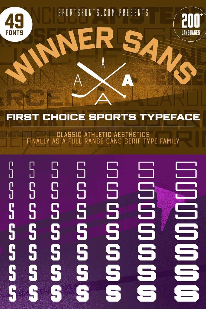
Winner Sans Font Family
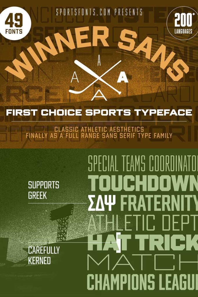
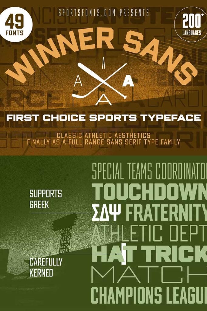
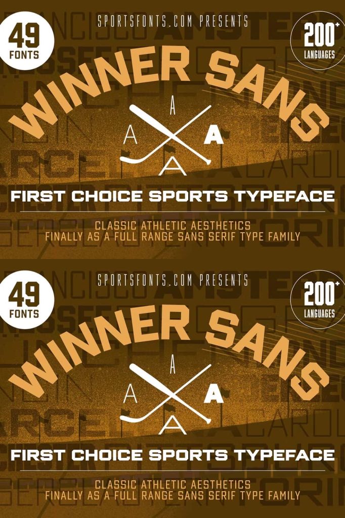
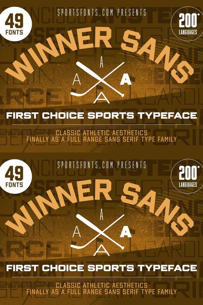
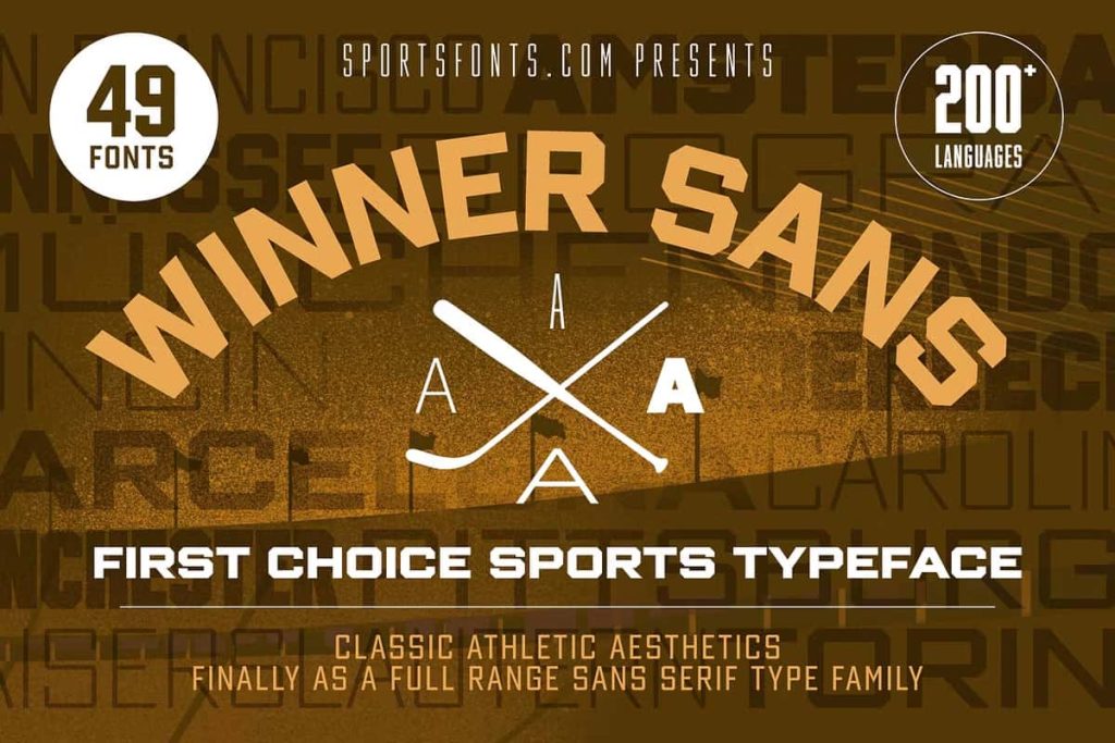
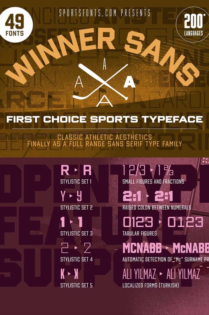
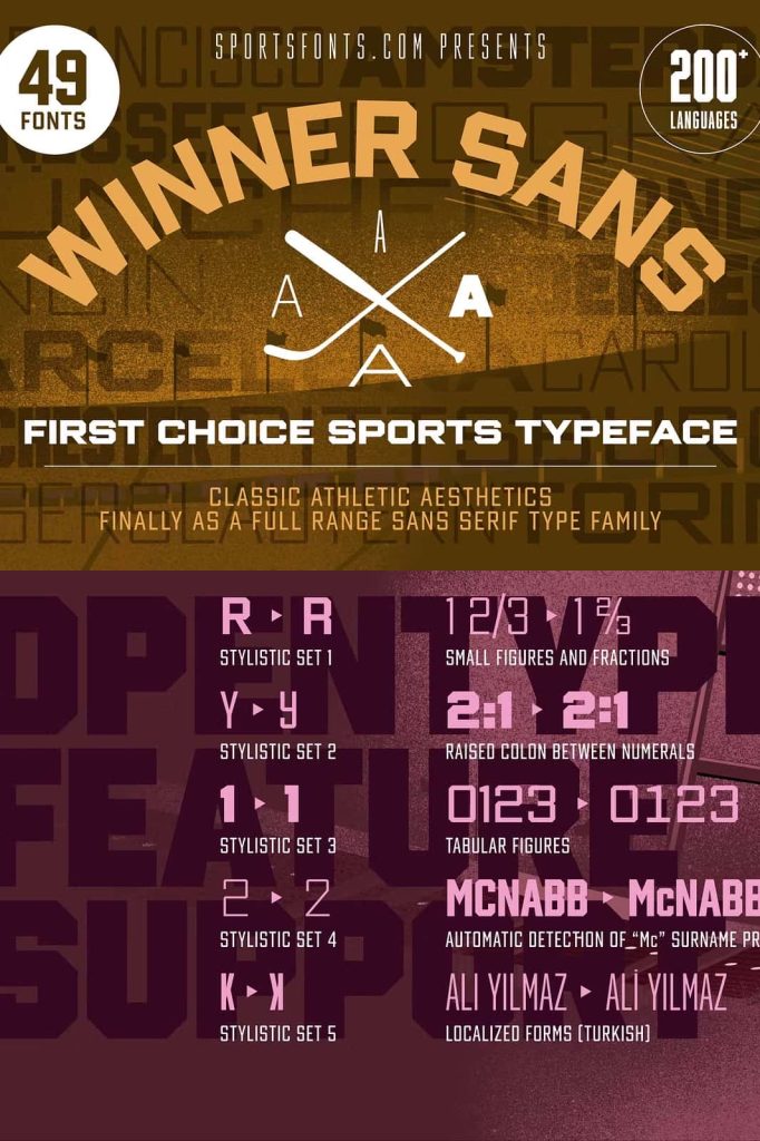
The Winner Sans font family and its companion typeface Winner redefine classic athletic typography by transforming it into a powerful contemporary super family. Inspired by traditional sports lettering, these fonts bring the energy and boldness of vintage athletic design into modern typography. Designers who want flexibility, strength, and clarity will find this type system especially useful for a wide range of creative projects.
Sports-inspired typography has long played an important role in branding, team identities, and promotional graphics. However, many classic sports fonts offer limited flexibility when designers need to adapt them to different layouts or design environments. Winner Sans and Winner solve this challenge by introducing an extensive typographic system that offers multiple weights, widths, and styles. This versatility allows designers to use the same type family across entire projects while maintaining visual consistency.
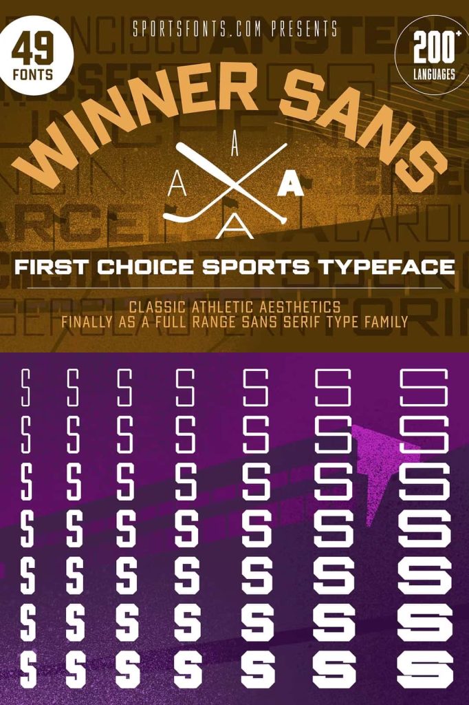
With its combination of seven weights and seven widths, along with serif and sans-serif variations, the Winner type family provides designers with a large toolbox of typographic possibilities. Whether creating headlines, editorial layouts, sports branding, or promotional campaigns, this font family adapts easily to different creative needs.
Inspired by Classic Athletic Typography
The design of the Winner Sans font family draws inspiration from the bold lettering traditionally seen in sports uniforms, stadium signage, and athletic branding. These classic letterforms carry a sense of competition, confidence, and determination. Designers often rely on this visual language when they want typography that communicates strength and performance.
Winner Sans captures these traditional characteristics while refining them for modern design standards. The letterforms maintain the strong geometric structure associated with sports typography, but they also introduce improved spacing, balance, and readability. This refinement ensures that the fonts perform well across both print and digital environments.
By blending classic sports aesthetics with contemporary design principles, Winner Sans offers designers a modern interpretation of athletic typography. The font family respects its heritage while expanding its potential for new creative applications.
A Comprehensive Super Family for Maximum Flexibility
One of the most impressive aspects of the Winner type system is its scale. The font family includes seven different weights and seven widths, giving designers precise control over typographic proportions. This wide range of variations allows the font to adapt easily to different layout requirements.
Designers can select narrower widths when space is limited, such as in vertical layouts, posters, or condensed headlines. Wider versions work perfectly for bold display typography where designers want strong visual presence and readability.
The multiple weight options further expand the creative possibilities. Lighter weights help create elegant and minimal compositions, while heavier weights produce bold titles and impactful branding elements. Because the entire family shares consistent design principles, designers can mix different weights and widths without losing visual harmony.
Available With or Without Serifs
The Winner type system becomes even more versatile because it includes both serif and sans-serif variations. The Winner Sans version offers a clean, modern appearance with smooth lines and strong readability. This style works well for contemporary branding, digital interfaces, and modern editorial layouts.
Meanwhile, the serif version, simply called Winner, introduces subtle decorative strokes that add character and tradition to the letterforms. The serif variation carries a slightly more classic tone, making it suitable for heritage branding, sports publications, or designs that benefit from a more traditional typographic style.
Designers can use these two versions together within the same project to build clear visual hierarchy. For example, the serif version might appear in strong display titles, while the sans-serif version supports body text or informational content. This pairing allows designers to maintain consistency while introducing typographic contrast.
Perfect for Sports Branding and Editorial Design
The Winner Sans font family naturally fits projects connected to athletics, competition, and performance. Sports teams, fitness brands, and event organizers can use the font to create strong visual identities that reflect energy and determination.
However, the versatility of the family extends far beyond sports. Designers can use it for editorial layouts, posters, advertising campaigns, corporate branding, and even packaging design. The combination of modern structure and classic inspiration allows the font to adapt to many different creative directions.
Because the family offers such a wide variety of styles, designers can build entire typographic systems using only this single font family. Headlines, subheadings, body text, and graphic accents can all come from the same cohesive design framework.
A Modern Evolution of Sports Typography
The Winner Sans font family represents a modern evolution of traditional athletic lettering. Instead of limiting designers to a single style, it expands the possibilities through an extensive collection of weights, widths, and serif options.
This super family allows designers to explore different proportions and typographic combinations while maintaining the bold spirit of classic sports design. Whether used for powerful headlines, structured editorial layouts, or dynamic branding systems, Winner Sans delivers flexibility and impact.
By combining heritage-inspired aesthetics with modern typographic engineering, Winner Sans and Winner create a complete design solution for designers who need strong, adaptable, and visually confident typography.