Tierra Display Font
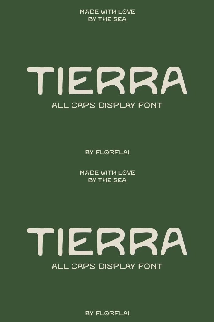
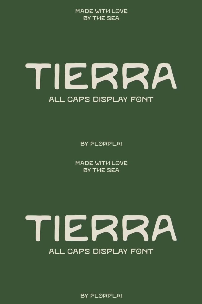
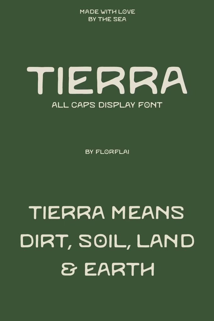
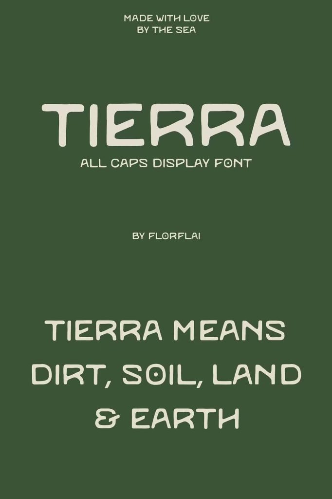
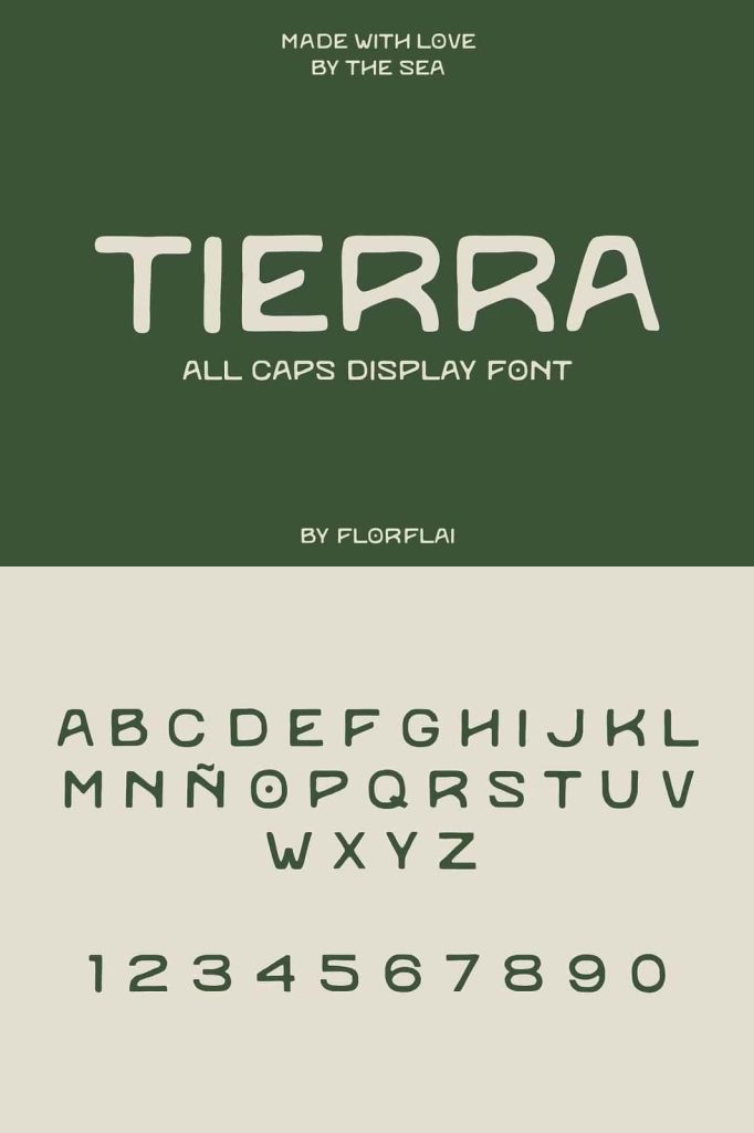
The Tierra display font captures the raw beauty and grounded essence of nature. The word “tierra,” which means earth, land, soil, and dirt in Spanish, perfectly reflects the philosophy behind this typeface. Designers created Tierra to embody the natural textures and organic forms found in the environment beneath our feet. Through subtle irregularities and balanced simplicity, this font communicates authenticity, warmth, and a strong connection to the natural world.
Typography often reflects the personality and atmosphere of a design project. Tierra delivers a visual language that feels natural and honest. Instead of relying on perfectly rigid geometry, the typeface introduces gentle variations that mimic the textures and imperfections found in soil, stone, and natural surfaces. These small details help create typography that feels alive and organic.
Designers who want to evoke a sense of nature, sustainability, and authenticity will find Tierra especially effective. Its earthy personality allows text to feel grounded and approachable while maintaining a clean and modern appearance.
Inspired by the Essence of the Earth
The Tierra display font draws direct inspiration from the textures and forms found in nature. Soil, rocks, clay, and natural landscapes influenced the design of its characters. These elements remind us that the earth carries depth, history, and natural beauty. The font translates those qualities into typography that feels rooted and genuine.
Natural materials rarely appear perfectly smooth or symmetrical. Instead, they contain subtle irregularities that give them character and uniqueness. Tierra embraces this principle by introducing slight variations within its letterforms. These imperfections mirror the organic shapes of the natural world while maintaining a cohesive typographic structure.
This connection to nature allows Tierra to communicate environmental themes and earthy aesthetics effectively. When designers use the font in visual compositions, it helps reinforce messages related to sustainability, authenticity, and connection to the land.
A Clean Sans Serif with Organic Character
At its core, the Tierra display font is a modern sans serif typeface. It maintains the clarity and readability associated with contemporary typography while introducing subtle organic qualities. The clean lines ensure that the text remains clear and legible, while the natural variations add warmth and personality.
The letterforms feature balanced proportions that allow the font to perform effectively in display typography. Designers can use it in large headlines, branding elements, and visual titles without losing its natural charm. The characters feel strong and stable, much like the solid ground that inspired them.
Because Tierra blends simplicity with organic texture, it stands out from typical geometric sans serif fonts. The typeface maintains a minimal structure while still conveying a natural and earthy identity.
Subtle Irregularities That Reflect Natural Textures
One of the most distinctive qualities of the Tierra display font lies in its subtle irregularities. These small variations within the letterforms echo the uneven textures found in soil, rocks, and natural surfaces. Instead of creating perfectly uniform characters, the designers intentionally introduced slight imperfections to mimic the organic patterns of the earth.
These details make the font feel handcrafted and authentic. The characters appear as if they were shaped by natural forces rather than strict mechanical precision. This effect adds visual interest while maintaining a clean typographic structure.
The result is a display font that feels grounded and tactile. Viewers can sense the connection between the typography and the natural world, even without consciously recognizing the design elements that create that effect.
Perfect for Branding and Environmental Design
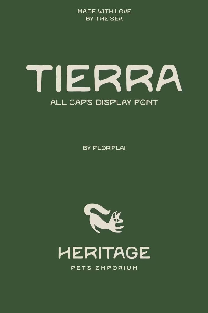
The Tierra display font performs exceptionally well in branding projects that emphasize sustainability, nature, and authenticity. Many modern brands focus on eco-friendly practices and natural products, and typography plays a key role in communicating these values.
Designers often use Tierra for organic food packaging, environmental campaigns, outdoor brands, and sustainable lifestyle products. The earthy character of the font reinforces messages about nature and responsible living.
Environmental graphics also benefit from Tierra’s strong personality. Signage for parks, ecological events, nature exhibitions, and outdoor experiences can gain visual authenticity when designers incorporate this typeface. The font naturally aligns with themes related to land, conservation, and environmental awareness.
Creating a Sense of Groundedness and Authenticity
Design projects often aim to build trust and emotional connection with audiences. The Tierra display font supports this goal by communicating groundedness and authenticity. Its natural structure feels honest and approachable, allowing the typography to resonate with viewers on a deeper level.
Instead of appearing overly polished or artificial, the font embraces the beauty of natural imperfection. This design philosophy reflects the idea that authenticity comes from embracing real textures and organic forms.
Designers can use Tierra to create compositions that feel stable, earthy, and trustworthy. The typeface supports messages about sustainability, craftsmanship, and connection to the environment.
A Natural Choice for Authentic Typography
The Tierra display font offers designers a powerful typographic tool inspired by the earth itself. Its blend of clean sans serif structure and organic irregularities allows it to stand out while maintaining clarity and balance. The subtle textures within the characters create a visual identity that feels natural and grounded.
Designers working on branding, environmental graphics, packaging, and creative projects related to nature will find Tierra especially valuable. Its earthy aesthetic reinforces themes of sustainability, authenticity, and connection to the land.
By translating the textures of soil, stone, and natural landscapes into typography, Tierra allows designers to create work that feels rooted in the beauty of the natural world. The result is a display font that communicates strength, honesty, and organic elegance.