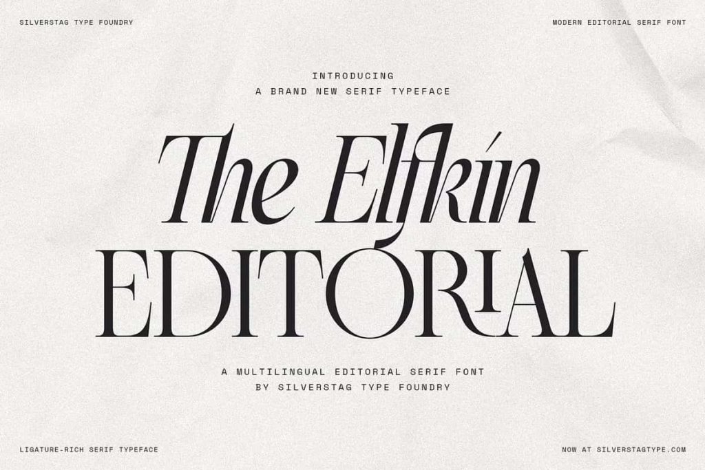
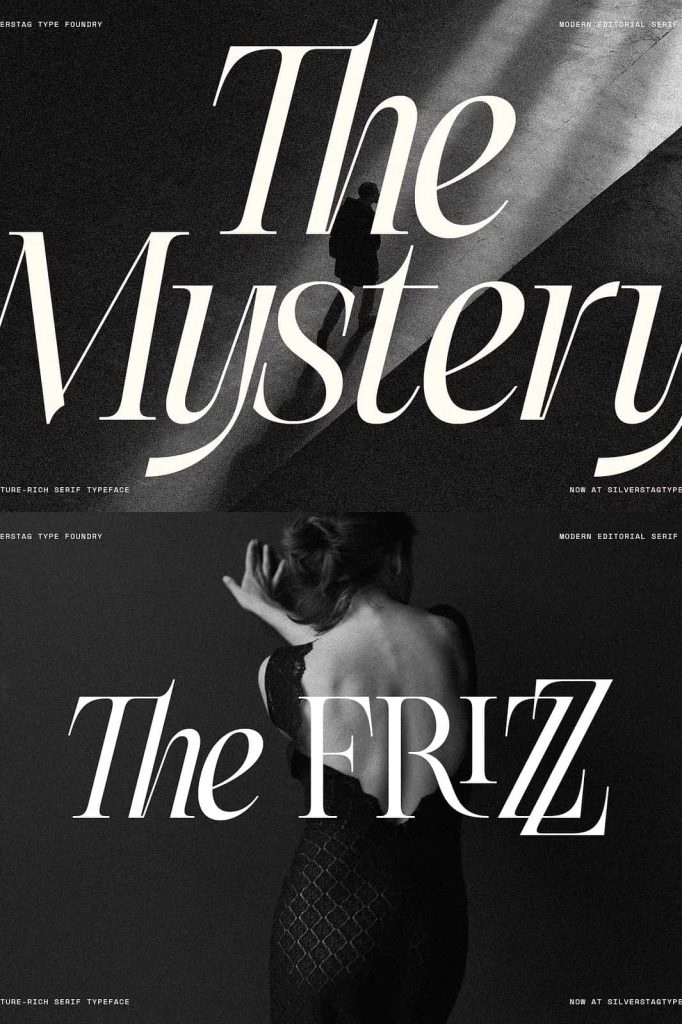
Elfkin Editorial Serif Font
Elfkin Editorial is a refined and versatile serif font designed to elevate editorial design, branding projects, and high-impact creative layouts. Built with elegance and intention, this typeface brings together classic structure and modern expression. Its carefully balanced proportions, graceful contrast, and expressive italic style allow designers to communicate sophistication while adding a confident sense of drama to every composition.
Elfkin Editorial does more than present text. It shapes narrative, establishes hierarchy, and enhances visual storytelling. Whether you design magazines, books, brand identities, or digital publications, Elfkin delivers a polished typographic voice that feels both timeless and contemporary.
Elegant Structure with Editorial Strength
Elfkin Editorial features a strong serif foundation inspired by traditional publishing typography. Its letterforms feel deliberate and well-crafted, giving long-form content a sense of authority and readability. The structure supports extended reading while maintaining visual interest across headlines, subheadings, and body text.
The font’s proportions create a natural rhythm that guides the reader smoothly through content. Designers can rely on Elfkin to build layouts that feel organized, refined, and professional. This balance makes it especially effective for editorial environments where clarity and aesthetics must work together.
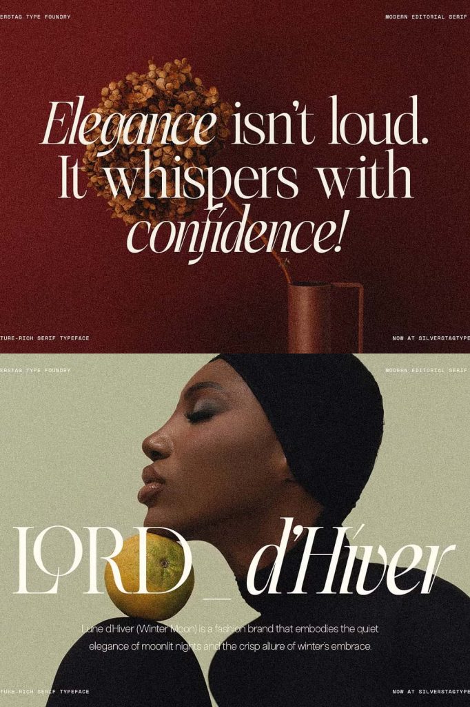
Graceful Contrast for Visual Depth
One of Elfkin’s defining qualities lies in its graceful contrast between thick and thin strokes. This contrast introduces elegance without appearing fragile or overly decorative. It adds depth to the letterforms and enhances readability at both large and moderate sizes.
The controlled contrast allows Elfkin Editorial to perform confidently in print and digital formats. Headlines feel bold and expressive, while paragraphs remain comfortable to read. This versatility strengthens its role as a complete editorial type solution.
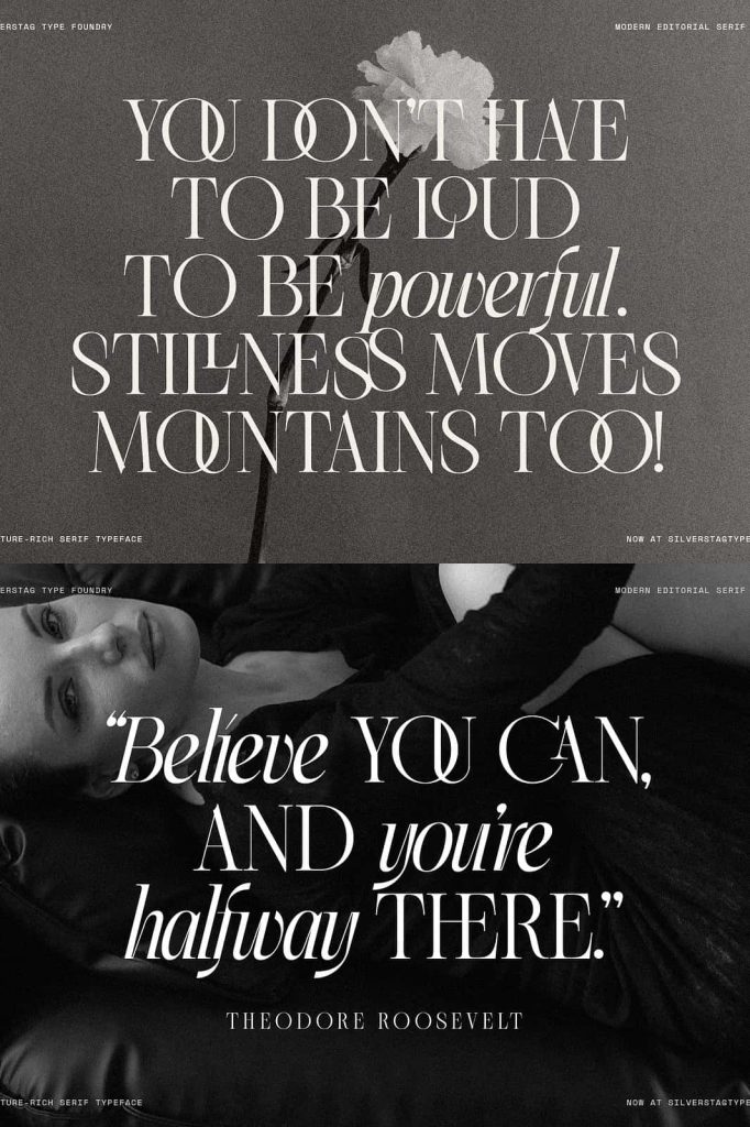
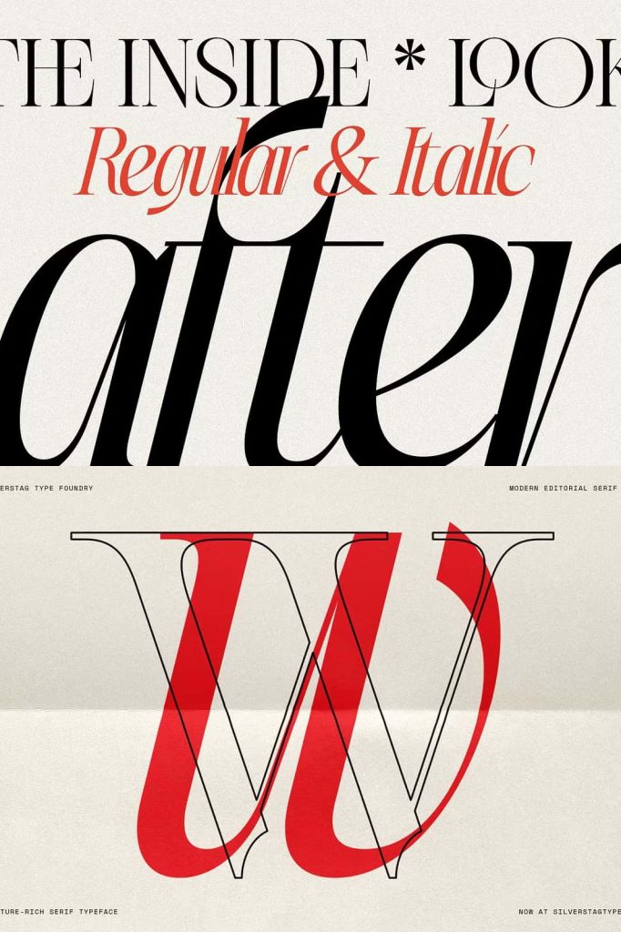
Expressive Italic with Character and Drama
The italic style of Elfkin Editorial stands apart with distinctive personality and movement. Rather than functioning as a simple slanted companion, the italic introduces expressive curves and subtle drama. It adds emphasis, emotion, and nuance to typography without overpowering the layout.
Designers can use the italic to highlight quotes, introduce editorial accents, or create contrast within branding systems. Its expressive nature supports storytelling and gives text a dynamic voice that feels intentional and crafted.
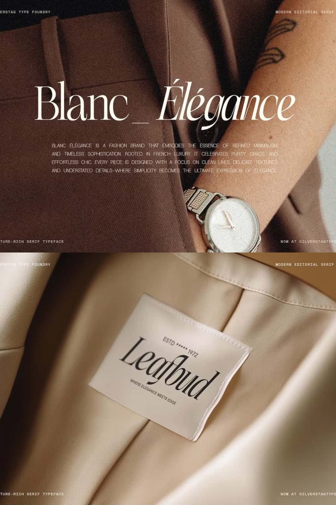
Add Personality Without Losing Refinement
Elfkin’s italic style allows you to inject character while maintaining overall sophistication. It works beautifully in fashion editorials, cultural magazines, book covers, and lifestyle branding. The italic adds warmth and expressiveness, making content feel more human and engaging.
This balance between refinement and emotion gives Elfkin Editorial a unique position among serif fonts. It enhances creativity while preserving professional polish.
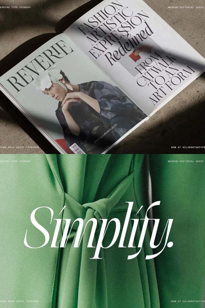
Perfect for Editorial and Publishing Design
Elfkin Editorial thrives in publishing environments. Use it to design magazine layouts, newspapers, journals, books, and digital articles. Its clear structure and refined detailing support complex typographic systems and multi-level hierarchy.
Headlines gain authority, subheadings guide readers effectively, and body text remains readable and elegant. Designers can pair Elfkin with clean sans-serif fonts for contrast or use it alone to maintain a consistent editorial tone.
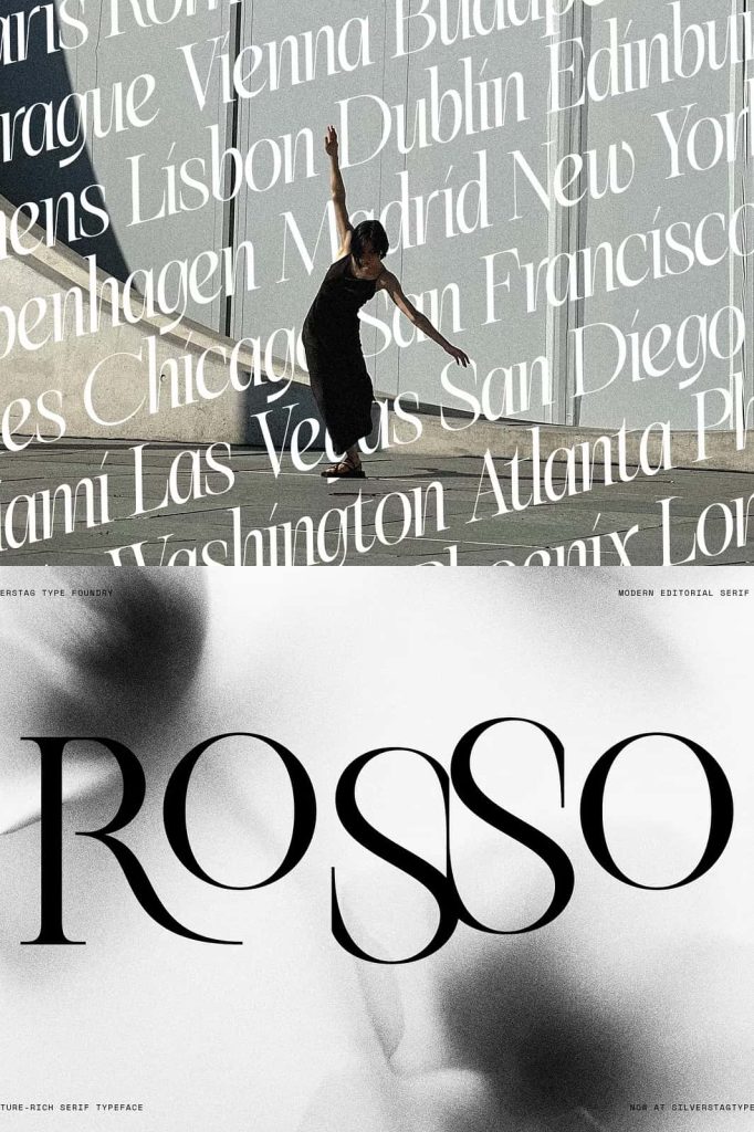
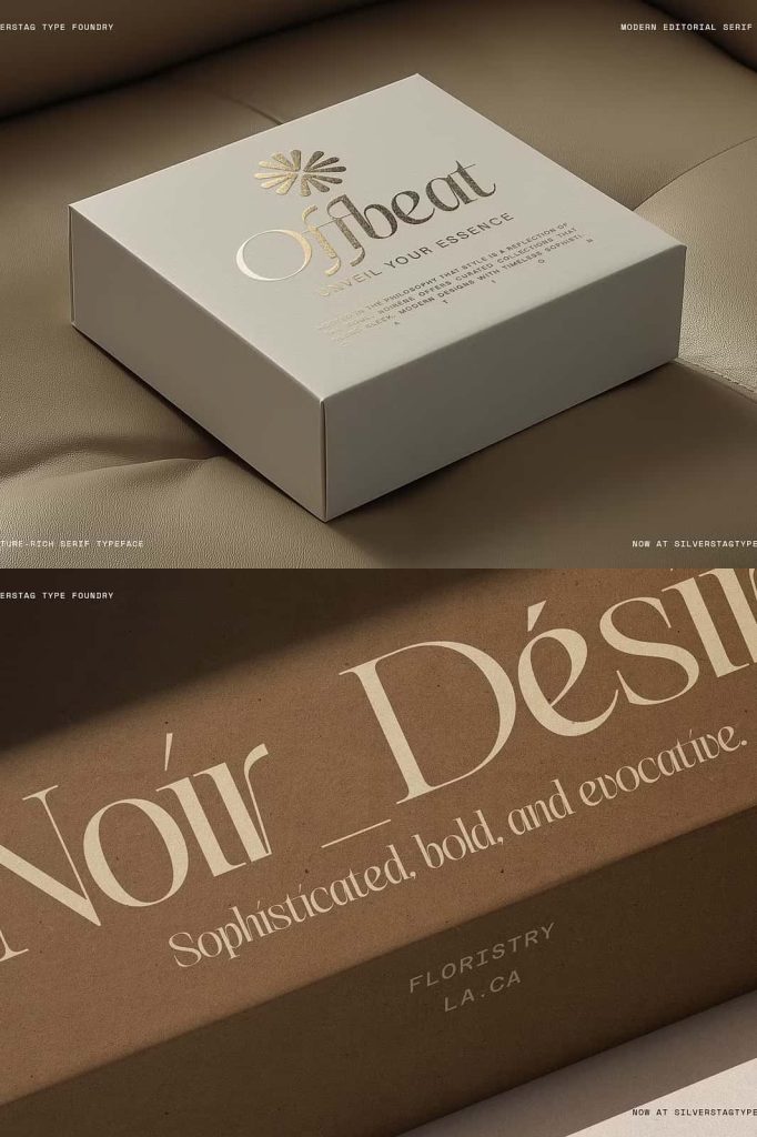
Ideal for Branding and Creative Layouts
Beyond editorial use, Elfkin Editorial excels in branding and creative applications. Its sophisticated serif style strengthens logos, wordmarks, packaging, and marketing materials. Brands that value storytelling, heritage, and elegance can use Elfkin to establish a strong visual identity.
The font adapts easily to both minimalist and expressive layouts. Designers can emphasize its classic qualities or highlight its dramatic potential through spacing, scale, and color choices.
Versatile for Print and Digital Media
Elfkin Editorial performs consistently across print and digital platforms. In print, it delivers sharp details and smooth contrast on covers, brochures, and packaging. On screen, it maintains clarity and elegance on websites, digital magazines, and social media graphics.
This adaptability allows designers to build cohesive visual systems across multiple channels using a single refined typeface.
Why Choose Elfkin Editorial Serif Font?
- Refined serif font designed for editorial excellence
- Elegant structure with balanced proportions
- Graceful contrast for readability and sophistication
- Expressive italic that adds personality and drama
- Ideal for editorial design, branding, and creative layouts
Elfkin Editorial serif font empowers designers to craft typography that feels elegant, expressive, and purposeful. It blends classic editorial strength with modern creative freedom, allowing you to shape compelling visual narratives. Choose Elfkin Editorial to elevate your layouts with confidence, character, and timeless sophistication.