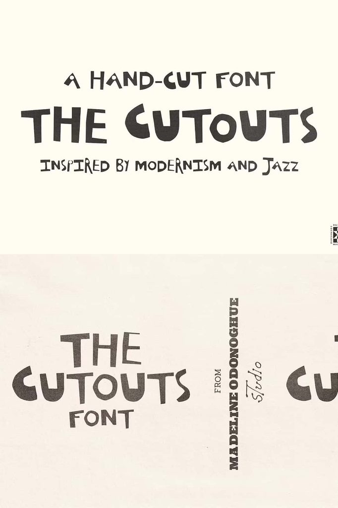
The Cutouts Font
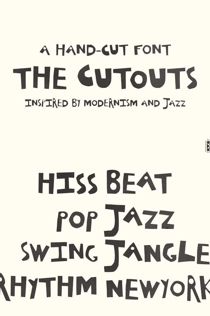
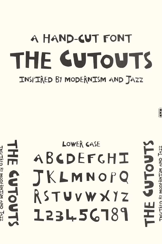
The Cutouts Font brings playful handmade energy, bold visual rhythm, and authentic analogue character to modern typography. Crafted entirely by hand with scissors, this all-caps display font turns the simple act of cutting paper into an expressive typographic style. Its raw edges and imperfect shapes create a lively appearance that feels tactile, artistic, and distinctly human.
Inspired by the creative world of Matisse’s cut-outs, vintage jazz posters, and DIY print techniques, The Cutouts combines artistic experimentation with practical display typography. It avoids overly polished digital perfection and instead celebrates irregular edges, unexpected shapes, and the natural personality that comes from handmade work.
A Playful Handmade Display Font
The Cutouts Font creates an immediate sense of fun through its bold all-caps presentation and handmade construction. Each character carries the visual evidence of a physical creative process, allowing the typography to feel more like crafted artwork than conventional digital lettering.
The scissors-inspired construction gives the font an organic quality that works especially well for designers who want to add personality to their compositions. Use it for short headlines, titles, posters, packaging, editorial graphics, invitations, and other display-focused applications where typography needs to make an impression.
Crafted with Scissors and Paper-Inspired Movement
The physical cutting process plays an important role in the personality of The Cutouts. Instead of creating perfectly uniform contours, the design embraces the small irregularities that naturally appear when an artist cuts shapes by hand. These raw edges give the lettering a tactile quality and help each word feel energetic and authentic.
This handmade approach also introduces visual rhythm. The letters interact with one another through changes in shape and edge, creating compositions that feel active without relying on complicated effects. Place the font prominently in your layout and allow its handmade character to become part of the visual story.
Inspired by Matisse’s Cut-Out Art
The Cutouts Font draws inspiration from the expressive cut-out technique associated with Henri Matisse. His paper-based compositions demonstrated how simple shapes could create powerful movement, color relationships, and visual balance. This font translates that spirit of cut-paper experimentation into typography.
The result gives designers a way to introduce an artistic sensibility into contemporary layouts. Rather than simply decorating a design with illustrations, you can make the lettering itself carry the handmade concept.
Turn Typography into Visual Art
Use The Cutouts when you want words to function as graphic shapes. Its bold all-caps construction can transform titles and short phrases into visual elements that interact naturally with surrounding artwork, photography, color blocks, and illustrations.
Experiment with large-scale typography to highlight the unique contours of the characters. You can also create dynamic compositions by adjusting spacing and alignment, allowing the letters to form an active part of the overall design.
Vintage Jazz Poster Influence
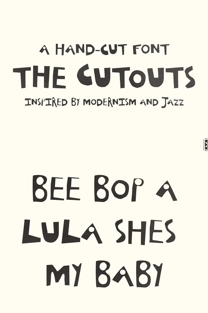
The Cutouts also taps into the expressive energy of vintage jazz posters. Jazz-inspired graphic design often relies on rhythm, movement, contrast, and strong typographic statements. These qualities make the font an exciting choice for music-related projects and cultural graphics.
Use it for concert posters, album artwork, event announcements, festival graphics, music merchandise, and promotional materials. Combine the font with photography, abstract shapes, or bold graphic elements to create a composition that feels energetic and unconventional.
Perfect for DIY Print-Inspired Designs
DIY print techniques provide another important influence behind The Cutouts Font. Handmade publishing and independent print culture often embrace experimentation rather than demanding absolute consistency. The Cutouts captures that creative attitude through its raw edges and analogue appearance.
Use the font for zines, independent magazines, flyers, posters, creative campaigns, artist publications, and experimental editorial projects. Its handmade quality can help communicate a sense of authenticity while giving your design a distinctive visual identity.
Create Authentic Editorial Layouts
Editorial design benefits from strong typography, especially when a headline needs to establish a clear visual direction. Use The Cutouts for magazine covers, feature titles, section headings, and short statements. Pair it with a clean serif or sans serif for body text to create a clear hierarchy.
The contrast between handcrafted display lettering and structured supporting typography can create a balanced composition. The Cutouts attracts attention while the supporting typeface keeps the information organized.
Bring Personality to Posters and Flyers
Posters and flyers provide an ideal canvas for The Cutouts Font. Its playful all-caps design can immediately establish a strong focal point and help viewers notice your message.
Use it for event names, promotional headlines, exhibition titles, announcements, and short calls to action. Increase the size of important words and experiment with placement to create movement across the composition.
Creative Packaging and Branding
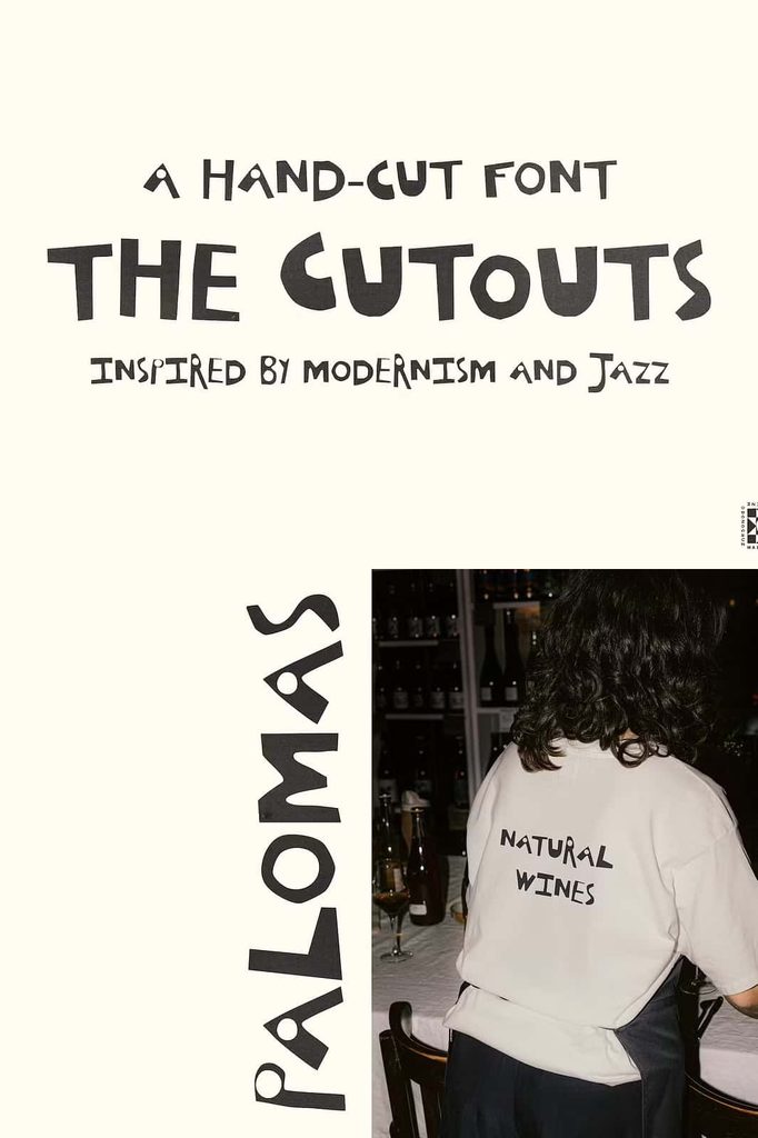
The Cutouts can also give product packaging a more playful and handcrafted identity. Use it for product names, labels, stickers, limited-edition packaging, and promotional materials that need a memorable visual style.
Brands with artistic, independent, playful, or design-focused identities can use the font to create a distinctive typographic voice. Combine it with simple layouts, bold imagery, or paper-inspired textures to reinforce the analogue concept.
Build a Memorable Visual Identity
Typography can help a brand communicate personality before customers read any additional information. The Cutouts offers a visual language that feels creative, approachable, and handmade.
Use the font selectively for major identity elements such as campaign titles, product collections, event names, or seasonal graphics. Pair it with restrained supporting typography to keep the overall identity flexible and readable.
Ideal for Artistic and Playful Projects
The Cutouts Font gives designers a versatile display option for projects that need a stronger human touch. Its combination of handmade construction, raw edges, analogue charm, and visual rhythm makes it suitable for a wide variety of creative applications.
- Vintage-inspired jazz posters
- Concert and music event graphics
- DIY zines and independent publications
- Editorial covers and magazine headlines
- Creative posters and flyers
- Art exhibition graphics
- Playful branding projects
- Handmade-inspired packaging and labels
- Album artwork and merchandise
- Experimental typography compositions
- Social media graphics
- Invitations and creative event stationery
Create Contrast with Clean Supporting Fonts
The expressive personality of The Cutouts works particularly well when you balance it with simpler typography. Use a clean sans serif or elegant serif for secondary information such as descriptions, dates, captions, or body copy.
This approach allows the handmade display font to dominate the visual hierarchy without making the entire design feel chaotic. Let The Cutouts communicate the personality while your supporting type provides structure and readability.
Why Choose The Cutouts Font?
The Cutouts Font gives your projects an unmistakable handmade quality. Its scissors-crafted construction, raw edges, all-caps format, and artistic rhythm create typography that feels tactile and expressive.
Choose it when you want to replace predictable digital perfection with something more playful and human. Its inspiration from Matisse’s cut-outs, vintage jazz posters, and DIY print culture provides a strong creative foundation while leaving you plenty of freedom to develop your own visual style.
Embrace Raw Edges and Analogue Charm
Great design does not always need perfect lines and uniform shapes. Sometimes, irregularity creates the strongest personality. The Cutouts Font embraces that idea by transforming handmade imperfections into an engaging display style.
From jazz posters and DIY publications to packaging, branding, editorial layouts, and artistic campaigns, The Cutouts Font helps typography become an active part of the design. Use its bold all-caps letters to create memorable headlines, experiment with scale and spacing, and combine the font with imagery or abstract shapes for an expressive result.
Bring the tactile character of scissors, paper, vintage print, and artistic experimentation into your next project. With The Cutouts, you can create typography that feels playful, authentic, energetic, and unmistakably handmade.