St. Canard Font – A Bold Mid-Century Inspired Display Typeface
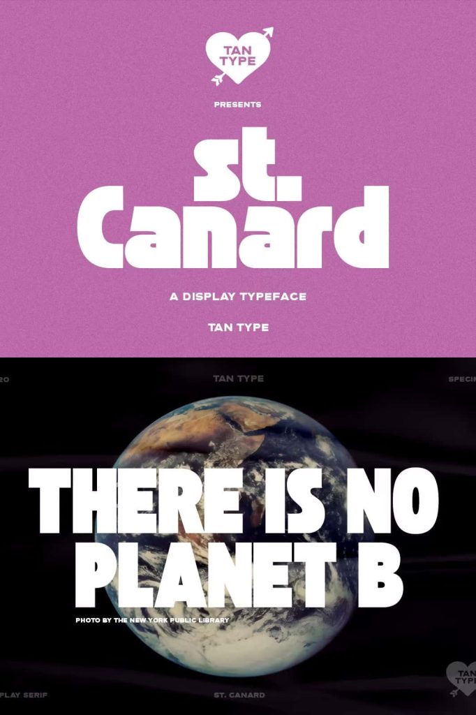
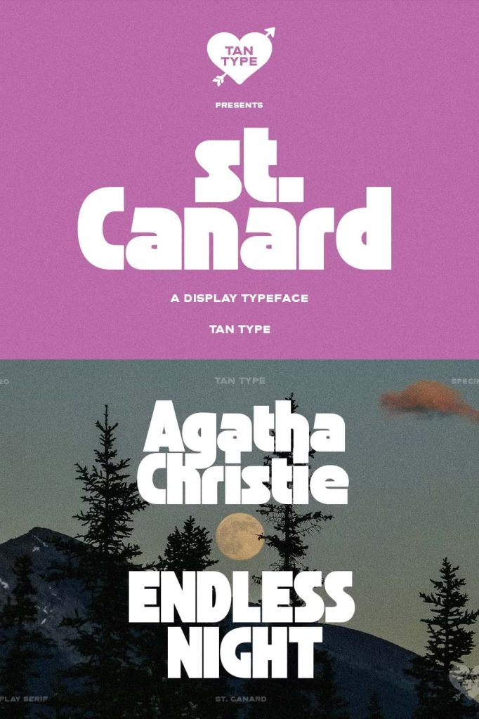
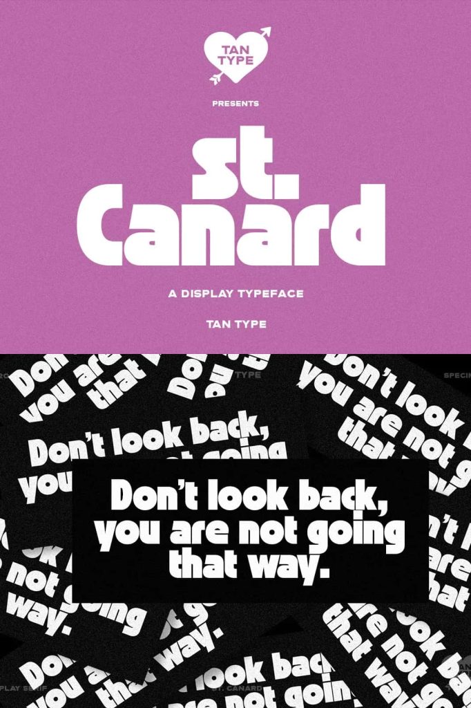
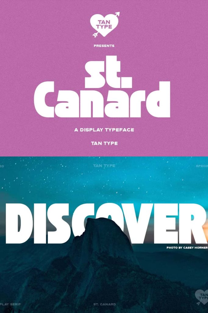
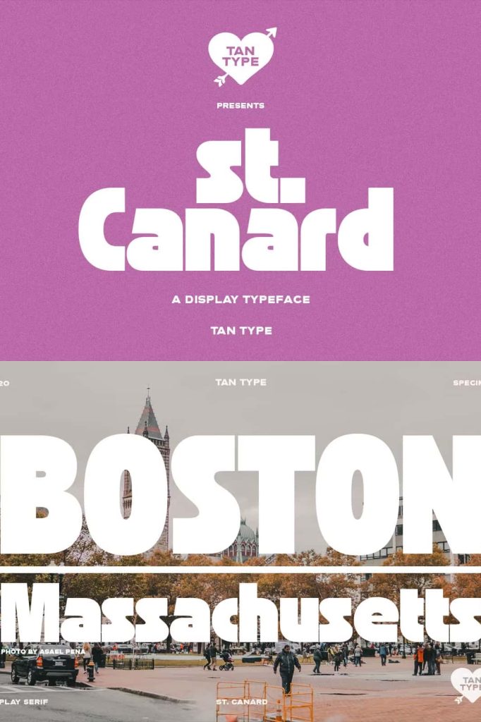
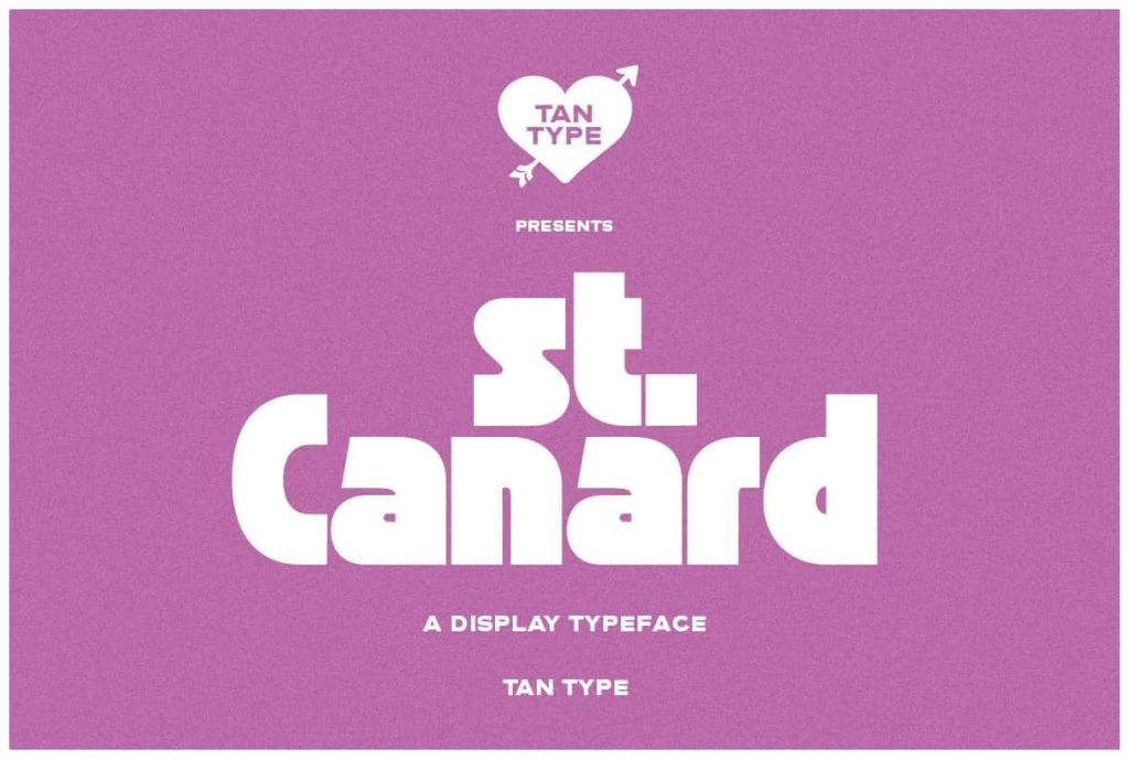
The St. Canard Font is a captivating display typeface that fully embraces the iconic spirit of mid-century design. Created for designers who appreciate retro charm, expressive shapes, and bold visual character, St. Canard brings the warmth, optimism, and geometric precision of the mid-1900s into the modern creative world. This nostalgic typeface revives the era’s classic aesthetic, making it ideal for branding, posters, product packaging, logos, signage, and editorial layouts that aim to capture a stylish vintage mood.
St. Canard celebrates the timeless appeal of mid-century typography through rounded edges, dynamic curves, and confident letterforms. Its display style shines in large compositions, where every detail of its retro construction can be appreciated. This typeface does more than echo history—it transforms it into a versatile tool for contemporary design.
A Display Typeface Rooted in Mid-Century Charm
Mid-century design is known for its bold simplicity, geometric shapes, and playful yet refined character. St. Canard embodies these principles beautifully. Each letter carries a nostalgic rhythm inspired by mid-century signage, print advertisements, magazine mastheads, and product labels. The font’s visual style reflects an era defined by creativity, optimism, and expressive typographic experimentation.
St. Canard reimagines these classic influences with smooth curves, generous proportions, and clean negative space. The result is a typeface that remains true to its roots while offering the crispness and clarity required in modern digital environments.
Key Features of St. Canard Font
1. Authentic Mid-Century Aesthetic
St. Canard’s letterforms are shaped by the iconic visual language of the 1950s and 1960s. Its bold geometry and rounded contours create a sense of nostalgia that instantly connects with viewers. Whether used in minimalist layouts or retro-inspired designs, the font introduces a distinctive personality that feels both classic and fresh.
2. Bold and Eye-Catching Display Style
As a display typeface, St. Canard performs best in large-scale settings where its strong presence and detailed shapes can shine. It works particularly well for headlines, logo marks, posters, storefront signage, packaging labels, and editorial titles. Its confident strokes and expressive visual weight make it impossible to ignore.
3. Geometric Curves and Smooth Proportions
The font’s construction blends structured geometric foundations with smooth, flowing curves. This balance helps maintain readability while preserving an artistic, handcrafted feel. The subtle interplay of sharp and soft forms brings harmony to every text block, making the typeface visually engaging without overwhelming the design.
4. Versatile for Modern and Retro Design Projects
Although deeply influenced by mid-century aesthetics, St. Canard fits effortlessly into contemporary branding and layout systems. It works well in minimalist compositions, bold modern color palettes, editorial spreads, and digital interfaces. Designers can use it to add a retro twist to modern design or to fully recreate the nostalgic style of the mid-century era.
5. Perfect for Branding and Creative Identity Systems
St. Canard provides a memorable foundation for brand identities that aim to stand out. Its distinct letterforms create powerful wordmarks, product labels, and visual signatures. Whether crafting a boutique logo, a beverage label, a retro café menu, or lifestyle branding, the typeface helps establish a strong and expressive personality.
Why Designers Choose St. Canard
Designers appreciate St. Canard for its balance of historical charm and modern usability. Its mid-century influence adds character and emotional appeal, while its clean construction ensures it integrates smoothly into digital and print workflows. The font’s ability to evoke nostalgia without feeling dated makes it a valuable asset in both creative and commercial projects.
Conclusion: Bring Mid-Century Style into Modern Design
The St. Canard Font offers a bold, stylish, and expressive tribute to mid-century display typography. With its geometric curves, warm retro personality, and strong visual presence, it elevates any project that seeks to capture vintage charm or timeless simplicity. From branding and posters to packaging and editorial design, St. Canard provides the perfect blend of nostalgia and contemporary appeal.