Tan-Dialogue Font – A Contemporary Duo of Bold and Elegant Styles
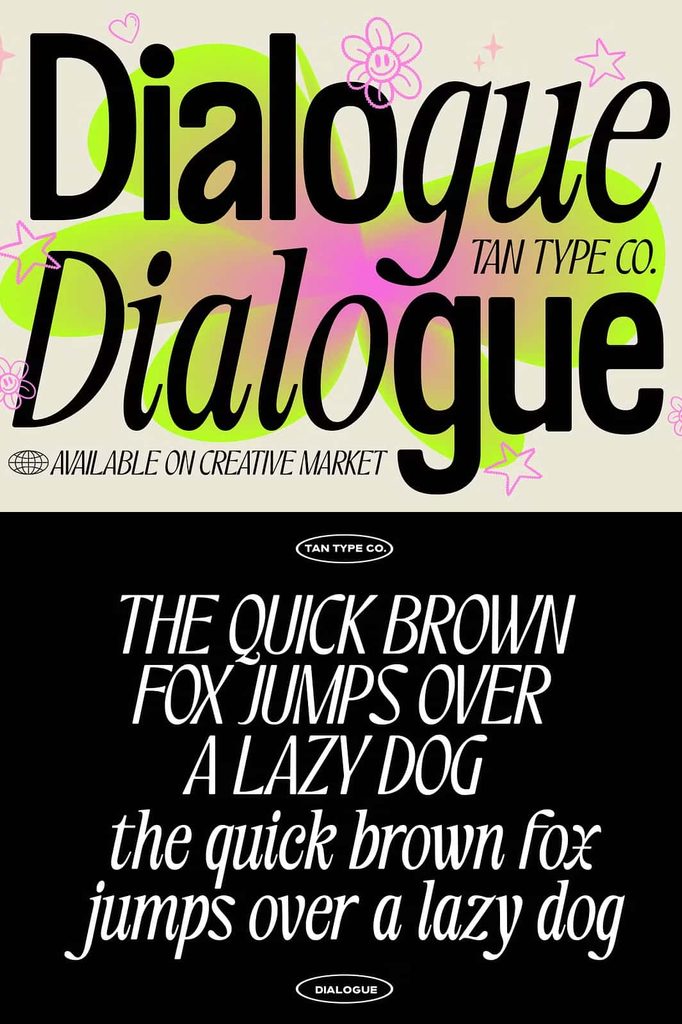
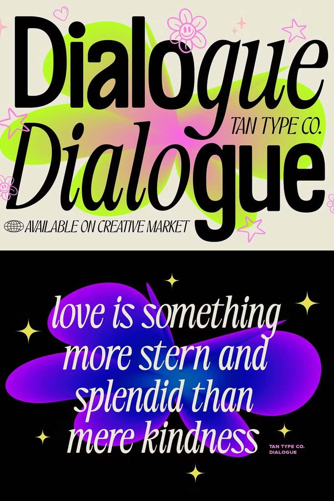
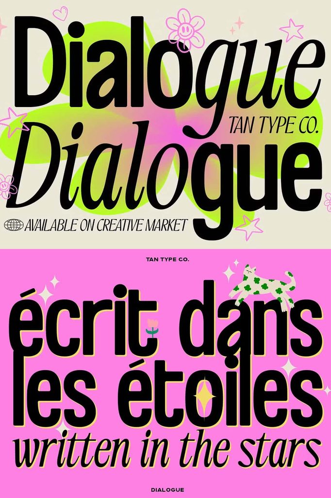
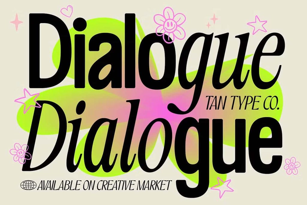
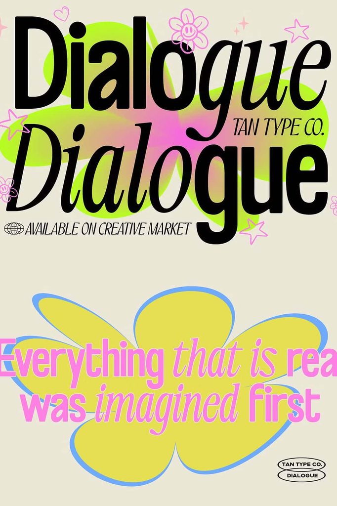
Tan-Dialogue Font brings two distinct typographic voices together in one contemporary font duo. Designed around contrast, balance, and visual harmony, this typeface combines a bold modern sans serif with an elegant italic style. Each side of the family delivers its own personality, yet both styles work together naturally to create polished and expressive compositions.
The first voice takes a confident approach with structured letterforms, clean shapes, and softly rounded edges. Its modern sans serif appearance creates a strong foundation without making the overall design feel harsh. The softened details add warmth and approachability, allowing the bold style to communicate strength while maintaining a friendly contemporary character.
The second voice introduces a more refined personality through thin, classic italics. Its graceful forms create an elegant contrast against the stronger sans serif style. The italic lettering adds movement, sophistication, and a subtle sense of playfulness, making it ideal for moments when your design needs a lighter and more expressive touch.
What Makes Tan-Dialogue Font Unique?
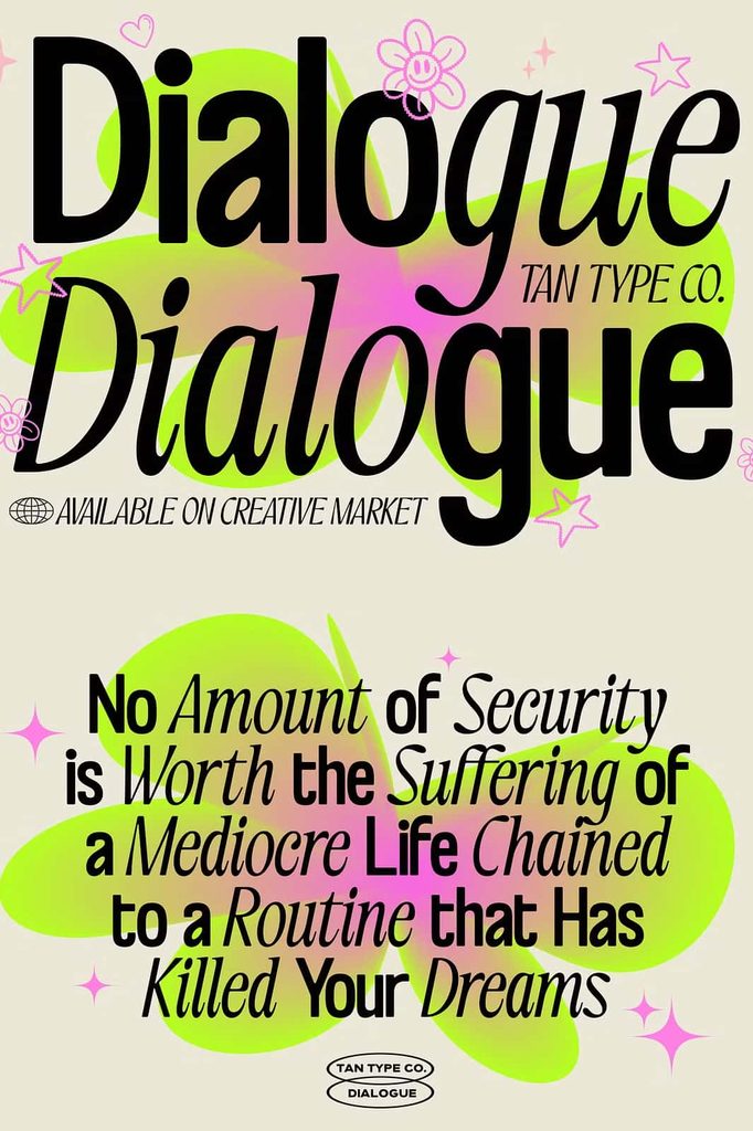
Tan-Dialogue stands out because it treats typography as a conversation between two complementary styles. Instead of relying on a single visual voice, the duo gives designers the freedom to create contrast within the same composition. The bold sans serif can establish hierarchy and visual impact, while the elegant italic can introduce personality and refinement.
This relationship makes the font duo especially useful for contemporary branding and editorial layouts. Designers can combine the two styles to separate headlines from supporting text, emphasize selected words, or create a dynamic typographic rhythm.
A Bold Modern Sans Serif
The sans serif side of Tan-Dialogue provides a clean and structured appearance. Its soft edges prevent the letterforms from feeling overly rigid, creating a balance between modern strength and approachable warmth. Use this style when you want your typography to feel confident, organized, and visually clear.
- Creates strong and noticeable headlines.
- Adds a modern personality to branding projects.
- Provides a clean foundation for contemporary layouts.
- Uses soft edges to balance its structured appearance.
- Works effectively for prominent display typography.
An Elegant Italic Companion
The italic side creates a completely different mood. Thin and classic letterforms introduce a delicate visual contrast that can make a composition feel more sophisticated. Its subtle, teasing personality gives designers another way to communicate emotion without overwhelming the overall layout.
Pairing the italic style with the bold sans serif can create an engaging visual dialogue. The contrast between heavier and lighter forms immediately establishes hierarchy while giving the design a carefully considered appearance.
Perfect for Modern Branding
Tan-Dialogue Font offers a versatile foundation for branding projects that need both confidence and elegance. Use the bold style to establish a memorable brand presence, then introduce the italic companion for supporting phrases, taglines, or decorative details.
This combination can work particularly well for fashion identities, lifestyle brands, creative studios, beauty projects, boutique businesses, personal branding, and other contemporary visual identities. The two styles allow designers to build contrast without introducing unrelated typefaces.
Tan-Dialogue Font for Editorial Design
Editorial projects often depend on clear hierarchy and expressive typography. Tan-Dialogue makes it easier to create that relationship by providing two contrasting voices within one cohesive design system.
Use the bold sans serif for titles, section headings, and attention-grabbing statements. Then use the elegant italic style to highlight selected words, captions, introductions, or supporting phrases. This approach creates movement across the page while maintaining a consistent visual identity.
Create Contrast Without Losing Harmony
The strongest feature of a font duo is its ability to create difference while preserving unity. Tan-Dialogue achieves this through its deliberate contrast between structured modern forms and delicate italic lettering.
Instead of mixing several unrelated fonts, designers can use these two styles to build a complete typographic composition. The result feels intentional, balanced, and contemporary.
Creative Uses for Tan-Dialogue Font
Because the font combines bold structure with elegant expression, it can adapt to a wide range of creative applications. Consider Tan-Dialogue for:
- Logo and brand identity concepts
- Fashion and lifestyle branding
- Beauty and boutique packaging
- Editorial layouts and magazine designs
- Social media graphics
- Advertising campaigns
- Website headings and hero sections
- Creative studio identities
- Personal branding projects
- Posters and promotional materials
- Invitation and stationery designs
- Quotes and expressive typography
Build a Distinctive Typographic Voice
Good typography does more than display words. It establishes mood, creates hierarchy, and helps an audience understand where to look. Tan-Dialogue gives designers two carefully contrasting styles that can perform these roles together.
Start with the bold sans serif when your composition needs structure and presence. Introduce the italic style when you want to soften the message or add a refined accent. By switching between these two voices, you can make individual words stand out and create a more engaging reading experience.
A Flexible Duo for Contemporary Projects
Tan-Dialogue balances modern simplicity with classic elegance. The sans serif delivers strength through its structured construction, while the italic introduces a graceful and subtly playful personality. Together, they create a flexible typographic system for designers who want contrast without sacrificing cohesion.
Why Choose Tan-Dialogue Font?
Tan-Dialogue Font offers a fresh approach to contemporary typography by combining two distinctive styles in one cohesive duo. Its bold sans serif brings clarity, confidence, and modern structure, while its thin italic counterpart adds elegance, movement, and character.
Whether you are developing a brand identity, designing an editorial project, creating social media graphics, or building a stylish promotional campaign, Tan-Dialogue can help you establish a clear visual relationship between different elements. Its contrasting personalities make it easy to create hierarchy and add visual interest while keeping your typography connected.
Conclusion
Tan-Dialogue Font celebrates the power of contrast. Its bold modern sans serif speaks with confidence, while its elegant italic responds with refinement and subtle charm. Together, they create a balanced contemporary duo that gives designers more freedom to experiment with hierarchy, emphasis, and visual personality.
Use Tan-Dialogue to create typography that feels modern yet warm, structured yet expressive, and confident yet refined. With two complementary voices working together, this font duo provides an engaging foundation for branding, editorial design, packaging, advertising, social media, and many other creative projects.