Summer in Seville Font Duo – Handcrafted Vintage European Sans Serif & Script
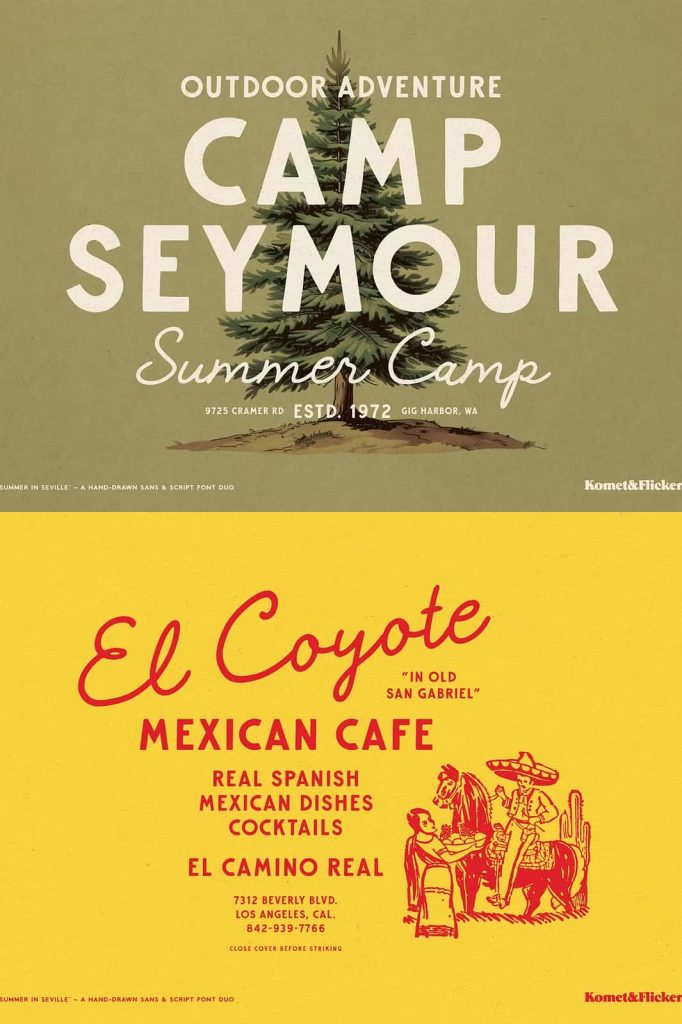
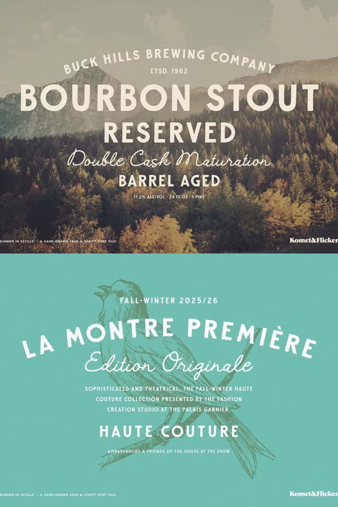
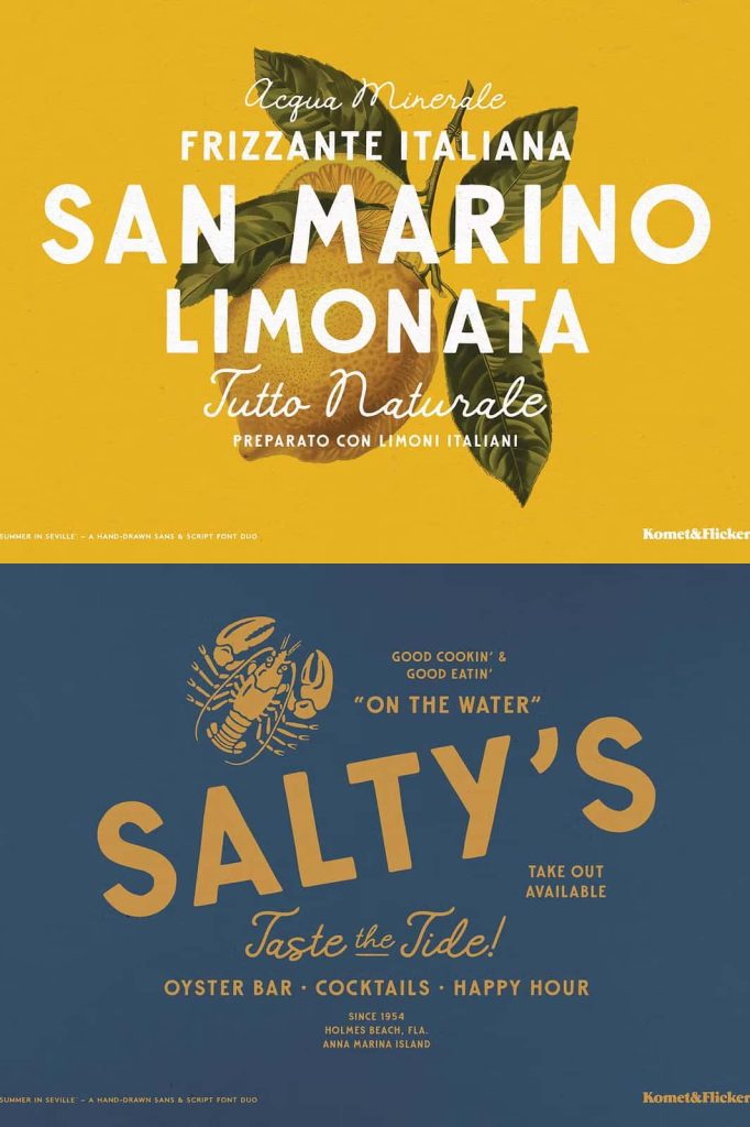
Summer in Seville Font Duo is a beautifully handcrafted typeface collection that captures the warmth, romance, and timeless elegance of classic European typography. Inspired by the charming streets, historic architecture, and artistic heritage of Southern Europe, this versatile font duo combines a bold sans serif with a relaxed handwritten script to create typography that feels authentic, inviting, and effortlessly stylish.
Designed with careful attention to detail, both typefaces work beautifully together while remaining strong enough to stand on their own. The bold sans serif delivers confidence, structure, and excellent readability, while the free-flowing script introduces personality, movement, and handcrafted charm. This thoughtful combination allows designers to create memorable visual identities that balance sophistication with warmth.
Whether you’re designing premium branding, vintage-inspired packaging, elegant wedding stationery, editorial layouts, or eye-catching social media graphics, Summer in Seville provides the flexibility and character needed to elevate every project.
Inspired by the Beauty of Timeless European Typography
Summer in Seville draws inspiration from the rich visual culture found throughout historic European cities. From traditional café signage and artisan shop windows to handwritten menus and classic travel posters, every letter reflects the timeless beauty of handcrafted typography that has remained admired for generations.
The design embraces the nostalgic atmosphere of warm summer afternoons, sunlit streets, and elegant architectural details while remaining practical for today’s creative professionals. This unique blend of vintage inspiration and modern usability allows designers to create work that feels both familiar and refreshingly original.
Rather than relying on excessive decoration, Summer in Seville communicates elegance through carefully balanced proportions, organic curves, and natural handwritten details that give every composition a genuine handcrafted appearance.
A Perfect Pairing of Sans Serif and Script
The greatest strength of Summer in Seville lies in the harmony between its two complementary styles. The bold sans serif provides a strong visual foundation with clean letterforms, balanced spacing, and impressive readability. It works exceptionally well for headlines, logos, branding, packaging, and promotional materials where clarity and confidence are essential.
The accompanying handwritten script introduces a softer, more expressive personality. Its natural strokes and relaxed flow add warmth to titles, signatures, invitations, labels, and decorative typography without overwhelming the overall design.
Together, these two styles create a versatile design system that allows typography to communicate professionalism while preserving an inviting, handcrafted character.
Create Elegant Branding with Vintage Character
Typography plays a vital role in shaping brand identity, and Summer in Seville offers a memorable solution for businesses seeking a refined yet approachable appearance. The combination of structured sans serif lettering and expressive script helps brands establish authenticity while standing apart from generic typography.
This font duo works particularly well for boutique businesses, artisan products, cafés, restaurants, lifestyle brands, travel companies, fashion labels, florists, and premium packaging. The warm personality of the script paired with the confidence of the sans serif creates branding that feels timeless rather than trend-driven.
Whether launching a new business or refreshing an existing identity, Summer in Seville provides the visual flexibility needed to communicate quality, craftsmanship, and creativity.
Ideal Applications Include:
- Logo design
- Brand identity systems
- Luxury packaging
- Product labels
- Wedding invitations
- Greeting cards
- Editorial design
- Magazine covers
- Book covers
- Restaurant menus
- Café branding
- Travel promotions
- Social media graphics
- Website headers
- Poster design
- Marketing materials
Handcrafted Details That Feel Authentic
Every character in Summer in Seville has been lovingly drawn by hand, allowing the fonts to preserve the subtle imperfections that make handcrafted typography so appealing. Instead of appearing overly mechanical, the letterforms maintain natural variation that adds personality and visual warmth to every design.
The script flows smoothly across words with graceful connections and expressive movement, while the sans serif maintains strong geometric balance without feeling cold or sterile. Together, these handcrafted qualities create typography that feels approachable, genuine, and highly refined.
The result is a font duo capable of delivering premium visual experiences across both print and digital media.
Versatile for Print and Digital Design
Summer in Seville has been designed to perform beautifully across a wide variety of creative applications. The sans serif remains crisp and readable in large headlines, product packaging, and web interfaces, while the script retains its elegant flow in invitations, certificates, branding, and decorative typography.
Whether used for printed brochures, business cards, signage, websites, online stores, or social media campaigns, this font duo maintains visual consistency while giving every project a distinctive handcrafted personality.
Its versatility allows designers to build cohesive design systems by using the sans serif for structure and the script for emphasis, creating layouts that feel balanced, engaging, and visually memorable.
Add Warmth and Sophistication to Every Design
Summer in Seville brings together nostalgic European inspiration and contemporary functionality in a way that feels effortless. The combination of bold typography and expressive handwriting allows designers to communicate both professionalism and creativity without compromising readability.
From elegant wedding collections and artisan branding to luxury packaging and editorial publications, the font duo adapts naturally to projects that require timeless beauty and handcrafted authenticity.
Its warm visual tone encourages emotional connection while maintaining the clean structure necessary for effective communication across multiple design styles.
Why Choose Summer in Seville Font Duo?
Summer in Seville is more than a collection of beautiful fonts. It is a thoughtfully crafted typographic system inspired by classic European design, handcrafted artistry, and timeless elegance. The pairing of a bold sans serif with a relaxed handwritten script provides exceptional flexibility for designers working across branding, publishing, packaging, invitations, and digital media.
If you want typography that combines vintage charm, modern usability, and handcrafted authenticity, Summer in Seville Font Duo is an excellent addition to your creative toolkit. Its harmonious balance of structure, warmth, and sophistication ensures every design leaves a lasting impression while celebrating the enduring beauty of classic European typography.