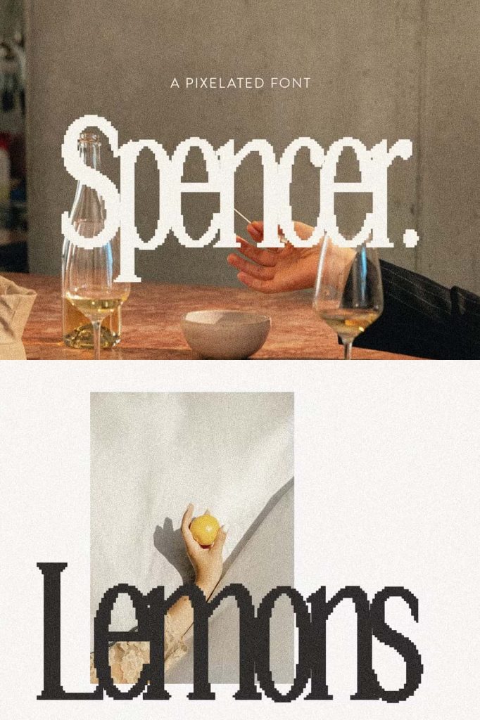
Spencer Font – A Modern Pixelated Serif with Retro Digital Character
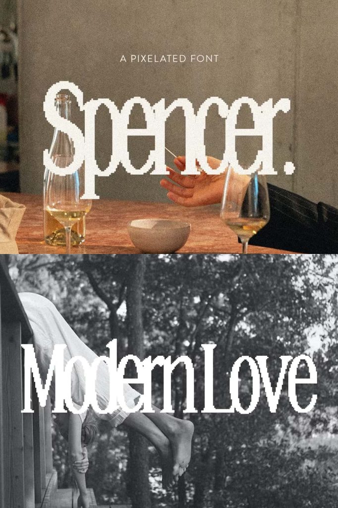
Spencer is a distinctive pixelated serif font that brings together modern digital aesthetics and nostalgic retro typography. Designed with a tall, narrow structure and sharp pixel-inspired details, Spencer gives creative projects an instantly recognizable visual identity. Its unusual combination of serif letterforms and pixel construction creates a playful contrast between old-school digital graphics and contemporary design trends.
Built primarily for headings and larger display text, Spencer delivers its strongest impact when designers give the letterforms enough space to become a central part of the composition. The font combines a condensed silhouette with a pixelated construction, allowing it to stand out in digital marketing, posters, social media graphics, branding, album artwork, websites, and other attention-focused projects.
A Fresh Take on Pixel Typography
Pixel fonts have long been associated with early computer interfaces, arcade games, digital displays, and low-resolution graphics. Spencer takes that familiar visual language and gives it a more refined contemporary direction. Instead of relying on a purely geometric pixel structure, it introduces serif details that add personality and create a more sophisticated appearance.
This combination makes Spencer feel both familiar and unexpected. The pixelated construction immediately recalls classic digital graphics, while the serif structure adds an editorial quality that separates it from conventional gaming or bitmap-style fonts. The result is a typeface that can create a deliberately retro atmosphere without making a design feel outdated.
Tall and Narrow Letterforms
One of Spencer’s defining characteristics is its tall, narrow construction. The condensed proportions help designers fit substantial words into limited horizontal spaces while maintaining strong visual impact. This makes the font particularly useful for headlines, titles, posters, banners, packaging, and digital advertisements where space can become an important part of the design.
The vertical proportions also give Spencer an energetic and contemporary appearance. Its letters naturally draw the eye upward, creating a sense of movement and visual rhythm. When designers combine Spencer with generous spacing, strong alignment, and simple supporting elements, the font can become the primary visual feature of the composition.
Designed for Display Typography
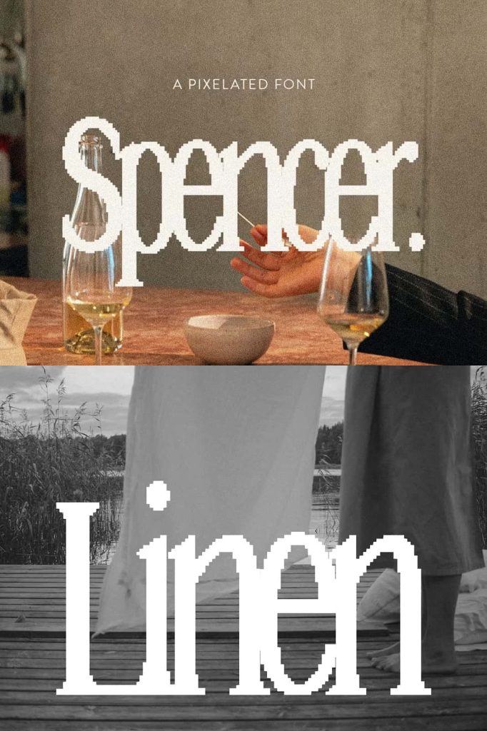
Spencer works best when designers use it at larger sizes. Headlines, campaign statements, promotional messages, poster titles, and short phrases allow the pixelated details to remain visible and expressive. At display sizes, viewers can appreciate the individual shapes, serif details, and distinctive construction of each character.
Because of its narrow proportions, Spencer can also create strong typographic compositions without requiring excessive space. Designers can build tall headline blocks, compact titles, vertical layouts, and stacked typography while preserving a clear and recognizable visual style.
Regular and Outlined Styles
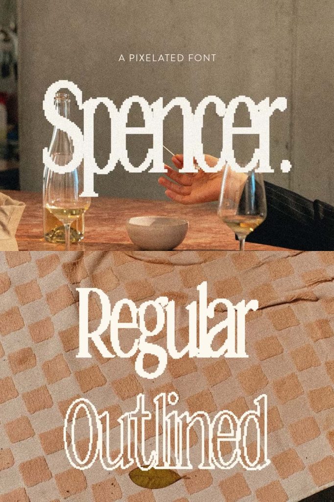
Spencer comes in both regular and outlined styles, giving designers two complementary approaches to the same pixel-inspired personality. The regular version creates a stronger and more immediate typographic presence. Its solid forms can anchor headlines and establish a bold visual hierarchy.
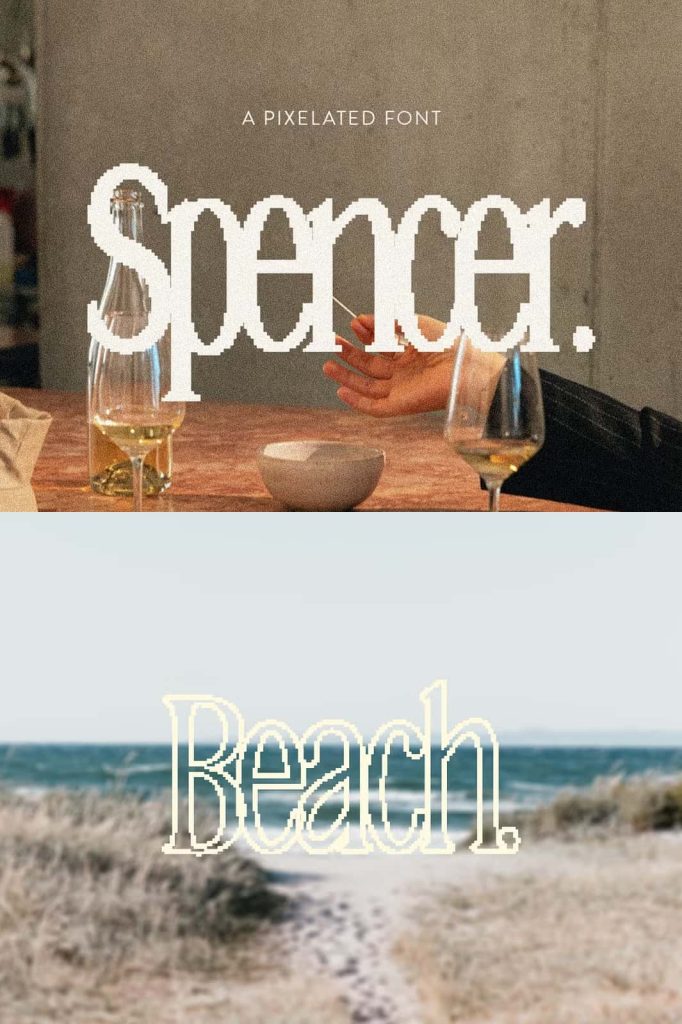
The outlined version introduces a lighter and more graphic interpretation. It can create layered compositions, decorative titles, experimental layouts, and more open visual treatments. Designers can also combine the two styles to create contrast within a single project.
Create Contrast with Two Distinct Styles
Using the regular and outlined versions together can produce especially engaging results. Designers might use the regular style for the main word and the outlined version for secondary text, or reverse the relationship to create a more unexpected composition. This simple contrast adds depth without requiring additional decorative elements.
The outlined style can also work effectively over photographs, gradients, textured backgrounds, and colorful digital artwork. Its open construction allows background elements to remain visible through the letterforms, creating a layered visual effect.
Perfect for Modern Digital Marketing
Spencer was designed with digital marketing in mind. Its unusual visual identity helps headlines stand apart in environments where audiences quickly scan large amounts of content. Social media campaigns, online advertisements, promotional graphics, website banners, and digital announcements can all benefit from its distinctive appearance.
The font works particularly well when the goal is to create a sense of nostalgia while maintaining a modern visual direction. Designers can pair Spencer with contemporary photography, minimalist layouts, vibrant graphics, or digital textures to create a deliberate contrast between old and new.
Its pixelated character can also reinforce themes connected to technology, gaming, digital culture, creative experimentation, and internet nostalgia. However, its serif construction gives designers enough flexibility to explore applications beyond these obvious categories.
Retro Inspiration with a Contemporary Edge
Spencer embraces the idea of an intentionally retro aesthetic while keeping its overall presentation modern. This balance allows designers to reference classic digital culture without recreating an old interface or arcade screen literally.
The font can help evoke the atmosphere of early computer graphics, pixel art, electronic displays, and vintage digital technology. At the same time, its tall proportions and serif details make it suitable for contemporary branding and editorial compositions.
This combination creates an ironic retro quality: the design looks intentionally nostalgic while remaining firmly connected to current typography trends. That makes Spencer especially useful for designers who want their projects to feel playful, experimental, and culturally aware.
Spencer for Posters and Headlines
Posters provide an excellent environment for Spencer because they give the typeface enough room to make a strong visual statement. Designers can use the font for event titles, campaign messages, music promotions, exhibitions, product announcements, and creative advertising.
The tall and narrow structure allows designers to experiment with scale and composition. A large Spencer headline can dominate the upper portion of a poster, while smaller supporting typography can provide information underneath. Designers can also rotate, stack, or repeat the font to create more experimental layouts.
Branding and Creative Identity Design
Spencer can also give a brand a highly recognizable typographic voice. Its pixelated serif structure makes it particularly suitable for creative businesses, digital products, entertainment projects, fashion concepts, independent studios, music brands, and youth-oriented campaigns.
For logos and wordmarks, designers can use Spencer to establish an identity that feels unconventional and memorable. The outlined version can provide an alternative logo treatment for secondary applications, while the regular version can create stronger primary branding.
Ideal Applications for Spencer
Although Spencer works best for headings and larger text, its distinctive character allows designers to explore a wide range of visual applications. It performs particularly well whenever typography needs to attract attention and establish a strong atmosphere.
Recommended Design Uses
- Digital marketing campaigns
- Website headlines and hero sections
- Social media graphics
- Poster and flyer design
- Event promotions
- Gaming and entertainment graphics
- Music artwork and album covers
- Creative branding and logo design
- Packaging and product graphics
- Technology-inspired designs
- Pixel art and retro digital projects
- Editorial headlines
- Advertising campaigns
- Merchandise and apparel graphics
- Creative presentations and promotional materials
How to Get the Best Results with Spencer
Because Spencer features a detailed pixelated structure, designers should treat it primarily as a display typeface. Larger sizes allow its unique characteristics to remain visible and help the audience recognize the intentional relationship between the pixel construction and serif details.
Keep supporting typography relatively simple when using Spencer as the primary headline. A clean sans serif can provide an effective contrast and improve readability throughout the rest of the design. Designers can also experiment with tracking, line spacing, and alignment to emphasize Spencer’s narrow proportions.
The outlined style offers additional opportunities for layering and experimentation. Place it over images, combine it with solid typography, or use it as a secondary decorative element. With thoughtful composition, Spencer can transform an otherwise simple layout into a memorable visual experience.
Why Choose the Spencer Pixelated Font?
Spencer offers a fresh interpretation of pixel typography by combining three distinctive qualities: a tall condensed structure, classical serif details, and a modern pixelated construction. This unusual combination gives designers a font that feels nostalgic without simply copying traditional bitmap typefaces.
Its regular and outlined styles provide additional flexibility, allowing designers to move between bold and open visual treatments. The font performs particularly well in headings, larger text, digital marketing, posters, branding, and other display applications where visual personality matters.
Bring Retro Digital Energy to Modern Designs
Spencer gives designers an engaging way to explore the continuing popularity of pixel-inspired typography. Its tall, narrow serif construction creates a strong silhouette, while its pixelated details introduce an unmistakable digital personality. The result feels modern, playful, nostalgic, and deliberately unconventional.
Whether you are designing a digital marketing campaign, a retro-inspired poster, a creative brand identity, a music project, or a technology-focused visual, Spencer can help your typography take center stage. Its regular and outlined versions give you the freedom to create different levels of contrast and expression while maintaining a consistent visual identity.
For designers looking for a pixelated font with more character than a traditional bitmap typeface, Spencer delivers a compelling blend of retro influence and contemporary design. Use it boldly for headlines, experiment with its outlined style, and let its distinctive letterforms become the visual focus of your next creative project.