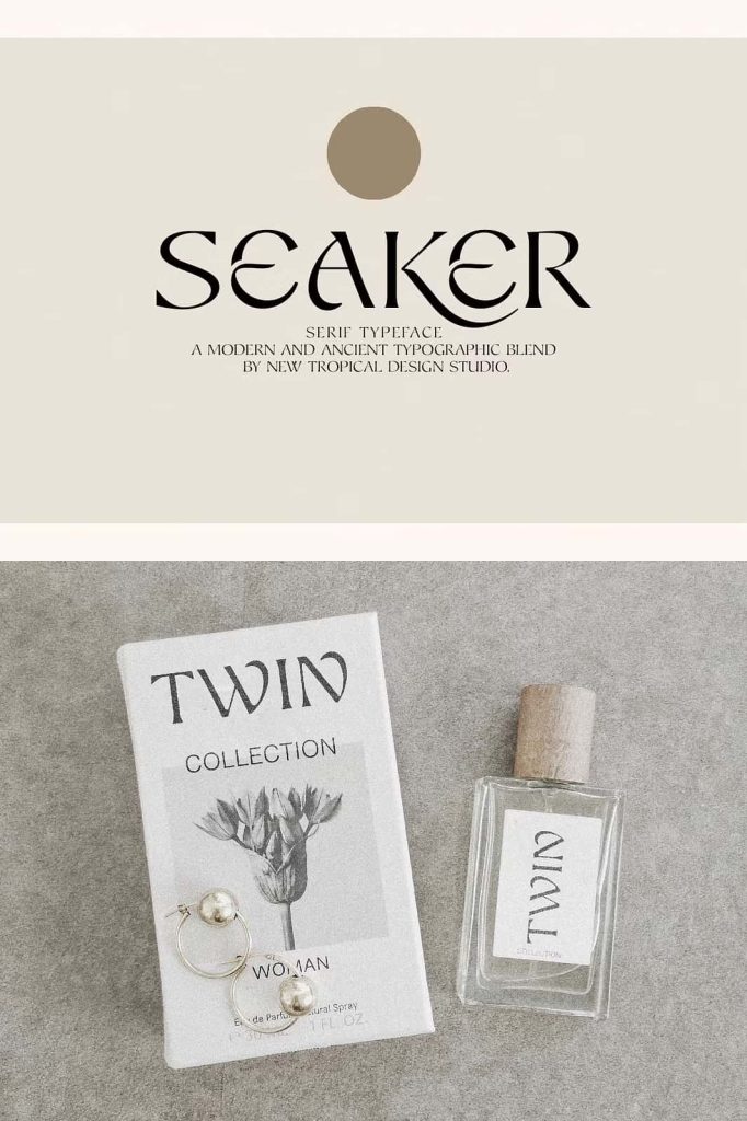
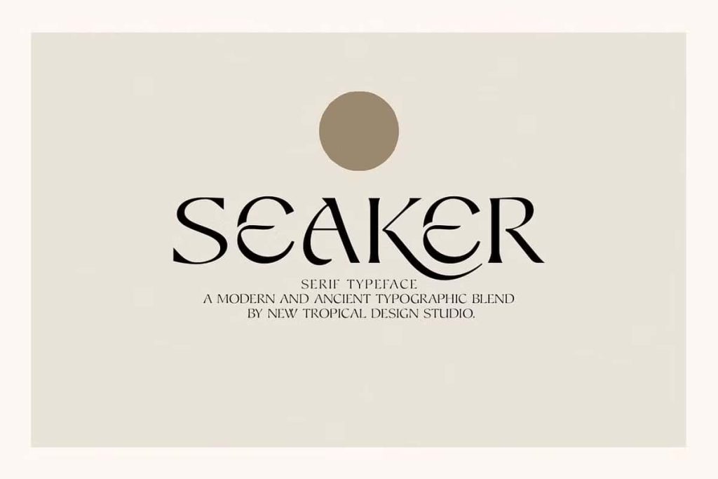
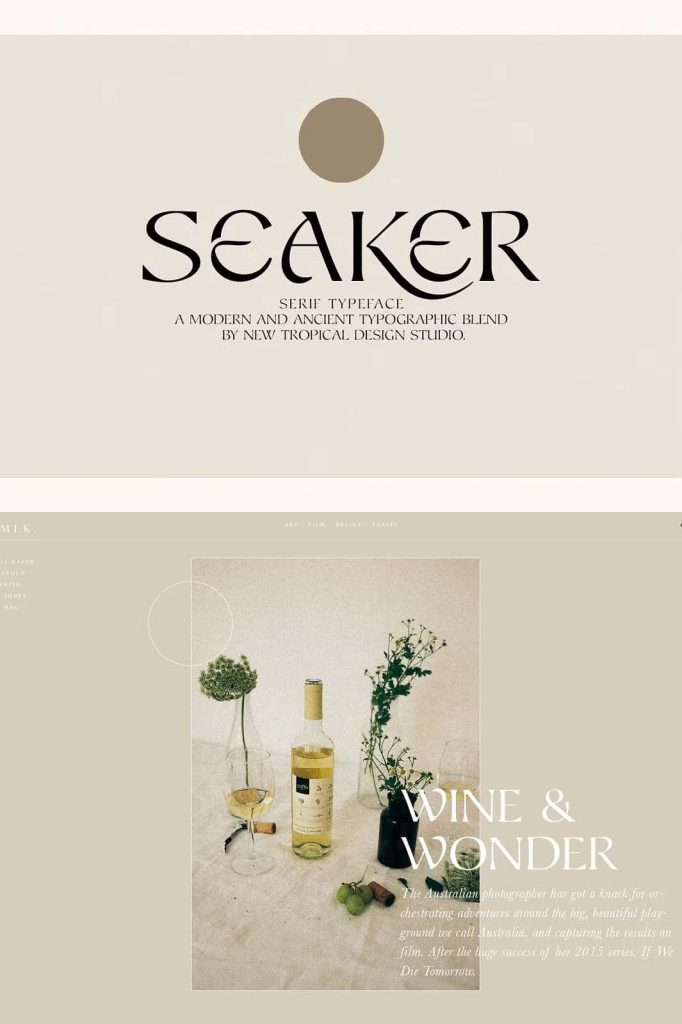
Seaker: A Spiritual Serif Font Inspired by Ancient and Modern Typography
Seaker is a distinctive serif font that merges the soul of ancient lettering with the clarity of modern typography. Designed to evoke nostalgia, curiosity, and a sense of timeless wonder, Seaker delivers a unique visual experience that feels both historic and contemporary. This typeface invites designers to explore storytelling, spirituality, and emotion through carefully crafted letterforms that feel alive, expressive, and deeply human.
A Fusion of Ancient Roots and Modern Design
At its foundation, Seaker draws inspiration from classical serif typography, echoing the visual language of old manuscripts, traditional print, and historical inscriptions. These influences are thoughtfully reinterpreted through a modern lens, resulting in a font that feels relevant in today’s design landscape while preserving the warmth of the past.
The balance between ancient and modern elements allows Seaker to stand out without appearing outdated. Its structured serif forms maintain legibility and order, while subtle stylistic choices introduce personality and depth. This fusion makes Seaker ideal for designers who want to create designs that feel meaningful, reflective, and rich with narrative.
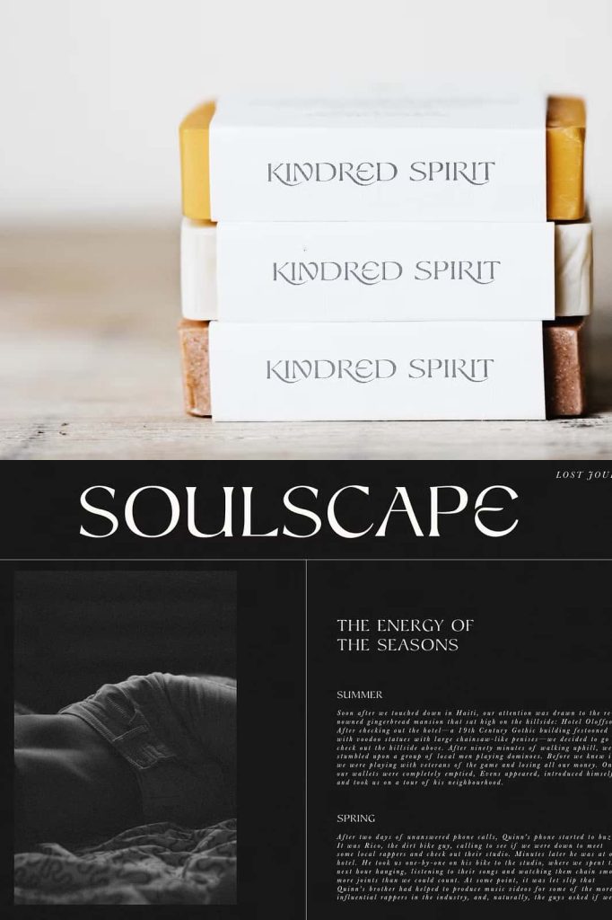
Spiritual Character with Nostalgic Wonderlust
Seaker carries a spiritual tone that encourages exploration, reflection, and emotional connection. The font’s nostalgic quality sparks a sense of wonderlust, making it especially suitable for projects rooted in culture, spirituality, travel, art, and personal storytelling. Each letter feels intentional, as if shaped by time rather than generated by a machine.
This emotional depth makes Seaker a powerful tool for branding and editorial projects that aim to communicate authenticity and soul. It supports messages that feel thoughtful, organic, and grounded, helping brands and creators connect with audiences on a deeper level.
Two Uppercase Styles for Creative Expression
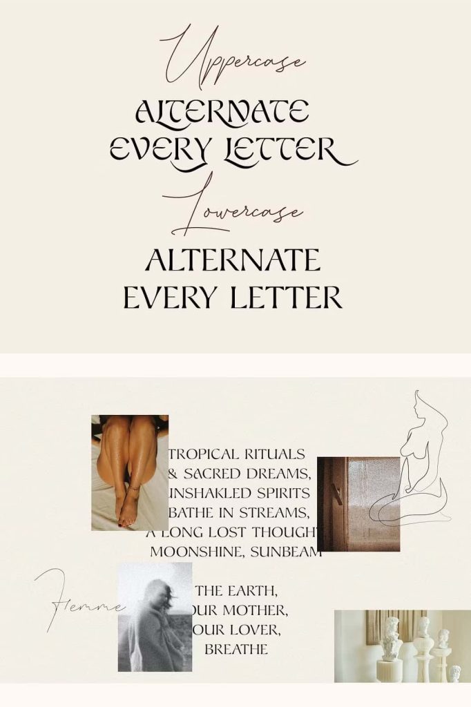
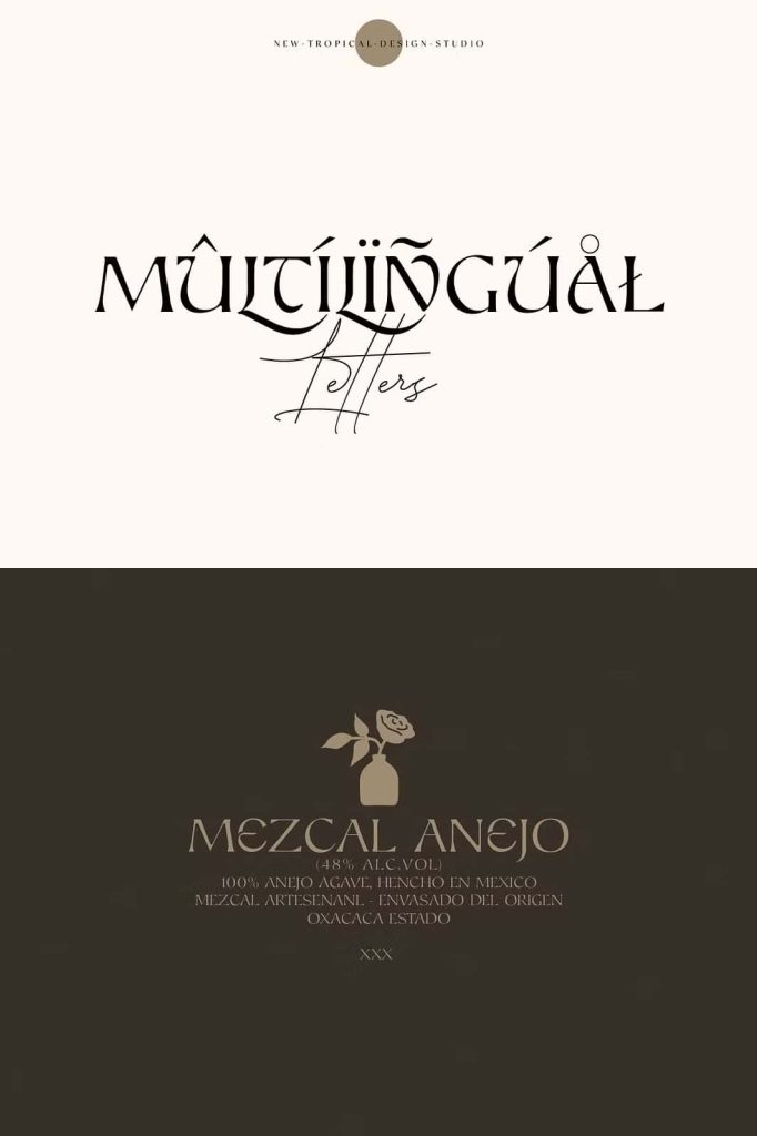
One of Seaker’s defining features is the inclusion of two distinct uppercase styles. These alternative uppercase characters allow designers to mix and match letterforms, creating dynamic and personalized typographic compositions. This flexibility encourages experimentation and gives designers the freedom to shape unique visual identities.
By combining the two uppercase styles, designers can introduce contrast, rhythm, and visual interest within headlines, logos, and display text. This feature is particularly effective for branding, album covers, book titles, and artistic layouts where individuality and expression are essential.
Handmade Texture with Subtle Irregularities
Seaker incorporates subtle irregularities into its letterforms, intentionally moving away from rigid perfection. These slight variations create an aged, handmade aesthetic that enhances the font’s organic feel. The imperfections add warmth and realism, giving the impression that the letters were crafted by hand rather than digitally produced.
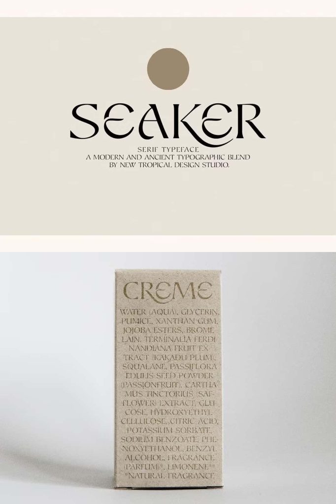
This textured quality brings authenticity to designs and helps them stand apart from overly clean or mechanical typography. The aged appearance works beautifully in projects that value craftsmanship, tradition, and emotional resonance, such as artisan brands, heritage-inspired designs, and creative publications.
Versatile Applications Across Creative Projects
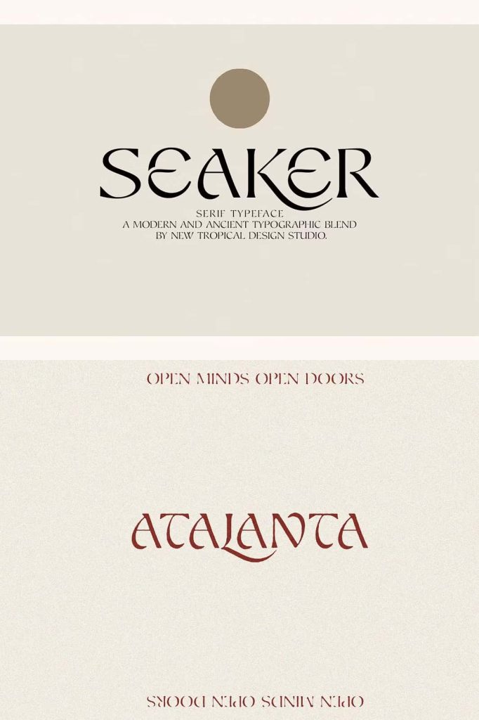
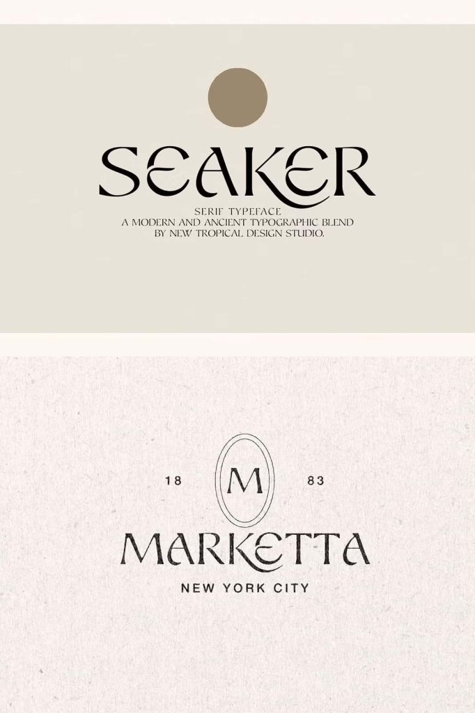
Despite its expressive character, Seaker remains highly functional across a wide range of design applications. It performs especially well in display settings, including logos, posters, editorial headlines, packaging, and social media visuals. Its strong presence ensures that text captures attention while maintaining clarity and balance.
Seaker also complements minimalist layouts by adding contrast and depth. When paired with clean sans-serif fonts, it creates a compelling typographic hierarchy that feels intentional and refined. This versatility allows Seaker to adapt to both bold artistic projects and thoughtfully curated brand identities.
A Serif Typeface with Soul and Story
Seaker is more than just a font; it is a typographic expression of time, spirituality, and human touch. By blending ancient inspiration with modern structure, it offers designers a meaningful way to communicate stories that feel personal and enduring. Its dual uppercase styles, handmade irregularities, and nostalgic tone make it a powerful choice for projects that seek authenticity and emotional depth.
Whether used for branding, editorial design, or creative storytelling, Seaker delivers a distinctive serif experience that feels timeless yet expressive. It is an ideal choice for designers looking to move beyond conventional typography and embrace a font that carries character, history, and soul.