Roc Grotesk Typeface
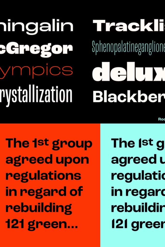
Roc Grotesk Typeface is a highly versatile sans serif font family inspired by the distinctive American wood typefaces that emerged during the late nineteenth century. Combining historical influences with modern design principles, Roc Grotesk delivers a powerful typographic system suitable for a wide range of creative and professional applications. Its carefully crafted letterforms, geometric structure, and impressive variety of styles allow designers to create visually striking layouts while maintaining excellent readability.
Designed to perform equally well in both large display settings and extended text environments, Roc Grotesk offers exceptional flexibility for branding, editorial design, digital interfaces, advertising campaigns, packaging, and corporate communications. The font family balances classic grotesque characteristics with contemporary refinement, making it a valuable asset for designers who seek both functionality and personality in their typography.
Inspired by Historic American Wood Type
Roc Grotesk draws inspiration from the bold and expressive wood typefaces widely used throughout America during the late 1800s. These historical type designs played an important role in advertising, posters, signage, and printed communication. By studying these traditional forms, the creators of Roc Grotesk developed a modern typeface that captures the strength and visual impact of vintage typography while meeting the demands of current design standards.
The result is a font family that preserves the confidence and character of classic wood type while introducing cleaner details, improved legibility, and a comprehensive range of styles. This combination allows designers to create projects that feel timeless, sophisticated, and highly professional.
Nine Weights for Complete Typographic Control
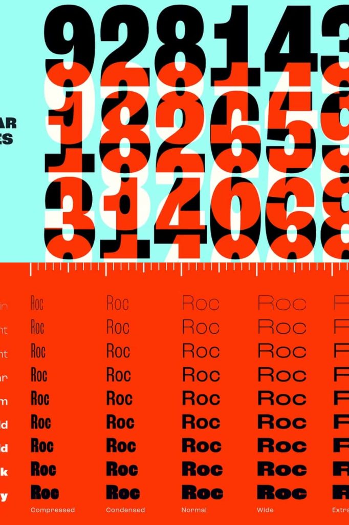
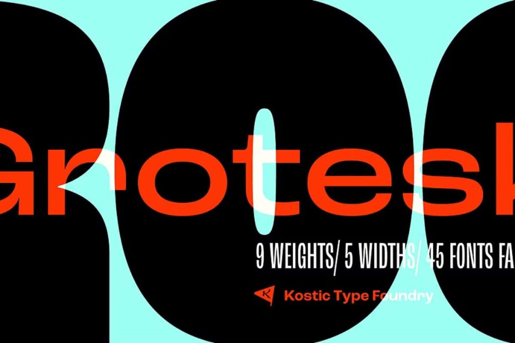
One of the most powerful features of Roc Grotesk Typeface is its extensive weight range. The family includes nine carefully designed weights, providing designers with the flexibility to create strong visual hierarchies and cohesive layouts across multiple media formats.
Available Weight Options
- Thin
- Extra Light
- Light
- Regular
- Medium
- Semi Bold
- Bold
- Extra Bold
- Black
This broad weight selection enables seamless transitions between headlines, subheadings, body text, captions, and call-to-action elements. Designers can establish clear visual structures while maintaining a consistent typographic identity throughout a project.
Five Widths for Maximum Versatility
Beyond its extensive weight range, Roc Grotesk also includes five width variations that dramatically expand its design potential. These width options provide greater flexibility when working with different layouts, screen sizes, branding requirements, and publication formats.
Whether you need condensed styles for space-saving headlines or wider forms for impactful display typography, Roc Grotesk offers practical solutions for nearly every design challenge. The multiple widths allow designers to optimize typography without sacrificing consistency or visual balance.
This versatility makes Roc Grotesk particularly valuable for large-scale branding systems, editorial publications, responsive websites, user interfaces, and multi-platform marketing campaigns.
Distinctive Grotesque Characteristics
Roc Grotesk embraces the defining qualities of traditional grotesque typography while introducing refined geometric influences. The font features strong proportions, clean construction, and carefully balanced letterforms that contribute to its modern appearance. These characteristics help create typography that feels both authoritative and approachable.
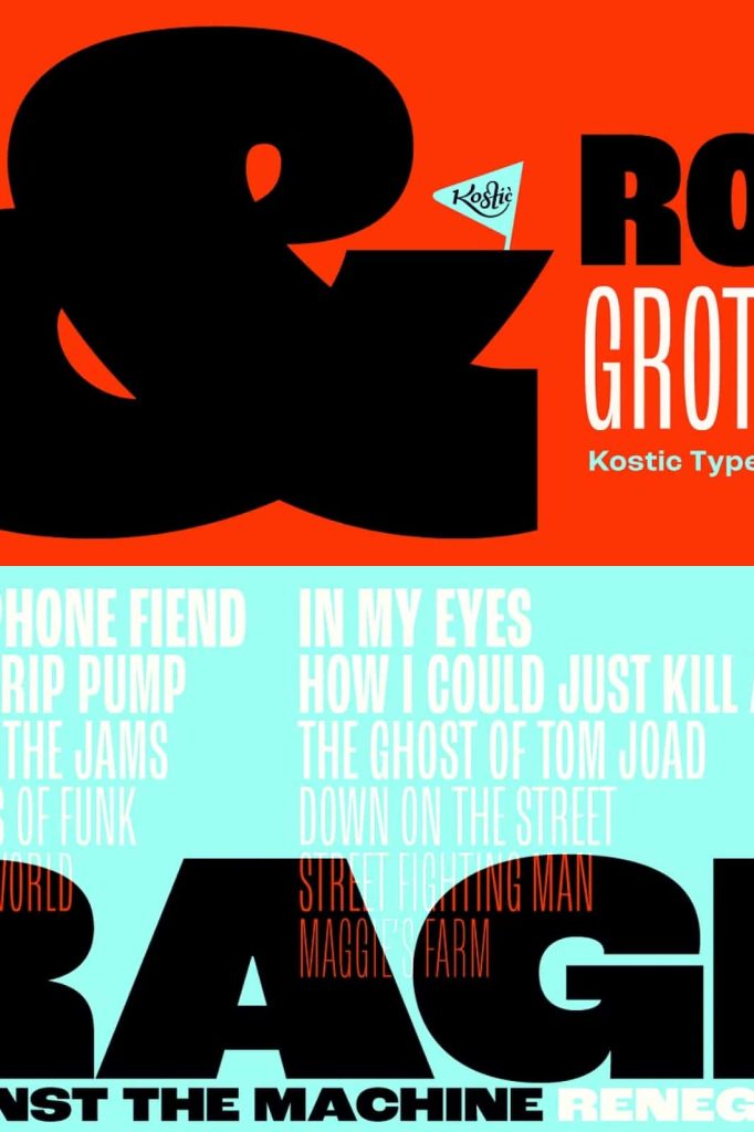
One of the most distinctive aspects of the family is its dynamic use of contrast. The heavier weights feature exaggerated stroke contrast that enhances visual impact and creates a memorable typographic presence. This characteristic gives headlines and branding elements additional personality while preserving the functional qualities expected from a professional sans serif typeface.
Ideal for Display and Text Applications
Many typefaces excel in either display or body text settings, but Roc Grotesk successfully bridges both worlds. Its thoughtful design allows it to perform exceptionally well across a variety of sizes and contexts. Large headlines benefit from its bold character and geometric structure, while smaller text remains clear, readable, and comfortable to read.
This adaptability makes Roc Grotesk an excellent choice for projects that require a unified typographic system. Designers can confidently use the same font family throughout an entire brand identity, publication, or digital product without needing additional supporting typefaces.
Popular Uses for Roc Grotesk Typeface
- Corporate branding and visual identity systems
- Editorial and magazine design
- Website and user interface design
- Advertising and marketing campaigns
- Packaging and product labeling
- Posters and large-format graphics
- Presentation and business materials
- Social media and digital content creation
- Signage and environmental graphics
- Professional publishing projects
Built for Modern Design Workflows
Today’s designers require fonts that can adapt to diverse platforms and communication channels. Roc Grotesk meets these expectations by offering an extensive range of styles that support both creative exploration and systematic design development. The combination of multiple weights and widths gives professionals the tools needed to build sophisticated visual hierarchies while maintaining consistency across print and digital environments.
Whether creating a minimalist corporate identity, a bold advertising campaign, or an engaging editorial layout, Roc Grotesk provides the flexibility and reliability necessary for modern design workflows.
Why Choose Roc Grotesk Typeface?
Roc Grotesk Typeface stands out as a comprehensive sans serif family that successfully blends historical inspiration with contemporary functionality. Drawing influence from classic American wood type while embracing modern grotesque design principles, it delivers a distinctive visual voice suitable for countless creative applications.
With nine weights, five widths, geometric construction, and expressive stroke contrast, Roc Grotesk offers unmatched versatility for designers seeking a professional and adaptable typography solution. Whether used for branding, publishing, digital products, or marketing materials, this typeface provides the flexibility, character, and performance required to create outstanding visual communication.