Reserve Elegant Script Typeface
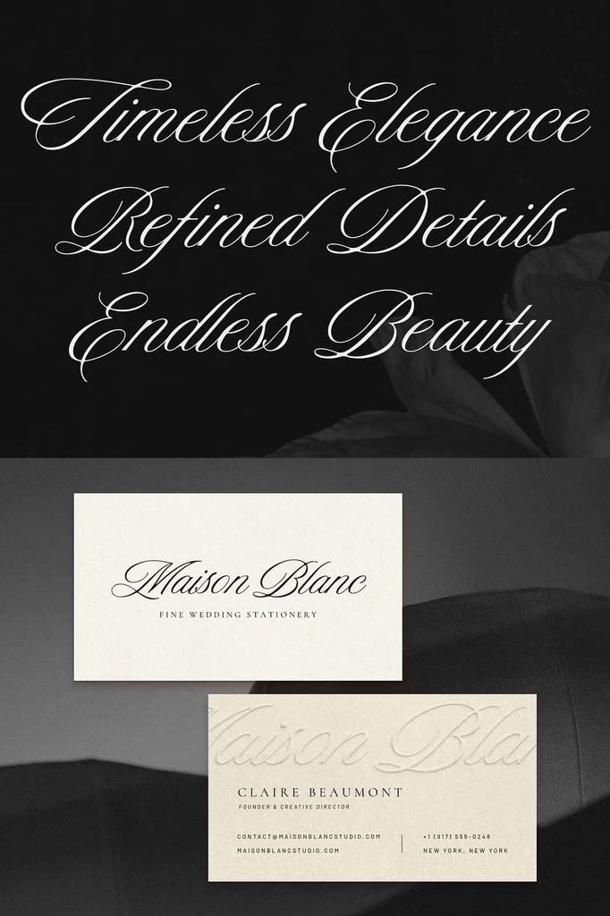
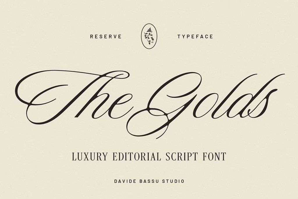
Reserve is an elegant script typeface that combines graceful lettering with a strong editorial character. Designed to balance softness and structure, this refined font brings flowing strokes, delicate details, and subtle contrast into a cohesive typographic style. Its expressive letterforms create a sophisticated impression while maintaining enough control and clarity to work across a wide range of creative applications.
Reserve offers the beauty of expressive script lettering without making your layouts feel overly decorative. Each character contributes to a smooth visual rhythm, allowing words and phrases to flow naturally across the page. The carefully controlled letterforms create a polished appearance that feels luxurious and personal, while the underlying structure gives the typeface enough versatility for modern branding, stationery, packaging, editorial graphics, and digital content.
With its timeless personality and contemporary versatility, Reserve can adapt to many different design directions. Use it for elegant wedding invitations, romantic stationery, sophisticated logos, beauty branding, product packaging, social media graphics, editorial headlines, quotes, and promotional materials. Whether your project requires a delicate handwritten touch or a polished editorial statement, Reserve provides a graceful typographic foundation.
A Refined Balance of Softness and Structure
The defining quality of Reserve lies in its balance. Script fonts often emphasize flowing movement and decorative strokes, while structured typefaces focus on consistency and clarity. Reserve brings these qualities together by creating expressive letterforms that remain controlled and visually composed.
Its flowing strokes introduce softness and movement, giving words an elegant handwritten character. At the same time, refined details and subtle contrast prevent the lettering from appearing overly loose or informal. This combination creates a sophisticated script that can communicate elegance without sacrificing usability.
The balanced construction also allows Reserve to move comfortably between different design styles. Use it within a romantic wedding invitation, a luxurious beauty campaign, or a clean editorial layout. The surrounding design can influence its personality while the typeface maintains its recognizable sense of refinement.
Flowing Strokes with Controlled Letterforms
Reserve uses flowing strokes to create a smooth connection between letters. This movement gives the typeface a natural rhythm and makes it especially effective for names, short phrases, headlines, and decorative typography.
Although the lettering feels expressive, the design keeps its forms controlled. This makes Reserve easier to integrate into professional layouts than highly ornamental scripts that can dominate a composition. You can use it as a focal point while maintaining a clean and organized overall design.
Elegant Typography for Wedding Stationery
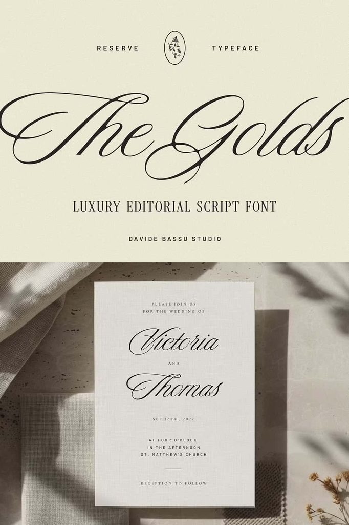
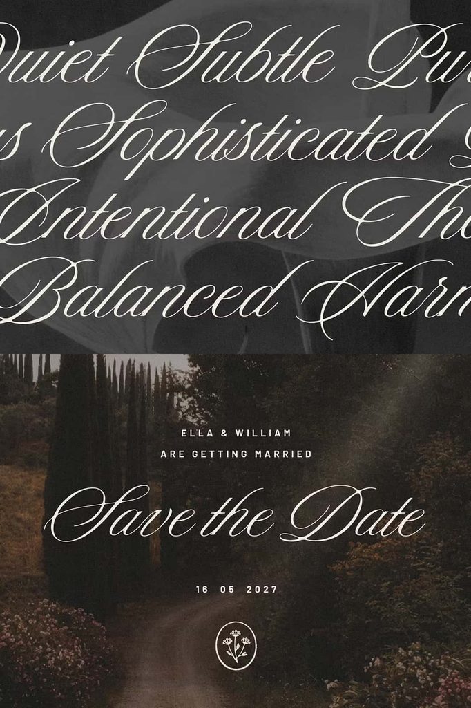
Reserve is an excellent choice for wedding invitations and stationery that require a sophisticated handwritten appearance. Its graceful strokes can bring warmth and elegance to names, invitation titles, dates, ceremony details, and decorative phrases.
Use Reserve for wedding invitations, save-the-date cards, menus, seating charts, welcome signs, thank-you cards, envelopes, table numbers, and other event stationery. Its refined appearance can complement both traditional and contemporary wedding aesthetics.
For a classic approach, combine Reserve with a simple serif typeface and generous spacing. For a modern design, pair it with a clean sans serif and use restrained layouts. The script can remain the focal point while supporting typography provides practical information and readability.
Create Sophisticated Invitation Designs
Reserve can transform a simple name or phrase into a strong decorative element. Use large script lettering for names and headlines, then reduce the size for supporting details. This creates a clear hierarchy while allowing the expressive qualities of the font to remain visible.
Combine the typeface with floral illustrations, delicate borders, subtle textures, or minimalist layouts. You can also use it on clean backgrounds to emphasize the elegance of the letterforms themselves.
Ideal for Elegant Branding
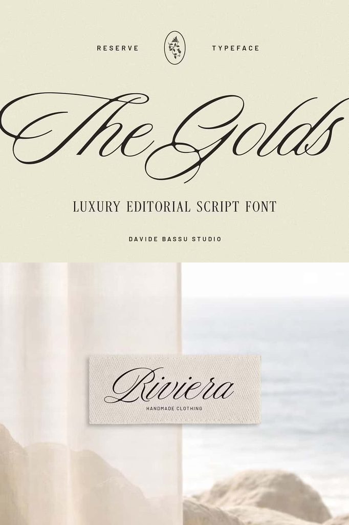
Reserve provides a sophisticated foundation for brands that want to communicate refinement, beauty, creativity, or personal craftsmanship. Its editorial character makes it especially useful for fashion, beauty, lifestyle, photography, boutique, wedding, stationery, and creative brands.
Use Reserve for wordmarks, logo concepts, signature-style branding, product names, taglines, campaign titles, and social media graphics. Its expressive letterforms can make a brand name feel more distinctive while retaining a polished appearance.
Build a Timeless Brand Identity
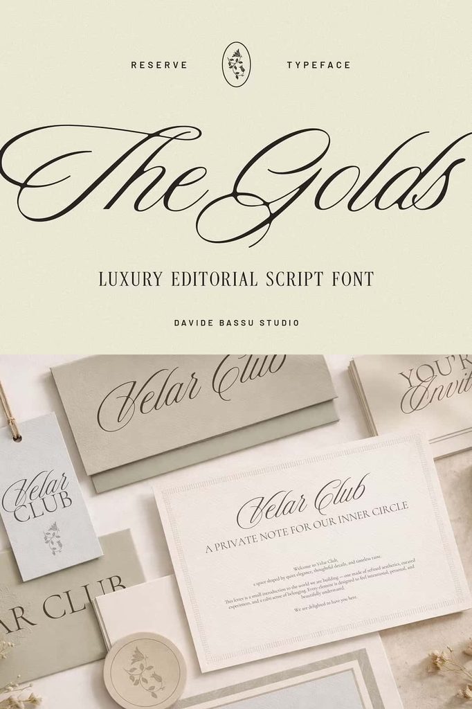
A successful brand identity should remain recognizable across different applications. Reserve can support this consistency by providing a distinctive typographic voice that works across both print and digital media.
Use the script for the primary brand name and combine it with a restrained supporting font for secondary information. Alternatively, use Reserve selectively for a signature word while a structured serif or sans serif handles the rest of the identity. This approach gives designers control over hierarchy and prevents the script from overwhelming the composition.
Reserve works particularly well for brands that want to feel established without appearing old-fashioned. Its timeless quality creates a classic foundation, while its controlled forms maintain a contemporary appearance.
Refined Packaging and Product Design
Reserve can add sophistication to packaging and product presentation. Use it for product names, collection titles, labels, limited-edition graphics, promotional cards, and decorative packaging elements.
The elegant script style works particularly well for beauty products, candles, fragrances, boutique goods, specialty products, wedding collections, stationery, and lifestyle brands. Its graceful letterforms can make product names feel more distinctive and create a premium visual atmosphere.
Pair Reserve with clean layouts and carefully selected supporting typography to maintain readability. You can also combine it with subtle textures, minimal illustrations, or refined borders to strengthen the overall presentation.
Create a Cohesive Product Collection
Use Reserve consistently across product names, packaging labels, promotional materials, and social media campaigns. Repeating the same typographic style can create a recognizable visual connection between different products within a collection.
For example, use the script for the main collection name and a simple sans serif for product descriptions. This approach gives the packaging a clear hierarchy while maintaining a sophisticated brand identity.
Editorial-Inspired Typography
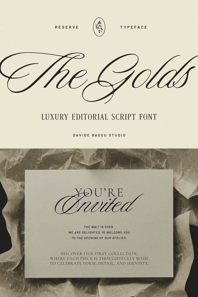
Reserve takes its visual personality from editorial design, making it an excellent choice for magazine-style layouts, lookbooks, fashion graphics, photography projects, and promotional campaigns. Its elegant script can function as a headline, title, accent, or decorative element within a structured composition.
Use large Reserve lettering alongside photography to create sophisticated cover-style artwork. Place a flowing title over an image, or use the script to introduce a feature section within a brochure or lookbook. The typeface can create a strong visual focal point without requiring excessive decorative elements.
Its subtle contrast also works well with minimalist editorial layouts. Give the lettering plenty of space and allow the flowing strokes to create movement against a clean background.
Perfect for Social Media Content
Reserve can help social media graphics feel polished and visually distinctive. Use it for quote graphics, announcements, campaign headlines, product promotions, event invitations, seasonal content, and branded posts.
Its elegant character works particularly well when you need to communicate a refined message in a compact format. Create a large script headline and surround it with minimal supporting text to produce a clean and sophisticated composition.
Create Memorable Quote Designs
Use Reserve to transform short quotes and phrases into elegant visual artwork. Highlight a meaningful word in the script and use a simple supporting typeface for the remaining text. This creates contrast while keeping the composition easy to read.
Reserve can also work beautifully for personal statements, inspirational phrases, romantic messages, and lifestyle content. Combine the lettering with subtle photography, neutral backgrounds, or delicate decorative elements to reinforce its refined personality.
How to Use Reserve Effectively
Reserve works best when designers allow its letterforms enough room to express their natural movement. Avoid overcrowding the composition with too many competing decorative elements. Instead, create a clear hierarchy and let the script provide the primary visual personality.
Experiment with font size, tracking, line spacing, and alignment to find the right balance for your project. Large lettering can showcase the refined details and flowing strokes, while smaller applications can provide elegant accents within a larger design system.
Consider pairing Reserve with a simple serif or sans serif font. A structured supporting typeface can provide clarity for paragraphs, descriptions, dates, or product information while Reserve handles the expressive display elements.
Use Contrast to Strengthen Your Layout
Contrast can help Reserve stand out. Combine its flowing script with clean geometric shapes, structured grids, generous whitespace, or simple typography. This relationship allows the softness of the script to interact with more organized design elements.
You can also explore contrast through scale. A large Reserve headline paired with small supporting text can create an editorial appearance, while a subtle script accent can add elegance to an otherwise minimalist layout.
Why Choose Reserve Elegant Script Typeface?
Reserve Elegant Script Typeface gives designers a refined combination of expressive movement and controlled structure. Its flowing strokes create a graceful handwritten appearance, while its subtle contrast and carefully constructed forms maintain a polished visual identity.
The font works across a wide range of creative projects, from wedding stationery and invitations to branding, packaging, editorial design, social media graphics, quotes, product presentation, and promotional artwork. Its versatility allows you to explore different creative directions without losing the sophisticated personality of the typeface.
Reserve also offers a timeless quality that helps designs remain relevant beyond short-lived trends. Its contemporary construction keeps the lettering fresh, while its elegant script foundation gives it a classic character.
Bring Timeless Elegance to Your Designs
Reserve provides a sophisticated way to introduce expressive script lettering into modern creative projects. Its graceful strokes, refined details, and subtle contrast create a balanced typographic experience that feels both soft and structured.
Use it to create wedding invitations that feel personal, branding that feels distinctive, packaging that feels refined, and editorial graphics that command attention. Let the flowing letterforms create movement while structured supporting typography keeps your layouts clear and organized.
Whether you are designing for a luxury-inspired brand, preparing elegant stationery, creating a product collection, or developing social media artwork, Reserve Elegant Script Typeface offers a versatile and polished solution. Its expressive yet controlled character gives your typography a timeless quality while maintaining the flexibility needed for contemporary design.
“`