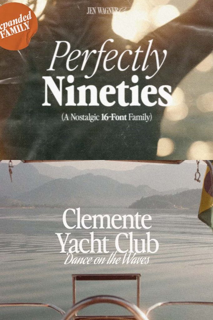
Perfectly Nineties Font Family – A Nostalgic Typeface Collection with Modern Versatility
Step back into an era of bold creativity and timeless style with the Perfectly Nineties Font Family—a complete expansion of the beloved Perfectly Nineties font. This extensive type collection includes 16 fonts, featuring both regular and italic styles, ranging from Thin to Black weights. Designed to bring the nostalgic charm of the 1990s into modern design, this family combines retro personality with professional versatility, making it ideal for everything from branding to editorial design.
Embrace the Classic Spirit of 90s Typography
The Perfectly Nineties Font Family captures the essence of an unforgettable decade—a time defined by expressive design, confident typography, and timeless aesthetic appeal. This typeface draws inspiration from the 1990s’ iconic style, blending geometric forms with soft curves and distinctive letter proportions. The result is a collection that feels familiar yet fresh, retro yet relevant for contemporary projects.
Each font in the family has been carefully refined to deliver exceptional clarity and balance. The lighter weights showcase delicate elegance, while the bold variations command attention with confidence and strength. Whether you’re creating editorial layouts, modern brand identities, or digital advertisements, Perfectly Nineties brings warmth, character, and authenticity to every design.
Comprehensive Font Collection for Every Design Need
With 16 unique fonts, the Perfectly Nineties Font Family gives designers full creative freedom. Each style—ranging from Thin to Black—comes in both regular and italic versions, ensuring flexibility for various typographic expressions. The italics introduce subtle dynamism, while the heavier weights deliver bold impact for headlines, logos, and display text.
This comprehensive approach allows you to achieve perfect consistency across multiple media formats. Use the Thin or Light styles for elegant minimalist layouts, or embrace the Black and Bold weights to make a statement in advertising or branding. The versatility of the family ensures you can maintain visual harmony while exploring a range of moods and tones within a single project.
Key Features of Perfectly Nineties Font Family
- 16 Font Styles – Includes Thin to Black weights, each with matching italics.
- Retro Aesthetic – Captures the nostalgic charm of 90s design with a modern twist.
- Professional Versatility – Ideal for branding, packaging, social media, and editorial design.
- High Legibility – Clear letterforms ensure readability across all sizes and platforms.
- Complete Family Package – Perfect for cohesive design systems and brand identities.
Perfect for Branding, Editorials, and Modern Design Projects
Designed with both nostalgia and functionality in mind, the Perfectly Nineties Font Family is perfect for brand designers, publishers, and creative agencies who want to infuse their projects with character and sophistication. Its wide range of weights makes it adaptable to multiple uses—whether you’re crafting a logo for a fashion brand, designing social media graphics, or developing a magazine layout.
The typeface’s balance of modern refinement and vintage flair ensures it stands out across all platforms. The regular styles maintain a clean and professional tone for body text, while the heavier and italic versions add energy and emotion to titles and callouts. This combination of practicality and style makes Perfectly Nineties an essential addition to any designer’s font library.
Why Designers Love Perfectly Nineties
Designers are drawn to the Perfectly Nineties Font Family for its blend of nostalgic aesthetics and modern usability. It pays homage to classic 90s typography—seen in print ads, editorial covers, and brand identities—while maintaining a contemporary structure that fits seamlessly into today’s design workflows. Its versatile range of weights allows for experimentation without compromising on readability or balance.
From delicate Thin scripts for elegant compositions to bold Black weights that exude authority, every variation has been crafted with meticulous attention to detail. The inclusion of italic versions adds a dynamic, expressive layer, allowing designers to create movement and rhythm in their text layouts. It’s a font family that inspires creativity and delivers professional results with ease.