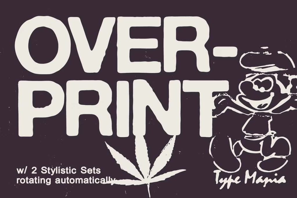
Overprint TM Distressed Typeface with Authentic Xeroxed Texture
Overprint TM is a bold distressed typeface designed to capture the raw character of imperfect print. With its uneven edges and distinctive xeroxed finish, this font delivers an authentic worn texture that immediately adds grit and personality to your typography. Overprint TM embraces imperfection and transforms it into a powerful visual statement.
This distressed typeface does not aim for polished perfection. Instead, it celebrates the organic flaws found in analog printing, photocopied posters, and aged ink impressions. By combining texture, irregular outlines, and intelligent OpenType features, Overprint TM allows you to create designs that feel expressive, tactile, and full of attitude.
Distinctive Uneven Edges and Xeroxed Finish
Overprint TM stands out with its deliberately uneven edges and rough contours. Each letterform features subtle distortions and ink-like irregularities that replicate the look of duplicated print materials. The xeroxed finish adds depth and texture, giving your text the appearance of layered ink and slightly degraded reproduction.
This design approach creates a dynamic visual effect. When you set headlines or short phrases in Overprint TM, the letters interact organically, forming compositions that feel alive and handcrafted. The distressed texture enhances posters, album covers, editorial titles, and branding projects that demand authenticity and bold expression.
Automatic Stylistic Set Rotation for Natural Variation
Overprint TM includes two stylistic sets that rotate automatically when contextual alternates are activated. This intelligent feature introduces subtle variations across repeated letters, preventing uniform repetition and enhancing the natural distressed look. Instead of identical shapes appearing side by side, the font cycles through alternate versions to simulate real-world print inconsistencies.
This automatic rotation strengthens the illusion of analog production. Words feel less mechanical and more organic, as if each letter received a slightly different ink impression. Designers can rely on this feature to achieve a convincing vintage aesthetic without manually replacing characters.
Contextual Alternates for Subtle Imperfections
With contextual alternates turned on, Overprint TM introduces refined imperfections throughout your text. These alternates adjust character forms depending on their surrounding letters, creating fluid and unpredictable texture. The effect remains subtle yet impactful, adding depth without compromising readability.
This advanced OpenType functionality allows you to design quickly while maintaining creative complexity. You can focus on layout and composition while the font handles variation and texture behind the scenes. The result feels intentional, authentic, and professionally crafted.
Designed for Bold and Experimental Typography
Overprint TM empowers designers who want to break away from clean, minimal type. Its distressed structure supports bold creative concepts, experimental layouts, and expressive branding. Use it to craft powerful headlines, rebellious graphics, and vintage-inspired visuals that demand attention.
The font works particularly well in large display sizes, where its textured details and xeroxed finish become more pronounced. Set it in oversized titles, impactful posters, or statement packaging to maximize its visual strength.
Perfect for Posters, Branding, and Editorial Design
Overprint TM distressed typeface excels in projects that require character and edge. It enhances music artwork, streetwear branding, creative studio identities, and alternative editorial layouts. The uneven edges and distressed finish inject personality into otherwise standard typography.
In branding applications, Overprint TM communicates authenticity and boldness. It suits brands that embrace raw aesthetics, handcrafted values, and independent spirit. Designers can use it for logos, wordmarks, merchandise graphics, and promotional materials that need strong visual impact.
In editorial contexts, the font adds drama and texture to headlines and cover designs. It helps you establish mood instantly, whether you aim for retro nostalgia or underground energy.
Balance Texture with Readability
Despite its distressed appearance, Overprint TM maintains strong structure and legibility. The letterforms retain clear proportions and balanced spacing, ensuring your message remains readable even with added texture. This balance makes the font practical as well as expressive.
You can pair Overprint TM with clean sans serifs or classic serif fonts to create contrast and hierarchy. The distressed texture works as a visual accent, while supporting typefaces maintain clarity in body text.
Create Impact with Imperfect Typography
Overprint TM transforms ordinary text into textured, character-driven design. Its uneven edges, xeroxed finish, automatic stylistic set rotation, and contextual alternates combine to produce typography that feels raw and authentic. This distressed typeface invites you to embrace imperfection and turn it into a defining visual feature.
Choose Overprint TM when you want to add grit, depth, and personality to your creative work. Activate contextual alternates, let the stylistic sets rotate, and watch your words evolve into bold statements filled with analog-inspired charm and modern design precision.