Ohio Symphonies Display Sans Font
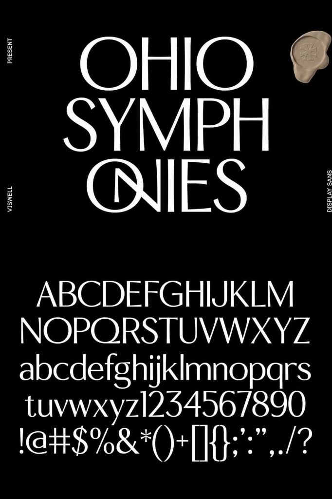
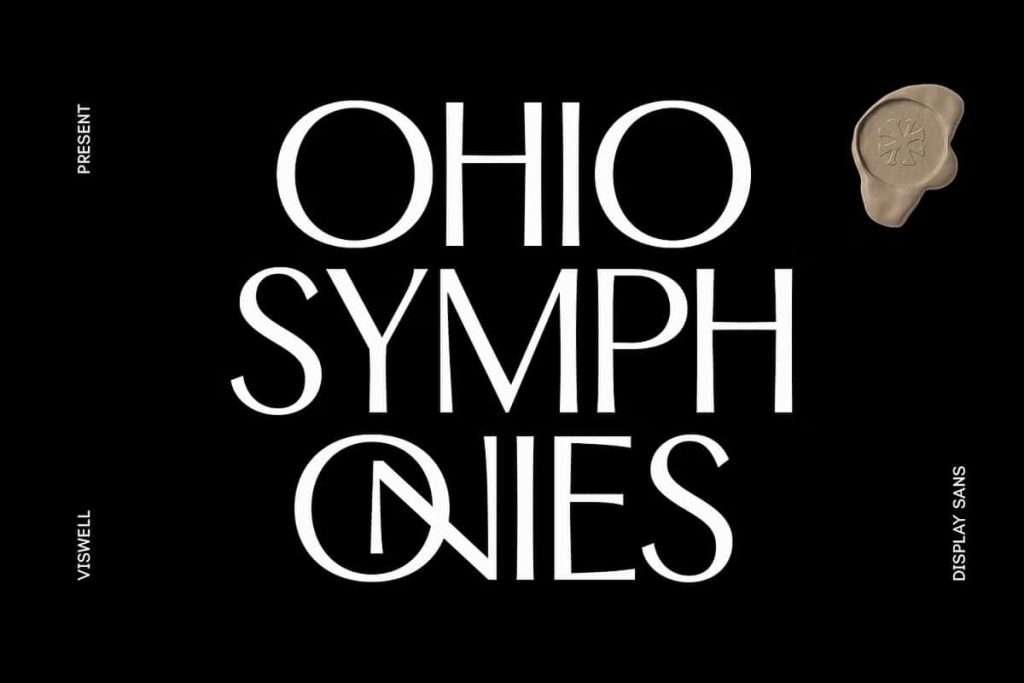
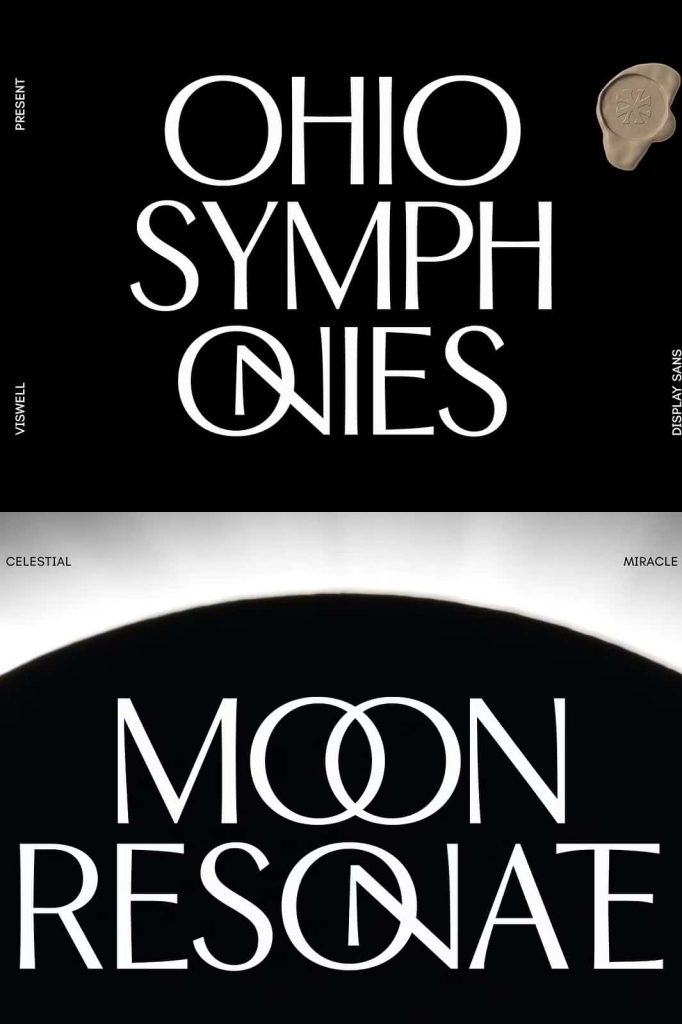
Ohio Symphonies is a refined display sans font that blends modern geometric precision with artistic elegance to create typography that feels both sophisticated and expressive. Designed for creative professionals who demand exceptional visual quality, this display typeface features tall, narrow letterforms, graceful curves, and carefully balanced proportions that instantly elevate any design project.
Inspired by the rhythm and harmony found in music, Ohio Symphonies transforms every word into a striking visual composition. Each letter has been thoughtfully crafted to maintain clarity while introducing subtle artistic details that add personality without overwhelming the design. The result is a display font that communicates confidence, elegance, and timeless appeal across both digital and print applications.
Whether you are developing a premium brand identity, designing editorial layouts, creating luxury packaging, or producing impactful advertising campaigns, Ohio Symphonies provides the versatility and visual strength needed to make your typography stand out.
A Modern Display Sans with Artistic Character
Ohio Symphonies moves beyond the limitations of conventional display fonts by combining clean geometric construction with flowing visual rhythm. Its tall and condensed proportions create an elegant vertical presence, while the soft curves and refined detailing introduce warmth and sophistication.
This balanced design allows the font to remain highly readable while delivering a unique personality that distinguishes it from ordinary sans serif typefaces. Every character contributes to a harmonious visual system that feels polished, contemporary, and remarkably versatile.
The result is typography that captures attention naturally while maintaining a professional appearance suitable for a wide range of creative industries.
Designed for Luxury Branding
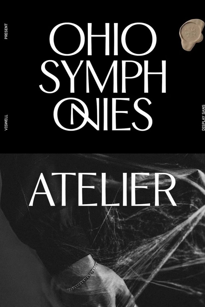
Typography plays a central role in defining memorable brands, and Ohio Symphonies has been carefully developed to help businesses establish premium visual identities. Its refined structure communicates professionalism, elegance, and creativity, making it an excellent choice for luxury brands, fashion companies, lifestyle products, and high-end marketing materials.
The font performs beautifully across logos, business cards, packaging, promotional graphics, websites, and social media campaigns. Its sophisticated appearance helps brands create a lasting impression while maintaining consistency across every touchpoint.
Recommended Branding Applications
- Luxury brand identities
- Fashion and apparel branding
- Cosmetic packaging
- Jewelry collections
- Beauty product labels
- Corporate branding
- Boutique business logos
- Creative agency identities
- Premium product packaging
Create Stunning Editorial Typography
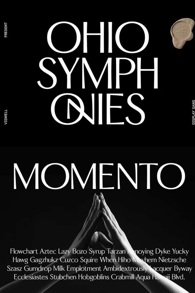
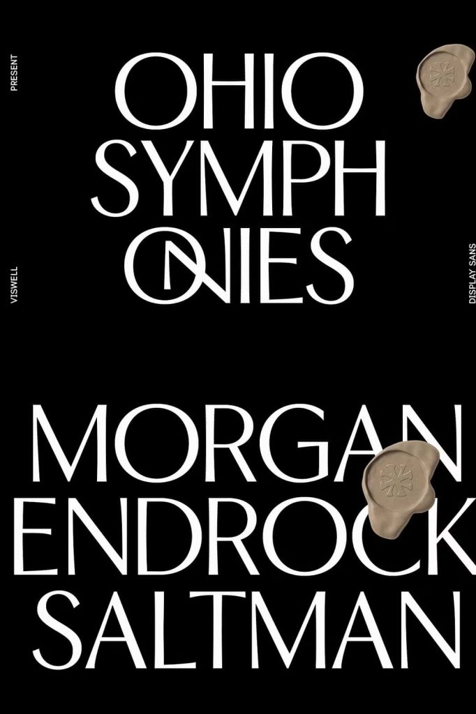
Editorial design requires fonts that combine visual impact with refined readability, and Ohio Symphonies delivers both qualities effortlessly. The elegant proportions of its letterforms make headlines appear bold and sophisticated while preserving a clean and organized layout.
Magazine covers, book titles, lookbooks, brochures, catalogs, and creative publications all benefit from the font’s balanced structure and expressive personality. Designers can pair Ohio Symphonies with classic serif or modern sans serif body fonts to create visually engaging editorial compositions that feel polished and professional.
Bring Energy to Posters and Display Design
Ohio Symphonies excels in large-format typography where every design element must command attention. Its narrow letterforms maximize visual impact without occupying unnecessary space, making it ideal for posters, banners, advertisements, event promotions, and exhibition graphics.
The artistic rhythm built into each character creates natural movement throughout headlines, helping designers establish strong visual hierarchy and dynamic compositions that immediately capture audience attention.
Enhance Every Project with Alternates and Ligatures
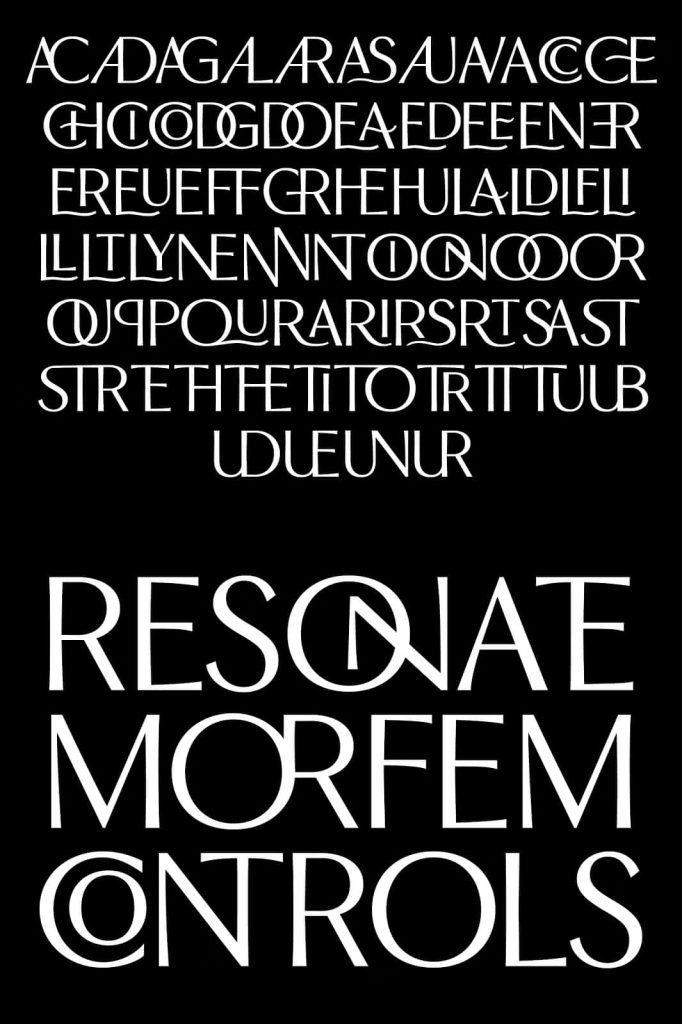
One of the standout features of Ohio Symphonies is its collection of thoughtfully designed stylistic alternates and elegant ligatures. These OpenType features allow designers to customize typography with ease, creating unique wordmarks and refined display text without requiring manual lettering adjustments.
Alternates introduce additional creative flexibility, while ligatures improve character connections and overall visual flow. Together, these features help transform ordinary text into memorable typographic compositions that reinforce premium branding and artistic expression.
Multilingual Support for Global Creativity
Ohio Symphonies includes multilingual language support, allowing designers to confidently use the font across international branding, publishing, and marketing projects. This expanded character set increases its usability for businesses and creative professionals working with diverse audiences around the world.
Whether your project targets local markets or international clients, Ohio Symphonies maintains consistent quality and elegant presentation across supported languages.
Versatile Across Creative Applications
Although Ohio Symphonies was designed as a display font, its refined construction makes it remarkably adaptable across numerous creative disciplines. Its combination of geometric clarity and expressive elegance allows it to perform beautifully in both minimalist and highly artistic layouts.
Perfect For
- Brand identities
- Luxury logos
- Editorial headlines
- Magazine covers
- Book titles
- Poster design
- Advertising campaigns
- Packaging design
- Fashion branding
- Website hero sections
- Social media graphics
- Presentation titles
- Creative portfolios
- Event promotions
- Marketing materials
Outstanding Performance in Print and Digital Media
Ohio Symphonies has been optimized to deliver exceptional results across both digital platforms and printed materials. Its clean construction ensures sharp rendering on websites, mobile applications, digital advertisements, and social media graphics while preserving elegant detail in brochures, catalogs, posters, packaging, and premium print publications.
The font maintains its visual harmony across different sizes, allowing designers to create consistent typography throughout entire branding systems and marketing campaigns.
Why Choose Ohio Symphonies Display Sans Font?
Ohio Symphonies offers much more than a beautiful display typeface. It provides a carefully engineered balance between geometric precision and artistic expression, allowing designers to communicate sophistication without sacrificing readability. Every curve, proportion, and stylistic detail has been developed to create a harmonious visual experience that enhances both traditional and contemporary design projects.
Its stylish alternates, elegant ligatures, multilingual support, and timeless character make Ohio Symphonies an invaluable addition to any professional font library. Whether you are designing for luxury brands, editorial publications, creative agencies, or modern businesses, this typeface delivers outstanding versatility and lasting visual impact.
Conclusion
Ohio Symphonies Display Sans Font is a sophisticated display typeface that successfully combines modern geometry with artistic rhythm. Featuring tall and elegant letterforms, expressive curves, refined alternates, stylish ligatures, and multilingual support, it provides everything designers need to create memorable typography. From branding and editorial design to posters, packaging, advertising, and premium marketing materials, Ohio Symphonies transforms every project with confidence, precision, and timeless elegance. Every letter works together like a perfectly composed symphony, helping your designs communicate beauty, professionalism, and exceptional craftsmanship.