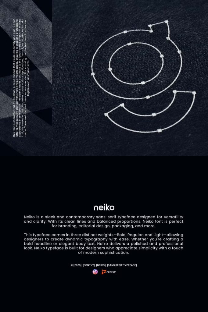
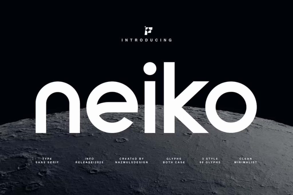
Neiko Sans Serif Font
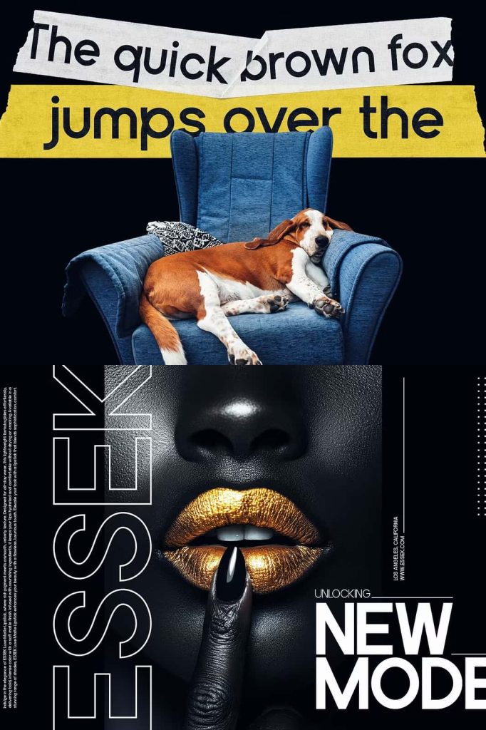
Neiko is a sleek and contemporary sans serif font designed to deliver clarity, balance, and modern sophistication in every layout. Built with clean lines and carefully refined proportions, Neiko transforms typography into a powerful design tool that strengthens visual identity and enhances readability. This typeface adapts effortlessly across branding, editorial design, packaging, and digital applications, making it a reliable choice for creative professionals.
Neiko does not rely on excessive decoration. Instead, it focuses on precision, structure, and simplicity. This disciplined approach allows your message to stand out clearly and confidently. Whether you design for print or screen, Neiko helps you communicate with purpose and impact.
Clean Lines for Clear Communication
Neiko embraces minimalism through sharp, clean lines and well-defined shapes. Each letterform reflects careful construction, ensuring consistency across words and paragraphs. The balanced geometry strengthens legibility while maintaining a refined aesthetic.
This clarity makes Neiko ideal for projects that demand professionalism and focus. Corporate presentations, website interfaces, marketing materials, and editorial layouts benefit from its structured design. It supports strong typographic hierarchy without overwhelming the composition.
Balanced Proportions for Modern Appeal
Neiko stands out because of its balanced proportions. The spacing between letters feels intentional and harmonious, creating smooth reading flow. The x-height and stroke weight work together to maintain visibility at various sizes.
Designers can confidently use Neiko for both bold headlines and detailed body text. It retains its character across different scales, delivering consistent visual performance in every context.
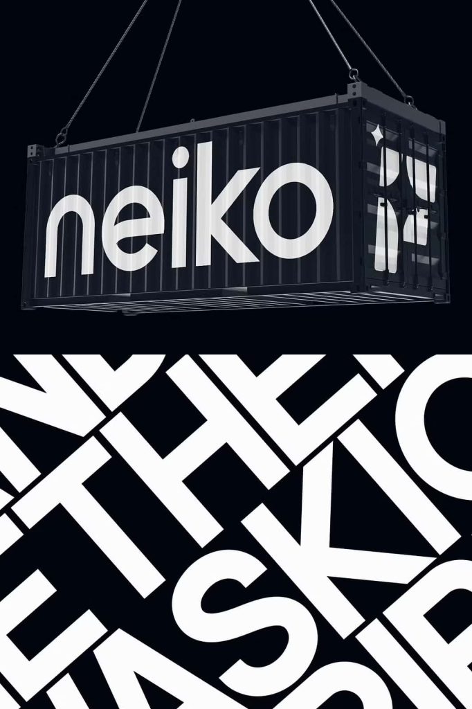
Perfect for Branding and Identity Design
Strong brands depend on strong typography. Neiko sans serif font provides a contemporary foundation for logos, wordmarks, and brand systems. Its clean structure projects confidence, innovation, and reliability.
Use Neiko to build a cohesive identity across business cards, packaging, social media graphics, and advertising campaigns. The font’s modern personality enhances industries such as technology, fashion, architecture, lifestyle, and creative agencies.
Create Memorable Logos and Visual Systems
Neiko’s simplicity allows designers to craft logos that feel timeless rather than trendy. The balanced letterforms create harmonious wordmarks that remain readable and distinctive. Pair it with bold color palettes or minimalist layouts to strengthen brand recognition.
This flexibility ensures your identity system maintains clarity across multiple platforms and formats.
Ideal for Editorial and Publishing Projects
Editorial design requires typography that guides readers smoothly through content. Neiko excels in magazine layouts, newsletters, brochures, and digital publications. Its clean lines maintain readability even in dense text blocks.
Use Neiko for section titles, subheadings, captions, and body copy to create strong hierarchy. The font supports organized layouts that feel modern and professional. Designers can pair it with serif fonts for contrast or use it exclusively for a clean, unified aesthetic.
Enhance Packaging and Product Design
Packaging design benefits from clarity and impact. Neiko delivers both. Its structured form ensures product names and details remain easy to read while maintaining a contemporary look. Whether you design labels, boxes, or promotional materials, Neiko reinforces brand credibility.
The font adapts to minimalist packaging as well as bold, graphic compositions. It strengthens shelf presence without appearing excessive or cluttered.
Optimized for Digital Performance
In digital environments, readability and precision matter more than ever. Neiko performs exceptionally well on websites, mobile applications, landing pages, and user interfaces. Its clean geometry ensures sharp rendering on screens of all sizes.
Designers can rely on Neiko to maintain consistent appearance across devices. The font supports responsive layouts and enhances user experience through clarity and structure.
Why Choose Neiko Sans Serif Font?
- Sleek and contemporary sans serif design
- Clean lines and balanced proportions
- Highly versatile for print and digital use
- Perfect for branding, editorial, and packaging projects
- Strong readability across various sizes and formats
Neiko sans serif font empowers designers to create clear, confident, and modern typography. Its disciplined structure and refined simplicity make it a valuable addition to any professional font library. Choose Neiko to elevate your branding, enhance editorial layouts, and build visually balanced designs that communicate with strength and precision.