Monterchi Font – A Renaissance-Inspired Serif Typeface
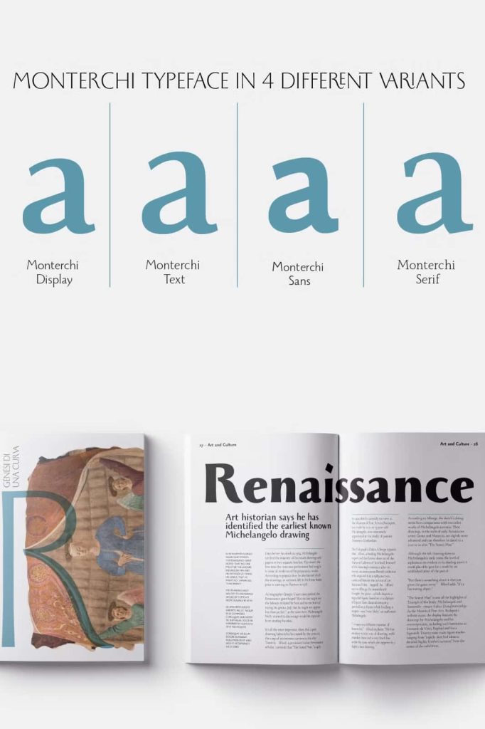
Monterchi is a sophisticated serif typeface inspired by the beauty of Italian Renaissance art and the timeless structure of classical Roman letterforms. Rooted in an extraordinary story surrounding Piero della Francesca and his celebrated fresco of the pregnant Madonna, Monterchi transforms historical artistic references into a versatile contemporary type system. With 50 carefully developed weights, elegant alternates, expressive ligatures, and a wide range of typographic possibilities, this font gives designers the tools to create refined, memorable, and highly functional visual communication.
The typeface takes its name from Monterchi, a small hill town in Italy associated with one of Piero della Francesca’s most recognized works. Its historical foundation gives the font an artistic personality, while its extensive design options make it suitable for modern graphic design. Whether you need sophisticated typography for an editorial layout, a distinctive logo, a cultural identity, or an effective signage system, Monterchi combines classical elegance with contemporary flexibility.
The Story Behind Monterchi
The story of Monterchi begins in 1459, when Italian Renaissance painter Piero della Francesca visited the town while caring for his dying mother. During his stay, he spent seven days creating a fresco depicting a pregnant Madonna inside a small country church. The resulting artwork eventually became recognized as one of the masterpieces of the Italian Renaissance.
The fresco carries a strong visual and cultural identity. Its restrained composition, graceful forms, and powerful symbolism continue to inspire artists, designers, and historians. Centuries after its creation, the artwork received a new visual identity in 2019 when Art Director Riccardo Falcinelli developed a new branding direction for the project.
Falcinelli commissioned the Zetafonts team to develop a custom typeface that could communicate the character of the artwork while functioning effectively within a modern identity system. This collaboration provided the foundation for Monterchi, a typeface that translates Renaissance inspiration into a practical tool for contemporary designers.
A Contemporary Reworking of Beatrix Antiqua
Cosimo Lorenzo Pancini designed Monterchi together with Andrea Tartarelli and Maria Chiara Fantini. The team developed the typeface as a reworking of Francesco Canovaro’s original Beatrix Antiqua, preserving its connection to classical serif typography while expanding its possibilities for modern applications.
Rather than simply reproducing historical letterforms, the designers built a complete typographic system that responds to contemporary communication needs. The result combines traditional proportions with carefully considered details, giving designers a font that feels sophisticated without becoming restrictive.
Classical Roman Letterforms with Modern Flexibility
At the heart of Monterchi lies the beauty of classical Roman typography. The letterforms carry an established sense of balance and proportion that immediately creates an elegant visual impression. At the same time, the family introduces modern variations that allow designers to adapt the typeface to different formats, sizes, and creative directions.
This balance makes Monterchi particularly effective for projects that require both heritage and contemporary relevance. It can establish a sense of history for cultural organizations while also supporting modern branding, fashion identities, editorial publications, and premium commercial projects.
A Versatile 50-Weight Font Family
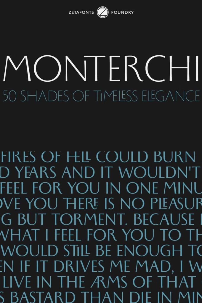
One of Monterchi’s defining characteristics is its extensive collection of 50 weights. This broad system gives designers exceptional control over typography and visual hierarchy. Instead of relying on a single serif style, designers can move between subtle, delicate weights and stronger, more commanding styles while keeping the entire project visually consistent.
Lighter weights can introduce an elegant and refined atmosphere to editorial layouts, captions, invitations, and supporting information. Medium styles can create comfortable reading experiences, while heavier weights can establish powerful headlines, logos, posters, and prominent brand statements.
The large number of available weights also makes Monterchi useful for complete identity systems. Designers can select different weights for headlines, subheadings, body text, navigation, packaging, and promotional materials while maintaining a recognizable typographic language throughout the project.
Elegant Alternates for Distinctive Typography
Monterchi goes beyond its standard character set by offering elegant alternates that provide additional creative possibilities. These alternate glyphs allow designers to customize selected letterforms and create typography with a more individual personality.
Alternates become especially valuable in logos, headlines, titles, covers, and display compositions. A carefully selected alternate can transform an otherwise familiar word into a distinctive typographic statement. Designers can experiment with different combinations to create compositions that feel refined, artistic, and memorable.
Expressive Ligatures Add Character
The family also includes quirky ligatures that introduce unexpected connections between characters. These details add rhythm and personality while maintaining the sophisticated foundation of the typeface.
Ligatures work particularly well in large display typography, branding, editorial headlines, posters, packaging, and invitations. Designers can use them selectively to create visual surprises without compromising the overall clarity of the text. This combination of controlled structure and expressive detail gives Monterchi a distinctive edge.
Monterchi for Editorial Design
Editorial design represents one of the strongest applications for Monterchi. Its classical serif structure creates a polished foundation for magazines, books, newspapers, art catalogs, cultural publications, and premium editorial layouts.
Designers can use lighter weights for sophisticated body copy and supporting information, then introduce stronger weights for headlines and section titles. Alternates and ligatures can add additional personality to covers, feature stories, pull quotes, and prominent editorial elements.
The result is a cohesive typographic system that can create hierarchy without relying on multiple unrelated typefaces. Monterchi allows designers to keep the visual identity consistent while introducing enough variation to maintain reader interest.
Branding and Logo Design
Monterchi also provides a strong foundation for branding projects. Its Renaissance-inspired character can help brands communicate sophistication, heritage, craftsmanship, culture, and quality. At the same time, its extensive weight range keeps the identity flexible enough for contemporary applications.
Use bold or expressive weights to build memorable wordmarks and logos. Combine them with lighter styles for brand guidelines, stationery, websites, packaging, and marketing materials. The alternates and ligatures can further personalize a logo and create a signature visual detail that distinguishes the brand from competitors.
Signage and Wayfinding Applications
The versatility of Monterchi extends into signage and wayfinding design. These applications demand strong hierarchy, consistency, and clarity. The extensive weight system helps designers establish different levels of information while maintaining a unified appearance.
Large, stronger styles can identify important destinations, entrances, buildings, and primary directions. Lighter or medium weights can support secondary information, descriptions, and additional navigation details. This flexibility makes the family useful for museums, cultural institutions, galleries, hospitality environments, exhibitions, and architectural spaces.
Perfect for Cultural and Premium Projects
Monterchi naturally fits projects that value artistic heritage and refined presentation. Its connection to Renaissance history makes it especially appropriate for museums, galleries, art publications, historical institutions, cultural campaigns, and exhibition identities.
However, the typeface does not limit itself to historical projects. Its contemporary system also supports fashion branding, luxury packaging, creative agencies, premium products, lifestyle publications, websites, posters, invitations, and sophisticated advertising campaigns.
Key Design Applications
- Editorial and magazine design
- Book covers and publishing
- Luxury and premium branding
- Logo and wordmark design
- Museum and gallery identities
- Art and cultural publications
- Packaging and product design
- Posters and advertising campaigns
- Signage and wayfinding systems
- Exhibition and event graphics
- Fashion and lifestyle branding
- Websites and digital editorial design
- Stationery and corporate identities
- Invitations and premium print materials
Why Choose the Monterchi Font?
Monterchi offers a rare combination of historical inspiration, typographic depth, and modern functionality. Its 50-weight system gives designers extensive control over hierarchy, while its elegant alternates and distinctive ligatures provide opportunities for more expressive compositions.
The font also carries a meaningful story. Its connection to Piero della Francesca’s Renaissance fresco gives the typeface a cultural foundation that goes beyond visual appearance. Designers can use that heritage to create identities that feel considered, authentic, and visually sophisticated.
At the same time, Monterchi remains practical. Its wide selection of weights and design options allows it to perform across multiple formats and communication environments. From a small editorial caption to a large architectural sign, the family gives designers the flexibility to maintain a coherent visual language.
Bring Renaissance Elegance into Modern Design
Monterchi transforms the visual spirit of Italian Renaissance typography into a flexible contemporary font family. Inspired by the history of Piero della Francesca’s famous fresco in Monterchi and developed through a modern branding project, the typeface connects centuries of artistic tradition with the needs of today’s designers.
Its 50 weights, classical Roman letterforms, elegant alternates, and quirky ligatures create a powerful toolkit for professional typography. Designers can build restrained editorial layouts, sophisticated identities, memorable logos, expressive posters, effective signage, and detailed wayfinding systems using one cohesive family.
For anyone searching for a Renaissance-inspired serif font that combines history, elegance, versatility, and modern functionality, Monterchi offers a compelling typographic solution. It preserves the spirit of classical letterforms while giving contemporary designers the freedom to create typography that feels distinctive, polished, and purposeful.