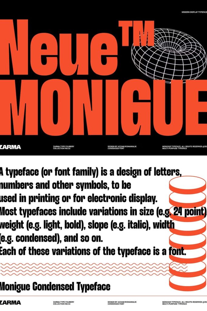
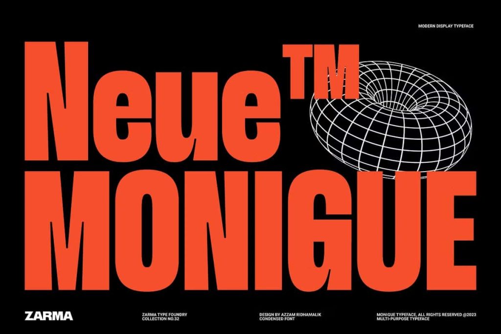
Monigue: A Bold Condensed Sans Serif Font That Makes a Statement
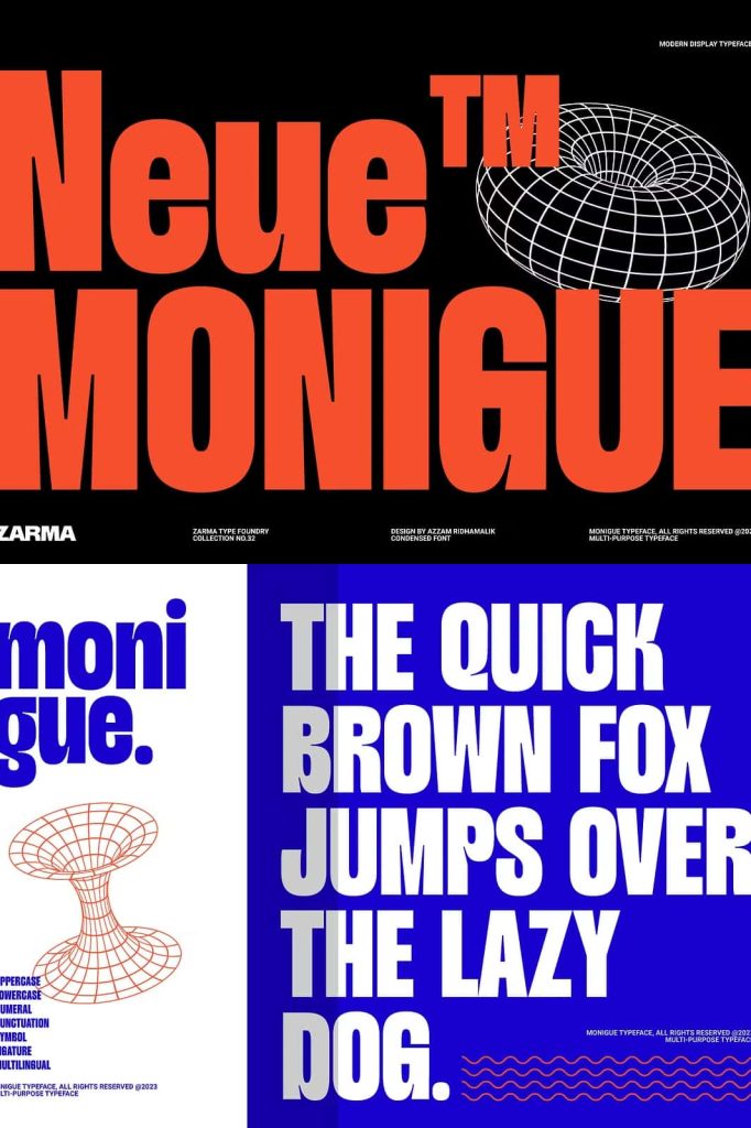
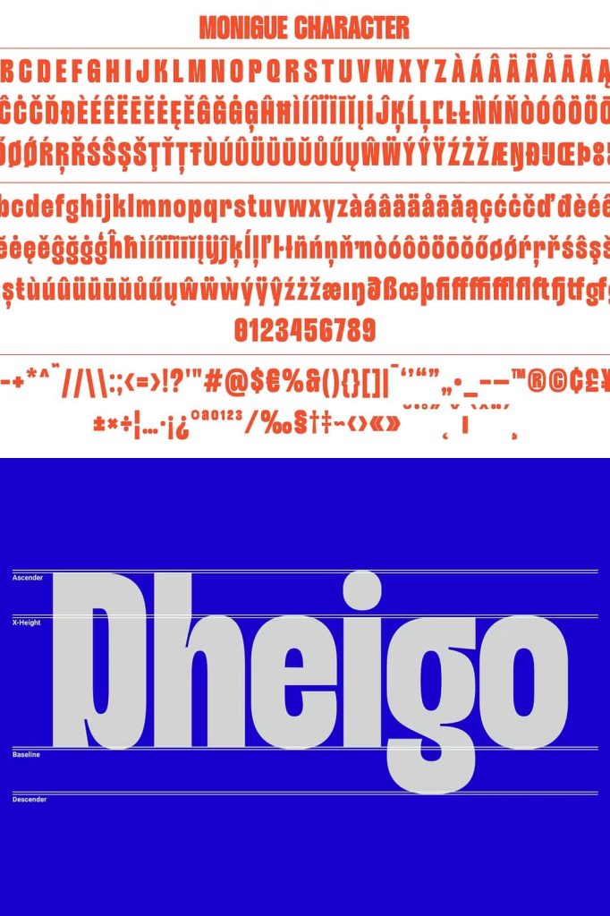
Monigue is a bold and powerful condensed sans serif font designed to command attention. It channels the sleek, confident energy of early 2000s modern design and reintroduces that iconic aesthetic with a sharper, more refined edge. Every letterform stands tall, tight, and assertive, helping your message cut through visual noise.
This typeface does not whisper. It speaks clearly and confidently. With its narrow proportions and strong vertical presence, Monigue maximizes impact while conserving space. Whether you design posters, website headers, or digital interfaces, this condensed sans serif font delivers intensity, clarity, and contemporary style.
Inspired by 2000s Modern Design
Monigue draws direct inspiration from the bold graphic trends of the 2000s. During that era, designers embraced sharp typography, compact layouts, and striking headline treatments. Monigue revives that spirit while refining it for today’s creative standards.
The font captures the sleek minimalism and urban sophistication that defined modern branding in the early digital age. However, it avoids outdated details. Instead, it integrates clean lines, balanced geometry, and polished curves that feel relevant in current design environments.
A Fresh Twist on a Recognizable Aesthetic
While Monigue echoes the visual confidence of the 2000s, it introduces subtle refinements that enhance usability and versatility. The spacing feels intentional and controlled. The curves appear smooth and deliberate. Each character maintains structural consistency without sacrificing personality.
This balance between nostalgia and innovation allows you to create designs that feel both familiar and forward-thinking.
Condensed Form for Maximum Visual Impact
The condensed structure defines Monigue’s strongest advantage. Its narrow letterforms allow you to fit more text into limited spaces without compromising readability. This makes it an ideal solution for bold headlines, impactful posters, and attention-grabbing banners.
The tall vertical proportions create a commanding presence. Words appear strong and confident, especially when set in uppercase. This vertical emphasis directs the viewer’s eye upward, reinforcing a sense of energy and movement.
Strong Strokes and Bold Personality
Monigue features bold strokes that enhance legibility and create dramatic contrast against lighter backgrounds. The weight distribution remains consistent, giving the typeface a solid and grounded feel.
Designers can rely on this bold structure to anchor layouts. Whether placed over photography or clean negative space, Monigue maintains clarity and dominance.
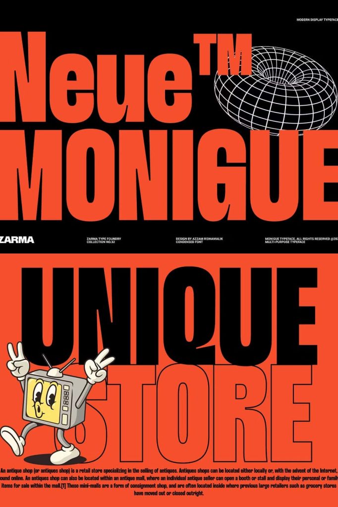
Perfect for Posters and Large-Scale Graphics
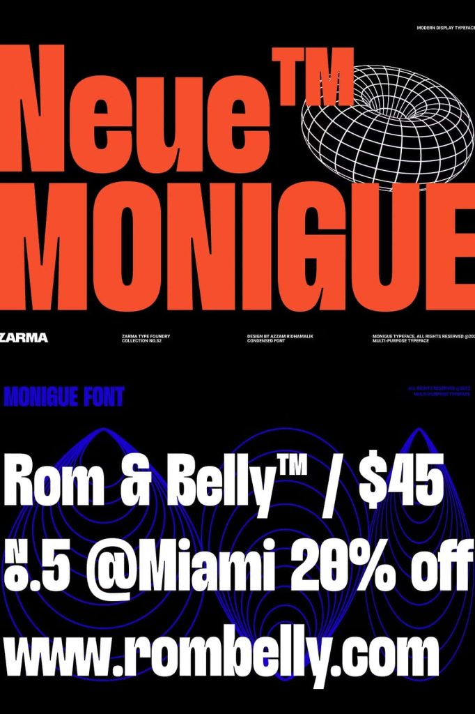
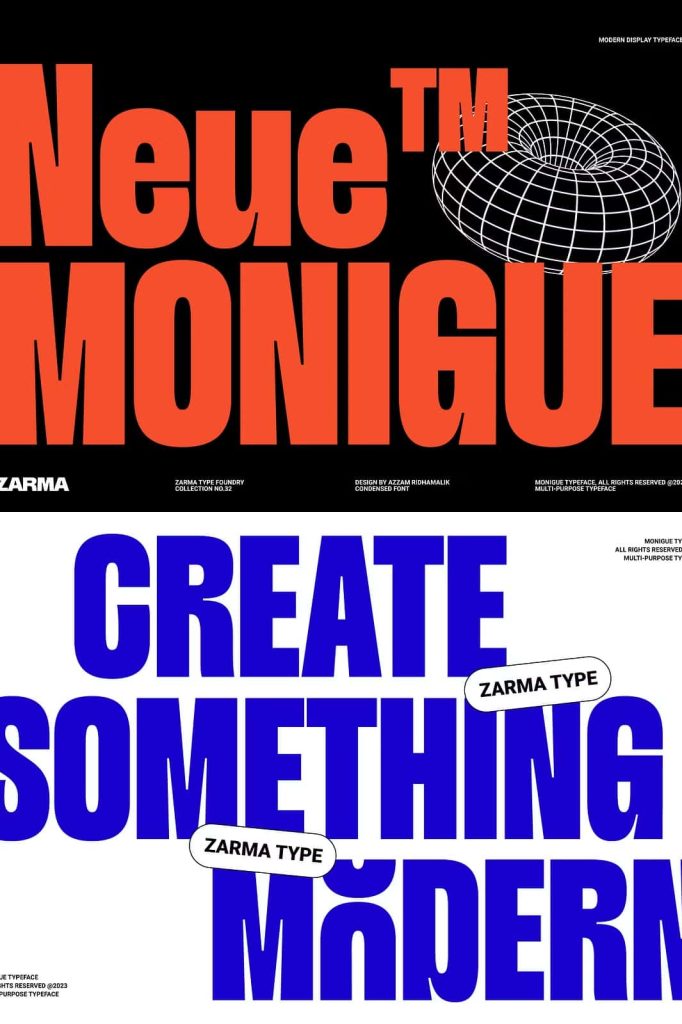
Monigue thrives in large formats. Use it for concert posters, promotional graphics, event banners, and campaign visuals that demand immediate attention. The condensed design allows dramatic typographic treatments without overwhelming the composition.
Its bold presence ensures that key messages remain readable from a distance. This makes it especially effective in advertising environments where impact and speed matter.
Captivating Website Headlines
In digital spaces, first impressions happen instantly. Monigue helps you create website headlines that grab attention and communicate authority. The clean sans serif structure ensures excellent screen readability, even on high-resolution displays.
Pair Monigue with lighter body text fonts to create contrast and hierarchy. Let it dominate hero sections, landing page banners, and call-to-action statements.
Sleek Interface and Branding Applications
Monigue adapts seamlessly to modern interface design. Its condensed form allows designers to maintain strong typographic hierarchy in limited UI space. Navigation labels, feature headings, and dashboard titles all benefit from its compact clarity.
For branding projects, Monigue offers a distinctive and assertive tone. It works exceptionally well for fashion labels, tech startups, lifestyle brands, and creative agencies that want to project bold confidence.
Versatile Across Print and Digital Media
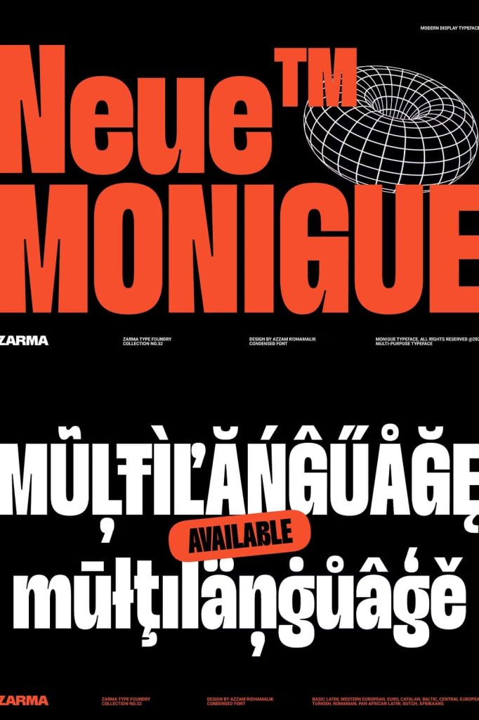
Monigue performs consistently across print and digital platforms. In print, it delivers crisp edges and strong contrast. In digital environments, it renders cleanly and maintains visual integrity at multiple sizes.
Use it for:
- Posters and event graphics
- Website hero headlines
- Interface design and app layouts
- Branding and logo concepts
- Editorial cover titles
- Social media campaign visuals
Why Choose Monigue?
Monigue gives designers the tools to create bold and structured typography with modern confidence. It offers:
- A condensed sans serif design for space efficiency
- Strong vertical proportions for visual dominance
- Bold strokes that enhance readability
- Inspiration from iconic 2000s modern design
- Versatility for posters, websites, and interfaces
If you want typography that stands tall, speaks clearly, and reinforces your design message with authority, Monigue delivers. This condensed sans serif font transforms ordinary layouts into striking visual statements, helping your projects capture attention and leave a lasting impression.