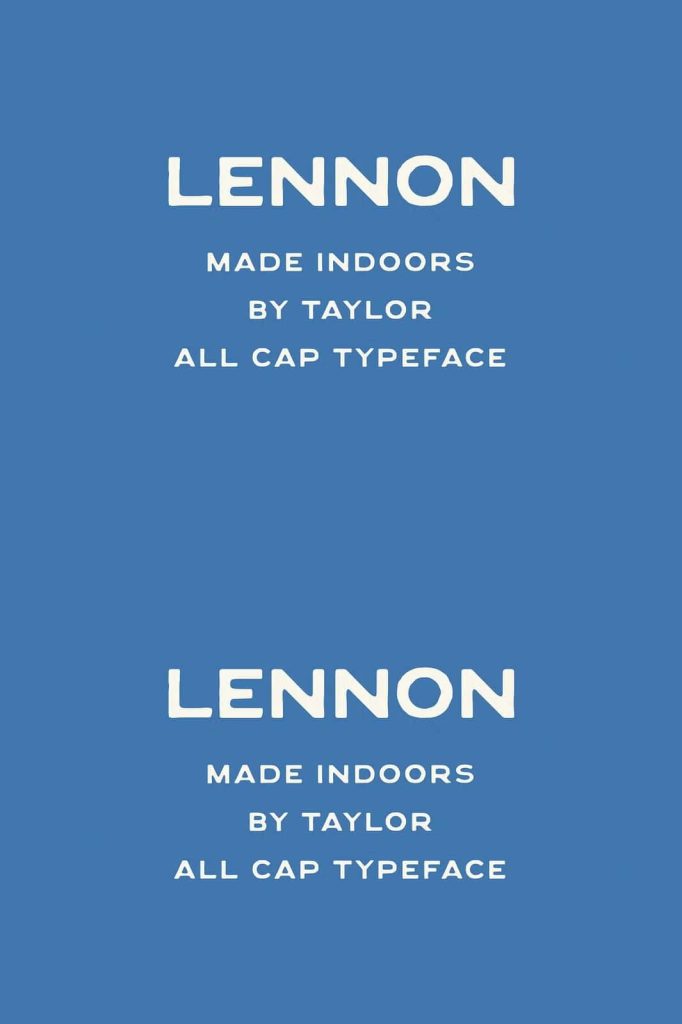
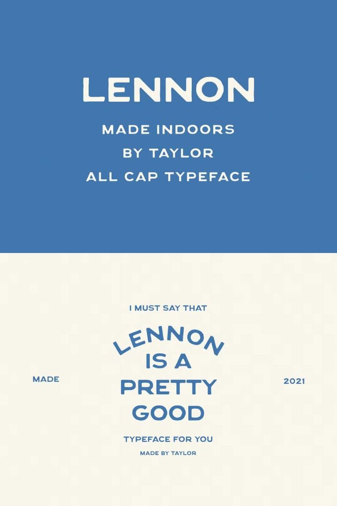
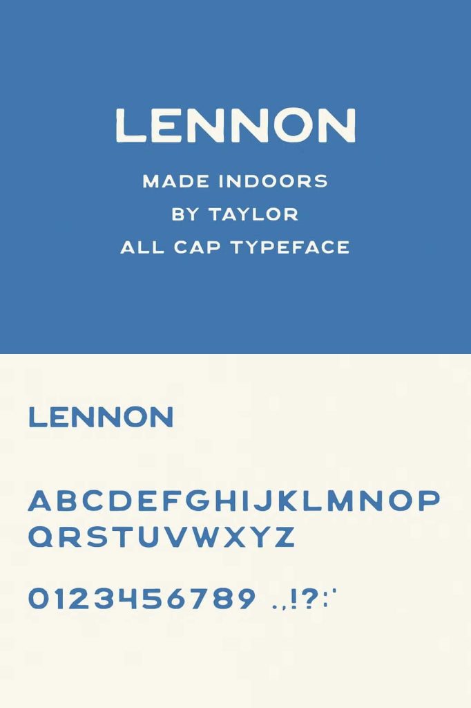
Lennon: A Present Day Take on Vintage Packaging Lettering
Lennon is a vintage display font that reimagines classic packaging lettering with a modern perspective. It draws inspiration from old product labels and retro branding while introducing refined structure and contemporary balance. The result feels nostalgic yet fresh, bold yet approachable.
This display typeface captures the spirit of handcrafted packaging from decades past. At the same time, it adapts seamlessly to modern design standards. If you want to infuse your project with character, warmth, and retro influence, Lennon delivers with confidence.
Inspired by Vintage Packaging Design
Lennon takes cues from lettering styles commonly found on classic tins, bottles, and boxed goods. These historic designs often featured bold, friendly letterforms that stood out clearly on shelves. Lennon channels that same shelf presence and transforms it into a versatile display font for today’s designers.
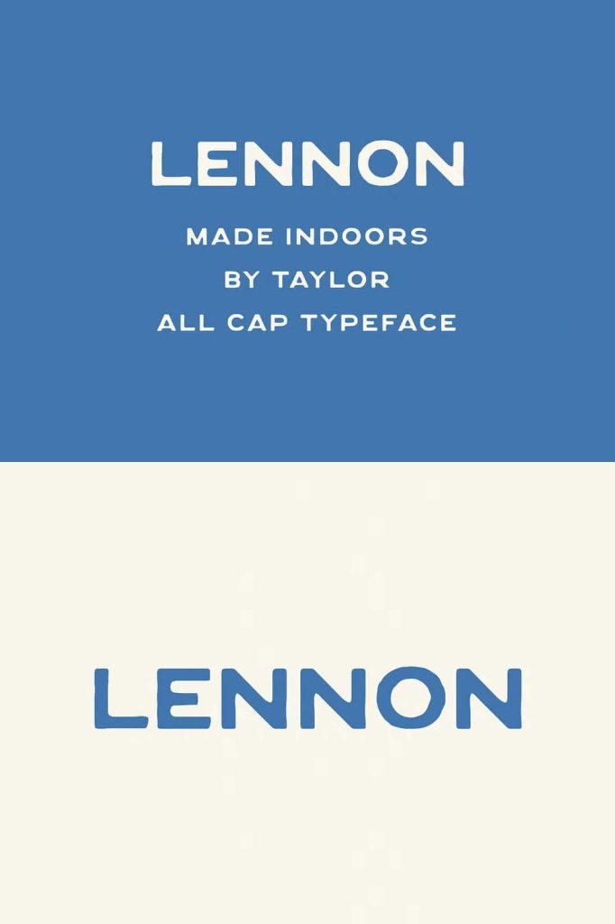
The font emphasizes strong shapes and confident proportions. Its wide letter format creates a powerful horizontal flow that commands attention in headlines and logos. This structure makes Lennon especially effective for branding and packaging design where impact matters most.
Rounded Edges with Retro Charm
One of Lennon’s defining characteristics is its rounded edges. Instead of sharp corners, the letterforms curve smoothly, creating a friendly and approachable tone. These softened edges echo vintage print techniques and worn packaging surfaces.
The rounded forms prevent the font from feeling rigid or mechanical. They add warmth and personality, making the typography feel welcoming and expressive. This balance helps Lennon stand out without overwhelming the layout.
Embracing Imperfections for Authenticity
Lennon celebrates subtle imperfections. Slight irregularities in shape and alignment give the font a handcrafted feel. These details mimic the natural inconsistencies found in traditional printing and sign painting.
Rather than striving for perfect geometric precision, Lennon introduces character through texture and variation. This design approach adds authenticity and visual depth. It makes your typography feel intentional and full of personality.
Wide Letter Format for Bold Statements
The wide letter format enhances Lennon’s display strength. Each character stretches horizontally, creating a strong visual rhythm across words. This expanded width increases readability in large-scale applications and amplifies impact in branding contexts.
Wide lettering works especially well for product names, logo types, and packaging titles. It creates a solid foundation for layered compositions and retro-inspired layouts.
Perfect for Packaging and Branding Projects
Lennon excels in packaging design. Its vintage influence naturally complements product labels, food packaging, beverage branding, and artisan goods. The bold shapes and friendly curves help products stand out on shelves and digital marketplaces alike.
Designers can use Lennon for:
- Product packaging titles
- Retro-inspired brand logos
- Headline typography for posters
- Editorial covers and magazine titles
- Merchandise and apparel graphics
- Signage and promotional materials
Its distinctive personality strengthens brand recognition and communicates heritage with confidence.
Modern Versatility with Retro Personality
Although Lennon draws inspiration from vintage packaging, it performs exceptionally well in contemporary design environments. Pair it with minimalist layouts to create striking contrast. Combine it with textured backgrounds to amplify its retro charm.
The font adapts easily to bold color palettes, muted earth tones, or monochrome branding systems. This versatility allows designers to experiment with style while maintaining cohesive visual identity.
Create Strong Visual Hierarchy
Lennon’s bold display structure naturally supports clear visual hierarchy. Use it for primary headlines to establish focus. Pair it with a clean sans-serif or simple serif font for supporting text. This combination keeps body content readable while allowing Lennon to shine as the main attraction.
The rounded edges and wide forms maintain clarity even at larger scales, ensuring that your message remains strong and legible.
Why Choose Lennon for Your Next Design?
Lennon offers a powerful blend of nostalgia and modern design sensibility. It channels the charm of vintage packaging lettering while delivering the clarity and balance required in present-day typography. Its rounded edges, subtle imperfections, and wide letterforms create a memorable visual presence.
Choose Lennon when you want to:
- Capture authentic retro packaging aesthetics
- Create bold and friendly display typography
- Design standout product branding
- Add warmth and character to headlines
- Blend vintage inspiration with modern execution
Lennon transforms simple words into expressive design elements. Its present day interpretation of vintage lettering helps brands tell stories rooted in tradition while remaining relevant and impactful. When you want typography that feels timeless, bold, and full of character, Lennon delivers a distinctive solution that elevates your creative vision.