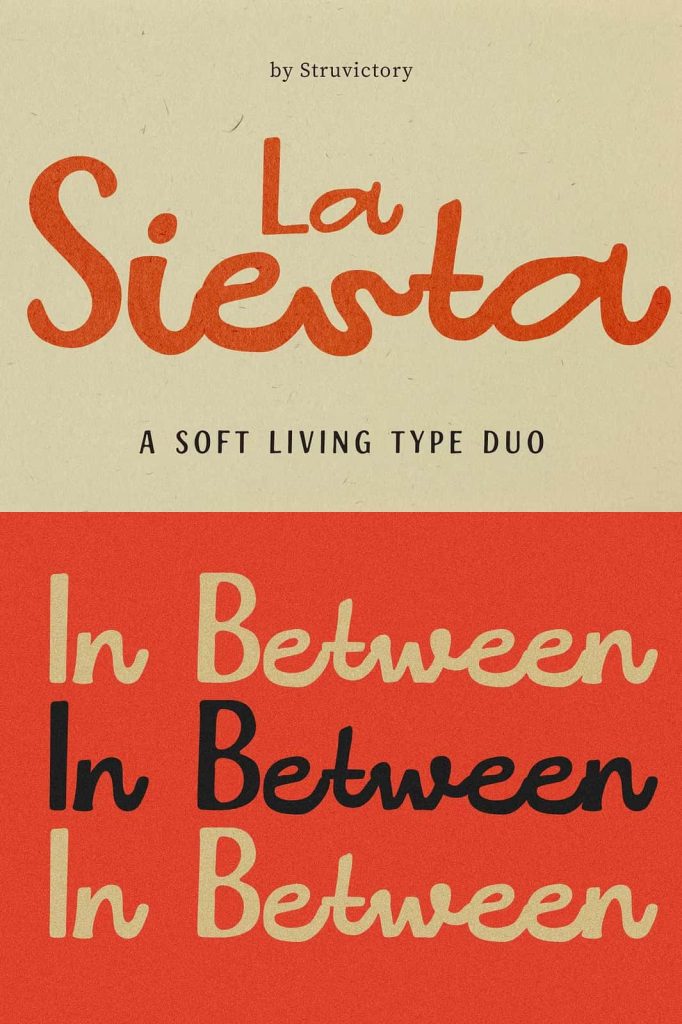
La Siesta Type Duo Font: Bold Structure Meets Effortless Script
La Siesta is a contemporary type duo that brings together two distinct styles into one cohesive and highly functional design system. It pairs confident uppercase lettering with a relaxed handwritten lowercase, creating a dynamic balance between strength and softness. This combination allows designers to build typography that feels structured yet approachable, making La Siesta a powerful choice for modern creative work.
The font does not simply combine two styles—it carefully integrates them into a seamless rhythm. The bold uppercase letters establish clarity and authority, while the handwritten lowercase introduces warmth and personality. This interplay creates a natural visual flow that enhances readability and elevates the overall aesthetic of any design.
A Unique Blend of Structure and Softness
La Siesta stands out because it merges two contrasting typographic approaches into a unified system. The uppercase characters feature strong, confident forms that command attention and provide a solid foundation. These bold shapes ensure that headlines and key elements remain clear and impactful.
In contrast, the lowercase characters adopt a handwritten style that feels effortless and organic. This softer approach adds a human touch, making the font feel more inviting and expressive. The combination of these elements allows designers to create compositions that balance professionalism with creativity.
This duality makes La Siesta highly adaptable. Designers can use uppercase text for emphasis and structure, while the lowercase script introduces variation and visual interest. The result is a flexible typographic system that supports a wide range of creative directions.
Designed for Modern Branding and Visual Identity
La Siesta performs exceptionally well in branding projects, where a strong and consistent identity is essential. Its combination of bold and handwritten styles allows brands to communicate both confidence and approachability. This makes it ideal for businesses that want to appear modern, stylish, and relatable.
In logo design, La Siesta provides a unique opportunity to create distinctive and memorable marks. Designers can mix uppercase and lowercase elements to achieve a balanced composition that stands out. The font’s versatility ensures that logos remain effective across different platforms and formats.
Create Natural Flow with Contrasting Styles
The contrast between the structured uppercase and the relaxed lowercase creates a natural flow that guides the viewer’s eye. This rhythm enhances readability and makes text feel more engaging. Designers can use this feature to build layouts that feel dynamic without becoming overwhelming.
The smooth interaction between the two styles allows for creative experimentation. Whether used in headlines, taglines, or supporting text, La Siesta maintains a cohesive look while offering enough variation to keep designs visually interesting.
Perfect for Packaging, Social Media, and Editorial Design
La Siesta adapts seamlessly to packaging design, where visual impact and clarity play a crucial role. Its bold uppercase letters help products stand out, while the handwritten lowercase adds a personal and inviting touch. This combination enhances product presentation and strengthens brand identity.
On social media, La Siesta helps content capture attention in crowded digital spaces. Its stylish and modern appearance makes posts feel fresh and engaging. Designers can use it for quotes, promotional graphics, and branding elements that require both clarity and personality.
In editorial design, La Siesta supports both expressive headlines and readable text. Its dual nature allows designers to create layouts that feel organized yet creative. Whether used in magazines, blogs, or digital publications, the font enhances the reading experience by combining structure with visual interest.
Ideal for Storefronts and Visual Displays
La Siesta also performs well in physical design applications such as storefronts and signage. Its bold uppercase ensures visibility from a distance, while the handwritten lowercase adds character and charm. This makes it an excellent choice for businesses that want to create a welcoming and stylish environment.
The font’s versatility allows it to adapt to different scales and contexts, ensuring consistent performance across various applications. Designers can rely on La Siesta to deliver both impact and readability in real-world settings.
Elevate Your Designs with La Siesta
La Siesta empowers designers to create work that feels balanced, expressive, and modern. Its combination of strong structure and soft script provides a unique typographic voice that stands out in any project. By using this type duo, designers can build compositions that communicate clearly while maintaining a distinct and engaging style.
This font goes beyond simple typography—it becomes a creative system that supports experimentation and innovation. With its versatility and refined design, La Siesta offers a reliable solution for projects that demand both functionality and visual appeal. It transforms text into a cohesive and memorable element, helping designs leave a lasting impression.