Larose Sans Font: An Elegant Modern Sans Serif Typeface
Larose Sans is an elegant modern sans serif font designed for creatives who want to combine clean typography with distinctive visual details. Its minimalistic construction gives designers a polished foundation for contemporary projects, while its extensive collection of stylistic alternates adds personality and creative flexibility.
Clean, versatile, and refined, Larose Sans works beautifully across a wide range of design applications. Use it to create memorable logos, strong headlines, modern posters, sophisticated packaging, social media graphics, editorial layouts, branding materials, and more. Its simple appearance allows your message to remain clear while its alternative characters give you the freedom to customize individual words and create a more unique typographic identity.
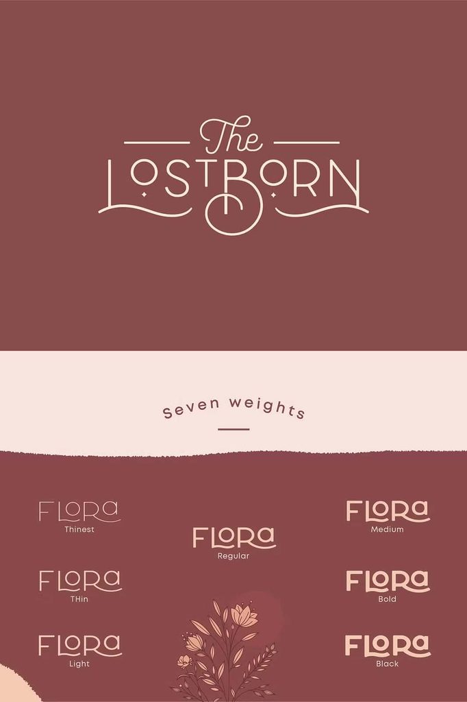
Larose Sans includes three different weights, allowing designers to build visual hierarchy and contrast within a cohesive type family. Move between lighter and heavier styles to emphasize important information, establish headlines, or create balanced compositions. With multiple weights and stylistic alternates working together, Larose Sans gives you plenty of room to experiment and develop fresh visual solutions.
A Clean and Contemporary Sans Serif
Larose Sans embraces the simplicity of modern sans serif typography. Its clean letterforms create an organized appearance that works naturally in both professional and creative environments. The minimalistic design keeps attention focused on the content while providing enough character to prevent the typography from feeling ordinary.
This balance makes Larose Sans a dependable choice for designers who want a contemporary aesthetic without unnecessary decoration. The typeface can communicate sophistication, clarity, confidence, and modernity through its straightforward forms.
Use Larose Sans on its own when you want a consistent and minimalist design system. Its clean construction can carry an entire visual identity, from a simple wordmark to a complete set of marketing materials.
Three Weights for Greater Design Flexibility
Larose Sans provides three weights that allow you to create contrast and hierarchy without leaving the type family. Each weight contributes a different level of visual emphasis, making it easier to organize information and guide the viewer’s attention.
Use lighter styles for elegant supporting text, captions, secondary information, or spacious layouts. Choose a stronger weight for headlines, brand names, product titles, and prominent statements. By combining different weights, you can create depth and structure while maintaining a unified typographic appearance.
Build a Strong Typographic Hierarchy
A clear hierarchy helps audiences understand your design quickly. Larose Sans makes this process simple by giving you multiple weights within the same visual language. Assign different weights to headlines, subheadings, descriptions, and supporting information to create an organized composition.
You can also create contrast by combining weight with size and spacing. A large, bold headline paired with a lighter supporting line can create a strong focal point without adding unnecessary decorative elements.
Explore Stylish Alternates
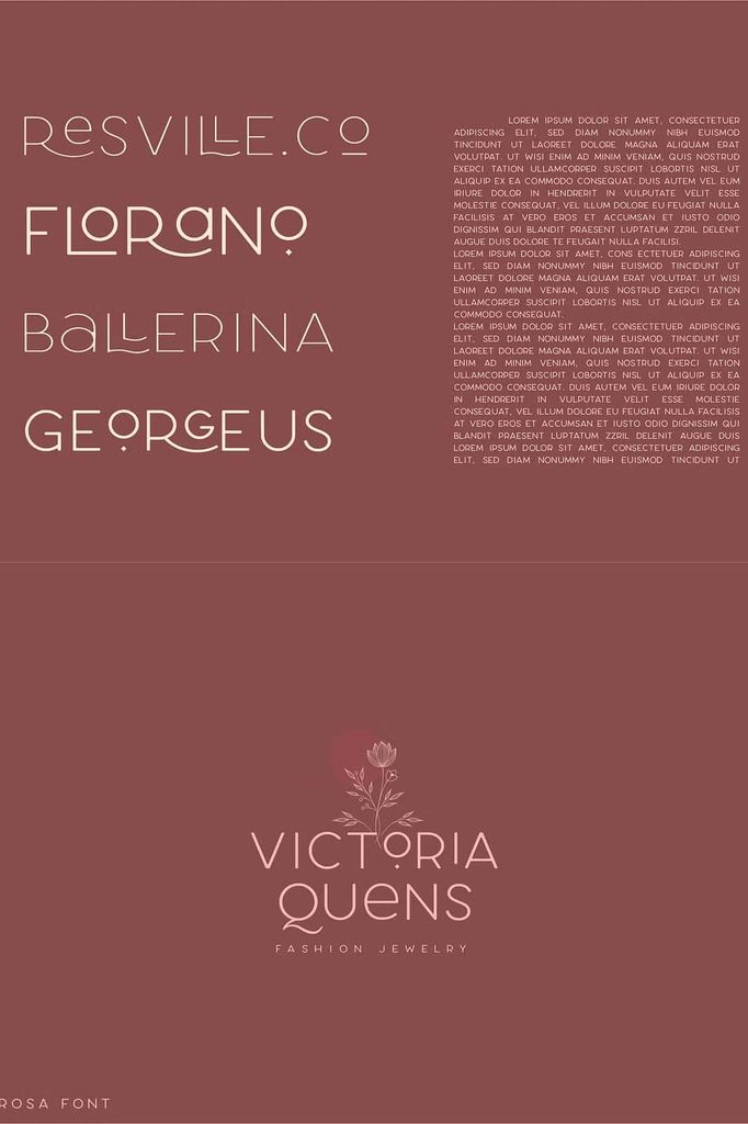
One of the most exciting features of Larose Sans is its collection of stylistic alternates. These alternate characters allow designers to customize the appearance of selected letters and create typography that feels more individual.
Instead of using the same letterform every time, experiment with alternative glyphs to discover combinations that suit your project. This feature can help transform a familiar word into a distinctive logo or headline.
Stylistic alternates are especially valuable for branding because they allow designers to introduce subtle differences without abandoning the core character of the typeface. Use them strategically to create memorable wordmarks, unique titles, and custom-looking compositions.
Create Unique Logos and Wordmarks
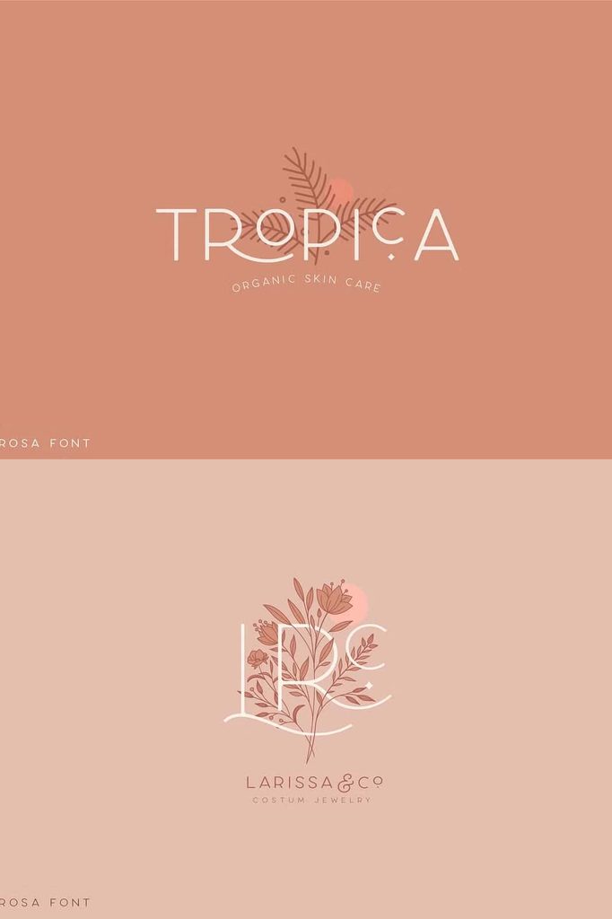
Larose Sans can provide a strong foundation for logo design. Start with its clean standard characters, then explore the available alternates to find a combination that gives your brand name a more distinctive appearance.
This approach can make a simple typographic logo feel custom-designed. Experiment with letter combinations, spacing, weight, and alignment to develop a visual identity that reflects your brand’s personality.
Perfect for Modern Branding
Larose Sans performs particularly well in contemporary branding projects. Its clean forms communicate professionalism and clarity, while the stylistic alternates provide enough personality to help a brand stand out.
Use the font for logos, business cards, packaging, websites, promotional materials, signage, social media templates, presentations, and advertising campaigns. The three weights also help you maintain consistency across different brand touchpoints.
Larose Sans can suit a wide variety of industries, including fashion, beauty, technology, creative services, architecture, lifestyle, retail, hospitality, and modern consumer brands. Its adaptable personality allows you to shape the overall mood through layout, color, imagery, and supporting typography.
Larose Sans for Headlines and Posters
Strong headlines need typography that communicates quickly. Larose Sans gives designers clean, confident letterforms that work particularly well at larger sizes.
Use the font for poster titles, event announcements, advertising campaigns, magazine covers, promotional graphics, and large display typography. Experiment with oversized lettering, tight or generous spacing, and contrasting weights to create different visual effects.
The stylistic alternates can add an extra layer of individuality to important words. Use them selectively within headlines to create a subtle custom-lettered appearance.
Modern Packaging Design
Packaging needs to communicate information while also establishing a strong visual identity. Larose Sans can help brands create clean and contemporary packaging that feels organized and sophisticated.
Use heavier weights for product names and key messages, then introduce lighter styles for descriptions, ingredients, specifications, or supporting details. The consistent family structure keeps the package visually cohesive.
Stylistic alternates can also help emphasize a product name or collection title. When used carefully, these alternate characters can create a memorable typographic signature without making the packaging feel overly complicated.
Versatile Applications for Larose Sans
Larose Sans offers enough flexibility to support a wide range of creative projects. Consider using the font for:
- Logo and wordmark design
- Brand identity systems
- Packaging design
- Posters and advertisements
- Magazine and editorial headlines
- Website headers
- Social media graphics
- Business cards and stationery
- Product labels
- Event branding
- Signage and promotional displays
- Fashion branding
- Creative agency projects
- Presentation design
- Digital marketing materials
Use Larose Sans on Its Own
Larose Sans does not need elaborate typography combinations to make an impact. Its clean and minimalistic construction allows it to perform effectively as a standalone typeface.
Create an entire visual identity using the three available weights. Use one style for major headlines, another for supporting headings, and a lighter option for secondary information. This approach creates a professional and cohesive design system without introducing unnecessary fonts.
For minimalist branding, pair the typeface with generous whitespace and simple graphic elements. Let the typography become the primary visual feature and allow its proportions and alternate characters to provide the personality.
Pair Larose Sans with Other Typefaces
Although Larose Sans works beautifully on its own, you can also combine it with other fonts to create additional contrast. Pair it with an elegant serif for a sophisticated editorial appearance or use it alongside a script font for a more expressive branding system.
The key is to let Larose Sans provide structure while the complementary typeface introduces a different visual voice. Use the weights strategically to maintain hierarchy and prevent the composition from becoming visually crowded.
Design Without Limits
Larose Sans encourages experimentation. Its clean foundation gives you the freedom to explore different layouts, while its stylistic alternates allow you to customize the smallest details. Adjust scale, tracking, alignment, and weight to discover new ways to present your message.
Use the font minimally for a refined aesthetic or create bold typographic compositions that make a stronger statement. Its versatility allows the same type family to support both subtle and expressive design approaches.
Why Choose Larose Sans?
Choose Larose Sans Font when you need a modern sans serif that combines simplicity, flexibility, and creative character. Its clean letterforms provide a reliable foundation, while three weights help you establish hierarchy and stylistic alternates let you customize your typography.
The font adapts easily to branding, logos, packaging, posters, headlines, digital content, and many other applications. Its minimalistic appearance keeps designs polished, while its alternative characters give you the tools to create something more distinctive.
Final Thoughts on Larose Sans Font
Larose Sans brings together modern simplicity and creative flexibility in one elegant sans serif family. Its clean construction makes it easy to use across professional and contemporary projects, while its three weights provide the range needed to create strong typographic hierarchy.
The collection of stylistic alternates adds another level of customization, allowing designers to transform standard lettering into more unique and memorable compositions. Use these alternatives to refine logos, emphasize headlines, or give selected words a custom appearance.
From minimalist branding and sophisticated packaging to bold posters, editorial layouts, and digital interfaces, Larose Sans gives you the freedom to explore. Let its clean forms establish the foundation, experiment with its weights and alternates, and create designs that reflect your own creative vision.