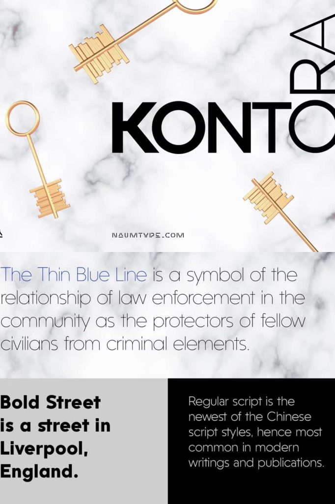
Kontora Font: Modern Minimalism with Retro Constructivist Influence
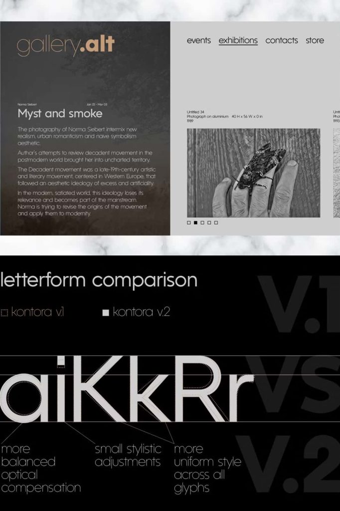
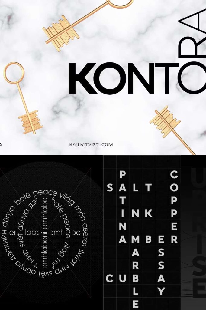
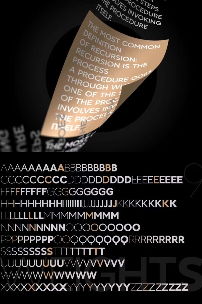
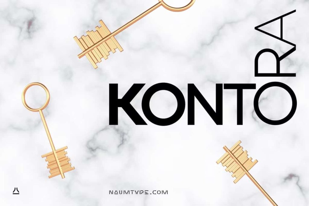
Kontora is a display typeface that confidently blends modern design principles with subtle retro constructivist aesthetics. Built on clean proportions and precise letterforms, this font delivers a strong visual presence without relying on excessive decoration. Its simplicity allows the structure of each character to speak clearly, while its historical influence adds depth, attitude, and a distinctive edge to contemporary design projects.
A Balance Between Modern Design and Retro Character
At its foundation, Kontora embraces modern typographic values. The letterforms feel controlled, intentional, and visually balanced, making the font highly effective in professional and creative environments alike. Instead of relying on ornamental elements, Kontora focuses on proportion, geometry, and spacing to create impact. This approach ensures that the font remains versatile while still commanding attention.
What sets Kontora apart is its subtle nod to retro constructivist aesthetics. Inspired by early 20th-century design movements, the font introduces structural confidence and bold form without appearing dated. The result is a typeface that feels both timeless and contemporary, allowing designers to reference history while staying firmly rooted in modern visual culture.
Strong Letterforms with Minimal Decoration
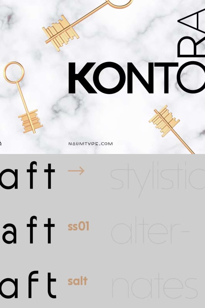
Kontora features a minimal amount of decorative detail, which enhances its clarity and strength. Each character is designed with purpose, avoiding unnecessary flourishes that could distract from the message. This minimal approach allows the font to perform exceptionally well in layouts where hierarchy, readability, and structure matter.
The clean lines and controlled curves create a sense of order and discipline. At the same time, the slightly retro construction introduces personality and confidence. This balance makes Kontora suitable for designers who want to communicate authority, creativity, and modern sensibility in a single typographic voice.
Ideal for Bold and Structured Design Applications
Kontora works especially well in design contexts that require a strong visual foundation. Its modern proportions and retro-inspired construction give it the ability to anchor layouts and define visual identity. The font performs consistently across both digital and print platforms, making it a reliable choice for long-term branding and communication.
Branding and Visual Identity
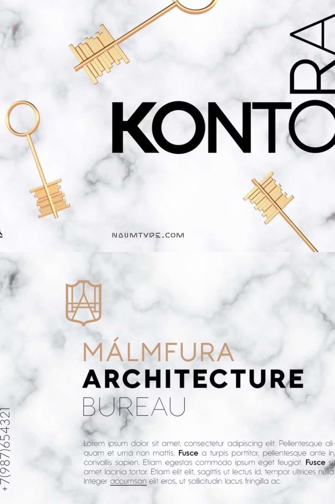
In branding and identity design, Kontora delivers clarity and confidence. Its structured forms help brands establish a strong presence while remaining visually clean and professional. The retro constructivist influence adds character, helping logos, wordmarks, and brand systems feel distinctive without appearing overly stylized.
Posters, Headlines, and Editorial Design
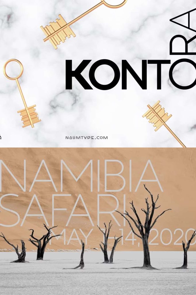
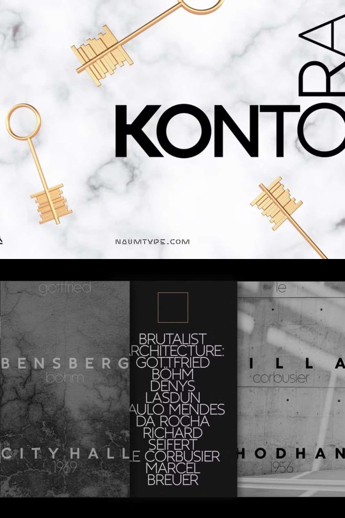
Kontora excels in headlines and large-format typography. The bold proportions and minimal decoration make it ideal for posters, magazine covers, and editorial layouts where impact is essential. The font draws attention quickly while maintaining legibility, allowing designers to communicate messages clearly and efficiently.
Packaging and Product Presentation
For packaging design, Kontora offers a refined yet assertive tone. It helps products stand out through structure and clarity rather than excessive embellishment. This makes it particularly effective for modern, industrial, or concept-driven products that value design integrity and visual discipline.
Retro Constructivist Influence in a Contemporary Context
The constructivist influence in Kontora appears through its geometric logic, strong alignment, and purposeful forms. These characteristics echo classic design movements while adapting seamlessly to modern usage. Designers can use Kontora to evoke progress, structure, and innovation without sacrificing aesthetic relevance.
By referencing retro design philosophies in a restrained way, Kontora avoids nostalgia and instead delivers a fresh interpretation. This approach allows the font to function across a wide range of creative projects, from experimental layouts to corporate communication.
Why Choose Kontora Font
Kontora is an excellent choice for designers who value clarity, structure, and timeless design. Its minimal decoration ensures flexibility, while its modern proportions and retro constructivist roots provide a unique visual identity. The font empowers designers to create work that feels intentional, confident, and visually compelling.
Whether used for branding, editorial design, posters, or packaging, Kontora brings together modern precision and historical inspiration. It is a font that communicates strength through simplicity and creativity through structure, making it a powerful addition to any professional type collection.