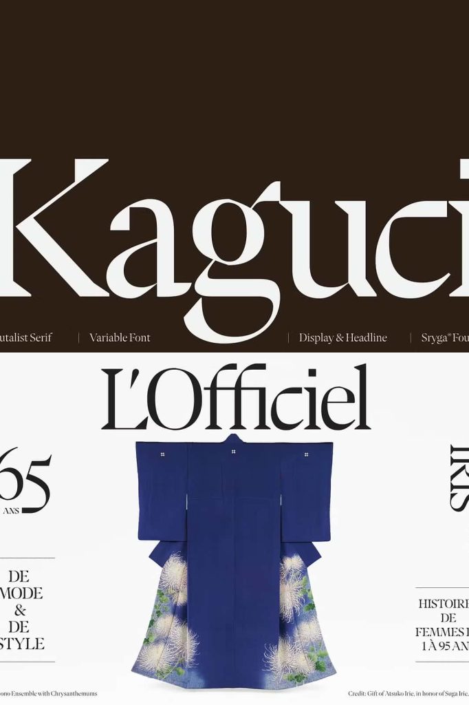
Kaguci Typeface: A Bold Fusion of Heritage and Futurism
Kaguci is not just another typeface; it is a striking visual statement that challenges conventional design boundaries. Born from the fusion of historical elegance and futuristic disruption, Kaguci redefines what a serif font can achieve in the modern digital era. It carries the essence of traditional typography while injecting a bold, experimental glitch aesthetic that pushes it into a new creative dimension.
The Concept Behind Kaguci
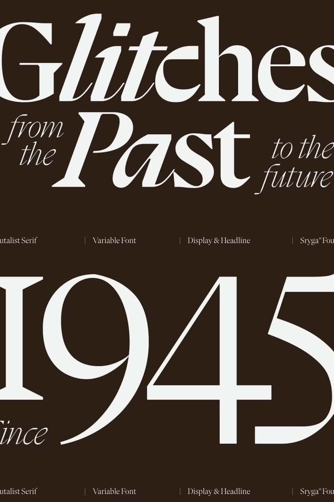
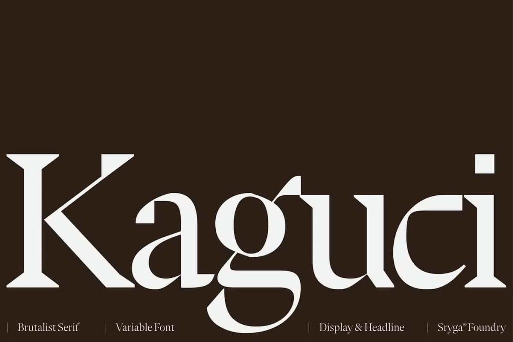
Kaguci draws deep inspiration from classic serif typefaces that have long symbolized refinement, authority, and timeless beauty. However, instead of preserving this tradition in its purest form, Kaguci intentionally disrupts it. The design introduces digital distortions, fragmented edges, and unexpected visual breaks that mimic the imperfections of a glitching system.
This deliberate contrast creates a compelling tension between past and future. On one side, you see the familiar structure of heritage typography. On the other, you experience a bold transformation driven by digital experimentation and brutalist design principles. Kaguci thrives in this intersection, making it both nostalgic and forward-thinking.
Aesthetic Characteristics
Traditional Serif Foundations
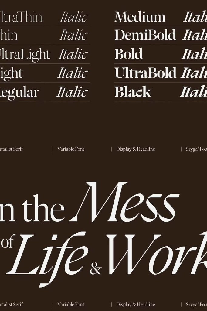
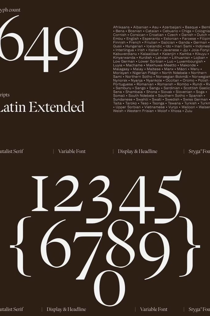
At its core, Kaguci maintains the recognizable anatomy of a serif typeface. The letterforms exhibit structured strokes, balanced proportions, and a sense of typographic discipline. These features ensure readability while grounding the font in a historical context.
Futuristic Glitch Elements
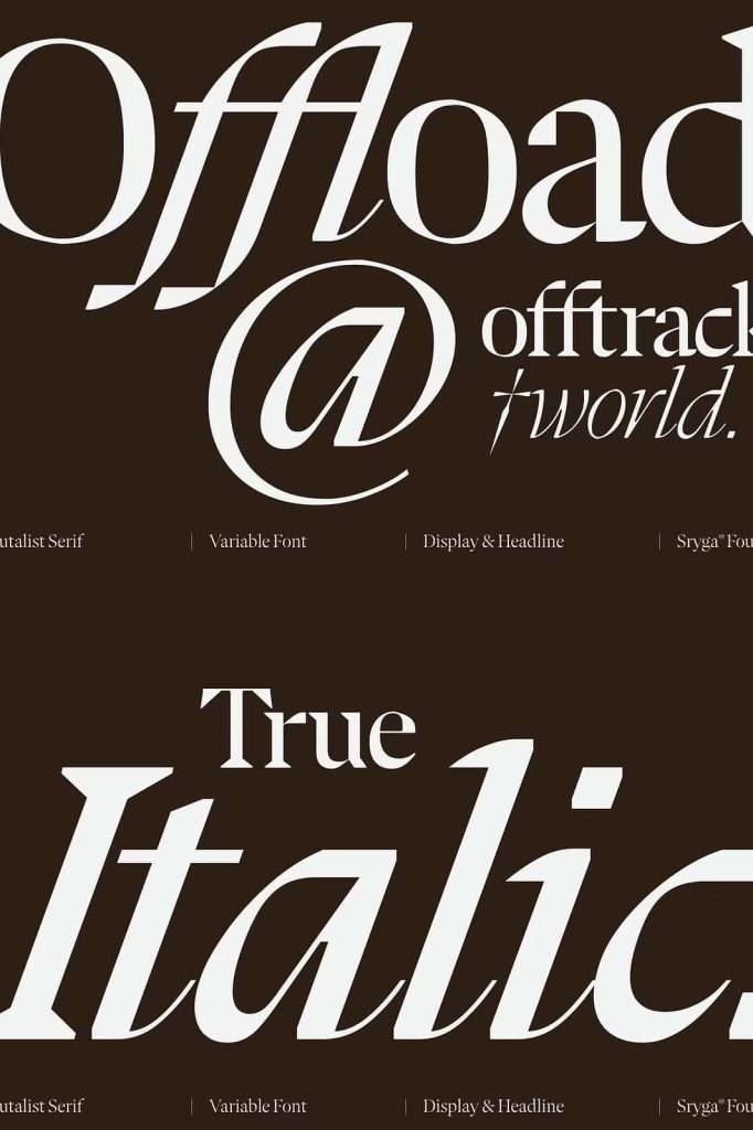
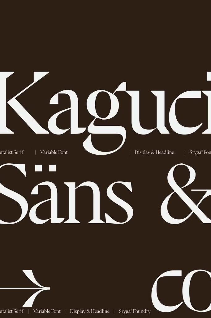
What sets Kaguci apart is its disruptive detailing. Glitch effects appear as intentional distortions—broken lines, asymmetrical cuts, and digital noise embedded within the characters. These elements give the typeface a raw, experimental edge that reflects modern digital culture.
Brutalist Influence
Kaguci embraces a brutalist approach by rejecting overly polished aesthetics. Instead, it highlights imperfection and visual tension. This makes the font feel bold, unapologetic, and highly expressive, perfect for designers who want to break away from conventional design norms.
Best Use Cases for Kaguci
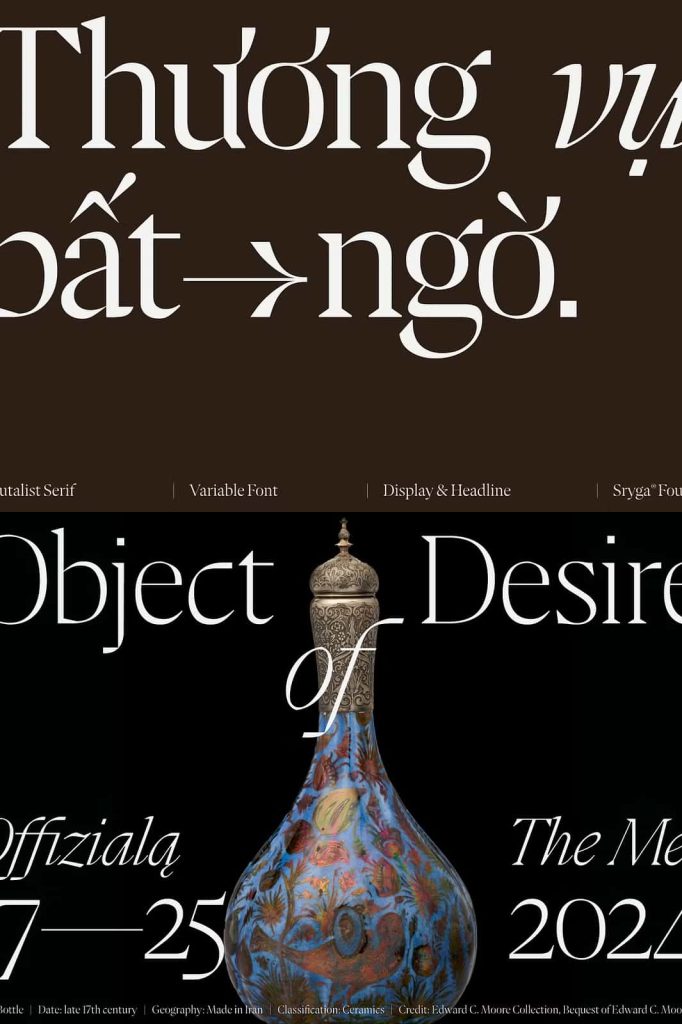
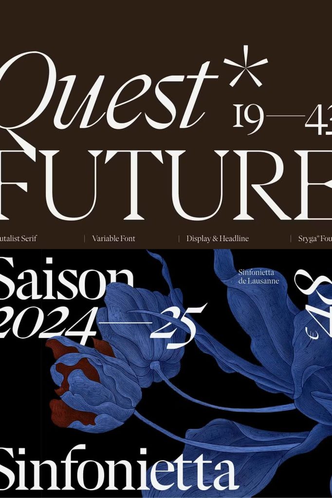
Kaguci performs exceptionally well in projects that demand attention and originality. Its distinctive style makes it ideal for:
- Editorial headlines that require a strong visual identity
- Posters and album covers with experimental or avant-garde themes
- Branding projects targeting modern, edgy, or tech-focused audiences
- Digital artwork that explores the intersection of tradition and innovation
Because of its bold personality, Kaguci works best in large sizes where its unique details can fully shine. Designers often pair it with minimal layouts to let the typeface become the focal point.
Why Choose Kaguci?
In a saturated world of predictable typography, Kaguci offers a refreshing alternative. It allows designers to communicate more than just words—it conveys emotion, disruption, and a forward-looking vision. By combining classical serif elements with digital chaos, Kaguci captures the spirit of a rapidly evolving design landscape.
This typeface empowers creatives to experiment fearlessly. Whether you are designing for print or digital platforms, Kaguci helps you create work that feels both grounded and revolutionary.
Conclusion
Kaguci stands as a testament to the power of contrast in design. It bridges the gap between heritage and futurism, blending the elegance of the past with the raw energy of the digital age. If you are looking for a typeface that challenges norms and elevates your creative projects, Kaguci delivers a bold and unforgettable experience.