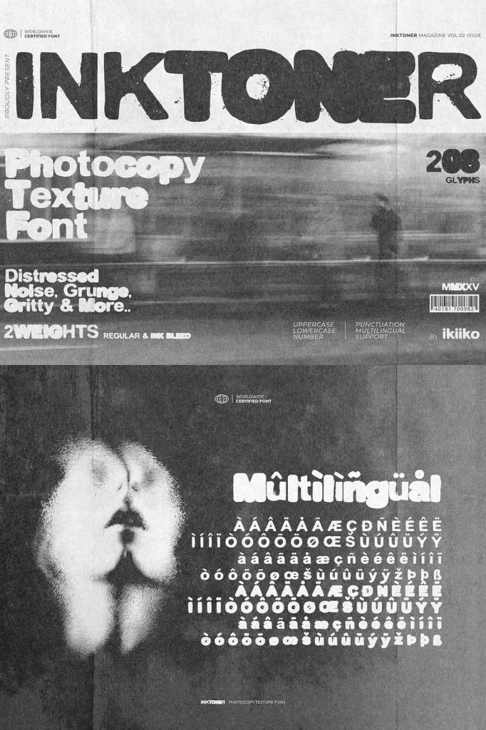
Inktoner: A Gritty Photocopy Texture Font with Raw 90s Attitude
Inktoner is a bold display font that embraces imperfection, texture, and visual noise as core design elements. Created by ikiiko, this typeface captures the unmistakable look of photocopied print, where ink bleeds, edges break down, and every letter carries a sense of physical process. Rather than aiming for precision, Inktoner celebrates the raw energy of distressed printing and underground graphic culture.
This font channels the unapologetic spirit of 1990s zines, DIY posters, and photocopied flyers. It delivers a tactile, hand-pressed feel that instantly injects personality, rebellion, and authenticity into modern design projects.
Inspired by Photocopy, Letterpress, and Distressed Print
Inktoner draws its visual identity from the imperfect world of analog printing. Old-school photocopiers, worn printing plates, and rough letterpress techniques serve as the foundation for its gritty appearance. Each character mimics the uneven pressure, smudged ink, and broken outlines that occur when ink meets paper without digital correction.
The result is a font that feels physical and lived-in. It looks as though it has been printed, reprinted, and copied multiple times, building layers of texture and character along the way. This distressed approach makes Inktoner feel honest and expressive rather than polished or sterile.
Dirty Details and Ink Bleed Effects
One of Inktoner’s defining features is its deliberate use of ink bleed and rough edges. Letters appear saturated, uneven, and slightly chaotic, mimicking the behavior of ink spreading across paper fibers. These details give the font a strong visual rhythm and ensure that no word feels flat or mechanical.
This texture-heavy design allows Inktoner to stand out in layouts that need immediate impact and emotional intensity.
A Bold Display Font with Underground Energy
Inktoner is designed as a display font, built to dominate attention in headlines, posters, and statement graphics. Its bold weight ensures legibility even when layered with heavy textures or placed against complex backgrounds. At the same time, its distressed form keeps it visually engaging and expressive.
The font thrives in rebellious, experimental, and non-conformist design environments. It works especially well for music posters, album artwork, streetwear branding, editorial spreads, and visual campaigns that embrace grit over perfection.
Perfect for 90s-Inspired and Grunge Design
Inktoner strongly reflects the visual language of the 1990s, a decade defined by DIY culture, underground publications, and raw creative expression. Designers can use this font to evoke nostalgia while still creating contemporary layouts that feel bold and relevant.
Whether you are designing for punk zines, alternative magazines, skate culture, or experimental branding, Inktoner delivers a typographic voice that feels loud, unapologetic, and authentic.
Built for Impact Across Print and Digital Media
Inktoner performs exceptionally well in both print and digital contexts. In print, its distressed texture enhances tactile qualities and creates depth. In digital media, the rough edges and noise bring warmth and human imperfection to otherwise clean screens.
Designers can scale the font large for maximum impact or combine it with clean sans-serif typefaces to create contrast and hierarchy.
Why Choose Inktoner?
Inktoner offers designers a powerful alternative to clean, minimal typography. It embraces chaos, texture, and imperfection as strengths rather than flaws. With its photocopy-inspired aesthetic, bold structure, and gritty ink details, this font transforms words into visual statements.
If your project demands raw energy, underground attitude, and a strong 90s-inspired personality, Inktoner delivers a distinctive typographic experience that refuses to blend in.