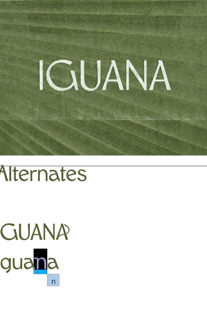
Iguana Font – Modern Humanist Sans-Serif with Calm Character
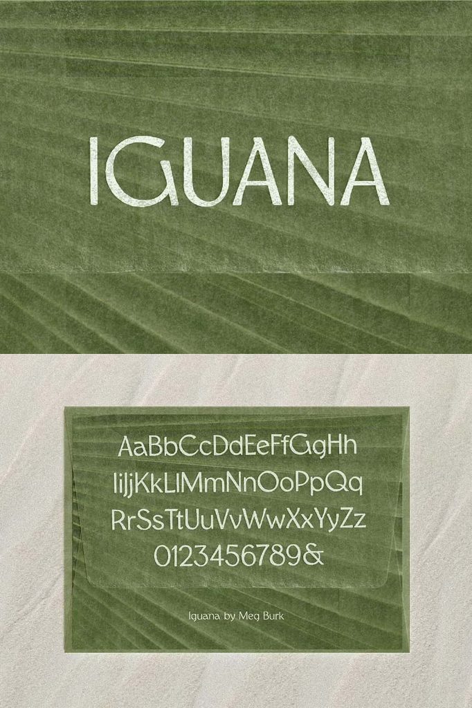
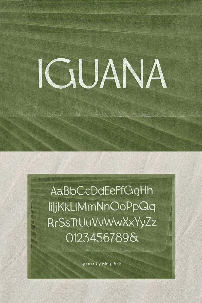
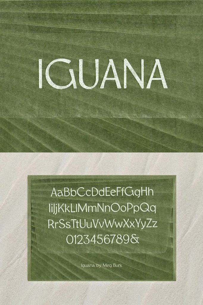
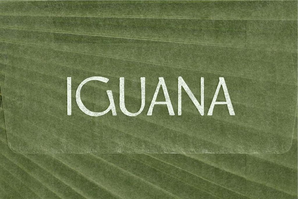
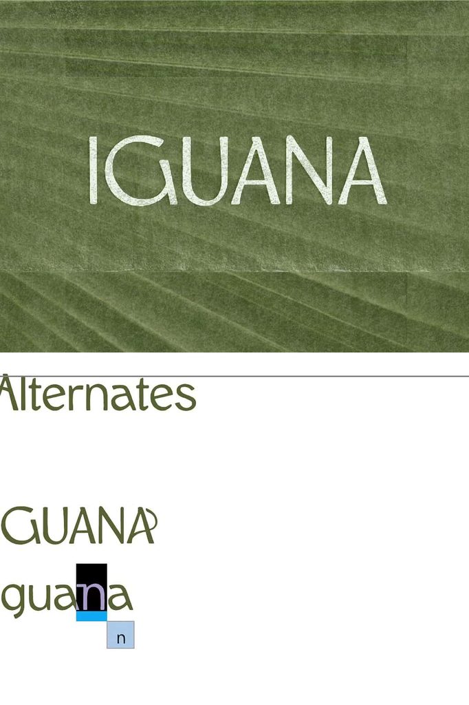
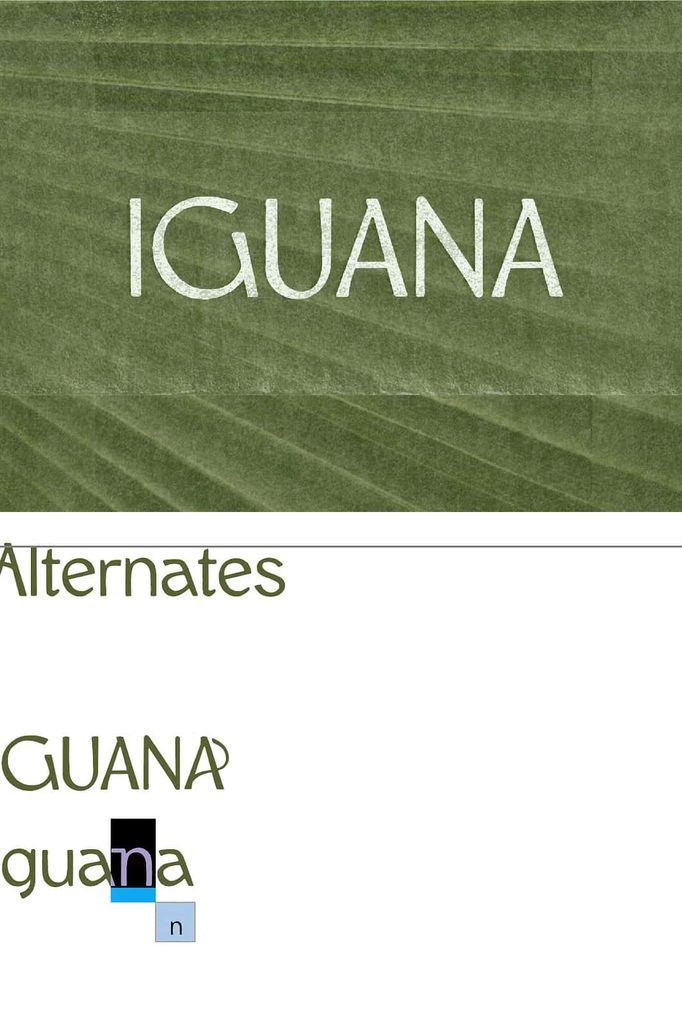
Iguana Font brings together humanist warmth, modern simplicity, and expressive typographic rhythm in a versatile sans-serif design. Built around gentle sweeping curves, open forms, and subtle texture, Iguana creates a visual personality that feels both airy and grounded. Its balanced construction gives designers a contemporary typeface that can communicate confidence without becoming harsh or overly mechanical.
Designed for visual impact and comfortable reading, Iguana works particularly well when typography needs to feel modern, approachable, and distinctive. Its open letterforms create breathing room within words, while its flowing curves introduce a subtle human quality. These details help the font move beyond the rigid appearance often associated with geometric sans-serifs.
Use Iguana for display typography, short paragraphs, branding, posters, editorial graphics, packaging, social media artwork, website headings, and other creative projects that need a strong yet relaxed typographic presence. Its combination of bold rhythm and calm proportions allows it to adapt to different visual environments without losing its identity.
A Humanist Sans-Serif with Modern Personality
Iguana takes its foundation from the humanist sans-serif tradition, where designers often draw inspiration from natural handwriting and organic letter construction. Rather than relying entirely on strict geometric forms, humanist typography introduces subtle variations that make letters feel more natural and visually engaging.
Iguana uses this approach to create a typeface with a distinctive balance between structure and softness. Its sweeping curves guide the eye naturally through each word, while open forms create a sense of spaciousness. This combination gives the font an approachable appearance that works well across contemporary design projects.
Gentle Curves and Open Forms
The gentle curves form one of the most recognizable characteristics of Iguana Font. These smooth transitions soften the overall appearance and help create a calm visual rhythm. At the same time, the open construction of many letterforms allows the typography to maintain clarity.
Open forms become especially useful in headlines and display applications because they prevent large text from appearing overly dense. They also help shorter paragraphs maintain a comfortable visual flow. When you need typography that looks substantial without feeling heavy, Iguana offers a useful balance.
Airy Typography with a Grounded Feel
Iguana achieves an interesting contrast between lightness and strength. Its open forms give the typeface an airy quality, while its bold rhythm keeps the design grounded. This balance allows designers to create compositions that feel confident without becoming aggressive.
The airy quality works particularly well in modern layouts with generous spacing, minimalist compositions, and clean visual systems. You can give the letters enough room to breathe and allow their curves to become part of the overall design. At the same time, the font retains enough visual weight to establish a clear focal point.
Subtle Texture Adds Character
Subtle texture gives Iguana an additional layer of visual personality. Instead of appearing completely sterile or digitally uniform, the font introduces a restrained tactile quality. This detail can help typography feel more expressive while preserving its modern foundation.
The texture works particularly well in large display settings where the details of the letterforms become more visible. Use Iguana in posters, covers, packaging, advertisements, and branding compositions when you want the typography to contribute texture without relying on excessive decorative effects.
Designed for Display Typography
Iguana Font performs especially well as a display typeface. Its bold rhythm and distinctive curves allow headlines to establish a strong visual presence. Use it for campaign titles, poster headlines, magazine covers, website hero sections, product names, event graphics, and promotional materials.
Large typography gives the font enough space to showcase its sweeping curves and open construction. You can also experiment with spacing, alignment, and scale to create different visual effects. Keep the composition simple when you want Iguana to become the primary visual element, or combine it with complementary fonts to build a more detailed hierarchy.
Make Headlines More Memorable
A strong headline needs to attract attention while communicating its message quickly. Iguana supports this goal by combining visual weight with approachable letterforms. Its shapes create enough distinction to make short phrases memorable without requiring elaborate decorative elements.
Use Iguana for brand statements, advertising headlines, editorial titles, promotional messages, and short calls to action. Its calm personality can help balance strong messaging, making it useful for brands that want to appear confident while remaining accessible.
Effective for Short Paragraphs
Although Iguana works naturally as a display font, its open forms also make it suitable for short paragraphs and supporting text. The spacious construction gives words a comfortable rhythm, particularly when you use appropriate line spacing and text size.
Use it for short introductions, product descriptions, captions, website sections, editorial snippets, and promotional copy. For longer reading passages, designers may prefer a typeface specifically optimized for extended text, but Iguana can provide an effective solution when the written content remains concise and visually focused.
Ideal for Modern Branding
Iguana Font can help establish a contemporary brand identity with a distinctive human touch. Its humanist foundation creates warmth, while its bold rhythm communicates confidence. This combination makes it suitable for brands that want to balance modern aesthetics with an approachable personality.
Use Iguana for logos, wordmarks, brand headlines, packaging, business cards, social media graphics, websites, and promotional campaigns. Its recognizable letterforms can create consistency across multiple brand touchpoints while allowing designers to build a flexible visual system.
Create Strong Visual Hierarchy
Typography becomes more effective when each element has a clear role. Use Iguana in larger sizes for primary headlines, then combine it with a simpler supporting typeface for secondary information. This contrast allows the distinctive qualities of Iguana to remain visible without making every element compete for attention.
You can also use variations in size, spacing, and weight to organize information. A large Iguana headline can establish the main focal point, while smaller supporting text provides context. This approach creates a clean hierarchy that works well in both digital and print environments.
Perfect for Posters and Editorial Graphics
The expressive curves and bold rhythm of Iguana make it a strong choice for poster design. Large words can become graphic elements themselves, allowing designers to create compositions that rely on typography as much as imagery.
Editorial projects can also benefit from Iguana’s modern character. Use it for magazine titles, feature headlines, pull quotes, section headings, and short introductions. Its humanist qualities can soften otherwise rigid layouts and introduce a more relaxed visual tone.
Versatile Applications for Creative Designers
Iguana Font adapts to many creative environments. Its modern construction allows it to work across digital interfaces, print materials, advertising, branding, and editorial design. The font can support a minimalist visual direction or become a stronger graphic element when used at larger sizes.
- Brand identities and modern wordmarks
- Poster and event designs
- Website headings and hero sections
- Editorial layouts and magazine covers
- Packaging and product labels
- Social media graphics
- Advertising campaigns
- Short paragraphs and introductory text
- Creative presentations
- Modern promotional materials
Why Choose Iguana Font?
- Features a distinctive humanist sans-serif structure.
- Uses gentle sweeping curves for a softer visual personality.
- Includes open forms that create an airy appearance.
- Balances bold rhythm with a calm modern aesthetic.
- Adds subtle texture without overwhelming the design.
- Works effectively for display typography and short paragraphs.
- Provides a contemporary alternative to rigid geometric sans-serifs.
- Supports branding, posters, editorial work, packaging, and digital graphics.
- Creates strong headlines while maintaining an approachable character.
- Combines visual confidence with a relaxed, human quality.
Bring Calm Confidence to Your Typography
Iguana Font gives designers a modern sans-serif with a clear sense of personality. Its gentle curves, open forms, subtle texture, and bold rhythm create a balanced typographic experience that feels both expressive and controlled.
Whether you need a powerful display face for a poster or a calm typeface for a short paragraph, Iguana provides a flexible foundation. Its humanist qualities help soften contemporary layouts, while its bold structure ensures that important messages remain visible and memorable.
Final Thoughts on Iguana Font
Iguana Font combines modern simplicity with organic typographic details to create a distinctive humanist sans-serif. Its airy forms give compositions room to breathe, while its grounded structure provides enough visual strength for headlines and display applications.
Use Iguana when your project needs typography that feels contemporary without becoming cold, bold without becoming aggressive, and distinctive without relying on unnecessary decoration. From branding and posters to editorial graphics, packaging, websites, and short-form content, Iguana can bring calm confidence and modern character to your creative work.