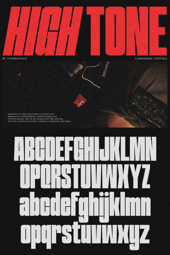
Hightone Retro Font Duo
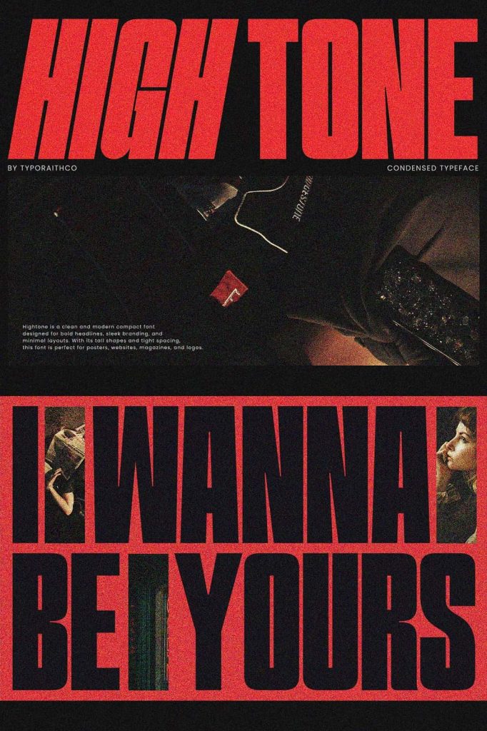
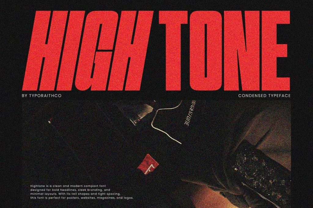
Hightone is a stylish retro font duo that blends nostalgic design with modern visual energy. This typeface captures the bold spirit of vintage typography while delivering the clarity and versatility needed for contemporary design projects. With two complementary styles, Regular and Italic or Slanted, Hightone allows designers to build expressive typography systems that feel both dynamic and balanced.
Designers often look for fonts that can create strong visual impact while still maintaining flexibility. Hightone answers that need by offering a clean yet distinctive letter structure inspired by retro aesthetics. The result is a typeface that feels confident, expressive, and perfectly suited for eye-catching design work.
Whether you design logos, posters, album covers, or branding materials, Hightone gives you the tools to create typography that immediately stands out. Its combination of vintage charm and modern structure makes it a powerful addition to any designer’s font library.
A Retro-Inspired Typeface with Modern Energy
Hightone draws inspiration from classic retro typography often seen in vintage advertisements, music posters, and iconic design movements. The letterforms feature bold shapes and confident proportions that reflect the visual language of past decades while maintaining a contemporary feel.
Instead of simply imitating vintage styles, Hightone reinterprets them for modern design environments. The characters feel clean, structured, and adaptable, which allows designers to integrate the font into both nostalgic and modern layouts. This balance makes the typeface especially useful for creative projects that aim to capture retro character while staying visually fresh.
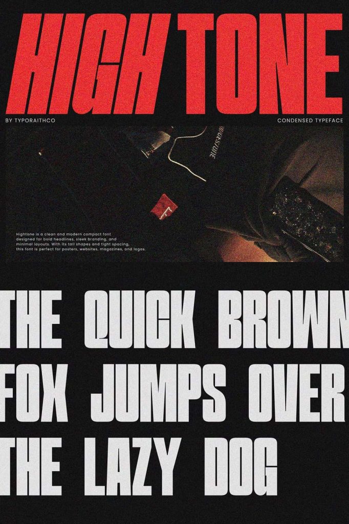
The strong shapes and balanced spacing ensure that text remains clear and readable even when used at large sizes. Designers can confidently use Hightone for titles and headlines where typography becomes the primary visual element.
Two Complementary Styles for Flexible Typography
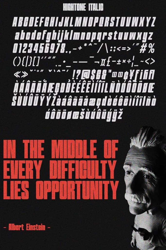
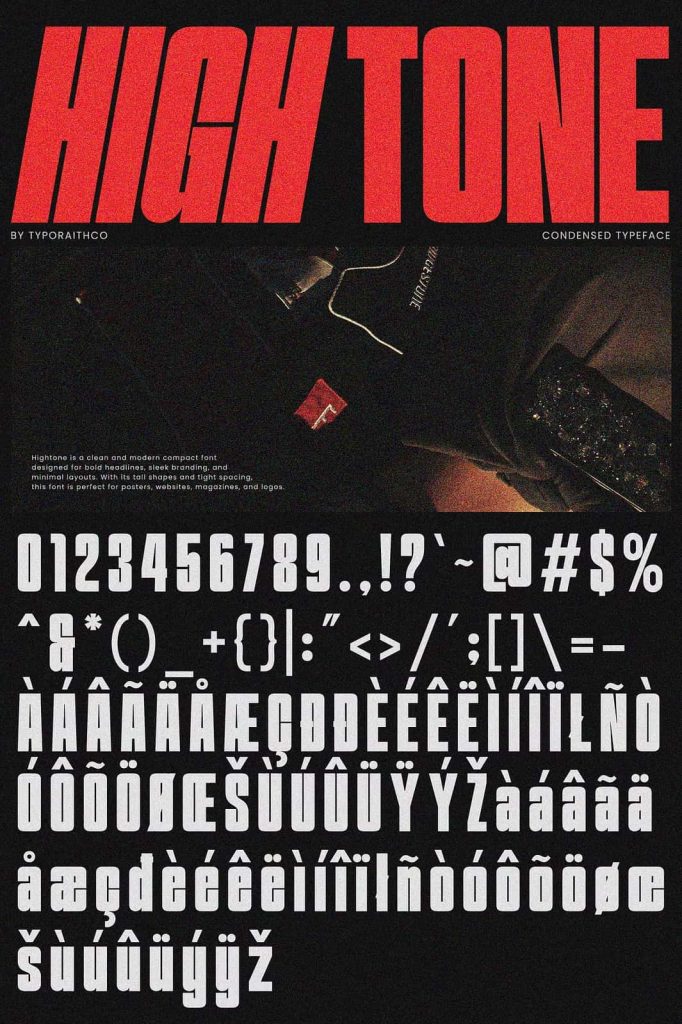
Hightone includes two matching styles that work seamlessly together: Regular and Italic or Slanted. This pairing allows designers to create visually engaging compositions without needing multiple font families. The Regular style provides a strong typographic foundation, while the Italic style introduces movement and emphasis.
The Regular version features stable letterforms that feel bold and structured. Designers can use it for headlines, titles, or primary text elements that need to stand out clearly. The Italic or Slanted version introduces a forward-leaning energy that adds rhythm and visual interest to layouts.
By combining both styles in the same design, you can highlight key words, create hierarchy, and guide the viewer’s eye through the composition. This flexibility makes the font duo especially useful in editorial layouts, promotional graphics, and branding materials.
Perfect for Bold Titles and Logo Design
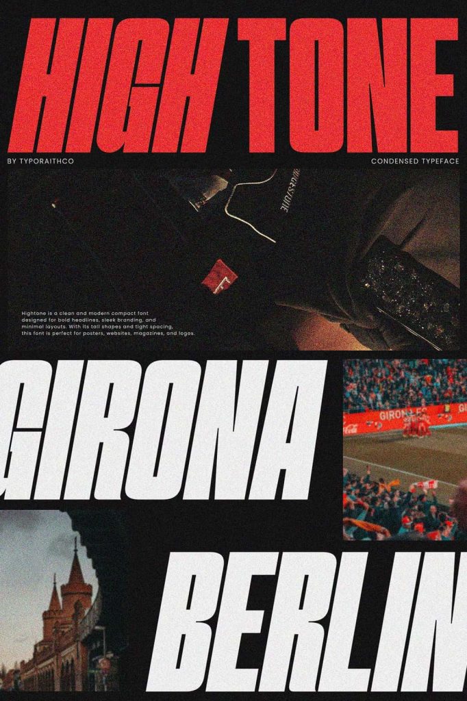
Hightone excels in applications where typography needs to capture attention. Bold titles and logo designs benefit greatly from the strong personality of this font duo. The retro-inspired letterforms create a recognizable visual identity that helps brands and creative projects stand out in crowded visual environments.
Designers working on branding projects can use Hightone to craft distinctive logos that communicate style and confidence. The font’s balanced proportions and clean structure allow it to adapt to various brand identities, from music labels and lifestyle brands to fashion companies and creative studios.
Because the typeface includes both upright and slanted styles, designers can experiment with dynamic logo compositions that feel energetic and modern while still maintaining retro appeal.
Ideal for Posters, Album Covers, and Creative Graphics
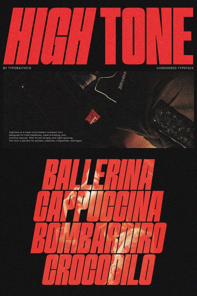
Hightone performs especially well in poster design and music-related projects. The bold letterforms and retro personality naturally align with the visual language of concert posters, album artwork, and promotional graphics. Designers can use the font to create titles that immediately attract attention and set the tone for the entire composition.
Album covers often rely heavily on typography to communicate the mood of the music. Hightone provides the visual strength needed to make titles memorable while maintaining an artistic and stylish look. The italic style can introduce movement that mirrors the rhythm and energy of music-based designs.
Posters, event announcements, and digital promotional graphics also benefit from the expressive character of the font. Its bold presence ensures that important messages remain visible and engaging across both print and digital platforms.
A Strong Choice for Lifestyle and Modern Branding
Lifestyle brands often require typography that feels stylish, confident, and contemporary. Hightone fits perfectly within this design space because it combines vintage inspiration with modern clarity. Brands focused on fashion, music, culture, and creative industries can use this font duo to establish a strong visual voice.
When used in branding materials, Hightone creates a recognizable and memorable aesthetic. Designers can apply it to packaging, social media graphics, promotional materials, and website headers. The bold letterforms help brands maintain visual consistency across multiple platforms.
The font duo also pairs well with minimal design elements, geometric shapes, and modern color palettes. This adaptability allows designers to integrate Hightone into many different visual styles while maintaining its retro-inspired personality.
Create Bold and Memorable Typography
Hightone empowers designers to create typography that feels confident, stylish, and visually engaging. The combination of Regular and Italic styles provides flexibility for building strong typographic compositions. Designers can easily establish hierarchy, emphasize key messages, and create dynamic layouts.
From logos and posters to album covers and lifestyle branding, Hightone brings retro charm and modern design together in a single font duo. Its bold structure, expressive style, and versatile design make it a valuable tool for creative professionals who want their typography to make a lasting impression.