Handmode Editorial Font Duo
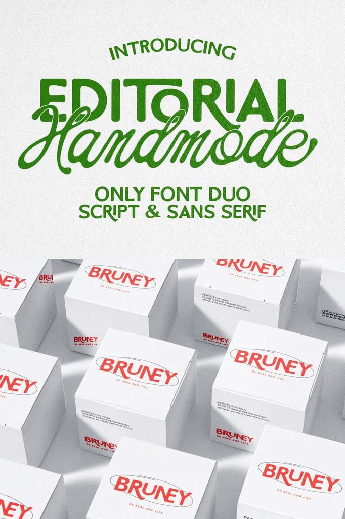
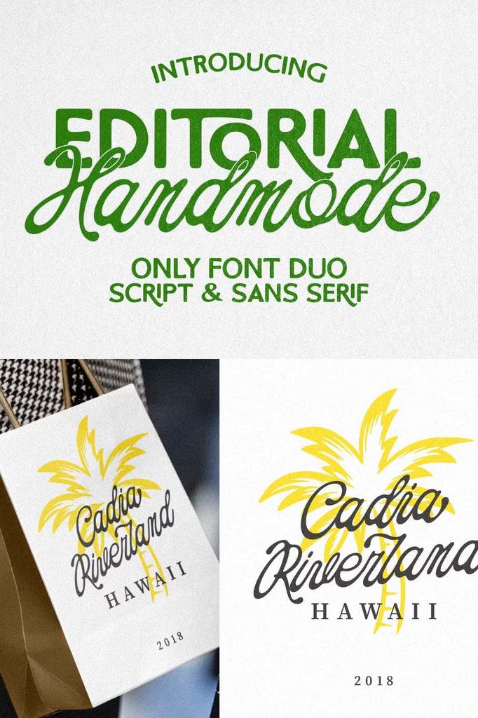
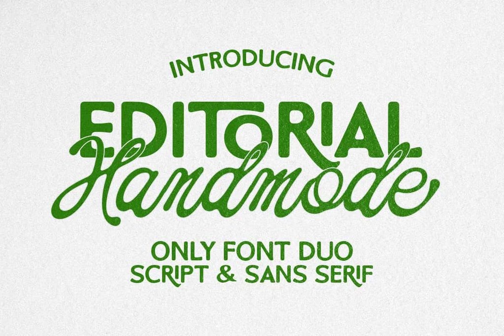
Handmode Editorial is a sweet and gentle font duo that combines bold rounded sans serif lettering with a flowing handwritten script. This playful pairing creates a warm and approachable typographic style that balances strength with friendliness. The rounded sans font establishes a confident visual foundation, while the handwritten script adds movement, personality, and a natural human touch.
Designed for creatives who want typography with character, Handmode Editorial gives you two complementary styles that work beautifully together. The bold sans serif can command attention in headlines, brand names, and product titles, while the flowing script can introduce expressive accents, decorative phrases, and personal details. Together, these fonts create a versatile system for modern branding and everyday creative design.
Handmode Editorial works especially well for projects that need a cheerful, inviting, and contemporary appearance. Use it for product labels, greeting cards, social media graphics, branding projects, logo concepts, packaging, quotes, promotional artwork, stationery, and more. Its friendly personality makes it easy to create designs that feel polished without becoming overly formal.
A Playful Combination of Bold and Friendly
The appeal of Handmode Editorial comes from its carefully balanced contrast. The rounded sans serif delivers bold shapes and a strong visual presence, while the handwritten script introduces a softer and more personal quality. This relationship allows designers to create clear hierarchy without sacrificing warmth.
Instead of using a single style for every element, you can assign different roles to each font. Let the rounded sans serif handle the primary message, product name, or headline. Then use the script to highlight a supporting phrase, add a decorative accent, or emphasize an important word. This simple approach can transform a basic composition into a more dynamic and engaging design.
The combination also helps your typography feel approachable. Rounded letterforms naturally create a softer appearance, while handwritten strokes add a sense of personality and spontaneity. Together, they produce a visual language that feels modern, cheerful, and easy to connect with.
Bold Structure with a Soft Personality
The bold rounded sans serif gives Handmode Editorial its visual strength. Its friendly curves create a contemporary appearance while maintaining enough weight to perform effectively in display applications. Use it for prominent headlines, product names, logos, labels, and other elements that need to capture attention.
The handwritten script provides the perfect counterpoint. Its flowing strokes create movement and bring a more personal feeling to your designs. Use it for short phrases, accents, signatures, greetings, quotes, and decorative typography.
Perfect for Product Labels and Packaging
Handmode Editorial can give product packaging a warm and memorable identity. Its combination of bold structure and handwritten charm works particularly well for handmade goods, lifestyle products, food packaging, beauty products, stationery, candles, accessories, and creative merchandise.
Use the rounded sans serif for the product name or primary information, then add the handwritten script to emphasize a flavor, collection name, tagline, or short descriptive phrase. This creates a clear visual hierarchy while maintaining a friendly and handcrafted appearance.
The duo also works well across a complete packaging collection. Apply the same typographic relationship to boxes, labels, stickers, cards, and promotional inserts to establish consistency. The result can feel cohesive while still allowing each product to maintain its own personality.
Create Friendly Product Branding
Handmode Editorial can help products feel more approachable and distinctive. Its playful personality makes it especially useful for brands that want to communicate warmth, creativity, optimism, or a personal connection with their customers.
Combine the fonts with soft illustrations, simple shapes, subtle textures, or clean backgrounds. You can also introduce small handwritten details throughout the packaging to reinforce the human quality of the design.
Beautiful Greeting Cards and Stationery
The sweet personality of Handmode Editorial makes it an excellent choice for greeting cards and stationery. Use the handwritten script to create warm messages and pair it with the bold sans serif for names, dates, headings, or supporting information.
Create birthday cards, thank-you cards, invitations, celebration stationery, holiday designs, friendship cards, and personalized notes. The contrast between the two fonts allows you to build a clear hierarchy while keeping the overall composition playful and inviting.
For a more elegant result, use generous spacing and a simple layout. For a more energetic composition, experiment with different sizes, overlapping elements, curved text arrangements, and decorative illustrations.
Build Memorable Branding and Logo Designs
Handmode Editorial gives designers a flexible foundation for developing brand identities with personality. The rounded sans serif can create a strong primary wordmark, while the script can provide a secondary accent or signature-style detail.
This combination works particularly well for small businesses, creative studios, lifestyle brands, boutiques, cafés, handmade shops, beauty businesses, stationery companies, and personal brands. It can communicate professionalism without creating a distant or overly corporate appearance.
Create a Distinctive Logo System
Use the bold sans serif for the main brand name and introduce the script for a tagline or secondary phrase. You can also reverse this structure and allow the handwritten style to become the central feature when the brand requires a softer personality.
For maximum flexibility, create several logo variations using the two styles. Develop a primary horizontal logo, a compact badge, a social media profile version, and a simplified mark. Keeping the same typographic relationship across these applications can help create a consistent brand identity.
Engaging Social Media Graphics
Handmode Editorial works naturally in social media designs where typography needs to communicate quickly. Use the bold rounded sans serif for strong headlines, announcements, product names, and promotional messages. Add the handwritten script to highlight keywords, short phrases, or friendly accents.
Create Instagram-style posts, story graphics, promotional banners, quote cards, product announcements, seasonal campaigns, and digital advertisements. The combination gives your content a recognizable visual personality and can help establish consistency across multiple posts.
Keep your layouts simple when possible. Give the typography enough space to remain readable, and use the contrast between the two fonts to guide the viewer through the message. A clean background can make the lettering stand out, while subtle textures can add additional warmth.
Perfect for Quote and Typography Designs
Handmode Editorial can turn simple phrases into engaging visual compositions. Use the rounded sans serif for the main statement and add the handwritten script to emphasize a meaningful word or supporting phrase. This approach creates contrast while keeping the design cohesive.
Create inspirational quotes, lifestyle messages, humorous statements, personal affirmations, greeting graphics, wall art, printable designs, and promotional content. The playful combination can make short messages feel more personal and expressive.
Mix Typography for Visual Interest
Experiment with scale and placement to make your quote designs more dynamic. Set one word in the flowing script and surround it with bold rounded lettering. You can also use the script as an underline, signature, or decorative element within the composition.
Keep the number of additional fonts limited so the two Handmode Editorial styles remain the primary visual focus. Simple supporting typography can help provide additional information without competing with the main design.
Modern Packaging with a Handmade Feel
Handmode Editorial can create a useful bridge between polished modern design and handcrafted aesthetics. The rounded sans serif provides a clean contemporary foundation, while the script introduces the personal quality often associated with handmade lettering.
This balance makes the duo suitable for modern artisan brands, food products, beauty packaging, home goods, stationery, craft products, and lifestyle merchandise. Use clean layouts and carefully selected decorative elements to create a sophisticated presentation without losing the playful character of the fonts.
How to Use Handmode Editorial Effectively
Start by assigning a clear purpose to each font. Use the bold rounded sans serif when you need structure and immediate visual impact. Use the flowing handwritten script when you want to introduce warmth, movement, or a personal accent.
Adjust the size difference between the two styles to create hierarchy. A large sans serif headline with a smaller script subtitle can produce a strong and organized composition. Alternatively, a large handwritten word supported by smaller bold lettering can create a softer and more expressive result.
Experiment with spacing, alignment, and placement to discover the best combination for your project. You can create centered compositions for greeting cards, structured layouts for packaging, or more playful arrangements for social media graphics and apparel.
Pair with Illustrations and Decorative Elements
Handmode Editorial pairs naturally with simple illustrations and decorative graphics. Try combining the fonts with flowers, stars, hearts, abstract shapes, hand-drawn icons, product illustrations, or minimal line artwork. These elements can reinforce the playful and friendly character of the typography.
Avoid overcrowding the composition. The two font styles already provide plenty of visual contrast, so a restrained design can often create the strongest result.
Why Choose Handmode Editorial Font Duo?
Handmode Editorial Font Duo gives designers two complementary voices within one creative typography system. The bold rounded sans serif delivers confidence and structure, while the flowing handwritten script adds warmth and personality. Together, they create a versatile combination that feels both polished and approachable.
Use Handmode Editorial for branding, logo design, packaging, product labels, greeting cards, social media graphics, quotes, promotional materials, stationery, and other creative projects. Its friendly character makes it especially effective for designs that need to communicate positivity, creativity, warmth, and individuality.
The duo also makes it easier to build visual hierarchy without searching for unrelated typefaces. The two styles naturally provide contrast, allowing you to create headlines, accents, supporting phrases, and decorative elements while maintaining a cohesive overall appearance.
Bring a Friendly Creative Touch to Your Designs
Handmode Editorial transforms the familiar font duo concept into a playful and expressive design tool. Its bold rounded sans serif establishes a strong foundation, while its flowing handwritten script adds a personal and artistic touch. Together, they create typography that feels sweet, contemporary, approachable, and full of character.
Whether you are creating a product label, designing a greeting card, developing a new brand identity, preparing packaging, creating a social media campaign, or turning a quote into artwork, Handmode Editorial gives you the flexibility to build a memorable composition.
Let the bold lettering capture attention and allow the handwritten script to add personality. With its balanced combination of structure and softness, Handmode Editorial Font Duo helps designers create visual work that feels friendly, expressive, and thoughtfully crafted.
“`