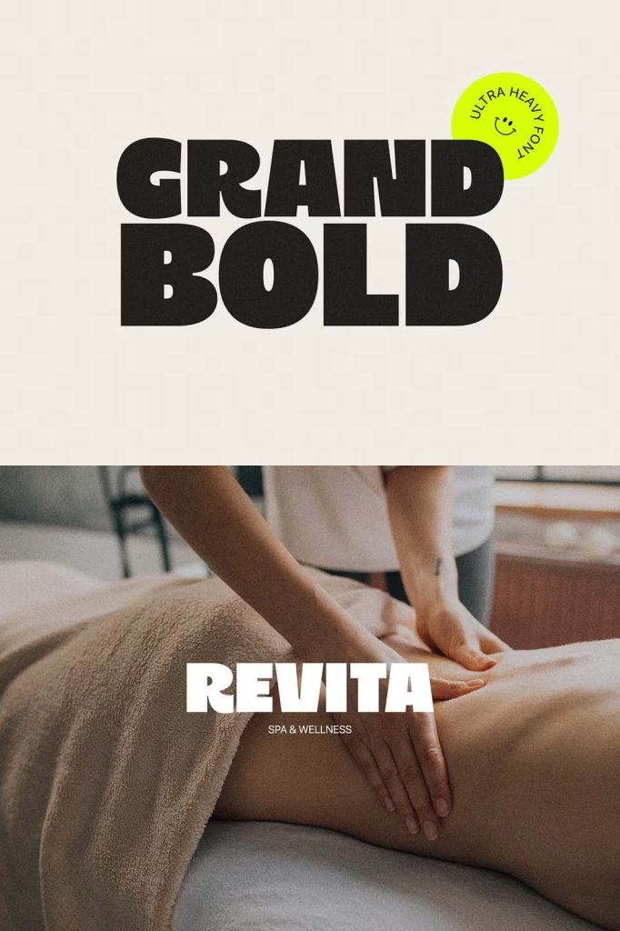
GRAND BOLD: An Ultra Heavy Display Font Inspired by 80s and 90s Nostalgia
GRAND BOLD is an ultra heavy display font designed to deliver maximum visual impact through powerful weight, confident proportions, and bold retro influence. Inspired by the graphic energy of the 1980s and 1990s, this typeface brings back an era when typography dominated the page and demanded attention. Every letter is built to stand tall, strong, and unmistakable, making GRAND BOLD an essential tool for designers who want their message to be seen instantly.
This font captures the spirit of classic advertising, magazine headlines, and bold branding from the late twentieth century. It blends nostalgia with modern clarity, allowing designers to reference the past while creating work that feels current and relevant.
Rooted in 80s and 90s Typography Aesthetics
The design of GRAND BOLD draws heavily from the visual language of the 80s and 90s, a period defined by oversized lettering, strong contrast, and unapologetic expression. During this era, typography often became the main visual element rather than a supporting detail. GRAND BOLD revives this mindset by emphasizing mass, structure, and presence.
The font’s thick strokes and compact counters reflect the bold experimentation of retro posters, television graphics, and print advertisements. These characteristics make it ideal for projects that aim to evoke nostalgia while maintaining professional polish.
Ultra Heavy Letterforms with Authority
Each letterform in GRAND BOLD is carefully constructed to maintain balance despite its extreme weight. The heavy strokes create a commanding presence without sacrificing legibility. This attention to structure ensures that the font remains clear and readable, even in dense compositions.
The result is a display font that communicates strength, confidence, and authority at first glance.
Designed for High-Impact Advertising and Headlines
GRAND BOLD excels in advertising environments where competition for attention is intense. Its ultra heavy weight ensures that headlines stand out in crowded layouts, whether on billboards, posters, or digital banners. The font instantly draws the eye and anchors the design around a strong typographic core.
In editorial design, GRAND BOLD works effectively for section headers, feature titles, and cover typography. It adds visual hierarchy and clarity, guiding readers through content with bold typographic cues.
Perfect for Branding, Posters, and Editorial Design
Branding projects benefit greatly from GRAND BOLD’s distinctive personality. The font helps establish a bold brand voice that feels confident and memorable. It is particularly effective for brands that want to project strength, creativity, or retro-inspired identity.
For posters and promotional materials, GRAND BOLD provides the scale and weight needed to communicate messages quickly and clearly. Designers can pair it with clean sans serif fonts or minimalist layouts to create striking contrast and visual tension.
Strong Performance in Print and Digital Media
GRAND BOLD performs consistently across both print and digital platforms. In print, its heavy structure ensures excellent ink coverage and visibility. On screens, the font retains its clarity and impact, making it suitable for websites, social media graphics, and digital campaigns.
Its adaptability allows designers to use the font confidently across multiple formats without losing visual strength.
Why Choose GRAND BOLD?
GRAND BOLD offers designers a reliable ultra heavy display font that combines retro inspiration with modern execution. Its roots in 80s and 90s aesthetics give it character, while its precise construction ensures professional performance.
If your design requires bold headlines, strong branding, and unmistakable presence, GRAND BOLD delivers a typographic solution that turns text into a powerful visual statement.