Girlish Waves Summer Sans Font: Playful Energy with a Breezy Summer Feel
Girlish Waves Summer Sans is a lighthearted and expressive sans serif font that captures the carefree essence of summer. It combines soft curves with a gentle, flowing structure to create a typeface that feels fresh, modern, and full of life. Inspired by the rhythm of ocean waves and the warmth of sunny days, this font brings a sense of movement and joy into every design.
This typeface does more than present clean typography—it creates an atmosphere. Designers can use Girlish Waves to build visuals that feel relaxed, stylish, and effortlessly engaging. Its approachable character makes it a perfect choice for projects that aim to connect with audiences on an emotional and uplifting level.
The Inspiration Behind Girlish Waves
Girlish Waves draws inspiration from the natural beauty of summer. It reflects the gentle motion of waves, the softness of sunlight, and the playful energy of warm, carefree days. These elements come together to form a typeface that feels fluid and organic while maintaining a clean and modern structure.
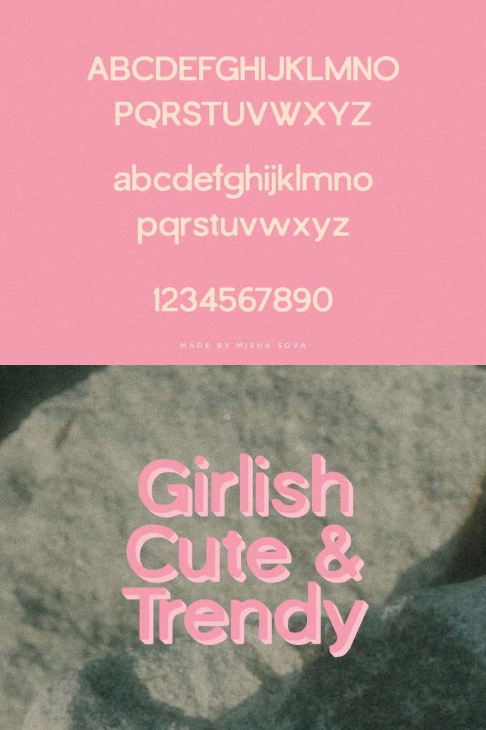
The design also embraces a youthful and feminine aesthetic. It introduces subtle curves and rounded forms that soften the overall look, creating a welcoming and friendly tone. This balance between simplicity and personality allows the font to stand out without overwhelming the design.
Key Features of Girlish Waves Summer Sans
Soft and Flowing Curves
The font features smooth, rounded edges that mimic the natural flow of water. These curves create a sense of movement, making the text feel dynamic and alive. This quality helps bring energy and rhythm into your layouts.
Light and Airy Structure
Girlish Waves uses a clean and open design that enhances readability while maintaining a delicate visual presence. The spacing and proportions allow the text to breathe, giving it a relaxed and effortless appearance.
Playful and Youthful Character
The typeface carries a cheerful and fun personality. Its design encourages creativity and experimentation, making it ideal for projects that aim to feel vibrant and approachable.
Modern Simplicity
Despite its playful nature, Girlish Waves maintains a modern and minimal structure. This ensures that it remains versatile and suitable for a wide range of contemporary design applications.
Best Use Cases for Girlish Waves
Girlish Waves Summer Sans performs best in projects that aim to evoke happiness, warmth, and a relaxed atmosphere. Its distinctive style makes it especially effective for:
- Summer-themed branding and seasonal campaigns
- Beauty, fashion, and lifestyle product packaging
- Social media graphics and digital content
- Event invitations, posters, and greeting cards
Designers often use this font for headlines, titles, and key visual elements. Pairing it with a neutral sans serif or simple serif font can help maintain balance while allowing its playful personality to shine.
Why Choose Girlish Waves Summer Sans?
Girlish Waves stands out because it blends emotional appeal with practical design. It allows designers to create work that feels both stylish and approachable. The font’s soft curves and light structure help establish a friendly tone, making it easier to connect with audiences.
In branding, this connection becomes a powerful advantage. Girlish Waves communicates positivity, warmth, and creativity—qualities that resonate strongly in modern design. It helps transform ordinary layouts into engaging visual experiences.
Conclusion
Girlish Waves Summer Sans is more than a playful typeface—it is a celebration of summer’s energy and charm. By combining flowing curves, modern simplicity, and a youthful spirit, it delivers a font that feels both refreshing and versatile. For designers who want to create bright, joyful, and memorable designs, Girlish Waves offers a perfect and inspiring solution.