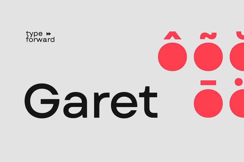
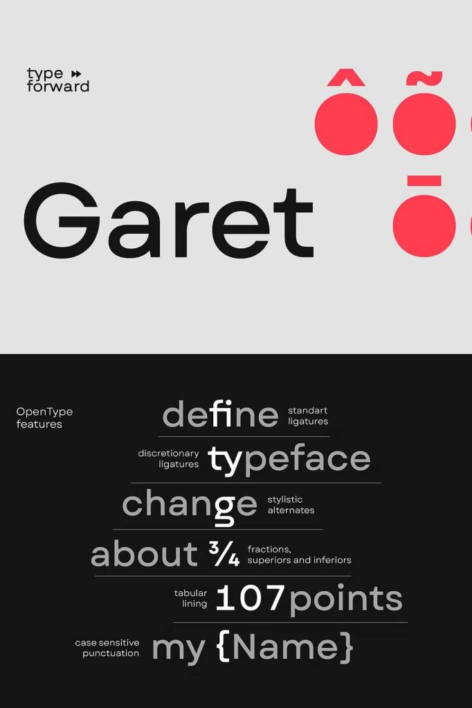
Garet Geometric Sans Serif Font Family – A Modern Typeface Built for Versatility and Precision
Garet is a modern geometric sans serif typeface designed to deliver clarity, flexibility, and contemporary style across a wide range of design applications. Combining clean construction with carefully balanced proportions, Garet offers a sophisticated typographic solution for designers, brands, agencies, and creative professionals who demand both aesthetics and performance.
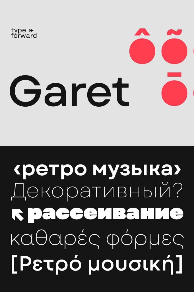
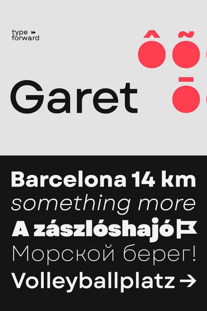
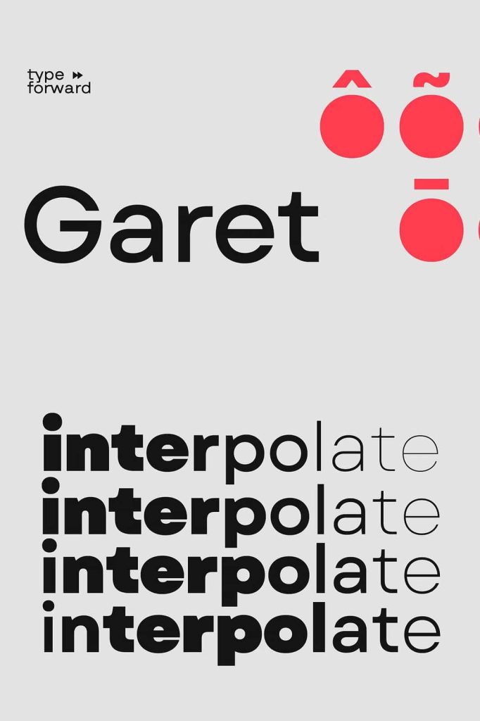
Defined by its high x-height, soft letterforms, and smooth masculine tone, Garet creates a strong visual presence while maintaining excellent readability. The typeface draws inspiration from geometric principles and optical precision, resulting in letterforms that feel modern, confident, and highly functional. Its distinctive oval shapes originate from the concept of the optically perfect circle, giving the font a unique personality that stands out in both digital and print environments.
With an extensive collection of 11 weights, matching italics, and a fully functional variable font, Garet provides an exceptional level of creative freedom. Whether you are building a corporate identity, designing a website, creating editorial layouts, or developing marketing materials, Garet adapts seamlessly to your design needs.
A Modern Geometric Sans Serif with Distinctive Character
Garet embraces the principles of geometric typography while introducing subtle refinements that make it highly versatile and visually engaging. The typeface balances mathematical precision with human-centered design, creating a font that feels both professional and approachable.
Its geometric structure delivers consistency and order, while the soft curves prevent the font from appearing cold or mechanical. This balance allows Garet to function effectively in a variety of industries, from technology and corporate branding to fashion, architecture, and creative services.
The carefully crafted proportions ensure that every character contributes to a cohesive and harmonious visual system. As a result, designers can use Garet confidently across multiple mediums while maintaining a consistent brand experience.
High X-Height for Superior Readability
One of Garet’s defining features is its high x-height, which significantly improves legibility across different sizes and formats. The larger lowercase characters create a comfortable reading experience, making the typeface highly effective for both display and body text applications.
This readability advantage is particularly valuable in modern digital environments where content must remain clear across desktops, tablets, and mobile devices. Whether used in websites, applications, presentations, or printed publications, Garet maintains excellent clarity and visual balance.
The high x-height also contributes to the font’s contemporary appearance, giving it a strong and confident presence without sacrificing accessibility.
Key Design Features
- Modern geometric sans serif construction
- High x-height for enhanced readability
- Clean and soft letterforms
- Distinctive oval geometric shapes
- Smooth masculine visual tone
- Closed counters for stronger character recognition
- Extensive weight range and italics
- Advanced variable font technology
Distinctive Oval Shapes Inspired by Perfect Geometry
Garet derives much of its personality from its carefully developed oval forms. Inspired by the concept of the optically perfect circle, these shapes introduce a refined geometric character that distinguishes the font from traditional sans serif typefaces.
The oval construction appears throughout the typeface, creating visual consistency and strengthening its modern identity. These forms contribute to the font’s clean aesthetic while adding subtle uniqueness that designers can leverage to build memorable branding and communication systems.
By combining geometric precision with optical adjustments, Garet achieves a natural balance that feels both modern and highly readable.
Closed Counters for a Stronger Visual Identity
Another defining characteristic of Garet is its use of closed counters. This design approach reinforces the geometric structure of the typeface and enhances character recognition, especially at larger display sizes.
The closed forms create a bold and unified appearance that helps headlines, logos, and branding elements achieve greater visual impact. At the same time, the font maintains a clean and sophisticated aesthetic suitable for professional applications.
These carefully considered details demonstrate the level of craftsmanship behind Garet and contribute to its effectiveness across diverse design environments.
11 Weights and 11 Italics for Complete Typography Systems
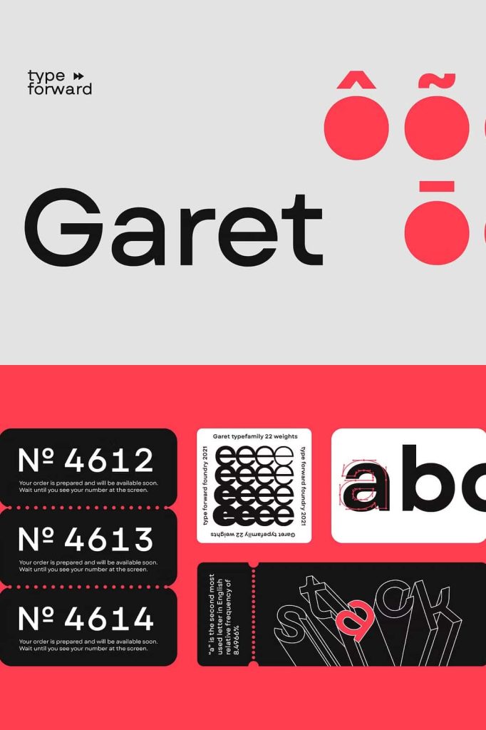
Garet offers one of the most comprehensive font families available, featuring 11 weights ranging from extremely thin styles to ultra-bold variations. Each weight includes a matching italic counterpart, resulting in a complete collection of 22 professionally designed fonts.
This extensive range allows designers to establish clear visual hierarchies and create highly flexible typography systems. Light weights add elegance and sophistication, while heavier styles provide strength and emphasis. The italic versions introduce movement and contrast that enhance editorial layouts, branding projects, and digital experiences.
Whether you need subtle supporting text or powerful display typography, Garet provides the perfect option for every design scenario.
Included Font Styles
- 11 Upright Weights
- 11 Matching Italic Styles
- Thin to Extra Heavy Variations
- Professional Typography Consistency
- Comprehensive Design Flexibility
Powerful Variable Font Technology
In addition to its complete font family, Garet includes a variable font that unlocks virtually unlimited design possibilities. Instead of being limited to predefined weights, designers can adjust the font continuously across its entire weight spectrum.
Variable font technology provides greater creative control, improved workflow efficiency, and enhanced performance for digital projects. Designers can fine-tune typography to achieve the exact visual balance required for each application without switching between separate font files.
This flexibility makes Garet particularly valuable for responsive web design, user interfaces, branding systems, and dynamic digital experiences.
Perfect for Branding and Corporate Identity
Strong typography is essential for effective branding, and Garet provides the versatility needed to create memorable visual identities. Its modern geometric structure communicates professionalism, innovation, and reliability while maintaining a distinctive personality.
Businesses across industries can use Garet to develop logos, corporate materials, brand guidelines, marketing campaigns, and digital communications. Its broad range of weights ensures consistency across every touchpoint while allowing flexibility for different content types.
The font’s clean appearance helps brands project confidence and credibility in increasingly competitive markets.
Ideal for Web Design, Editorial Projects, and User Interfaces
Garet performs exceptionally well across digital and print environments. Web designers appreciate its readability and variable font capabilities, while editorial designers benefit from its extensive weight range and balanced typography.
The typeface works beautifully in websites, mobile applications, software interfaces, magazines, books, annual reports, presentations, and digital publications. Its clean construction ensures content remains accessible while maintaining a polished and contemporary appearance.
This versatility makes Garet a dependable choice for projects that require both aesthetic sophistication and functional performance.
Popular Applications for Garet
- Corporate branding and identity design
- Technology and startup branding
- Web design and user interfaces
- Mobile applications
- Editorial and magazine layouts
- Advertising campaigns
- Business presentations
- Packaging design
- Social media content
- Digital and print marketing materials
Why Choose Garet Geometric Sans Serif Font Family?
Garet stands out as a modern geometric sans serif designed for designers who value flexibility, precision, and contemporary aesthetics. Its high x-height, distinctive oval forms, closed counters, and clean letterforms create a typeface that feels both sophisticated and highly functional.
The extensive family of 22 fonts, combined with powerful variable font technology, provides unmatched creative freedom for branding, editorial, web, and corporate projects. Whether you need elegant minimalism, bold visual impact, or a complete typography system capable of adapting to diverse design challenges, Garet delivers exceptional results.
For creative professionals seeking a versatile sans serif font family with modern appeal and advanced typographic capabilities, Garet is an outstanding choice. Its combination of geometric precision, readability, and design flexibility makes it a valuable asset for any professional font library.