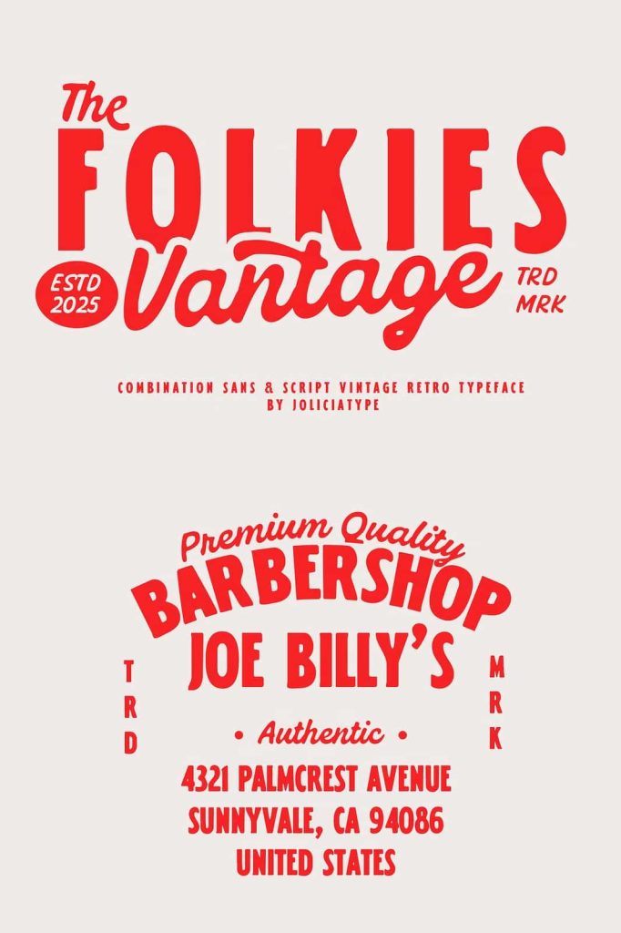
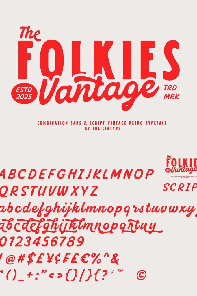
Folkies Vantage: A Bold Vintage Font Duo with Handcrafted Soul
Folkies Vantage is a bold and expressive vintage font duo designed to capture the warmth and authenticity of handcrafted lettering from a bygone era. Inspired by retro signage, faded ink, and artisanal typography, this typeface brings nostalgic character into modern design workflows. It evokes a time when letters were painted by hand, printed with texture, and shaped by human imperfection rather than digital precision.
This font duo delivers strong visual contrast by pairing clean, structured Sans Serif characters with rugged, expressive Script strokes. Together, they create a typographic system that feels both classic and personal, making Folkies Vantage a powerful choice for branding and display-focused projects.
Inspired by Retro Signage and Handcrafted Letterforms
Folkies Vantage draws its visual identity from vintage signs, old storefront lettering, and hand-painted typography found in markets, workshops, and roadside businesses. The design embraces the charm of rough textures, worn edges, and subtle inconsistencies that define traditional craftsmanship.
Rather than hiding these imperfections, the font celebrates them. Each letterform carries a sense of history and human touch, creating an emotional connection between the design and the viewer. This nostalgic influence helps brands feel grounded, authentic, and approachable.
A Typeface Built on Contrast and Character
What truly sets Folkies Vantage apart is its intentional contrast. The Sans Serif component provides structure, clarity, and stability. Its clean lines and solid forms anchor the design, making text easy to read and visually balanced.
The Script component introduces movement, energy, and personality. Its handcrafted strokes mimic natural pen and brush movements, adding warmth and expression. This contrast allows designers to create dynamic compositions that feel both organized and lively.
Designed for Authentic and Timeless Branding
Folkies Vantage excels in branding projects that require a sense of heritage and personality. It works exceptionally well for logos, packaging, labels, signage, and identity systems that want to communicate craftsmanship and tradition. The font duo helps brands tell a story rooted in authenticity and creativity.
By combining sans and script styles within one family, Folkies Vantage allows designers to build hierarchy and emphasis without introducing multiple unrelated fonts. This consistency strengthens brand recognition while maintaining visual interest.
Perfect for Display, Packaging, and Editorial Use
This vintage font duo performs best in display applications where character and mood matter. Headlines, posters, menu designs, and product packaging benefit from its bold presence and textured feel. The Script style adds a personal accent, while the Sans Serif ensures clarity and balance.
In editorial layouts, Folkies Vantage enhances storytelling. It adds depth to titles, pull quotes, and section headers, supporting visual narratives that rely on emotion and atmosphere.
Flexible Pairing for Modern Design Systems
Despite its vintage roots, Folkies Vantage integrates smoothly into contemporary design systems. Designers can pair it with minimalist layouts, modern color palettes, or clean photography to create a compelling contrast between old and new.
The font duo adapts well across print and digital formats, maintaining its impact whether used on physical signage or on-screen branding materials.
Why Choose Folkies Vantage?
Folkies Vantage offers a thoughtful blend of structure and expression. Its bold Sans Serif and handcrafted Script styles work together to create designs that feel timeless, human, and visually engaging. This balance makes it ideal for projects that need to communicate authenticity without sacrificing clarity.
If your design aims to evoke nostalgia, craftsmanship, and personality, Folkies Vantage provides a versatile and expressive typographic solution that brings character and soul to every word.