Flyer TM Font
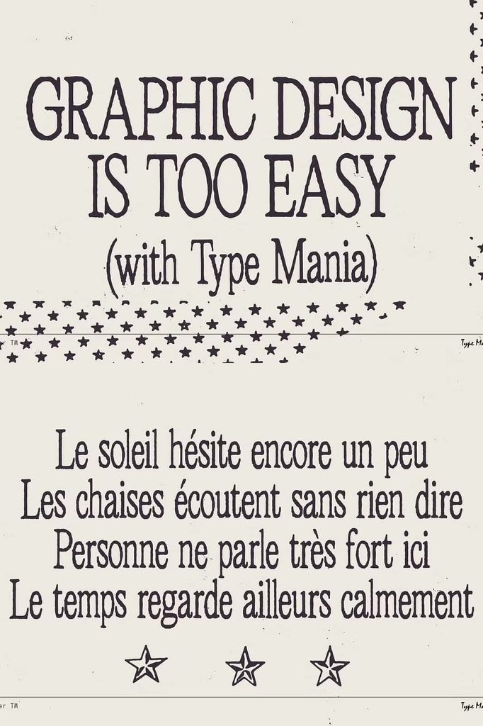
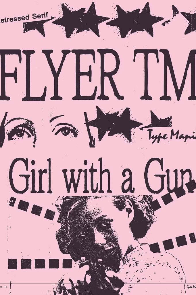
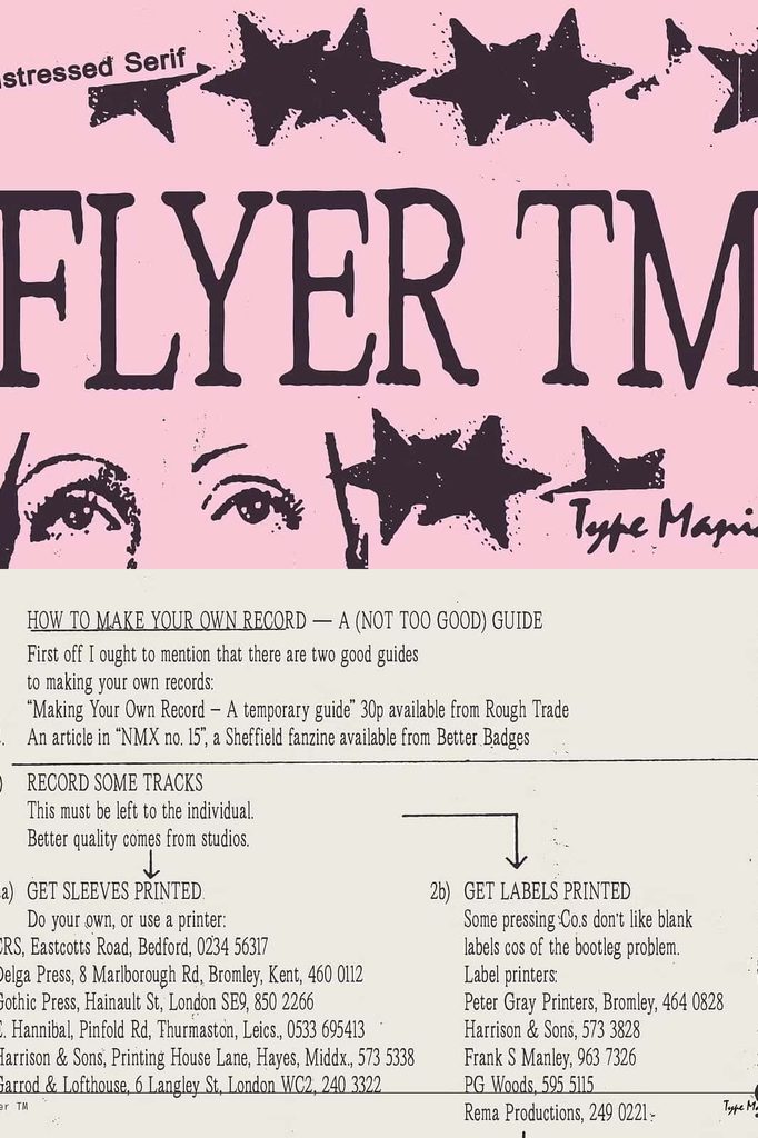
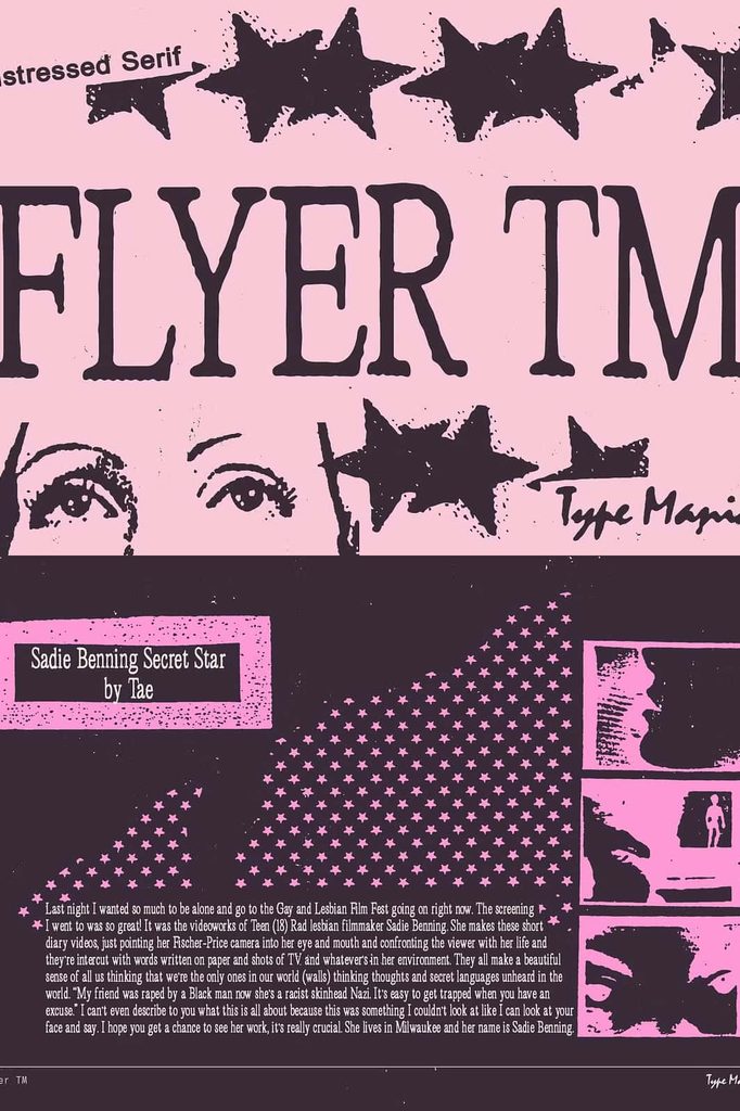
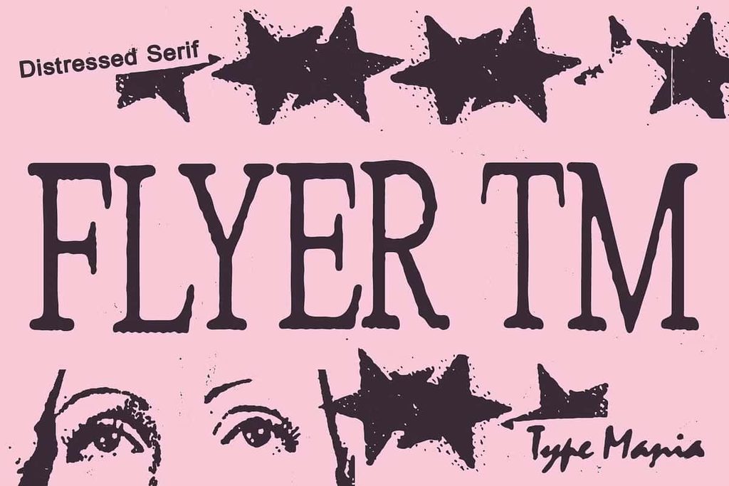
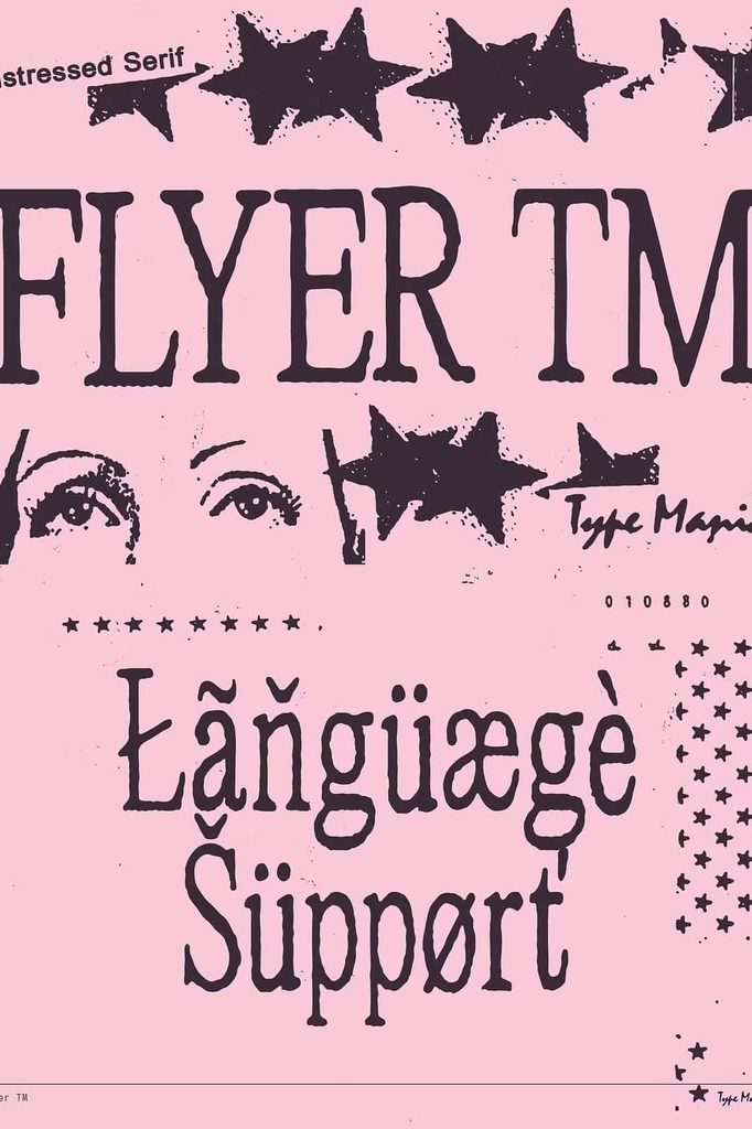
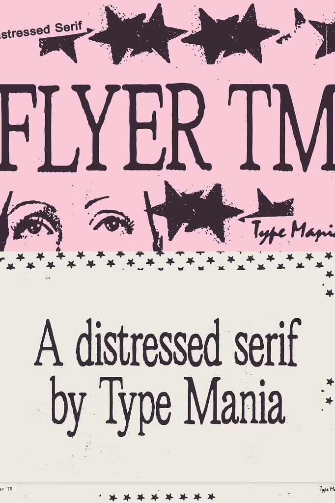
Flyer TM Font channels the raw energy and independent attitude of 1990s fan zines into a distinctive typographic style. Inspired by the DIY culture that turned photocopied pages, handmade layouts, and personal publications into powerful forms of creative expression, Flyer TM brings that same human-forward spirit into modern design.
This typeface gives designers an opportunity to move away from overly polished and predictable typography. Instead, it helps create compositions that feel personal, direct, expressive, and deliberately handmade. Whether you are designing an editorial spread, an experimental poster, a book cover, or a promotional flyer, Flyer TM can add character and visual attitude to your work.
Inspired by the DIY Spirit of 90s Fan Zines
The visual culture of fan zines encouraged creators to make their own rules. Writers, artists, musicians, and independent publishers used simple tools to create publications that felt immediate and personal. Flyer TM Font draws from that creative mindset and translates it into a versatile display typeface for contemporary designers.
Rather than trying to reproduce a sterile digital aesthetic, Flyer TM emphasizes the human side of graphic design. Its character works particularly well when you want your typography to feel connected to independent publishing, underground culture, music, art, and alternative editorial design.
Bring a Human-Forward Vibe to Your Layouts
Flyer TM helps your designs communicate personality through typography. Use it when you want viewers to feel that a real person created the design rather than a generic template. This quality makes the font especially useful for projects that celebrate individuality, creative freedom, and independent expression.
Large headlines can immediately establish a strong visual presence, while shorter phrases can become memorable graphic elements. Experiment with scale, spacing, alignment, and placement to create layouts that feel active and spontaneous.
Powerful Typography for Editorial Design
Editorial design provides an ideal environment for Flyer TM Font. Use it for magazine covers, feature headlines, article titles, cultural publications, independent journals, and experimental editorial spreads. Its distinctive character can help establish hierarchy and draw attention to important content.
Pair Flyer TM with a simpler typeface for supporting text to create a clear visual relationship between headlines and body copy. This approach lets the expressive personality of the display font stand out while keeping longer information comfortable to read.
Create Engaging Magazine and Zine Covers
Make your publication immediately recognizable by giving its cover a strong typographic identity. Flyer TM can help you create bold titles and memorable cover compositions that capture the independent spirit associated with zine culture.
Combine the font with photography, photocopy-inspired textures, illustrations, collage elements, or simple monochrome layouts. These combinations can reinforce the DIY-inspired atmosphere without requiring complicated design effects.
Make Bold and Expressive Posters
Posters need to communicate quickly, and strong typography can make the message impossible to ignore. Flyer TM Font provides an effective option for headlines, event names, campaign statements, artistic announcements, and promotional graphics.
Use large lettering to establish an immediate focal point. Experiment with unconventional positioning and generous or compressed spacing to create visual tension. You can also combine different sizes to produce a layered editorial feel inspired by handmade print materials.
Design Memorable Book Covers
Typography plays an important role in shaping the identity of a book. Flyer TM works particularly well for titles that explore creative culture, music, art, independent publishing, youth culture, photography, or unconventional subjects.
Use the font for the main title, author name, series identity, or selected cover details. Its human-forward personality can help a cover feel more individual and less conventional. Combine it with photography or illustration to build a visual concept that feels contemporary while retaining a DIY influence.
Create Eye-Catching Flyers
Flyer TM Font naturally suits flyers because its name and character connect directly with the fast-moving world of independent promotional graphics. Use it for concerts, creative events, exhibitions, workshops, markets, community projects, independent releases, and other announcements that need an expressive visual identity.
Build a strong headline first, then organize supporting information around it. You can use contrasting typefaces and different sizes to establish hierarchy. The result can feel energetic, approachable, and distinctly human.
Experiment with Independent Graphic Design
Flyer TM encourages experimentation. You do not need to keep every element perfectly aligned or rely on conventional layouts. Try asymmetrical compositions, oversized headlines, unexpected spacing, overlapping elements, and bold typographic placement.
This flexibility makes the font particularly useful for designers who want to explore visual concepts rather than follow rigid design formulas. Let the typography become part of the artwork instead of treating it as simple information.
Perfect for Creative and Alternative Projects
Flyer TM Font can support a wide range of projects that require personality and a strong independent identity. Its 90s fan-zine inspiration makes it especially suitable for alternative, artistic, cultural, and editorial work.
- Editorial magazines and independent publications
- DIY-inspired fan zines and personal publications
- Bold event and music posters
- Creative book covers
- Promotional flyers and announcements
- Art exhibition graphics
- Independent music artwork
- Cultural campaign materials
- Experimental typography projects
- Social media graphics with an editorial feel
Build Strong Typographic Contrast
Flyer TM can take center stage, but it also works effectively as part of a larger typographic system. Pair it with clean sans serif or classic serif fonts to create contrast between expressive headlines and structured supporting information.
Use Flyer TM for the elements that need attention, then introduce simpler typography for descriptions, captions, dates, and other details. This strategy helps you preserve the font’s distinctive personality while maintaining a clear and organized layout.
Why Choose Flyer TM Font?
Flyer TM Font gives designers a direct connection to the creative freedom of DIY publishing. It brings a human-forward quality to modern typography and helps transform ordinary layouts into more expressive visual experiences.
Choose Flyer TM when you want to create designs that feel independent, personal, energetic, and authentic. Its zine-inspired character can strengthen editorial concepts, enhance posters, establish memorable book covers, and give flyers a strong visual voice.
Give Your Design a Human Touch
Modern design often focuses on precision, consistency, and polished digital presentation. Flyer TM offers another direction. It celebrates the creative energy that comes from making something yourself and communicating an idea without unnecessary restraint.
From editorial spreads and posters to book covers and flyers, Flyer TM Font helps you create typography with personality. Use it boldly, experiment with your layout, and combine it with imagery and supporting typefaces to build a design that feels unmistakably your own.
Bring the DIY spirit of 90s fan zines into your next project with typography that feels human, expressive, and ready to break the rules. Flyer TM gives your words the visual confidence to become an active part of the design rather than simply sitting on the page.