Fifty Fifty – Editorial Serif Font Family
Fifty Fifty is a sophisticated editorial serif font family designed to deliver elegance, flexibility, and expressive typographic performance. Built with smooth curves and carefully balanced proportions, this font family brings a refined voice to modern design projects. With six distinct weights, each available in regular and italic styles, Fifty Fifty offers designers a complete and adaptable typographic system that supports both creative freedom and structural consistency.
A Complete Serif Font Family with Depth and Character
As an editorial serif font family, Fifty Fifty was created to perform across a wide range of design applications. The six weights allow designers to establish clear hierarchy, rhythm, and emphasis within layouts. From light and subtle text to bold and commanding headlines, each weight carries the same design DNA while offering a unique level of visual intensity.
The italic styles introduce fluidity and contrast, enabling expressive typography without disrupting overall balance. These italics enhance storytelling by adding emphasis, movement, and nuance. Together, the regular and italic styles form a cohesive system that adapts seamlessly to editorial, branding, and display needs.
Smooth Curves and Elegant Letterforms
Fifty Fifty stands out through its smooth curves and confident serif construction. Every letterform reflects careful craftsmanship, resulting in typography that feels polished and intentional. The curves soften the structure of the serif forms, creating a harmonious blend of classic elegance and contemporary clarity.
This design approach ensures that the font remains visually appealing at both large and small sizes. Whether used in expansive headlines or compact editorial text, Fifty Fifty maintains legibility and grace. The refined details invite readers in, making long-form content more engaging and visually pleasing.
Over 100 Ligatures for Expressive Typography
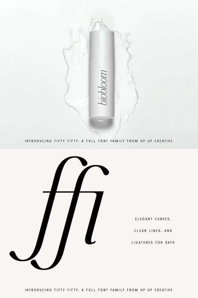
One of the defining features of Fifty Fifty is its extensive collection of more than 100 ligatures. These ligatures allow letters to connect naturally, creating smooth transitions and refined typographic flow. They add a layer of sophistication that elevates text beyond standard letter spacing.
Designers can use these ligatures to create distinctive wordmarks, editorial headlines, and custom typographic compositions. The ligatures enhance personality without overwhelming the design, offering subtle refinement that rewards closer inspection.
Powerful in All Caps and Confident in Lowercase
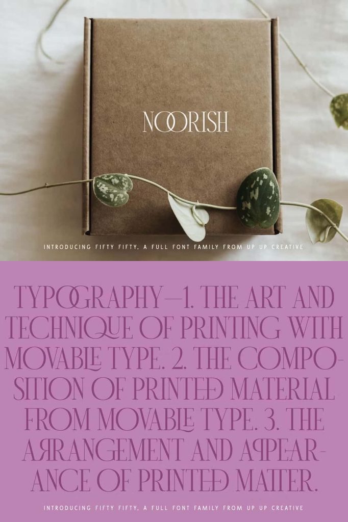
Fifty Fifty looks especially striking when set in all caps. The strong serif structure and balanced proportions give uppercase text a commanding presence, making it ideal for headlines, titles, and posters. All-caps settings feel bold, elegant, and authoritative.
At the same time, the lowercase letters demonstrate exceptional strength and readability. They hold their own in body text, subheadings, and editorial layouts. This balance allows designers to use Fifty Fifty across multiple typographic roles within a single project, maintaining consistency and visual harmony.
Ideal for Editorial, Branding, and Display Design
Fifty Fifty is perfectly suited for editorial design, where typography must support storytelling and structure. Magazines, books, and digital publications benefit from its versatility and refined tone. The font helps guide readers through content while reinforcing a professional and curated aesthetic.
In branding and logo design, Fifty Fifty communicates confidence, craftsmanship, and sophistication. It works beautifully for monograms, luxury branding, creative studios, fashion labels, and cultural projects. Poster design and promotional materials also benefit from its expressive forms and strong visual presence.
A Versatile Serif Font for Modern Designers
Fifty Fifty offers designers a reliable and expressive editorial serif font family that adapts to diverse creative challenges. Its wide range of weights, elegant italics, and rich ligature set make it a powerful typographic asset. The font performs consistently across print and digital platforms, ensuring cohesive design systems.
By choosing Fifty Fifty, designers gain a serif font family that combines beauty, flexibility, and performance. It transforms text into a refined visual experience and supports designs that demand both personality and precision. Fifty Fifty empowers designers to create compelling layouts that feel intentional, balanced, and timeless.