Fander Font Family: Minimalist Typography Built for Distinctive Branding
Fander is a modern font family created with one clear purpose: to help designers craft clean, minimalist logos, wordmarks, titles, and taglines that feel refined and intentional. This typeface focuses on simplicity without sacrificing character, offering a structured yet flexible design system that adapts effortlessly to contemporary branding needs.
Rather than relying on decorative elements, Fander uses precision, proportion, and subtle variation to achieve its visual impact. It is designed for creatives who value clarity, balance, and control, and who want typography that enhances identity rather than overpowering it.
Minimalist Design for Modern Visual Identity
Fander embraces minimalist design principles at its core. Each letterform is carefully constructed to feel clean, confident, and modern. The font avoids unnecessary details, allowing the shapes themselves to communicate sophistication and professionalism.
This restrained approach makes Fander especially effective in branding contexts where clarity and memorability are essential. Logos and wordmarks created with Fander feel timeless, adaptable, and versatile across different platforms and formats.
Clean Letterforms with Balanced Proportions
The strength of Fander lies in its balanced proportions. Each character maintains consistent visual weight and spacing, ensuring harmony across words and lines. This balance helps typography feel stable and trustworthy, which is critical for brand communication.
The clean construction also supports excellent legibility, even at smaller sizes. This makes Fander suitable not only for large titles but also for taglines and supporting text.
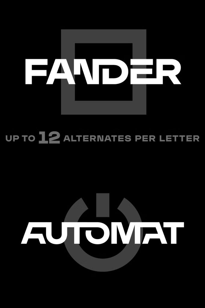
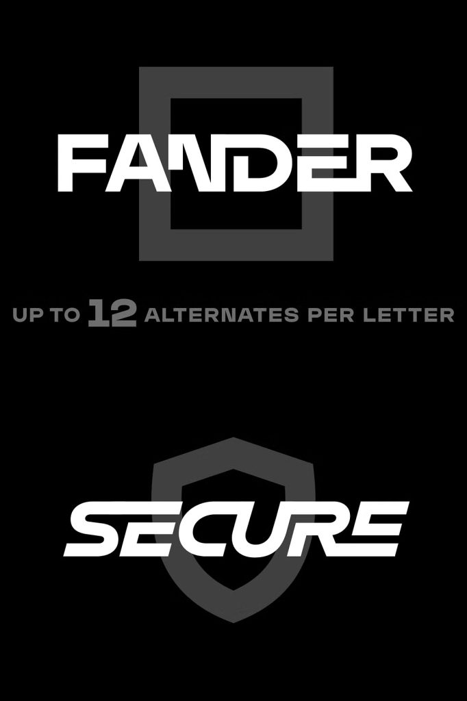
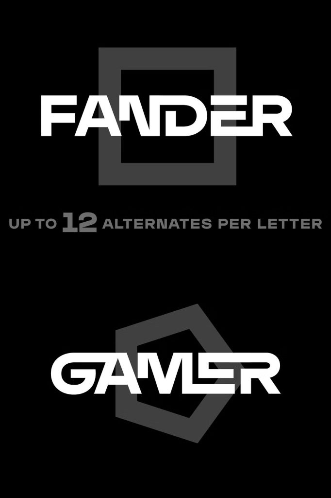
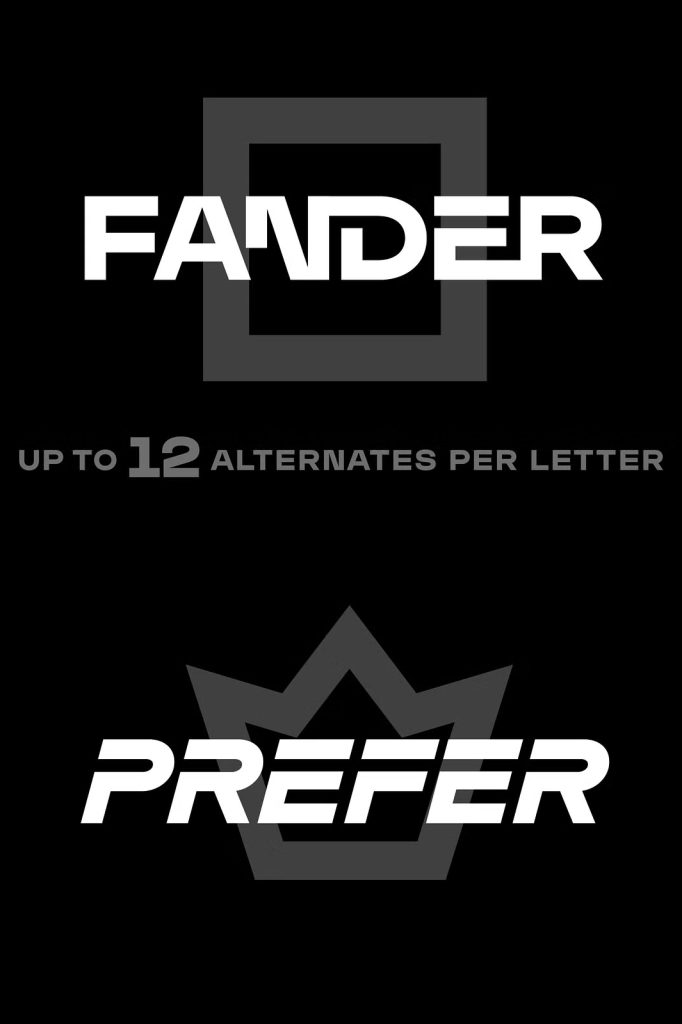
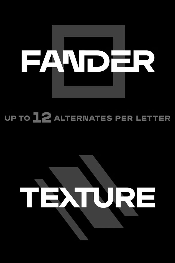
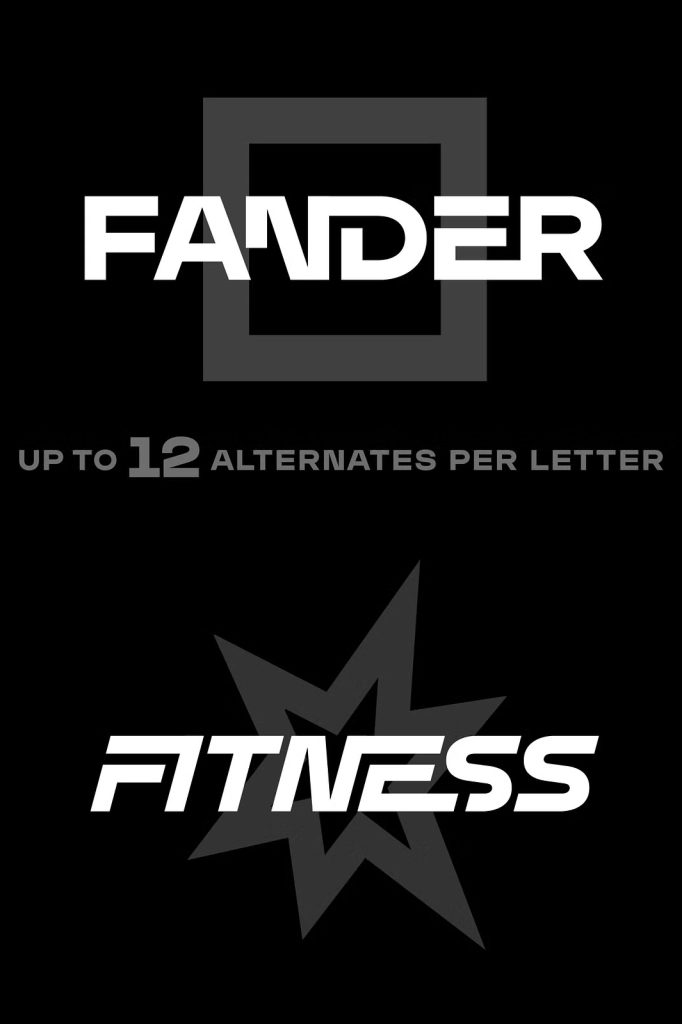
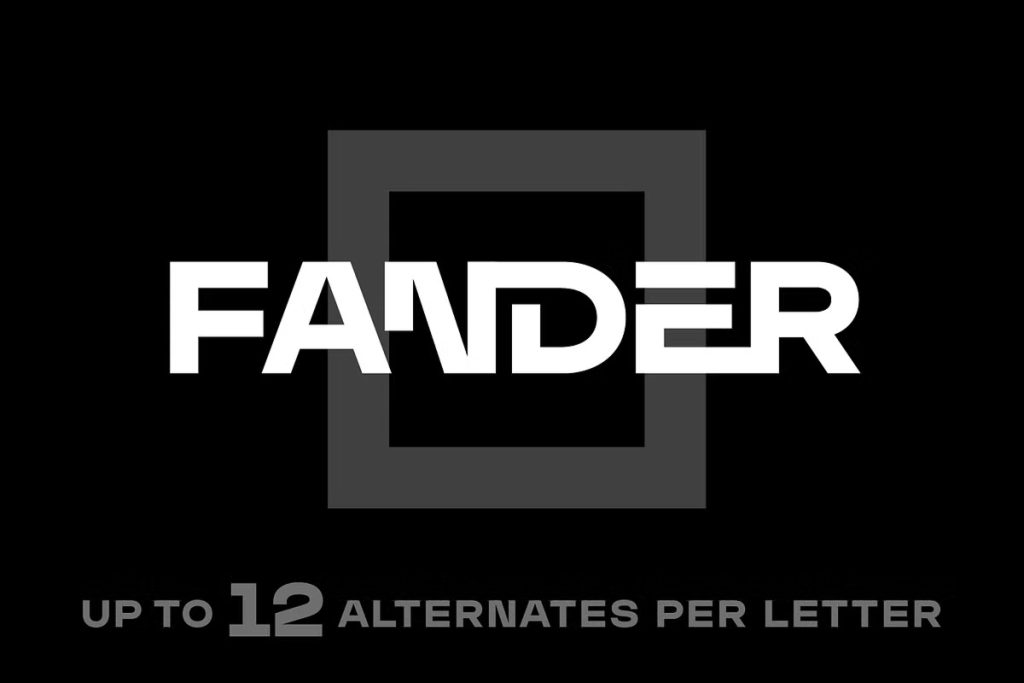
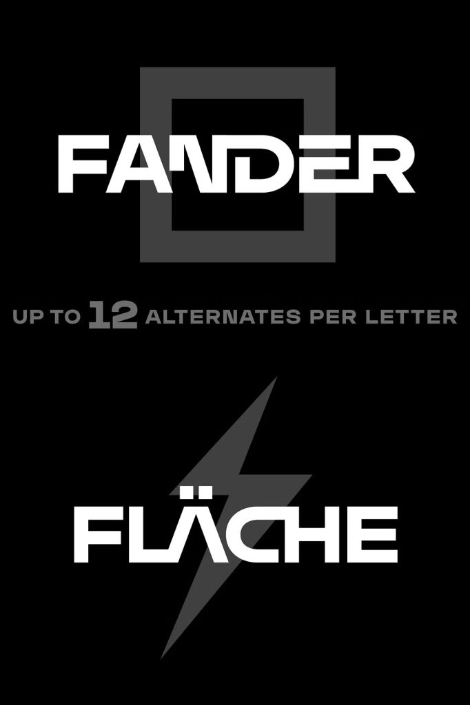
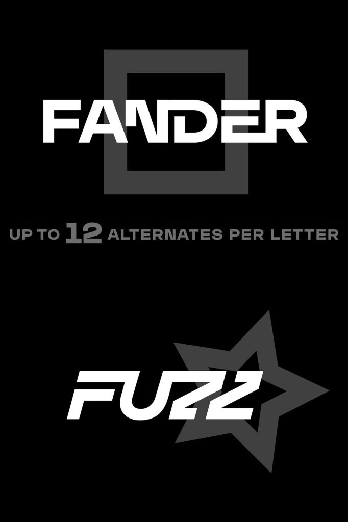
Up to 12 Alternates Per Letter for Creative Freedom
One of Fander’s most powerful features is its extensive collection of alternates. Each letter includes up to twelve alternate forms, giving designers an exceptional level of creative control. These alternates allow subtle variations in shape, width, or structure while preserving the font’s minimalist aesthetic.
By mixing default characters with alternates, designers can build unique typographic combinations that feel custom and distinctive. This flexibility helps brands avoid generic solutions and create wordmarks that stand apart visually.
Mix and Match for Unique Compositions
Fander encourages experimentation. Designers can test different alternates to find the most effective rhythm and balance for each word. This process allows typography to feel handcrafted and intentional rather than automated.
Because the alternates are designed to work harmoniously together, even bold experimentation results in cohesive and polished typography.
Optimized for Logos, Wordmarks, and Titles
Fander is specifically optimized for display use in branding and identity design. Its structure and alternates make it ideal for logos and wordmarks where individuality and consistency matter most. The font adapts easily to different brand personalities, from understated and elegant to modern and progressive.
Titles and headlines set in Fander benefit from its clean geometry and subtle variations. The font communicates confidence without distraction, allowing the message and brand identity to remain the focal point.
- Logo and wordmark design
- Brand identities and visual systems
- Titles and headlines
- Taglines and slogans
- Minimalist editorial layouts
A Flexible Tool for Contemporary Designers
Fander works seamlessly within modern design workflows. Its alternate characters are accessible through OpenType features in professional design software, allowing designers to switch between forms quickly and efficiently. This ease of use makes Fander practical for both concept development and final production.
The font’s versatility allows it to perform consistently across print and digital environments. Whether used on websites, packaging, or brand collateral, Fander maintains its clarity and visual integrity.
Typography That Supports Brand Longevity
Because Fander is rooted in minimalist principles, it avoids short-lived trends. Its clean forms and customizable alternates help brands stay visually relevant over time. Designers can refresh a logo or identity simply by adjusting alternate combinations, extending the lifespan of the design.
This adaptability makes Fander a valuable long-term asset in any font library.
A Minimalist Font Family with Maximum Control
Fander proves that minimalism does not mean limitation. By offering up to twelve alternates per letter, it empowers designers to shape typography with precision and creativity. The font delivers a rare balance between simplicity and flexibility, making it suitable for a wide range of branding and display applications.
For designers seeking a minimalist font family that enables distinctive logos, refined wordmarks, and clean titles, Fander offers a powerful typographic solution. It transforms simple letterforms into a customizable design system built for modern visual identity.