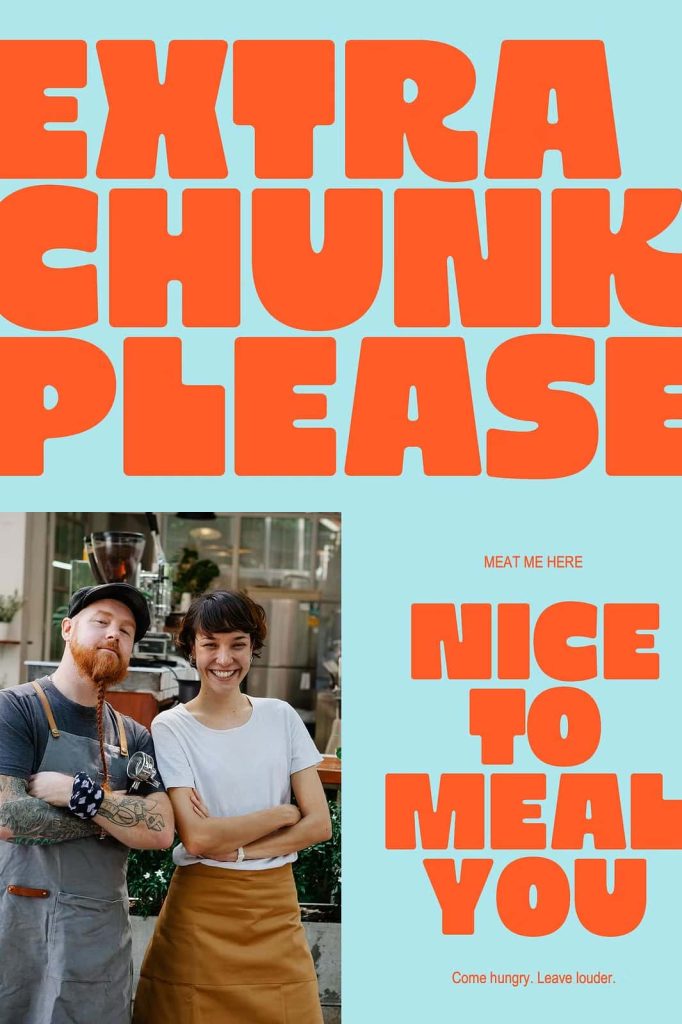
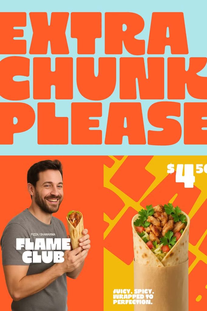
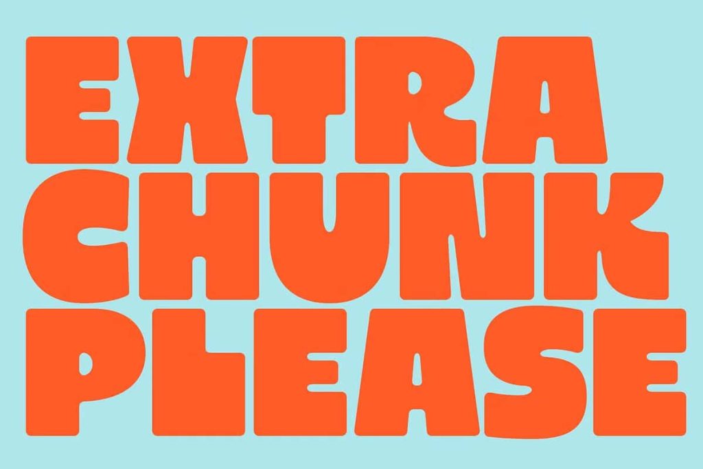
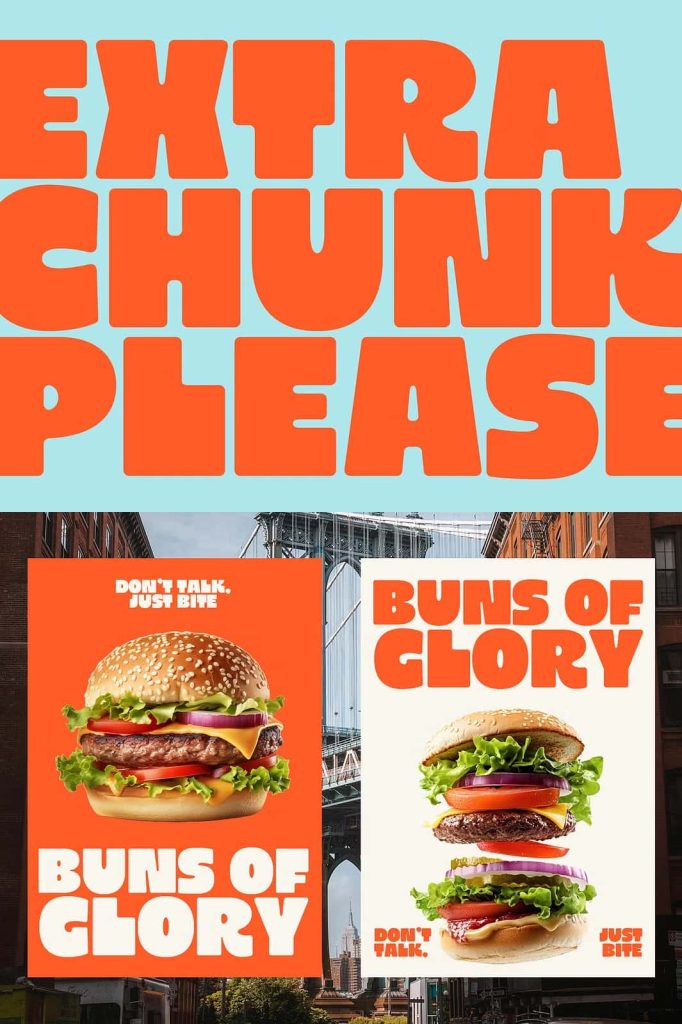
Extra Chunk Please: A Bold Modern Display Font with Playful Minimalism
Extra Chunk Please is a modern display font designed to make typography the focal point of your layout. It blends bold geometric construction with playful minimalism, resulting in letterforms that feel confident, approachable, and visually striking. With its rounded edges and strong character design, this font delivers clarity and personality in equal measure.
Rather than relying on decorative excess, Extra Chunk Please uses shape and proportion to create impact. The font embraces simplicity while still expressing a distinct voice, making it a powerful tool for designers who want clean layouts with unmistakable presence.
Bold Geometry with Soft, Rounded Edges
At the core of Extra Chunk Please lies its geometric foundation. Each character is built from solid shapes that feel structured and intentional. These bold forms provide visual weight, allowing the font to stand out effortlessly in headlines and display settings.
The rounded edges soften the geometry, adding warmth and playfulness to the design. This balance between firmness and friendliness gives Extra Chunk Please its unique personality. It feels modern without becoming cold and playful without losing professionalism.
A Strong Character-Driven Design
Extra Chunk Please emphasizes character design over ornamentation. Every letterform contributes to a cohesive visual rhythm that feels confident and energetic. The font communicates clearly, even at large sizes, ensuring your message remains readable and impactful.
This character-driven approach makes the font ideal for typography-led compositions, where text carries the visual narrative rather than supporting it.
Perfect for Clean and Typography-Focused Layouts
Extra Chunk Please excels in clean layouts where typography takes center stage. It works exceptionally well in branding, editorial design, web interfaces, posters, and digital campaigns that prioritize clarity and visual hierarchy.
Designers can use this font to create strong headlines, bold mastheads, and eye-catching callouts. Its geometric consistency ensures alignment and balance, making it easy to integrate into structured design systems.
Modern Appeal Across Branding and Editorial Design
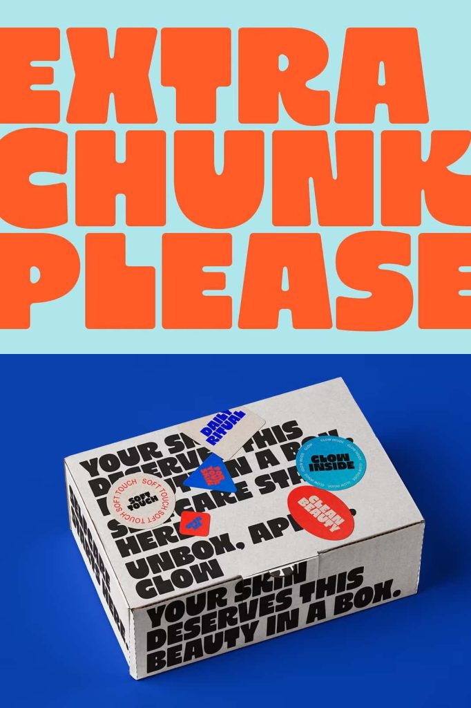
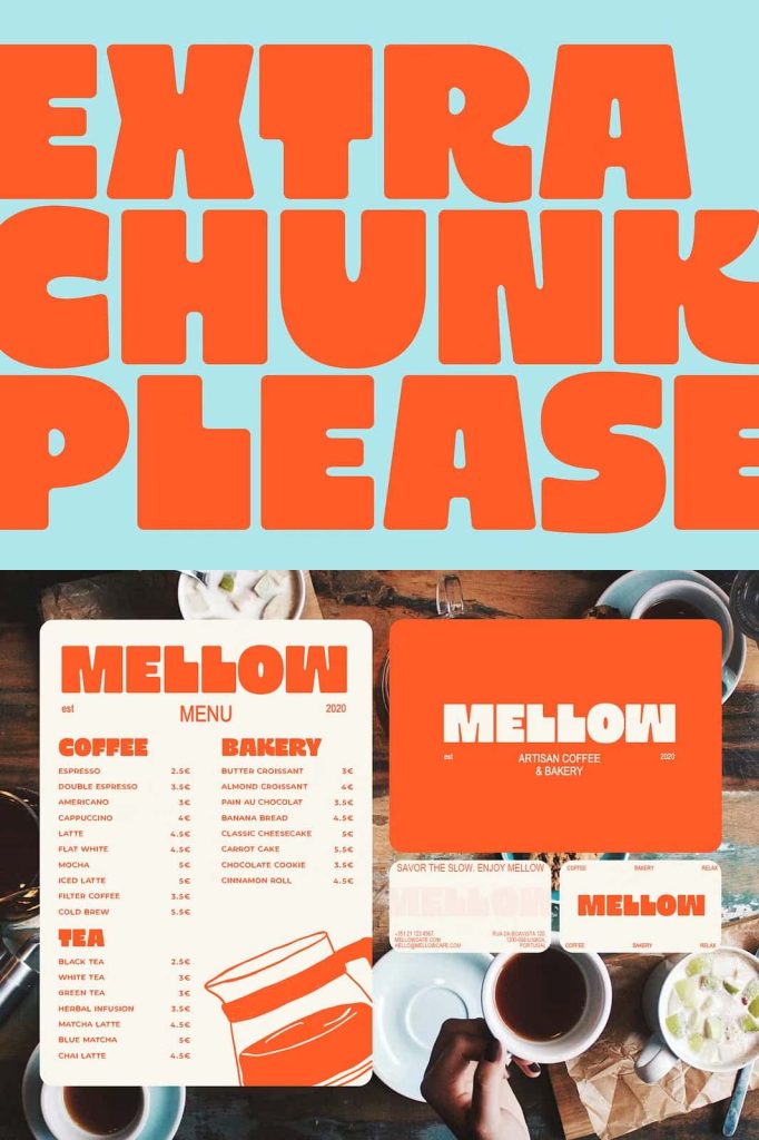
In branding, Extra Chunk Please helps establish a contemporary identity that feels fresh and confident. It suits startups, creative studios, lifestyle brands, and modern products that want to communicate approachability and strength through typography.
For editorial design, the font adds visual impact without overpowering the content. Magazine covers, feature titles, and section headers benefit from its bold presence and clean lines.
Versatile Across Digital and Print Media
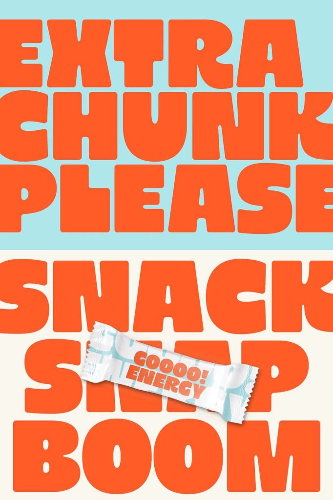
Extra Chunk Please performs consistently across digital and print formats. Its strong shapes maintain clarity on screens, while its solid forms reproduce well in print. This versatility allows designers to use the font confidently across multiple platforms and media types.
The font pairs effectively with minimalist sans-serif fonts or neutral body text, allowing it to shine as a display element while supporting content remains clean and readable.
Why Choose Extra Chunk Please?
Extra Chunk Please offers a modern typographic solution for designers who value simplicity, structure, and personality. Its blend of bold geometry and playful minimalism makes it suitable for a wide range of creative projects, from branding and editorial layouts to digital campaigns and visual identities.
If your design demands clarity, confidence, and a strong visual voice, Extra Chunk Please delivers a display font that turns simple layouts into memorable experiences through typography alone.