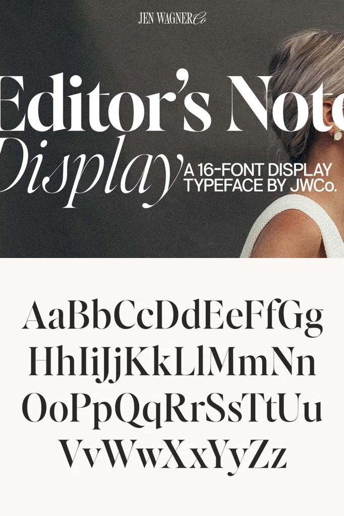
Editor’s Note Display Font stands out with its sharp contrast and refined design. Built as the perfect companion to Editor’s Note and Editor’s Note Text, this typeface adds clarity and style to every project. Its bold lines and delicate curves work together to deliver a strong visual presence ideal for headlines, covers, and sophisticated brand identities.
Sharp Contrast, Clear Character
With its clean proportions and elegant contrast, Editor’s Note Display brings life to editorial layouts. Each character is carefully crafted to maintain balance and readability, even at large sizes. The high contrast between thin and thick strokes gives your text depth, sophistication, and a timeless visual rhythm.
This font performs beautifully in magazine covers, luxury brand designs, and digital publications. Its precision and visual power make it perfect for titles that demand attention while maintaining a sense of elegance and control. Designers can rely on its structure to bring unity and focus to visual storytelling.
Designed for Editorial Harmony
Editor’s Note Display was created to work seamlessly with Editor’s Note and Editor’s Note Text. Together, they form a complete typographic system—Display for impactful headlines, Note for balanced body text, and Note Text for longer reading. This pairing ensures consistent visual flow, making layouts appear cohesive and professional from start to finish.
Use this display font when you want to emphasize sophistication and control. Its precision and geometry balance beautifully with the softer forms of its text companions. Whether used in print or digital environments, the result is always striking, refined, and easy to read.
Why Choose Editor’s Note Display?
- Elegant contrast: Bold strokes and fine lines create striking visual appeal.
- Perfect pairing: Complements Editor’s Note and Editor’s Note Text seamlessly.
- Professional tone: Suited for magazines, branding, and high-end publications.
- Modern versatility: Adapts beautifully to print and web design.
- Balanced craftsmanship: Every curve and edge is designed for precision.
Versatile Applications
Editor’s Note Display enhances any creative project that values elegance and clarity. In editorial design, it delivers strong, readable titles and striking section headers. For branding, it communicates confidence and professionalism. Its sculpted letterforms elevate business presentations, packaging, websites, and digital campaigns, maintaining consistency across media.
The font’s unique blend of modern geometry and classic serif influence ensures lasting appeal. It provides flexibility for designers who want to mix authority with style—ideal for fashion brands, design agencies, book covers, or marketing materials that require a confident, polished look.
Final Impression
Editor’s Note Display Font embodies precision, creativity, and timeless beauty. Its sharp contrasts and elegant forms allow designers to craft engaging visual experiences that stand out in any medium. When combined with the Editor’s Note family, it forms a comprehensive toolkit that supports both expressive headlines and legible text. Choose Editor’s Note Display to elevate your next project with confidence, clarity, and typographic excellence.