Doomer TM – A Soft-Edged Blackletter Font with Dynamic Character
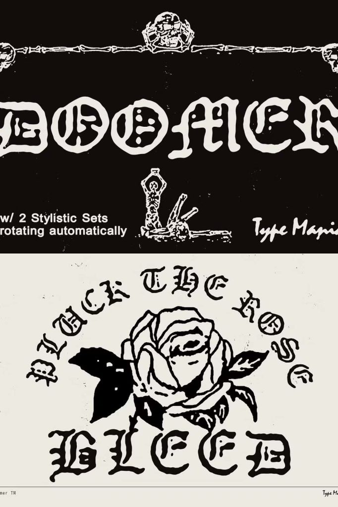
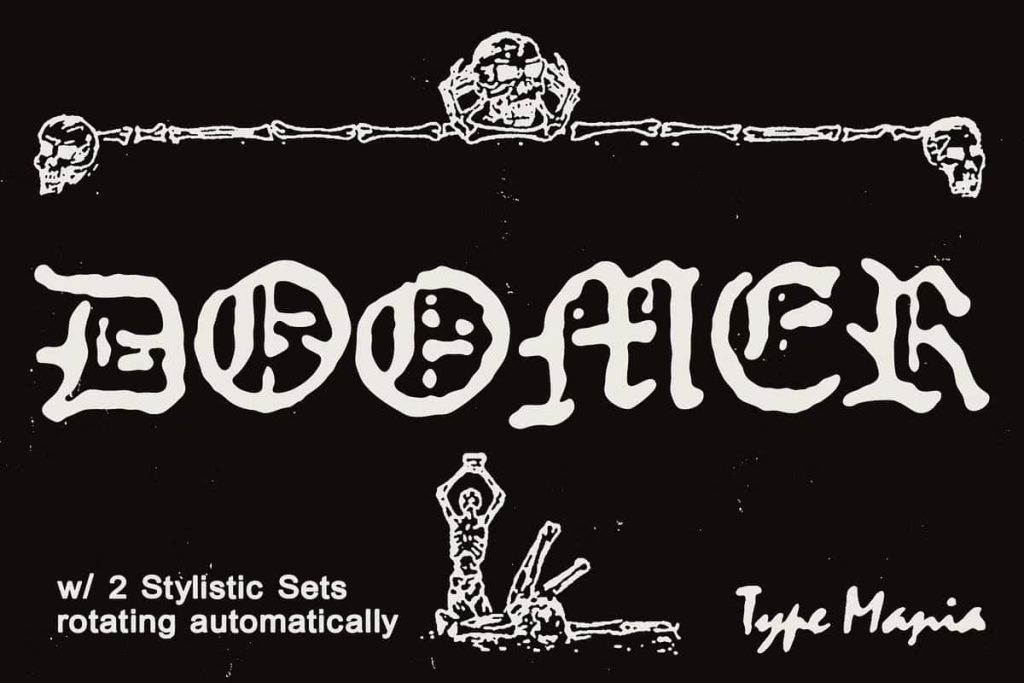
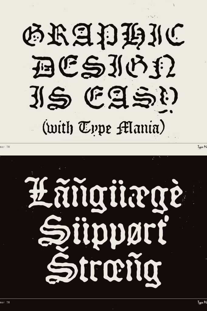
Doomer TM is a distinctive blackletter font that combines the dramatic character of traditional Gothic typography with a softer, more contemporary visual approach. Designed with soft edges and a multi-layered character, Doomer TM creates a bold typographic presence while avoiding the overly rigid appearance often associated with classic blackletter styles.
Its expressive letterforms make it an excellent choice for designers who want to build memorable headlines, logos, posters, apparel graphics, album artwork, packaging, and other projects that require strong visual personality. Doomer TM takes the recognizable structure of blackletter typography and introduces a more approachable finish, giving designers greater freedom to use Gothic-inspired lettering in modern creative contexts.
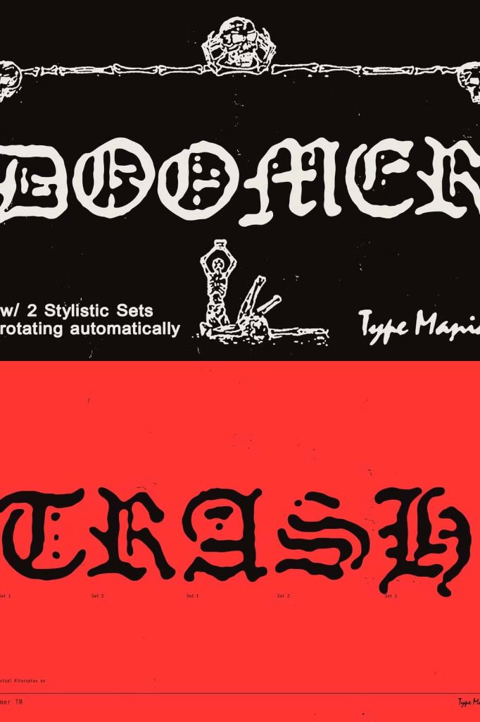
One of the font’s most practical features is its automatic stylistic variation. With two stylistic sets available, Doomer TM can introduce alternate letterforms when contextual alternates are enabled. This feature makes the design process more efficient while helping your typography develop a natural sense of variation.
A Modern Interpretation of Blackletter Typography
Blackletter fonts have a long history of creating powerful visual statements. Their dense forms, distinctive strokes, and dramatic structures immediately attract attention. Doomer TM builds on that tradition while introducing softer edges that give the typeface a different personality.
Instead of relying exclusively on sharp, rigid forms, Doomer TM creates a more fluid impression. The softened details can make the font feel contemporary, expressive, and experimental while preserving the strong visual impact associated with blackletter typography.
This balance makes Doomer TM suitable for designers who want to reference Gothic lettering without producing a completely traditional historical aesthetic. Use it to create modern interpretations of blackletter branding, editorial graphics, merchandise, and digital artwork.
Soft Edges for a Distinctive Look
The soft-edged construction gives Doomer TM an important visual advantage. It creates contrast between the heavy presence of blackletter forms and the more approachable quality of rounded or softened details.
This characteristic can help the font work across a wider range of creative projects. You can use it for bold headlines and logos while maintaining a sense of personality and movement. The softer treatment also makes Doomer TM an interesting choice for designs that combine dark, dramatic themes with contemporary visual aesthetics.
Pair Doomer TM with minimal layouts, bold photography, illustrations, textures, or clean supporting typography to create compositions with strong visual contrast. Its distinctive shapes can become a central graphic element rather than simply serving as a method of displaying text.
Dynamic Typography with Two Stylistic Sets
Doomer TM includes two stylistic sets that provide additional character variations. When contextual alternates are enabled, these alternatives can automatically appear in appropriate combinations, helping the lettering feel more natural and varied.
This feature can save valuable design time. Instead of manually replacing individual characters throughout your artwork, you can activate contextual alternates and allow the font to handle much of the variation automatically. The result is typography that can feel more expressive without requiring extensive manual adjustments.
Let Contextual Alternates Do the Work
Contextual alternates can change selected characters based on their position or surrounding letters. For Doomer TM, this functionality supports the font’s multi-character personality and helps prevent repetitive-looking combinations.
Designers can activate the feature through OpenType controls in compatible design applications. Once enabled, the font can introduce alternative forms where appropriate, giving words a more dynamic appearance while maintaining a cohesive overall style.
Perfect for Logos and Branding
Doomer TM can create an immediate identity for brands that need a bold and unconventional visual direction. Its blackletter foundation gives logos a strong presence, while the softened edges and stylistic variations add a more contemporary personality.
Use Doomer TM for music brands, fashion labels, alternative lifestyle projects, creative studios, entertainment identities, and businesses that want to stand apart from conventional branding.
The font works particularly well for short brand names and wordmarks where the lettering can become the primary visual feature. Experiment with spacing, scale, and stylistic variations to develop a logo that feels distinctive and memorable.
Make Powerful Album Covers and Music Artwork
The dramatic character of blackletter typography makes Doomer TM a natural choice for album covers, band identities, concert posters, merchandise, and music-related graphics. Its bold shapes can communicate intensity and attitude while the softer edges keep the overall appearance contemporary.
Use large Doomer TM lettering for artist names, album titles, or track-related artwork. Combine it with photography, textures, illustrations, or atmospheric compositions to create music graphics with a strong visual identity.
Stand Out with Apparel and Merchandise
Doomer TM also works effectively for apparel graphics and merchandise. Its strong letterforms can translate into eye-catching T-shirts, hoodies, jackets, caps, posters, stickers, patches, and other products.
Use short phrases, slogans, names, or statements to create bold typographic graphics. The blackletter structure gives the design an established visual presence, while the soft-edged treatment and alternate characters introduce additional personality.
For merchandise collections, use the stylistic sets to create variations across different products while maintaining a recognizable overall identity. This approach can help you build a cohesive series without repeating exactly the same lettering treatment on every design.
Ideal for Posters and Editorial Graphics
Doomer TM can turn a headline into a major visual element. Its distinctive forms work especially well for posters, editorial covers, event graphics, promotional artwork, and digital campaigns where typography needs to compete with other strong visual elements.
Use large-scale lettering to create immediate impact, or integrate smaller typographic details into a more complex composition. Pair the font with simple sans serif typography when you need a strong contrast between expressive display lettering and practical information.
Creative Applications for Doomer TM
- Blackletter-inspired logo design
- Brand identities and wordmarks
- Album covers and music artwork
- Band merchandise and apparel
- T-shirts, hoodies, and fashion graphics
- Concert posters and event graphics
- Alternative fashion branding
- Packaging and product labels
- Editorial covers and headlines
- Posters and promotional designs
- Social media graphics
- Digital artwork and campaigns
- Stickers, patches, and merchandise
- Creative studio branding
- Experimental typography projects
Create Expressive Typography with Doomer TM
Doomer TM gives designers an effective way to combine traditional blackletter influence with a more contemporary and flexible approach. Its soft edges create a distinctive visual texture, while its multi-layered character and stylistic alternatives encourage experimentation.
Try combining different letter combinations, adjusting tracking, and enabling contextual alternates to discover the font’s full range. Use the stylistic sets selectively when you want to emphasize particular words or create additional variation within a composition.
For maximum impact, keep the supporting design relatively simple and allow the typography to lead. Doomer TM has enough character to function as a major graphic element, so even a short word or phrase can create a memorable visual statement.
A Bold Blackletter Font for Contemporary Design
Doomer TM reimagines blackletter typography through soft edges, expressive forms, and automated stylistic variation. Its distinctive design gives creatives a strong tool for branding, music artwork, apparel, posters, packaging, editorial design, and experimental projects.
The inclusion of two stylistic sets and contextual alternates makes the font especially practical for designers who want variation without spending unnecessary time adjusting every character manually. Activate the appropriate OpenType features, explore the alternate forms, and let the typeface create a more dynamic typographic rhythm.
Choose Doomer TM when your project needs bold Gothic influence with a softer, modern personality. Whether you are designing a striking logo, an atmospheric album cover, a statement T-shirt, or an experimental poster, Doomer TM gives your typography the character and flexibility needed to make an impression.