Dessign Maison Hybrid Display Typeface
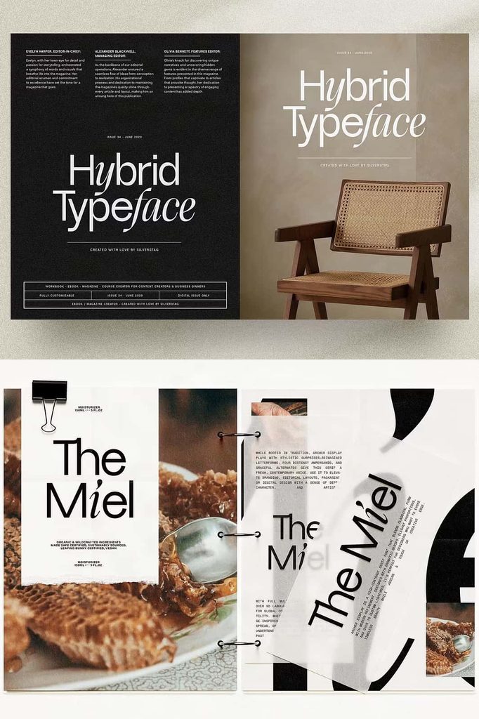
Dessign Maison introduces a fresh approach to contemporary typography by combining geometric sans serif letterforms with expressive calligraphic details. This distinctive hybrid display typeface brings two seemingly different design languages together within one cohesive font. It does not rely on a traditional font pairing or a separate script companion. Instead, Dessign Maison builds its identity through a carefully balanced system where clean geometric shapes and graceful handwritten influences work side by side.
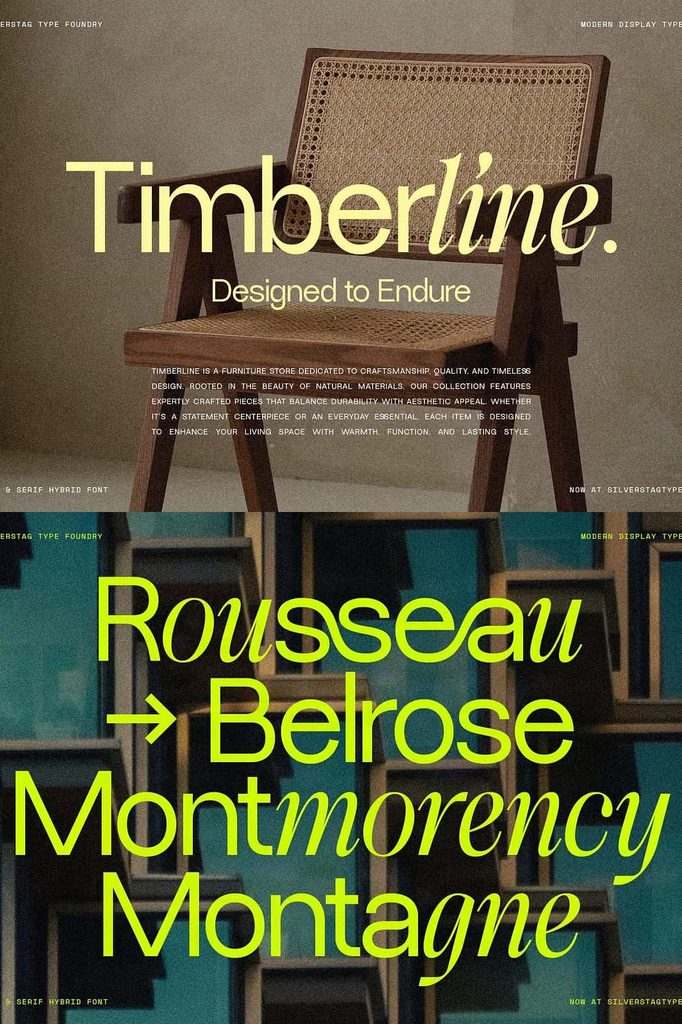
At first glance, Dessign Maison presents a structured and modern appearance. Its geometric letterforms create a sense of order, clarity, and precision. However, subtle calligraphic features add warmth, movement, and individuality to the overall design. A teardrop-shaped i introduces a refined decorative touch, while the distinctive crossbar of the f reflects the expressive movement of a calligraphic hand. These details create an unexpected visual experience without disrupting the unity of the typeface.
By blending precision with artistic expression, Dessign Maison offers designers a display font that feels sophisticated, experimental, and versatile. It gives ordinary typography a distinctive personality while maintaining a strong visual structure. Whether you create luxury branding, editorial artwork, packaging, posters, or modern promotional graphics, this hybrid typeface can help your designs communicate with confidence and originality.
A Unique Combination of Geometric and Calligraphic Design
The defining feature of Dessign Maison lies in its ability to merge geometric sans serif construction with calligraphic gestures. Traditional geometric fonts often emphasize consistent proportions, clean curves, and carefully controlled shapes. Calligraphic lettering, on the other hand, introduces fluid strokes, elegant transitions, and a more expressive rhythm.
Dessign Maison brings these characteristics together in a single typographic system. Its surrounding letters retain a clean and geometric foundation, allowing words to maintain a modern and organized appearance. At the same time, selected characters introduce unexpected details that soften the structure and create visual interest. This interaction gives the font a distinctive character that feels neither strictly minimalist nor entirely decorative.
Rather than treating geometric and calligraphic styles as separate elements, Dessign Maison integrates them into one design language. The result is a typeface that can support both contemporary layouts and more expressive creative concepts. Its unusual construction encourages designers to explore typography beyond conventional categories.
One Typeface, Not a Traditional Font Pair
Many creative projects combine a sans serif font with a script or calligraphic typeface to create contrast. While this approach can produce attractive results, it often requires designers to adjust spacing, proportions, and visual weight between two different font families. Dessign Maison takes a different approach by incorporating contrasting influences directly into one font.
This unified construction creates a more consistent visual experience. The geometric characters establish a stable foundation, while the calligraphic details provide a distinctive accent. Designers can explore expressive typography without having to coordinate two unrelated typefaces. The font itself supplies the contrast, allowing the overall composition to remain connected and visually cohesive.
This approach makes Dessign Maison especially appealing to creatives who want a display typeface with built-in personality. It can add sophistication and originality to a design while avoiding the predictable appearance of a standard geometric sans serif.
Distinctive Letterforms with Artistic Details
Dessign Maison gains much of its personality from the subtle differences within its letterforms. Instead of applying decorative details uniformly across every character, the design introduces calligraphic influences where they create the greatest visual impact. These carefully considered features make the typeface feel thoughtful, expressive, and refined.
The Teardrop-Shaped “i”
The i in Dessign Maison features a teardrop-inspired detail that adds elegance to an otherwise structured letterform. This small feature creates a visual accent that can immediately distinguish the typeface from conventional geometric sans serif fonts. It introduces a gentle, decorative quality while preserving the clarity of the character.
When used in headlines, names, titles, or branding, this teardrop detail can contribute to a more refined and memorable typographic style. It demonstrates how a small adjustment to a familiar letter can influence the personality of an entire font.
The Calligraphic “f”
The f brings another expressive detail to the typeface through its distinctive crossbar. Inspired by the movement of calligraphic lettering, this feature creates a sense of flow and gesture within the geometric framework. It adds visual energy without overwhelming the surrounding characters.
This contrast between structured letterforms and expressive strokes gives Dessign Maison its hybrid identity. Each special character contributes to the overall design while preserving the font’s unified appearance.
Clean Geometric Supporting Characters
The surrounding letterforms maintain a clean and geometric structure that supports the more expressive details. This balance helps the typeface remain readable and organized, even when designers use it in bold display compositions. The geometric foundation also makes it easier to combine Dessign Maison with other design elements, including illustrations, photographs, patterns, and minimalist layouts.
Modern Typography with a Refined Personality
Dessign Maison combines contemporary structure with artistic sophistication. Its geometric foundation creates a modern appearance, while the calligraphic influences introduce warmth and individuality. This combination allows the font to move comfortably between minimalist design and more decorative visual styles.
Designers can use Dessign Maison to create typography that feels polished without becoming overly formal. Its unusual details add character to headlines and visual identities, while its structured construction keeps compositions balanced. The typeface can communicate creativity, elegance, confidence, and originality depending on the surrounding design choices.
Its hybrid character also makes it useful for projects that need a subtle sense of luxury or editorial sophistication. Instead of relying on excessive ornamentation, Dessign Maison creates distinction through carefully designed letterforms. This approach gives your typography a more considered and contemporary appearance.
Creative Applications for Dessign Maison
As a hybrid display typeface, Dessign Maison works particularly well in projects where typography plays a central visual role. Its unique combination of geometric and calligraphic influences can help designers create memorable headlines, wordmarks, and decorative text compositions.
Branding and Logo Design
Dessign Maison can bring a distinctive identity to creative brands, boutique businesses, fashion labels, beauty concepts, and design-focused studios. Its clean geometric structure supports a professional appearance, while its calligraphic details introduce a more personal and artistic quality.
Use the font for brand names, logo concepts, packaging titles, and visual identity explorations. Its unusual letterforms can help a wordmark stand apart from more conventional sans serif designs. Designers can also experiment with custom spacing and selective capitalization to create a stronger brand presence.
Fashion and Beauty Graphics
The combination of modern geometry and graceful strokes makes Dessign Maison suitable for fashion campaigns, beauty packaging, editorial titles, and promotional artwork. Its refined details can complement elegant photography, soft color palettes, clean layouts, and sophisticated visual compositions.
Use it for product names, campaign headlines, magazine-style graphics, or boutique packaging. The typeface can add a contemporary yet artistic quality to designs that require both structure and visual charm.
Editorial and Magazine Design
Dessign Maison can create engaging headlines, section titles, cover designs, and feature introductions. Its contrasting letterform characteristics add visual variety to editorial layouts without requiring multiple font families. The geometric characters establish a clear structure, while the calligraphic details create a distinctive typographic accent.
Pair the font with generous spacing, carefully arranged images, and a restrained supporting typeface to create a balanced editorial composition. Its display-oriented personality works particularly well when designers want typography to become a prominent part of the page.
Posters and Promotional Artwork
Use Dessign Maison to build memorable poster headlines, event graphics, promotional campaigns, and creative advertisements. Its hybrid structure gives short phrases a unique visual presence and encourages viewers to examine the details of each letter.
Experiment with large text, overlapping layouts, contrasting sizes, and carefully selected colors to highlight the font’s unusual character. The typeface can support both clean contemporary designs and more expressive artistic compositions.
Packaging and Product Presentation
Dessign Maison can add personality to product labels, packaging concepts, stationery, and presentation materials. Its geometric foundation creates order, while its calligraphic touches introduce a subtle decorative quality. This combination can help products communicate a sense of creativity and thoughtful design.
Use the font for product titles, collection names, short descriptions, or prominent packaging details. Combine it with simple supporting typography to maintain a clear hierarchy and allow the hybrid letterforms to remain the focus.
How to Make the Most of Dessign Maison
To highlight the distinctive qualities of Dessign Maison, consider using it as a display font rather than filling an entire page with lengthy paragraphs. Its special letterforms become more noticeable when you give them enough space to breathe. Large headlines, short phrases, brand names, and carefully selected words allow the geometric and calligraphic details to stand out.
Experiment with different font sizes, tracking, line spacing, and alignment to discover the best presentation for your project. A spacious layout can emphasize the elegance of the calligraphic details, while a tighter composition can create a stronger graphic impact. You can also combine Dessign Maison with a neutral sans serif or a simple serif font to establish a clear typographic hierarchy.
Because the font already contains contrasting design influences, you do not need to add excessive decorative elements. Let the letterforms provide the visual interest. Simple backgrounds, restrained color combinations, and carefully arranged compositions can help the typeface communicate its personality more effectively.
Why Choose Dessign Maison Hybrid Display Typeface?
Dessign Maison offers a fresh alternative to conventional display fonts by bringing geometric precision and calligraphic expression into one cohesive design. It gives designers the opportunity to explore contrast without relying on a traditional font pairing. Every distinctive detail contributes to a unified visual system that feels modern, artistic, and carefully constructed.
Its unusual letterforms can help branding projects develop a memorable identity, while its structured foundation supports clear and balanced compositions. From fashion graphics and beauty packaging to editorial headlines, posters, logos, and creative campaigns, Dessign Maison provides a flexible foundation for expressive typography.
Choose Dessign Maison when you want a typeface that combines clean geometry with graceful artistic gestures. Its teardrop-shaped i, calligraphic f, and refined supporting characters create a distinctive visual language that rewards close attention. The result is a hybrid display font that adds character, sophistication, and originality to a wide range of creative projects.
Discover a New Direction in Display Typography
Dessign Maison challenges the conventional boundaries between geometric sans serif fonts and calligraphic lettering. It proves that structured forms and expressive strokes can coexist within one carefully designed typeface. Instead of choosing between modern precision and artistic elegance, designers can explore both qualities through a single cohesive font.
With its distinctive details, contemporary construction, and expressive personality, Dessign Maison brings fresh possibilities to branding, editorial design, packaging, posters, and promotional artwork. It transforms familiar letterforms into a more engaging visual experience and gives creative projects a unique typographic voice.
Whether you are developing a sophisticated brand identity, designing an editorial headline, creating an artistic poster, or experimenting with modern lettering, Dessign Maison Hybrid Display Typeface offers a compelling way to make your typography stand out. Let its geometric structure establish balance, allow its calligraphic details to create movement, and use its unified design to build memorable compositions.
“`