Cringe Sans – A Distressed Typeface Built for Clarity and Character
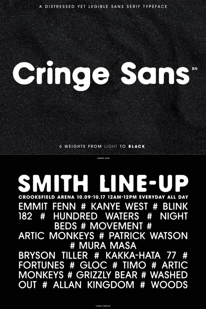
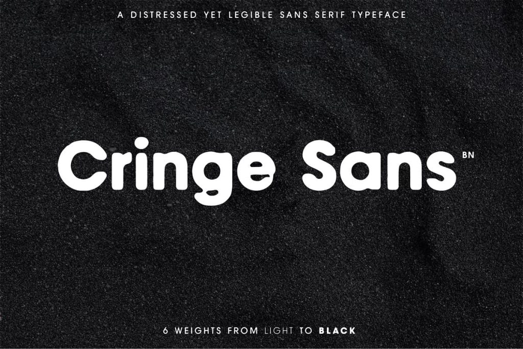
Cringe Sans is a bold and expressive distressed typeface created to help brands and designers stand out with confidence. While many distressed fonts sacrifice readability for texture, Cringe Sans takes a different approach by prioritizing legibility without losing its raw and unconventional personality. This balance makes it a powerful choice for modern branding, editorial design, and visual communication that demands attention.
Designed to Deliver a Distinctive Visual Identity
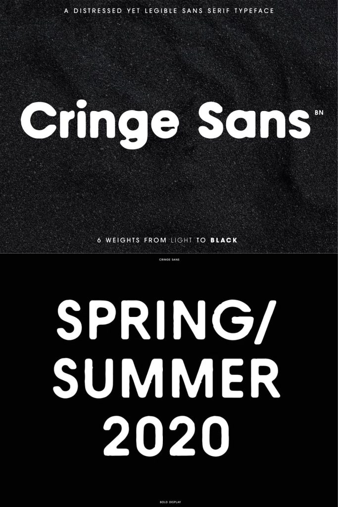
Cringe Sans brings a unique look and feel to any design by combining clean sans serif foundations with carefully controlled distressing. The texture adds grit and attitude, while the underlying structure ensures that every word remains clear and easy to read. This intentional contrast allows designers to communicate bold ideas without compromising usability.
The typeface works especially well for brands that want to challenge conventions and express individuality. Whether used in logos, packaging, posters, or digital media, Cringe Sans immediately creates a strong visual presence. It gives designs an edge while still maintaining professional clarity.
Meticulously Crafted Characters and Weights
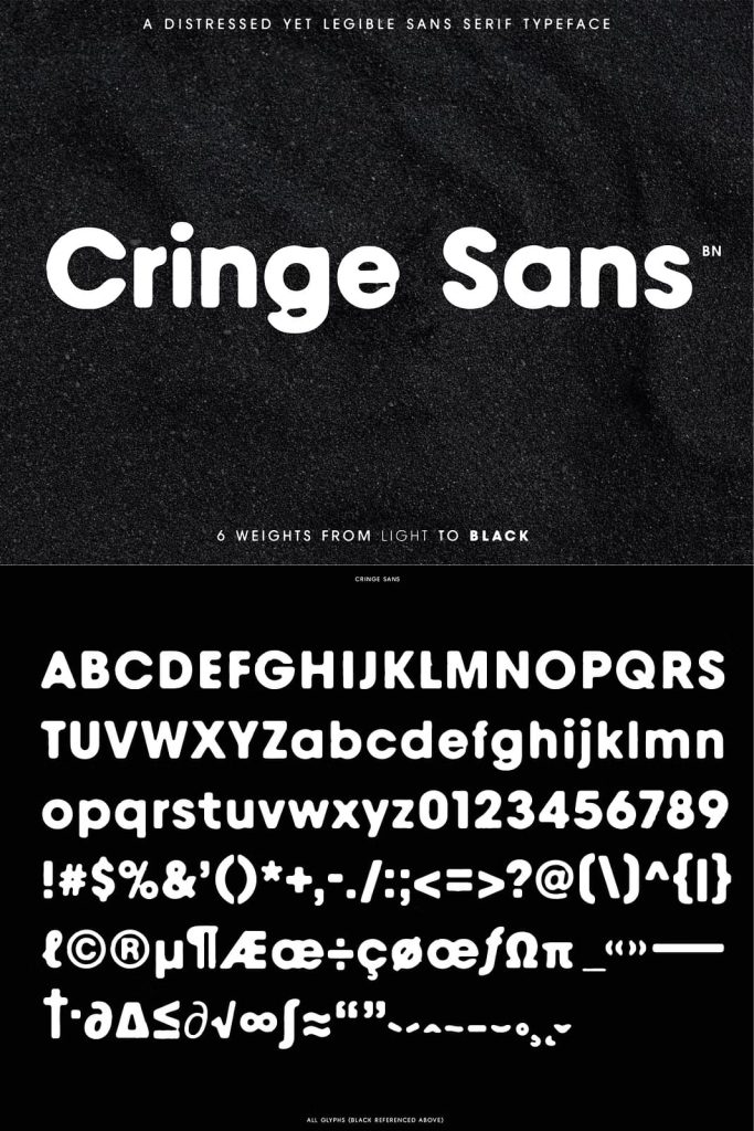
Every weight of Cringe Sans has been designed with careful attention to detail. Rather than applying the same distressed effect across all characters, each letter has been individually crafted to introduce subtle differences and unique attributes. This approach creates a more natural and dynamic texture that feels intentional rather than repetitive.
The variation between characters adds visual interest and authenticity, making text feel alive and expressive. These differences become especially noticeable in larger blocks of text or prominent headlines, where the font’s personality can fully emerge. Designers benefit from typography that feels custom and thoughtfully designed.
Consistency Across Variables with Creative Depth
Despite the unique variations between characters, Cringe Sans maintains consistency across its weights and styles. The proportions, spacing, and overall structure remain balanced, allowing designers to mix and match weights without losing harmony. This makes the typeface suitable for building cohesive design systems while still embracing expressive details.
The careful balance between consistency and variation gives designers greater creative freedom. You can create hierarchy, emphasis, and contrast within your typography while maintaining a unified visual language.
Built for Legibility in Print and Digital Use
Cringe Sans was designed with real-world use in mind. Its strong letterforms and clear spacing ensure excellent legibility across different sizes and mediums. Whether displayed on large-format posters or viewed on digital screens, the font remains readable and impactful.
This makes Cringe Sans an excellent choice for both print and digital applications. Designers can confidently use it for branding, advertising, web design, social media graphics, and editorial layouts, knowing that the message will stay clear and engaging.
Perfect for Bold Branding and Creative Design
Cringe Sans thrives in projects that require personality and distinction. It works especially well for creative brands, fashion labels, music-related visuals, street-inspired designs, and experimental projects. The distressed texture adds emotional weight and visual interest, helping brands communicate attitude and authenticity.
Because each character carries its own subtle details, Cringe Sans helps designs feel handcrafted and intentional. This quality makes it ideal for projects that want to avoid generic or overused typography and instead present a strong, memorable identity.
A Typeface That Balances Grit and Precision
Cringe Sans proves that distressed typography can be both expressive and practical. By combining meticulous craftsmanship with a focus on legibility, this typeface delivers a unique solution for designers who want texture without chaos. It empowers creative professionals to produce work that feels bold, modern, and thoughtfully constructed.
If your goal is to create designs that stand apart while remaining clear and functional, Cringe Sans offers the perfect balance of grit and precision. This distressed typeface gives your brand or project a distinctive voice that feels confident, deliberate, and visually compelling.