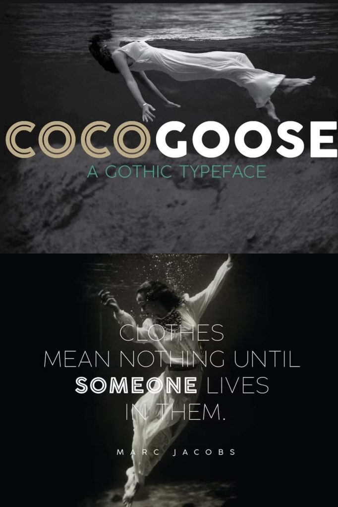
Cocogoose Geometric Sans Serif Font
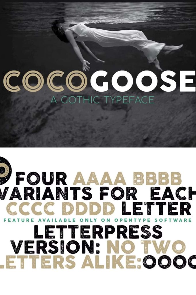
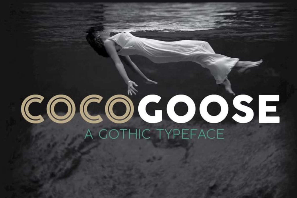
Cocogoose is a distinctive geometric sans serif font that combines modernist precision with exceptional versatility. Built around clean monolinear strokes, balanced geometric forms, and carefully refined details, this typeface delivers a bold visual identity while maintaining excellent readability. Inspired by classic geometric typography and contemporary design principles, Cocogoose offers a powerful solution for designers seeking a font that performs equally well in branding, display applications, and extended text layouts.
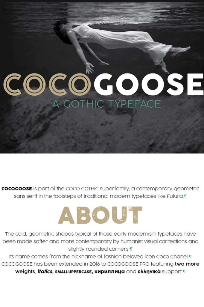
The font is characterized by its strong structural foundation, featuring straight lines, circular elements, and square-inspired shapes that create a clean and confident appearance. While many geometric fonts can appear rigid or mechanical, Cocogoose introduces softened corners and subtle optical adjustments that make the typeface more approachable and visually balanced. These refinements improve readability while preserving the strong personality that defines the font.
Whether you are designing a memorable logo, developing a professional brand identity, creating editorial layouts, or producing attention-grabbing headlines, Cocogoose provides the flexibility and visual impact required for modern creative projects.
Modern Geometric Design with Timeless Appeal
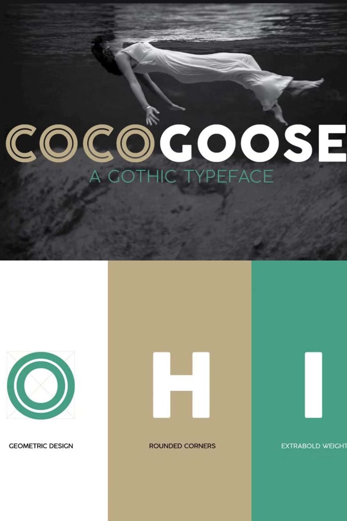
At the core of Cocogoose lies a carefully crafted geometric structure. The typeface embraces the principles of modernist typography by utilizing clean lines, consistent stroke widths, and mathematically inspired letterforms. This design approach creates a polished and professional appearance that feels contemporary while remaining timeless.
The geometric construction gives Cocogoose a sense of order, clarity, and sophistication. Circular and square forms work together to establish a harmonious visual rhythm that enhances both individual characters and complete text compositions. This balance makes the font suitable for a wide variety of industries, including technology, fashion, architecture, publishing, and creative branding.
Its modern appearance allows designers to create sleek and impactful visuals without sacrificing character or originality.
Rounded Corners for Improved Readability
One of the standout features of Cocogoose is its subtle use of rounded corners. These carefully considered design details soften the rigid geometry of the letterforms, creating a more welcoming and visually comfortable reading experience.
The rounded edges help reduce the harshness often associated with highly geometric typefaces. This approach not only enhances the font’s aesthetic appeal but also improves legibility across various sizes and applications. As a result, Cocogoose feels balanced and approachable while maintaining its bold architectural structure.
These refinements make the typeface particularly effective for projects that require a professional appearance combined with a touch of warmth and accessibility.
Excellent Performance for Display and Text Applications
Many geometric display fonts excel in headlines but struggle when used in longer passages of text. Cocogoose addresses this challenge through its generous x-height and carefully optimized proportions. The larger x-height improves character recognition and enhances readability, allowing the font to perform exceptionally well across different contexts.
This versatility enables designers to use Cocogoose for both prominent display elements and supporting text. Whether creating a bold title, a detailed brochure, or a digital interface, the typeface maintains clarity and consistency throughout the design.
Its adaptability makes Cocogoose an excellent choice for comprehensive branding systems that require a unified typographic voice across multiple applications.
Key Features of Cocogoose Font
- Clean geometric sans serif construction
- Monolinear strokes for visual consistency
- Circular and square-inspired letterforms
- Soft rounded corners for improved readability
- Generous x-height for better text performance
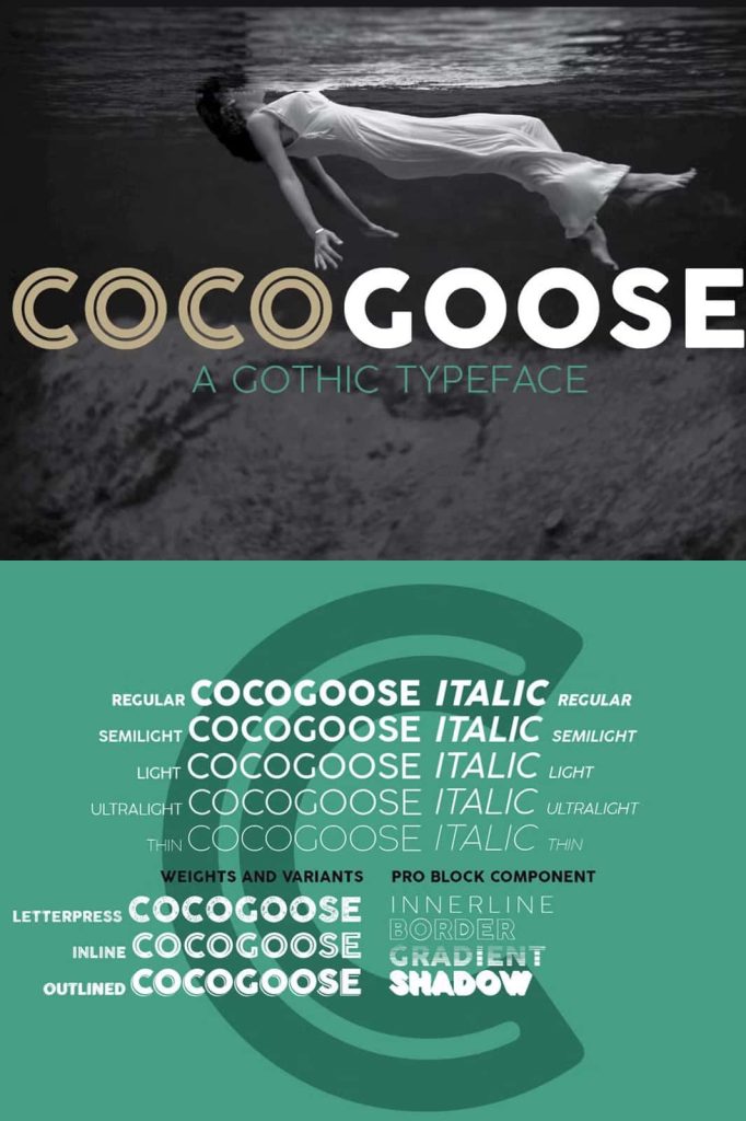
- Five versatile font weights from Regular to Thin
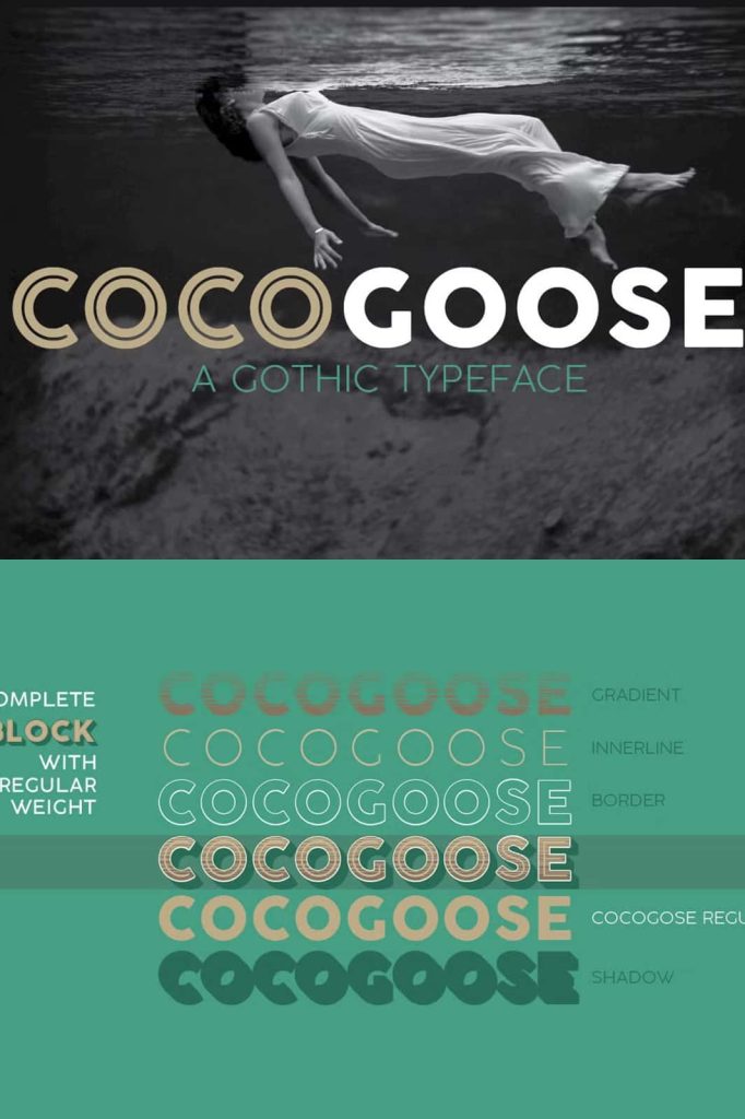
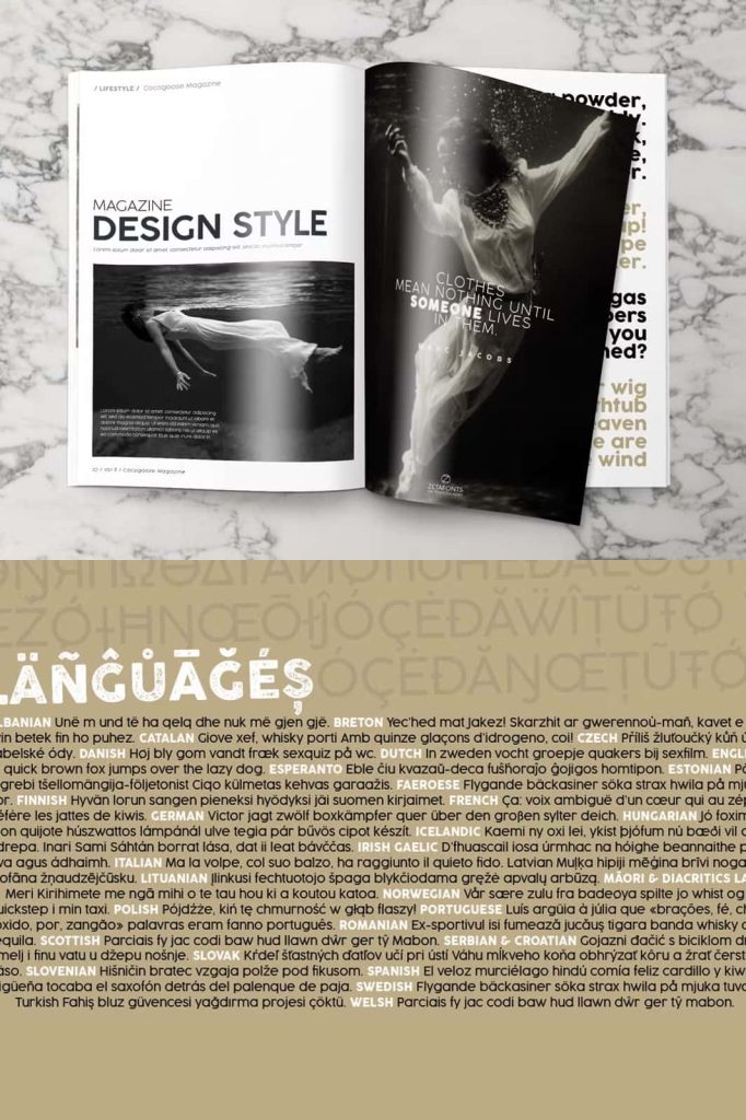
- Four display variants including Letterpress, Inline, and Outline styles
- Strong visual identity suitable for branding and display design
- Professional appearance for both print and digital projects
- Excellent compatibility with modern design systems
Multiple Weights for Greater Design Flexibility
Cocogoose includes five carefully crafted weights, ranging from Regular to Thin, allowing designers to create dynamic typographic hierarchies and sophisticated layouts. Each weight maintains the integrity of the original design while offering different levels of emphasis and visual impact.
The availability of multiple weights makes the font highly adaptable for branding projects, websites, editorial designs, advertisements, and corporate communications. Designers can use lighter weights for elegant and minimal compositions while relying on heavier styles to create bold headlines and powerful visual statements.
This flexibility helps ensure visual consistency across a wide range of applications and design environments.
Creative Display Variants for Unique Typography
In addition to its standard weights, Cocogoose includes several display variations that expand its creative possibilities. The Letterpress, Inline, and Outline styles allow designers to introduce texture, depth, and decorative elements into their typography without abandoning the core identity of the font.
These display variants are ideal for posters, packaging, logos, signage, promotional graphics, and creative branding projects. They provide additional visual interest while preserving the geometric aesthetic that defines Cocogoose.
By combining different weights and display styles, designers can create engaging typography systems that feel both cohesive and distinctive.
Perfect for Branding, Logos, and Editorial Design
Cocogoose has become a popular choice among designers because of its strong visual personality and exceptional versatility. Its bold geometric structure makes it highly effective for logo design, helping brands establish a memorable and recognizable identity.
The font also performs beautifully in editorial design, where readability and style are equally important. Magazine covers, book titles, brochures, and marketing materials all benefit from the font’s balanced combination of clarity and character.
Its modern yet slightly vintage-inspired appearance makes it suitable for projects that seek a contemporary aesthetic with subtle retro influences.
Why Choose Cocogoose Geometric Sans Serif Font?
Cocogoose Geometric Sans Serif Font offers an exceptional blend of modern design, geometric precision, and practical functionality. Its monolinear construction, generous x-height, rounded corners, and multiple style options make it one of the most versatile typefaces available for contemporary design projects.
From professional branding and logo creation to editorial layouts and large-scale display typography, Cocogoose consistently delivers strong visual impact and reliable readability. The combination of five weights and multiple display variants provides designers with the creative freedom needed to build cohesive and engaging visual identities.
For designers seeking a font that balances bold geometric structure with refined usability, Cocogoose is an outstanding choice. Its timeless appeal, distinctive character, and adaptability make it a valuable addition to any professional typography collection, helping creative projects achieve clarity, style, and lasting visual recognition.