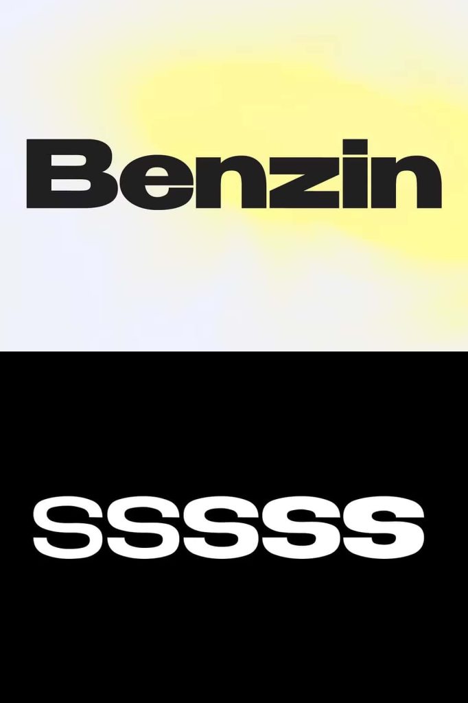
Benzin Geometric Sans Serif Font Family
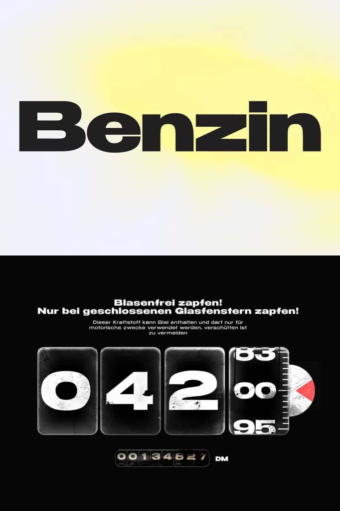
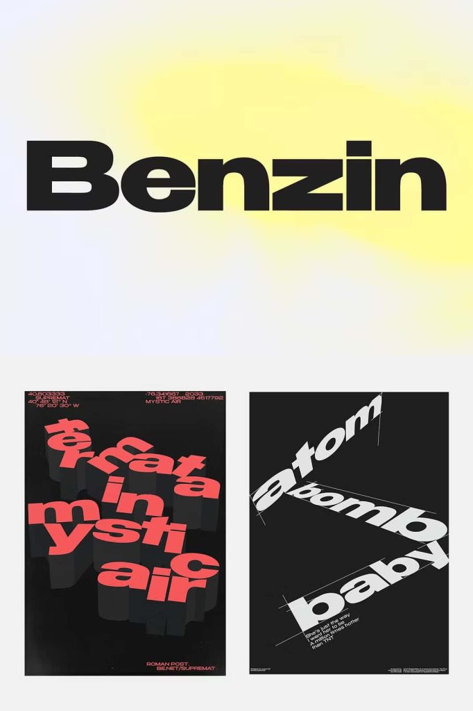
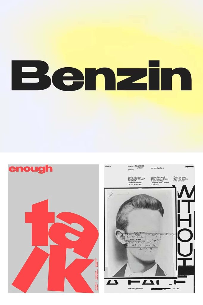
Benzin is a modern geometric sans serif font family designed to deliver exceptional versatility, readability, and visual consistency across a wide variety of creative projects. Built with precision and functionality in mind, Benzin includes five carefully crafted weights that allow designers to create everything from bold attention-grabbing headlines to highly legible body text. Unlike many geometric typefaces that require manual spacing adjustments, Benzin features customized kerning for every weight, allowing you to focus on your design instead of spending valuable time refining letter spacing.
Its clean geometric structure, balanced proportions, and intelligent spacing system make Benzin an excellent choice for branding, editorial layouts, websites, mobile applications, advertising, packaging, presentations, and corporate communications. Whether you are creating a minimalist visual identity or a large-format marketing campaign, this font family provides the flexibility and performance needed for professional results.
A Contemporary Geometric Sans Serif with Practical Design
Benzin embraces the timeless appeal of geometric typography while introducing practical refinements that improve usability across multiple design environments. Every character has been carefully constructed using clean lines, balanced curves, and consistent proportions, creating a modern appearance that feels both professional and approachable.
The font maintains a strong geometric personality without becoming overly rigid. Its carefully designed letterforms provide excellent readability while preserving the visual simplicity that makes geometric sans serif fonts so popular among designers, creative agencies, and modern brands.
Whether used in print or digital media, Benzin delivers crisp typography that remains clear and visually appealing at virtually any size.
Five Weights for Complete Typographic Flexibility
Benzin includes five versatile weights, allowing designers to establish a clear visual hierarchy throughout every project. Each weight has been carefully developed to maintain the same design language while providing varying levels of emphasis.
This flexibility allows you to create harmonious layouts using a single font family. Thin weights provide elegance and openness for smaller text, while heavier styles deliver strong visual impact for titles, banners, and promotional materials.
Instead of switching between multiple typefaces, you can rely on Benzin to maintain consistency across every section of your design.
Optimized Kerning for Every Weight
One of Benzin’s most valuable features is its intelligently customized kerning. Unlike many font families that apply identical spacing across all weights, Benzin adjusts letter spacing specifically for each style to maximize readability and visual balance.
The thinner styles feature more generous spacing, allowing small text and long paragraphs to remain comfortable to read. This open kerning prevents characters from appearing crowded and improves overall text clarity.
In contrast, the heavier weights use tighter spacing to create bold, compact headlines with greater visual impact. This denser kerning strengthens large typography, making titles and posters feel more cohesive and powerful.
Because these spacing adjustments are already built into the font, designers can immediately begin creating professional layouts without manually fine-tuning kerning for different font weights.
Ideal for Headlines and Body Text
Many display fonts excel only in large sizes, while traditional text fonts often lack visual personality for headlines. Benzin successfully bridges this gap by performing exceptionally well in both situations.
Use the bold styles to create impactful headlines, advertising campaigns, event posters, magazine covers, and hero banners that instantly capture attention. Then switch to the lighter weights for paragraphs, captions, articles, product descriptions, and interface text while maintaining a consistent visual identity throughout the project.
This versatility makes Benzin a dependable solution for designers who want one typeface capable of handling an entire design system.
Perfect for Professional Creative Projects
Benzin adapts effortlessly to a wide range of professional applications thanks to its modern appearance and excellent readability.
Brand Identity and Logo Design
Create contemporary logos, brand guidelines, business cards, and corporate identities with typography that communicates confidence, precision, and professionalism.
Editorial Design
Design magazines, books, catalogs, annual reports, newspapers, and brochures using a typeface that provides excellent readability while maintaining a clean editorial style.
Websites and User Interfaces
Benzin performs beautifully in websites, mobile applications, dashboards, and software interfaces. Its optimized spacing enhances readability while supporting modern digital experiences.
Advertising and Marketing
Produce eye-catching posters, flyers, billboards, banners, presentations, and promotional materials with typography that delivers strong visual impact across every medium.
Packaging Design
From technology products to cosmetics, fashion labels, food packaging, and premium consumer goods, Benzin helps create packaging that feels modern, refined, and highly legible.
Designed for Print and Digital Excellence
Benzin performs consistently across both print and digital environments. Its balanced geometry and carefully refined kerning ensure that text remains sharp on high-resolution displays while reproducing beautifully in printed materials.
Whether you are designing responsive websites, printed magazines, large-format signage, or presentation slides, Benzin maintains excellent clarity and visual consistency across every platform.
Why Choose Benzin Geometric Sans Serif Font Family?
Benzin stands out by combining modern geometric design with intelligent functionality. Its five carefully developed weights provide exceptional flexibility, while the customized kerning system automatically optimizes spacing for both thin and bold styles. This thoughtful approach allows designers to create polished typography without spending extra time adjusting letter spacing manually.
The font family offers the versatility needed for logos, branding, editorial layouts, websites, mobile applications, packaging, advertising campaigns, presentations, and corporate communications. Its clean geometric forms communicate professionalism while remaining approachable and highly readable across different sizes and formats.
If you are searching for a contemporary sans serif font that delivers visual precision, effortless usability, and consistent performance, Benzin Geometric Sans Serif Font Family is an outstanding choice. With its intelligent kerning, balanced letterforms, and adaptable range of weights, Benzin provides everything designers need to build cohesive, impactful, and professional typography for virtually any creative project.