Belvare Serif Font: Timeless Retro Elegance with a Modern Voice
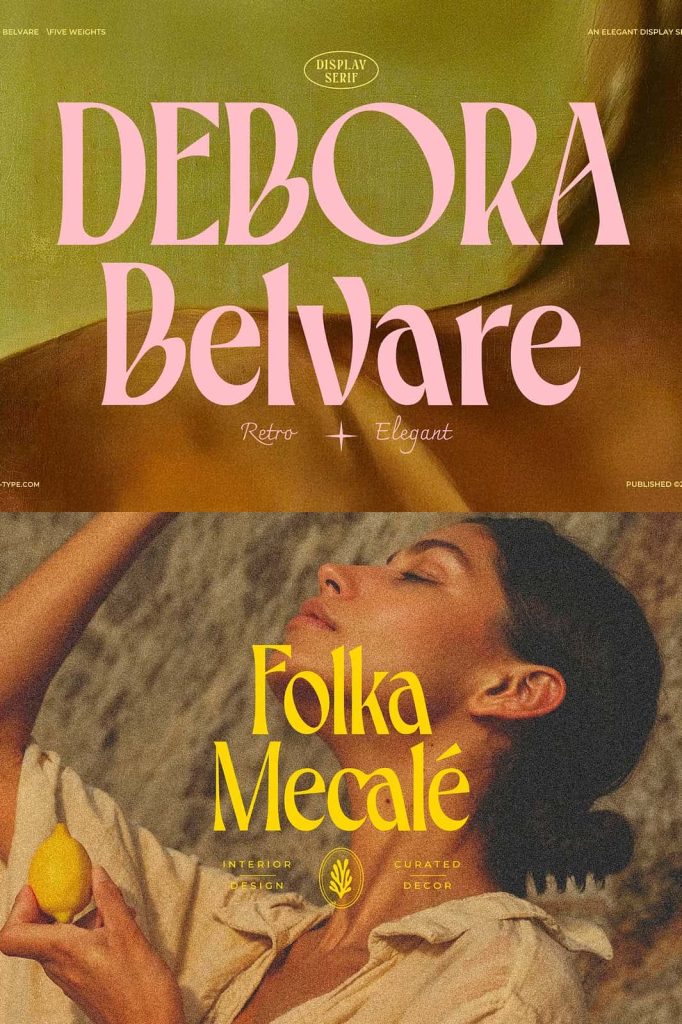
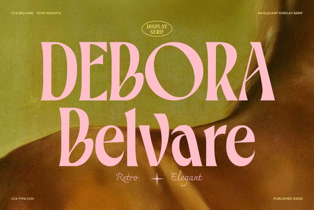
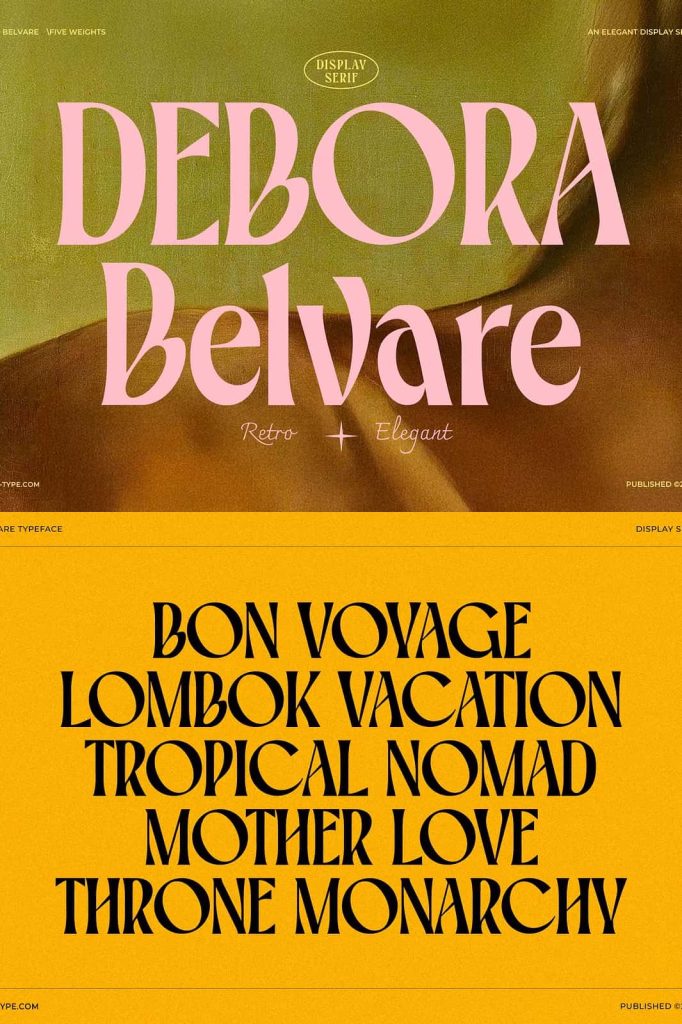
Belvare is a sophisticated retro-inspired serif font designed to bring timeless elegance and warm character into contemporary design work. Rooted in classic typography while refined for modern usage, Belvare bridges the gap between nostalgic charm and present-day clarity. It speaks with confidence, style, and approachability, making it a valuable asset for designers who want their typography to feel both familiar and fresh.
This font family embraces heritage without feeling outdated. Every curve, serif, and proportion has been carefully crafted to deliver visual harmony while remaining highly functional across a wide range of creative applications.
A Retro-Inspired Serif with Lasting Appeal
Belvare draws inspiration from classic serif typography often seen in mid-century print, editorial layouts, and traditional branding. However, it reinterprets those influences through modern design sensibilities. The result is a font that feels grounded in history while remaining relevant for today’s visual communication.
The retro inspiration is subtle and refined rather than exaggerated. Belvare does not rely on heavy ornamentation. Instead, it uses thoughtful proportions and smooth details to create a sense of elegance that stands the test of time.
Rounded Letter Proportions for a Friendly Tone
One of Belvare’s defining characteristics is its rounded letter proportions. These softened forms introduce warmth and approachability into the design, helping the font feel welcoming rather than rigid. This quality makes Belvare especially effective for brands and projects that want to communicate trust, authenticity, and human connection.
The rounded structure balances the traditional authority of serif typography with a gentle, modern friendliness. This combination allows Belvare to adapt easily to both formal and casual design contexts.
Three Weights for Flexible Design Expression
Belvare is available in three carefully calibrated weights: Light, Regular, and Bold. Each weight has been optimized to maintain consistent character and balance while offering designers greater control over hierarchy and emphasis.
The Light weight delivers elegance and subtlety, making it ideal for refined headlines, editorial accents, or high-end branding. The Regular weight provides versatility and readability, serving as a dependable choice for body text, subheadings, and balanced compositions. The Bold weight adds strength and authority, perfect for titles, logos, and statements that need to command attention.
Consistent Design Across All Weights
Every weight in the Belvare font family shares the same design DNA. Stroke transitions, curves, and serif details remain consistent, ensuring visual cohesion when mixing weights within a single layout. This consistency allows designers to build structured typographic systems without sacrificing style.
Whether you use a single weight or combine all three, Belvare maintains a polished and professional appearance.
Versatile Applications Across Creative Projects
Belvare adapts seamlessly to a wide variety of design uses. Its elegant serif structure makes it an excellent choice for editorial layouts, book covers, and magazine headlines. At the same time, its friendly proportions allow it to perform beautifully in branding, packaging, and digital design.
Logos created with Belvare feel established and trustworthy, while still remaining inviting. Headlines gain a sense of authority without appearing harsh. Even short blocks of text feel thoughtfully composed and visually pleasing.
- Brand identities and logo design
- Editorial layouts and publishing
- Packaging and product design
- Marketing materials and advertising
- Web and digital typography
Designed for Modern Workflows
Belvare integrates smoothly into contemporary design environments. It performs reliably across print and digital platforms, ensuring clarity and consistency at various sizes and resolutions. The font’s clean construction supports smooth rendering on screens while retaining its refined serif details in print.
This balance between beauty and usability makes Belvare a practical choice for long-term design systems and brand identities.
A Serif Font Built for Longevity
Trends in typography come and go, but Belvare is designed to endure. Its retro inspiration connects it to proven design traditions, while its modern refinement ensures ongoing relevance. Designers can rely on Belvare for projects that require both style and staying power.
By combining timeless elegance, friendly proportions, and versatile weights, Belvare becomes more than just a typeface. It becomes a dependable creative partner for designers seeking expressive serif typography that feels confident, warm, and enduring.