Baru Sans Geometric Typeface – Modern Precision with Humanist Character
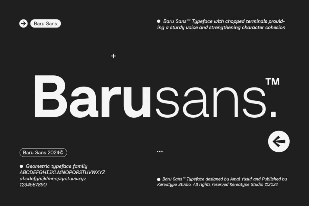
Baru Sans is a contemporary geometric typeface that combines precision, functionality, and refined design into a highly versatile font family. Built on strong geometric foundations, Baru Sans features clean proportions, carefully crafted letterforms, and distinctive chopped terminals with striking 90-degree strokes. These unique characteristics give the typeface a confident visual identity while maintaining excellent readability across both print and digital media.
Beyond its structured geometric appearance, Baru Sans introduces a beautifully balanced italic style inspired by natural handwriting. This thoughtful combination of geometric construction and humanist influence allows designers to create typography that feels both modern and approachable. Whether you’re designing corporate branding, editorial layouts, digital interfaces, or creative marketing materials, Baru Sans delivers exceptional clarity and sophistication.
A Geometric Typeface Designed for Modern Communication
Baru Sans was developed to meet the needs of today’s designers who require typography that performs consistently across a wide variety of applications. Every letter is built using balanced geometric principles, creating a clean and harmonious appearance that works equally well in headlines, body text, branding, and user interfaces.
The font’s structured design provides a sense of order and professionalism, making it suitable for projects that demand precision without sacrificing personality. Its carefully refined proportions ensure comfortable reading while maintaining a distinctive visual style that separates it from conventional geometric sans serif fonts.
Distinctive 90-Degree Terminal Design
One of the defining characteristics of Baru Sans is its signature chopped terminals with clean 90-degree strokes. These subtle yet impactful design elements give the typeface a recognizable identity while enhancing its modern aesthetic. Rather than relying on excessive decorative details, Baru Sans achieves visual interest through carefully engineered letter construction.
The result is typography that appears sharp, contemporary, and highly professional. These geometric details create memorable headlines, clean logos, and polished editorial layouts that immediately capture attention without overwhelming the overall composition.
Humanist Italic Inspired by Handwriting
While the upright styles embrace geometric precision, the italic version introduces a softer and more expressive personality. Inspired by natural handwriting, the italic style brings warmth and movement to the typeface, creating an elegant contrast with the structured upright forms.
This humanist influence makes Baru Sans exceptionally flexible. Designers can combine the upright and italic styles to establish clear visual hierarchy, emphasize important information, or add subtle personality to editorial layouts, branding systems, and digital content.
Perfect for Professional Branding
Baru Sans provides businesses with a dependable typography solution that reflects professionalism, innovation, and modern design. Its balanced appearance works across industries including technology, architecture, finance, education, healthcare, fashion, creative agencies, and lifestyle brands.
The clean geometric structure helps establish trust and consistency while the refined details ensure your visual identity remains distinctive and memorable. Whether you’re building a new brand or refreshing an existing identity, Baru Sans offers exceptional versatility.
Ideal Applications
- Corporate branding
- Logo and wordmark design
- Editorial layouts
- Books and magazines
- User interface (UI) design
- User experience (UX) projects
- Website typography
- Mobile applications
- Business presentations
- Advertising campaigns
- Product packaging
- Signage systems
- Annual reports
- Marketing materials
- Social media graphics
Excellent Readability Across Every Medium
Readability remains one of the strongest advantages of Baru Sans. Its carefully balanced spacing, clean proportions, and consistent stroke widths make the font highly legible at both large display sizes and smaller text settings. Designers can confidently use it for headlines, body copy, captions, navigation menus, and technical documents.
Whether printed on paper or displayed on high-resolution screens, Baru Sans maintains outstanding clarity while preserving its refined geometric appearance.
Versatile for Print and Digital Design
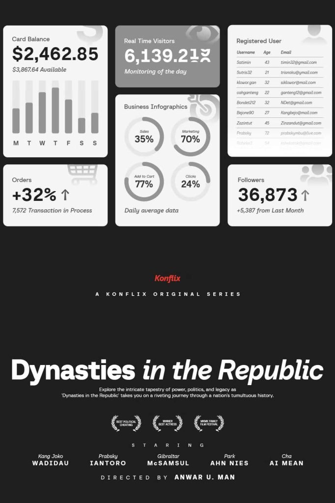
Baru Sans performs beautifully across numerous creative disciplines. In print, it delivers elegant typography for brochures, catalogs, books, magazines, packaging, and corporate publications. In digital environments, it enhances websites, applications, dashboards, presentations, and online marketing campaigns with clean and modern typography.
The combination of geometric structure and humanist italic styles provides designers with greater creative flexibility, allowing consistent typography across complete branding systems.
Features
- Modern geometric sans serif design
- Distinctive chopped terminals with 90-degree strokes
- Humanist-inspired italic styles
- Clean and balanced proportions
- Excellent readability
- Professional and contemporary appearance
- Ideal for branding and editorial design
- Suitable for user interface and digital products
- Perfect for print and web applications
- Highly versatile across multiple industries
Why Choose Baru Sans Geometric Typeface?
Baru Sans successfully bridges the gap between geometric precision and human expression. Its structured letterforms provide clarity and consistency, while the handwritten-inspired italic styles introduce warmth and elegance. This unique combination allows designers to create visual identities that feel modern, sophisticated, and approachable.
Instead of following temporary design trends, Baru Sans focuses on timeless principles of typography, ensuring that your projects remain visually relevant for years to come. It adapts effortlessly to corporate branding, editorial publishing, digital interfaces, packaging, and marketing materials.
Build Modern Designs with Confidence
If you’re looking for a versatile geometric typeface that delivers professional performance without sacrificing personality, Baru Sans is an outstanding choice. Featuring distinctive 90-degree terminals, balanced geometric construction, and expressive humanist italics, this typeface provides everything needed to create memorable branding, elegant editorial layouts, intuitive user interfaces, and impactful marketing materials. Baru Sans helps every design communicate clarity, confidence, and contemporary sophistication across every creative project.