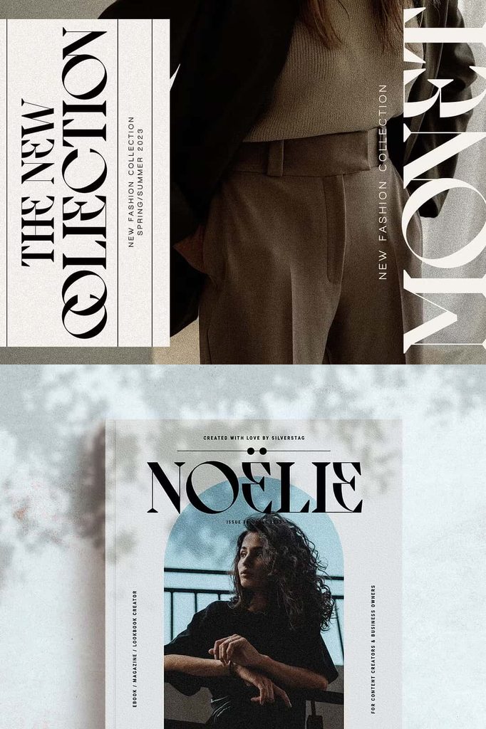
Archer Display Font: A Perfect Blend of Classic Elegance and Modern Style
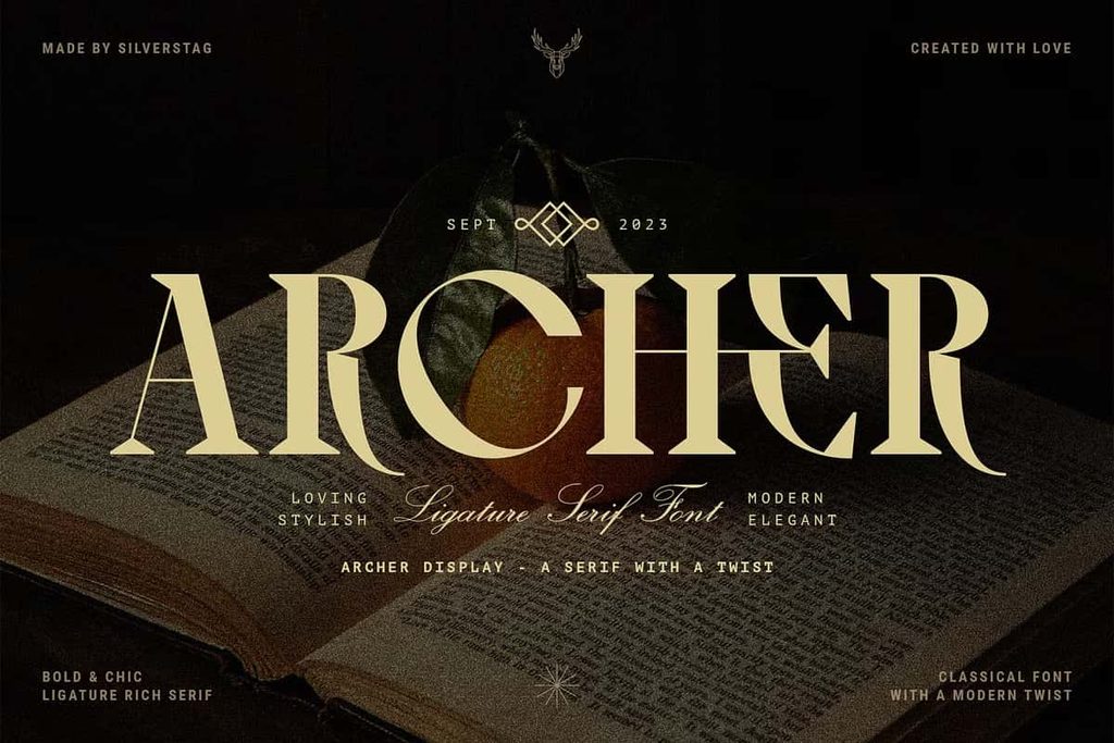
Archer Display is a distinctive serif font that brings together the timeless beauty of traditional typography and the bold creativity of modern design. With its high-contrast letterforms, substantial serifs, and carefully reimagined characters, this typeface creates a striking visual identity for designers who want to balance classic sophistication with contemporary expression. Its refined appearance captures the spirit of vintage typography while introducing fresh details that make every composition feel relevant and memorable.
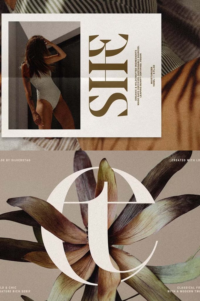
Designed to command attention, Archer Display gives headlines, logos, brand identities, and editorial layouts a confident personality. Its strong strokes and elegant proportions create a powerful visual presence, while its distinctive letterforms introduce an artistic touch that separates it from conventional serif fonts. Whether you are developing a luxury brand, designing a magazine cover, or creating promotional materials, Archer Display helps you communicate style, confidence, and individuality through typography.
Discover the Distinctive Character of Archer Display
Archer Display stands out through its ability to combine traditional typographic principles with an innovative visual approach. Its substantial serifs recall the craftsmanship of classic print design, while its carefully balanced proportions give the typeface a polished and contemporary appearance. This combination allows designers to create compositions that feel both familiar and unexpected.
The font’s strong visual structure makes it especially effective when you want to establish a clear focal point. Its prominent serifs guide the eye across each word, while the contrast between thick and thin strokes adds depth and sophistication. These details help create typography that looks deliberate, expressive, and visually engaging.
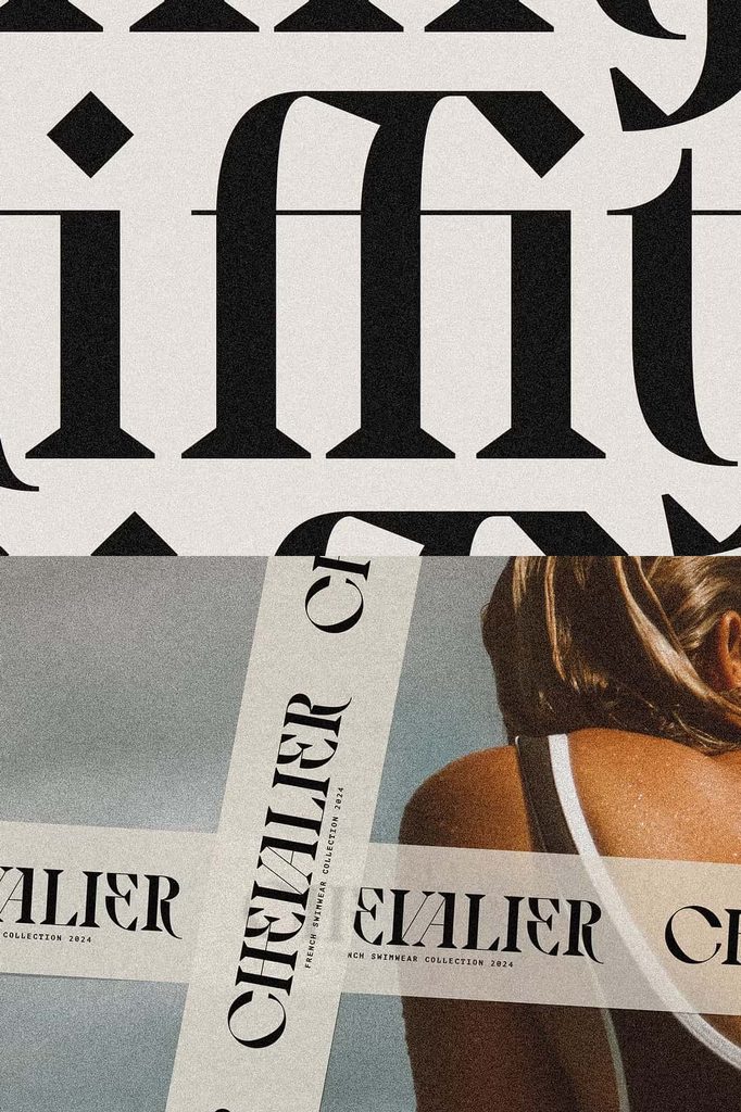
Rather than relying entirely on traditional forms, Archer Display introduces thoughtfully reimagined characters that add a subtle avant-garde quality. These distinctive details bring fresh energy to the overall design without sacrificing the elegance associated with classic serif typography.
High-Contrast Letterforms and Bold Serifs
One of the defining characteristics of Archer Display is its high-contrast design. The noticeable difference between thick and thin strokes creates a dramatic appearance that immediately attracts attention. This contrast gives the font an elegant rhythm and allows individual letters to stand out within a composition.
Its substantial serifs reinforce the typeface’s confident personality. These carefully defined details create a strong foundation for each character and connect the design to the traditions of established serif typography. At the same time, their bold appearance helps Archer Display maintain a contemporary edge.
Designers can use these features to emphasize important messages, establish visual hierarchy, and create distinctive typographic compositions. The font performs particularly well in large text, where its refined details and contrasting strokes remain clear and visually impactful.
A Modern Interpretation of Traditional Typography
Archer Display celebrates the enduring appeal of traditional serif fonts while exploring new possibilities in letterform design. Its vintage-inspired structure evokes the sophistication of classic books, printed advertisements, and timeless editorial layouts. However, its contemporary details prevent the typeface from feeling outdated or overly formal.
This balance makes Archer Display suitable for designers who appreciate heritage-inspired aesthetics but want their work to feel fresh and original. The font can communicate tradition, craftsmanship, and credibility while introducing enough visual character to support modern creative concepts.
Use Archer Display when you want to create a design that connects the past with the present. It can complement minimalist layouts, sophisticated brand systems, contemporary publications, and vintage-inspired artwork. With thoughtful styling, the typeface adapts to different visual directions without losing its distinctive identity.
Perfect for Branding and Logo Design
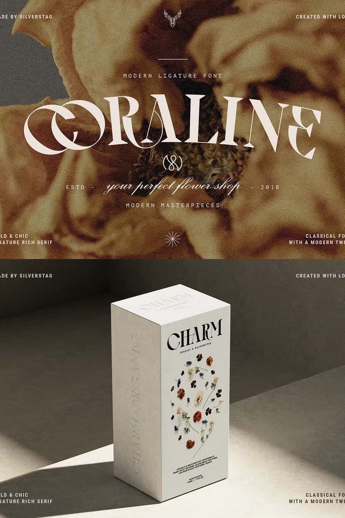
A memorable brand identity needs typography that communicates personality and builds recognition. Archer Display offers a strong option for businesses that want to project confidence, sophistication, and creative originality. Its bold serifs and distinctive letterforms can help transform a simple brand name into a recognizable visual signature.
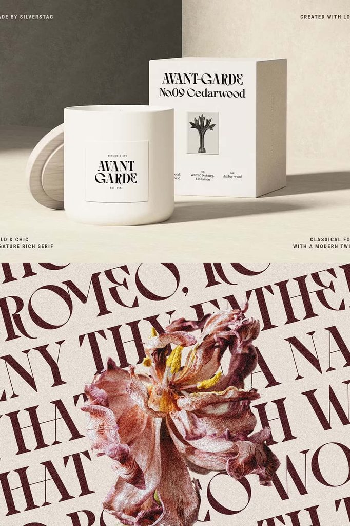
Consider using Archer Display for fashion labels, luxury products, creative studios, hospitality brands, lifestyle businesses, and premium retail identities. Its traditional foundations communicate stability and quality, while its contemporary details give brands a more distinctive and forward-thinking appearance.
For an effective branding system, pair Archer Display with a clean sans-serif typeface for supporting information. This combination creates contrast between expressive headlines and readable secondary text. You can also introduce generous spacing, restrained colors, and simple graphic elements to highlight the font’s unique character.
Elevate Editorial Design and Magazine Headlines
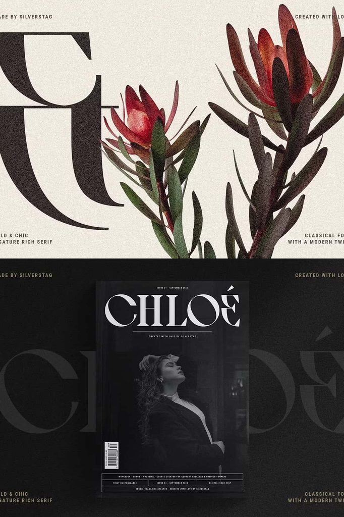
Archer Display makes an excellent choice for editorial projects that demand strong typography and a refined visual hierarchy. Its high-contrast strokes create dramatic headlines, while its substantial serifs bring a sense of authority and sophistication to magazine covers, feature titles, and promotional layouts.
Designers can use the font to establish an immediate connection with readers. A carefully composed headline can capture attention, communicate the tone of an article, and reinforce the publication’s overall identity. Archer Display works particularly well for fashion editorials, lifestyle magazines, culture publications, and design-focused content.
For longer articles, combine the display typeface with a highly readable body font. This approach allows Archer Display to deliver visual impact while maintaining a comfortable reading experience throughout the layout.
Explore Creative Applications for Archer Display
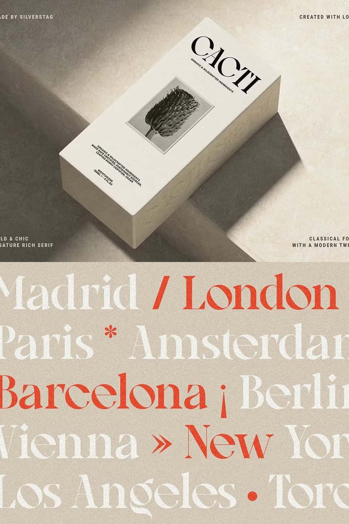
Beyond branding and editorial design, Archer Display offers creative possibilities for posters, book covers, packaging, invitations, advertisements, website headers, and social media graphics. Its strong visual presence makes it especially effective for projects that need a distinctive headline or a sophisticated typographic statement.
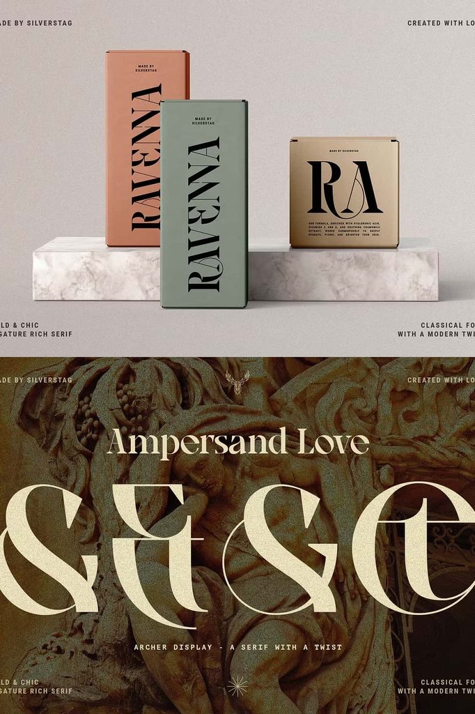
Packaging designers can use Archer Display to communicate quality and individuality through product names, labels, and promotional messages. Graphic designers can incorporate it into event posters, campaign graphics, and presentation covers to create a polished and memorable impression.
For digital projects, use the font strategically to highlight key information and strengthen the overall visual identity. Because Archer Display emphasizes expressive letterforms, it generally works best for short headlines and prominent text rather than lengthy paragraphs or very small captions.
Tips for Using Archer Display Effectively
To get the most from Archer Display, consider how its bold structure interacts with the other elements in your design. Give headlines enough space to showcase the high-contrast strokes and distinctive serifs. Avoid overcrowding the composition with competing decorative elements that could weaken the font’s visual impact.
Choose complementary typefaces carefully. A simple sans-serif font can balance Archer Display’s expressive character, while a restrained serif can create a more traditional editorial atmosphere. Adjust font size, line spacing, and letter spacing according to the needs of your layout.
Finally, check readability at different sizes and across different devices or print formats. Display fonts often reveal their most impressive details at larger sizes, so test the typography in its intended context before finalizing your design. Always review the font license to confirm that your planned personal or commercial use is permitted.
Why Choose Archer Display Font?
Archer Display offers a compelling combination of classic elegance, bold typography, and contemporary originality. Its high-contrast strokes create visual drama, its substantial serifs establish a confident foundation, and its reimagined characters add a distinctive creative edge.
These qualities make Archer Display a valuable choice for designers who want to create memorable logos, sophisticated branding, striking headlines, and polished editorial compositions. It brings a sense of heritage to modern projects while preserving the flexibility needed for contemporary visual communication.
Conclusion
Archer Display bridges the worlds of traditional and modern typography through its refined proportions, dramatic contrast, and distinctive serif details. It honors the elegance of classic type design while introducing fresh character through carefully reimagined letterforms.
Whether you are building a brand identity, designing a magazine cover, creating packaging, or developing a striking poster, Archer Display helps your typography communicate confidence and sophistication. Use it to establish strong visual hierarchy, highlight important messages, and create designs that combine timeless appeal with a modern creative spirit.