Arbeit Neo-Grotesque Typeface: Functional Precision for Modern Design Systems
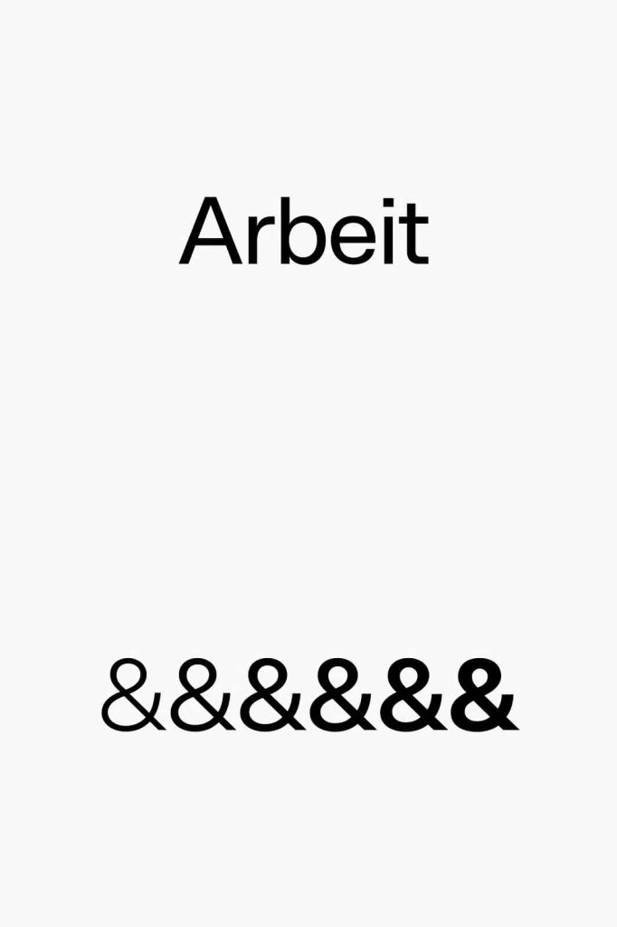
Arbeit is a highly functional neo-grotesque typeface built to deliver clarity, consistency, and versatility across modern design environments. It embraces the principles of classic grotesque typography while refining them for contemporary use. With its clean structure and disciplined forms, Arbeit provides a reliable foundation for designers who demand performance without sacrificing visual quality.
This typeface focuses on usability. It supports clear communication in both digital and print contexts, making it an essential tool for branding, editorial design, and user interfaces. Arbeit does not rely on decorative elements; instead, it prioritizes precision and readability, allowing content to take center stage.
The Concept Behind Arbeit
Arbeit follows the neo-grotesque tradition, which emphasizes neutrality, simplicity, and efficiency. This design approach removes unnecessary ornamentation and focuses on balanced proportions, consistent stroke widths, and straightforward letterforms. The result is a typeface that feels professional, modern, and highly adaptable.
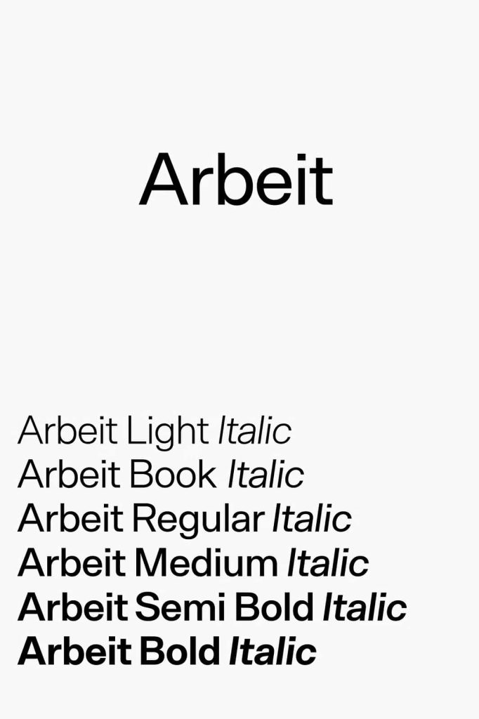
The inclusion of a variable font version further enhances its functionality. Designers can adjust weight and other attributes dynamically, creating flexible typographic systems that respond to different contexts and screen sizes. This capability makes Arbeit particularly valuable in responsive design and evolving digital platforms.
Key Features of Arbeit
Neo-Grotesque Clarity
Arbeit delivers a clean and neutral appearance that supports readability in any setting. Its letterforms maintain consistent proportions, ensuring that text remains clear and legible at various sizes.
Variable Font Technology
The typeface includes a variable font version, allowing designers to fine-tune weight and style within a single file. This feature reduces the need for multiple font files and simplifies workflow while expanding creative possibilities.
Functional and Versatile Design
Arbeit adapts easily to a wide range of applications. From body text to headlines, it maintains a consistent tone that supports both minimal and complex layouts.
Balanced and Modern Aesthetic
The font achieves a balance between neutrality and refinement. It avoids extreme stylistic choices, making it suitable for professional environments while still feeling contemporary.
Best Use Cases for Arbeit
Arbeit performs exceptionally well in projects that require clarity, structure, and scalability. Its functional design makes it ideal for:
- Corporate branding and identity systems
- User interface and user experience design
- Editorial layouts and digital publications
- Signage and information design
Designers often use Arbeit as a core typeface within a system. Its neutral tone allows it to pair well with other fonts, while its variable capabilities enable flexible and responsive typography.
Why Choose Arbeit?
Arbeit stands out because it combines traditional typographic principles with modern technology. It gives designers the tools to create clear and consistent designs while adapting to changing requirements. The variable font feature adds efficiency and control, making it easier to manage complex projects.
In a design landscape that demands flexibility and precision, Arbeit provides a dependable solution. It supports both creative exploration and practical execution, ensuring that your work remains effective and professional.
Conclusion
Arbeit is more than a neo-grotesque typeface—it is a functional system designed for modern design challenges. With its clean structure, versatile application, and advanced variable font capabilities, it offers a complete typographic solution. For designers seeking clarity, adaptability, and performance, Arbeit delivers a strong and reliable foundation.