Altone: A Modern Geometric Sans Serif Typeface Built for Clarity and Strength
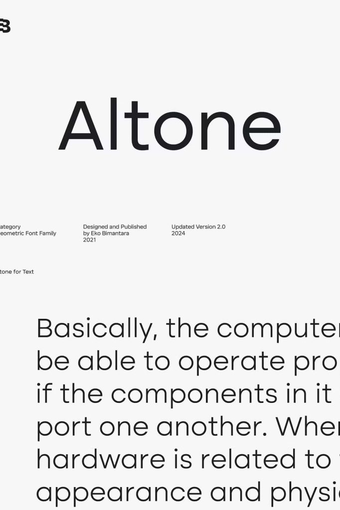
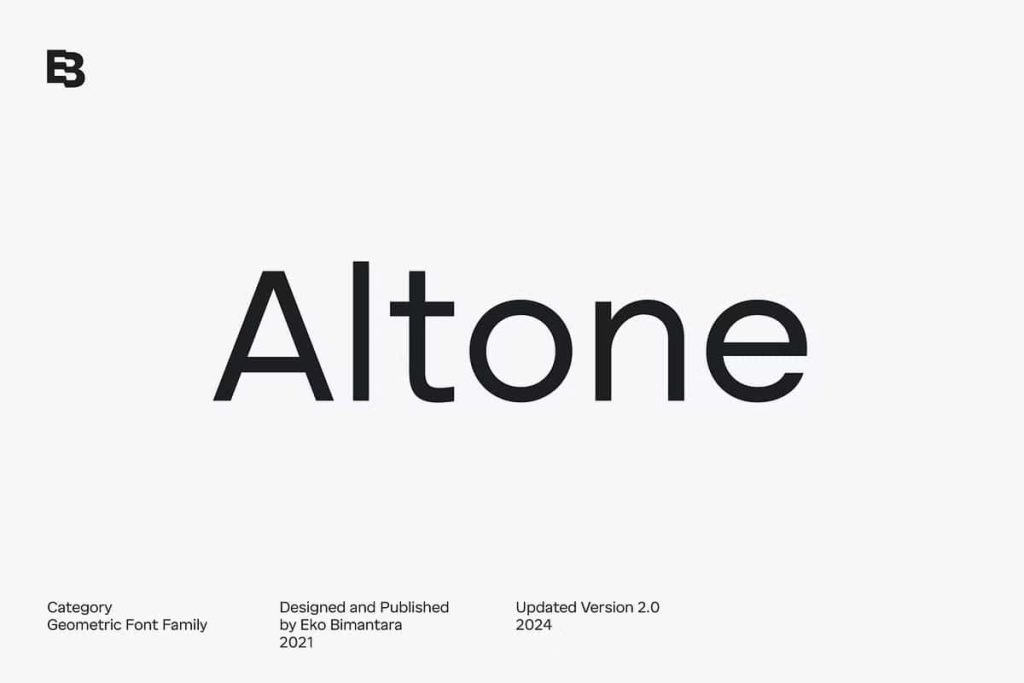
Altone was developed with a clear and deliberate goal: to achieve visual regularity and functional simplicity within a geometric sans serif typeface. In a design landscape where readability and adaptability are essential, Altone responds with a structure that feels natural to the eye while maintaining a confident and contemporary presence. Its design philosophy focuses on balance, precision, and accessibility, making it a reliable choice for designers who value both form and function.
Design Philosophy and Core Concept
The foundation of Altone lies in the pursuit of conventional geometric sans serif principles. These principles emphasize clean construction, consistent proportions, and visual harmony across all letterforms. By adhering to these fundamentals, Altone becomes easy to read, quick to recognize, and comfortable for extended viewing. This makes it particularly effective for modern communication, where clarity and speed of comprehension play a critical role.
Rather than relying on decorative elements, Altone expresses its personality through structure and proportion. The typeface delivers a simple yet assertive character, projecting confidence without appearing aggressive. This balance allows Altone to perform well across a wide range of applications, from corporate branding and editorial layouts to user interfaces and digital platforms.
Grotesk Influence with a Modern Interpretation
Although Altone originates from geometric design principles, its letterforms align more closely with the Grotesk tradition than with the original Bauhaus style. This distinction is intentional. While classical Bauhaus typography often leans toward experimental and rigid geometry, Altone embraces a more practical and adaptable approach. The Grotesk influence introduces a sense of neutrality and professionalism, ensuring the typeface feels contemporary rather than historical.
This modern interpretation allows Altone to bridge the gap between strict geometry and human usability. The result is a typeface that feels structured yet approachable, making it suitable for both expressive and informational contexts.
Proportional Width and Structural Consistency
Altone is formed with moderate and carefully controlled proportions. The letter widths are neither condensed nor overly wide, creating a balanced rhythm that enhances readability across different sizes. This proportional consistency ensures that text set in Altone remains visually stable, whether used in headlines, subheadings, or body copy.
By maintaining uniform spacing and predictable shapes, Altone supports a smooth reading experience. Designers can rely on it to perform consistently across print and digital media, reducing the need for excessive adjustments or corrections.
Flat Apex and Closed Apertures
One of Altone’s defining characteristics is its flat apex design. This feature reinforces the geometric nature of the typeface while adding a sense of firmness and clarity to each letterform. The flat apex contributes to the overall visual strength of the typeface, helping it stand out without relying on excessive contrast.
The closed apertures further enhance Altone’s solid appearance. By minimizing open spaces within the letterforms, the typeface achieves a compact and confident look. This design choice improves legibility at smaller sizes and reinforces the bold personality that defines Altone.
Straight Stroke Endings and Visual Precision
Altone features straight-cut stroke endings, a detail that emphasizes precision and control. These clean terminations support the geometric structure and contribute to the typeface’s modern aesthetic. Straight stroke ends also help maintain clarity on screens, making Altone a strong candidate for digital environments and responsive layouts.
This attention to detail reflects the overall design intent: to create a typeface that feels intentional, reliable, and visually coherent across all characters.
Versatility and Practical Applications
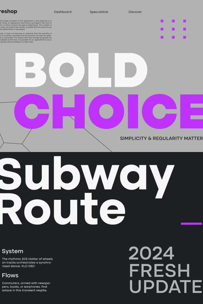
Thanks to its neutral yet strong character, Altone offers broad usage possibilities. It adapts seamlessly to branding systems, editorial design, advertising, packaging, and interface design. Its simplicity allows it to support visual content without overpowering it, while its bold structure ensures it never fades into the background.
Altone is especially effective in environments that demand clarity, consistency, and a modern tone. Whether used by startups seeking a clean identity or established brands aiming for refined communication, Altone delivers dependable performance and timeless appeal.
A Typeface Designed for Modern Communication
Altone stands as a clear example of how thoughtful design can balance aesthetics and usability. By combining geometric regularity with Grotesk influence, proportional width, and precise detailing, Altone achieves a simple, bold, and strong personality. It is a typeface designed not to distract, but to communicate clearly and confidently in any context.
For designers looking for a modern sans serif typeface that prioritizes readability, structure, and versatility, Altone offers a solution grounded in clarity and built for long-term use.