All Round Gothic Font Family
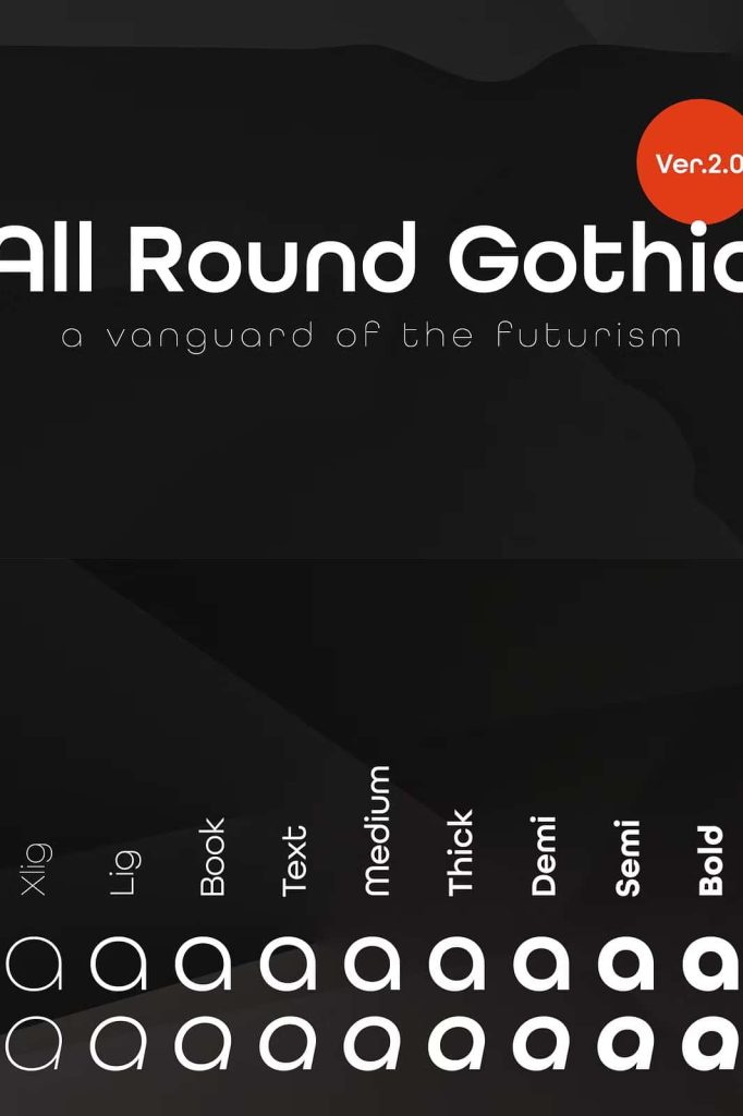
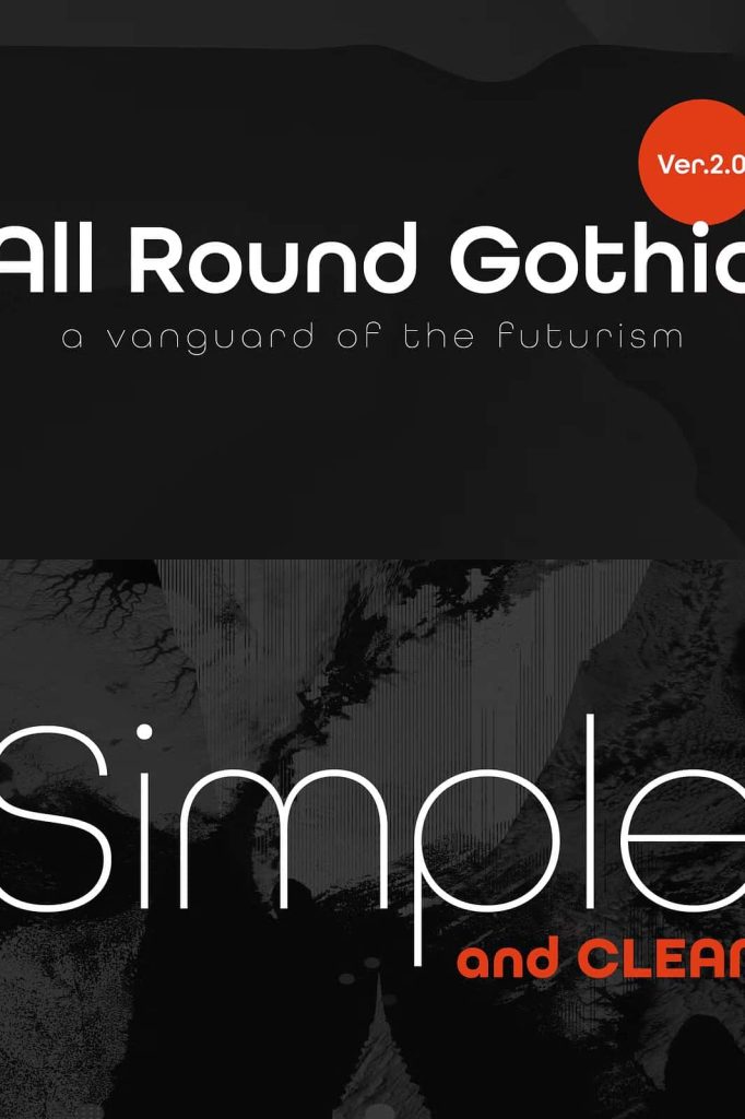
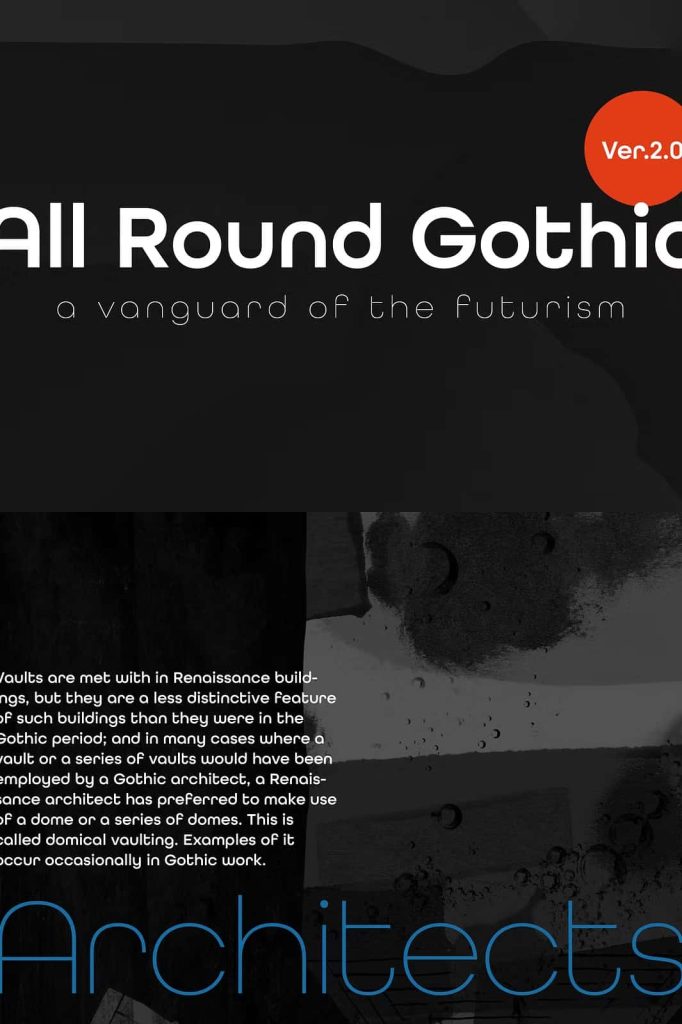
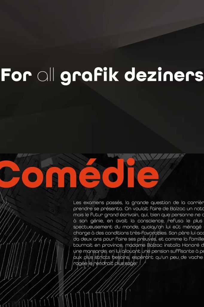
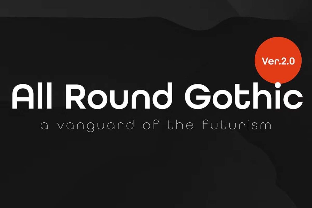
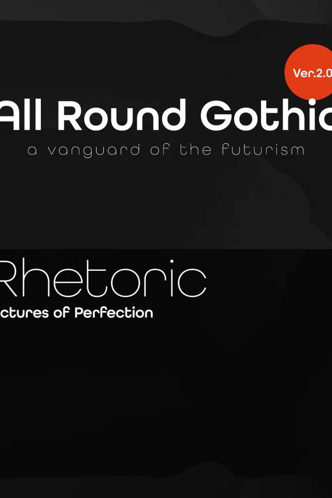
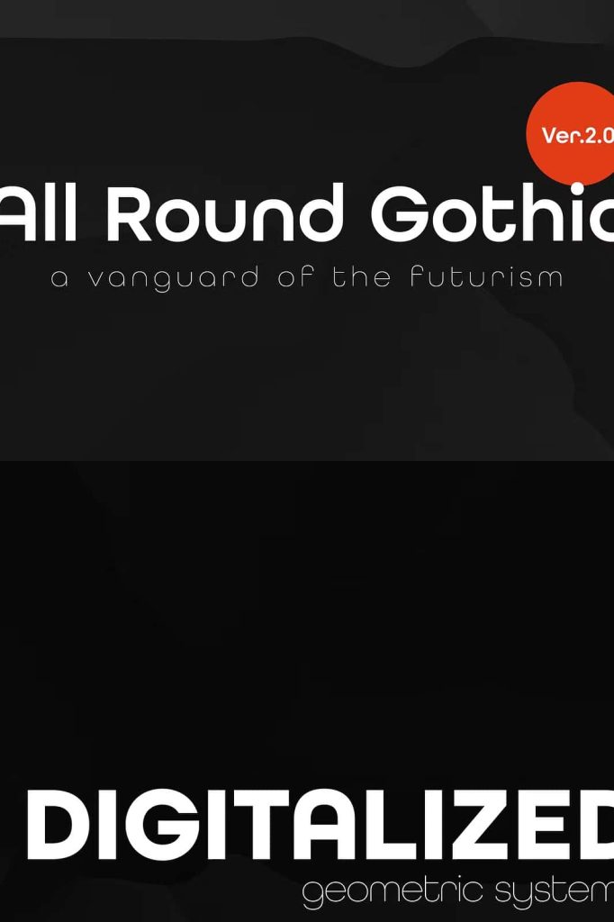
All Round Gothic is a beautifully crafted geometric sans-serif font family that successfully combines timeless modernist principles with a fresh contemporary personality. Originally designed in 2012 by Ryoichi Tsunekawa, this typeface takes inspiration from legendary geometric fonts such as Avant Garde Gothic and Futura while introducing its own distinctive visual identity. Instead of simply recreating classic geometric forms, All Round Gothic refines them with softer curves, cleaner construction, and subtle organic details that make every character appear approachable and highly readable.
The font family achieves an excellent balance between precision and warmth. Its carefully engineered letterforms maintain the structured geometry expected from a modern sans-serif while embracing gentle imperfections that prevent the design from feeling overly mechanical. This thoughtful combination allows All Round Gothic to adapt effortlessly across digital and print applications, making it an outstanding choice for designers seeking a versatile typeface with timeless appeal.
A Modern Interpretation of Geometric Sans-Serif Design
Inspired by iconic typefaces from the early twentieth century, All Round Gothic embraces the clean geometry that made fonts like Avant Garde Gothic and Futura internationally recognized. However, rather than following these classics without change, designer Ryoichi Tsunekawa introduces a softer design philosophy that gives the font a more welcoming appearance.
The letterforms remove unnecessary stems and simplify structural elements to create a cleaner silhouette. Instead of relying on perfectly rigid circles, the bowls feature intentionally imperfect curves that produce a subtle organic rhythm throughout the typeface. These carefully balanced details help the font feel more natural while preserving the strong geometric foundation that designers appreciate.
This unique approach creates a typeface that bridges the elegance of 1920s modernist typography with the expectations of today’s visual communication. Whether used for minimalist branding or expressive editorial layouts, All Round Gothic maintains clarity, consistency, and sophistication.
Friendly Character with Professional Precision
One of the defining characteristics of All Round Gothic is its ability to appear both professional and approachable. Many geometric sans-serif fonts prioritize mathematical perfection, sometimes resulting in cold or sterile typography. All Round Gothic avoids this limitation by introducing subtle softness into its letter construction.
The rounded forms, balanced proportions, and carefully refined curves create text that feels inviting without sacrificing precision. This balance allows designers to communicate confidence, creativity, and accessibility at the same time.
Whether your project targets technology companies, creative agencies, educational institutions, lifestyle brands, or modern startups, All Round Gothic provides a visual language that supports clear communication while maintaining a welcoming personality.
Excellent Readability Across Every Size
Readability remains one of the greatest strengths of All Round Gothic. Every letter has been carefully designed to maintain visual clarity from small body text to oversized headlines. The balanced spacing, consistent stroke widths, and clean geometric forms help readers process information quickly without unnecessary distractions.
This impressive readability makes the font suitable for both print and digital environments, including websites, mobile applications, presentations, magazines, books, brochures, packaging, and advertising campaigns.
Whether displayed on high-resolution screens or printed materials, All Round Gothic maintains crisp edges and consistent visual rhythm that contribute to an enjoyable reading experience.
Versatile Applications for Creative Projects
The flexibility of All Round Gothic makes it an excellent investment for designers working across multiple industries. Its contemporary appearance easily adapts to projects ranging from corporate branding to artistic expression.
Brand Identity
Create memorable logos, visual identities, business cards, and brand guidelines with typography that feels modern, trustworthy, and approachable.
Editorial Design
Use All Round Gothic for magazines, books, catalogs, newspapers, and digital publications where clean typography and comfortable readability are essential.
Web Design and User Interfaces
The font performs exceptionally well in websites, dashboards, software interfaces, and mobile applications thanks to its clear letterforms and excellent legibility.
Marketing Materials
Design compelling brochures, posters, flyers, social media graphics, presentations, and promotional campaigns that capture attention while maintaining a professional appearance.
Packaging Design
Modern packaging benefits from typography that communicates quality without appearing overly decorative. All Round Gothic provides a clean aesthetic suitable for food, cosmetics, fashion, technology, and premium consumer products.
Balanced Between Heritage and Innovation
One of the reasons All Round Gothic stands out is its ability to connect historical typography with modern visual trends. The influence of classic geometric sans-serif design remains immediately recognizable, yet the font introduces enough refinement to feel completely current.
This balance makes the typeface particularly valuable for brands that want to express innovation while respecting timeless design principles. Instead of following temporary design trends, All Round Gothic offers long-lasting visual relevance that continues to perform across evolving creative styles.
Designed by Ryoichi Tsunekawa
Ryoichi Tsunekawa has earned recognition for creating high-quality typefaces that combine technical precision with strong visual personality. All Round Gothic reflects this design philosophy through careful attention to proportion, spacing, and usability. Every character demonstrates thoughtful craftsmanship, allowing designers to build cohesive layouts without sacrificing flexibility or creative freedom.
The result is a font family that not only looks beautiful but also performs consistently in demanding professional environments.
Why Choose All Round Gothic?
If you are looking for a geometric sans-serif font that goes beyond rigid minimalism, All Round Gothic offers an exceptional solution. Its combination of modern geometry, friendly curves, and refined organic details creates typography that feels contemporary, elegant, and highly functional.
From branding projects and editorial publications to websites, user interfaces, packaging, advertising, and creative campaigns, All Round Gothic delivers outstanding versatility and dependable readability. By blending the enduring influence of classic modernist typography with subtle contemporary refinements, this font family provides designers with a reliable tool that remains visually engaging across countless creative applications.
Whether you are developing a sophisticated corporate identity, designing an innovative digital experience, or creating expressive marketing materials, All Round Gothic gives your typography a confident, approachable, and timeless voice that continues to perform beautifully across every medium.