WERKER SANS Font
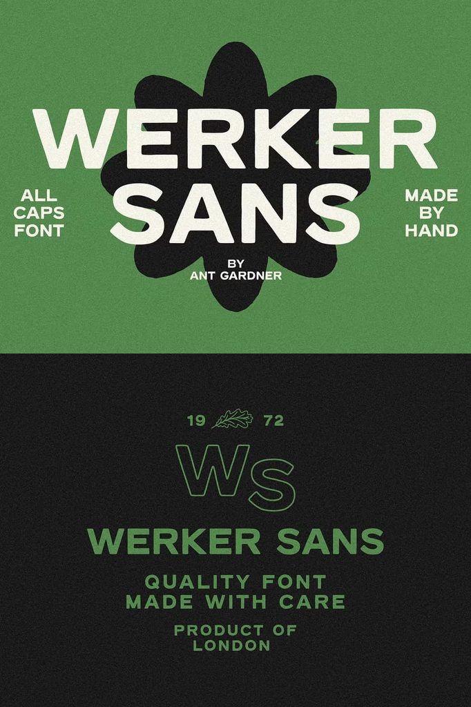
WERKER SANS Font delivers a bold and straightforward hand drawn style for designers who want typography with personality and strong visual presence. Its all-caps construction creates an immediate impact, while the hand drawn character gives the lettering a natural and approachable quality. The combination makes WERKER SANS a practical choice for projects that need bold display typography without unnecessary complexity.
Designed with simplicity and strength in mind, WERKER SANS can help transform headlines, brand names, slogans, and short phrases into clear visual statements. Its hand drawn appearance adds character to the lettering, while the straightforward sans serif structure keeps the overall design clean and easy to use.
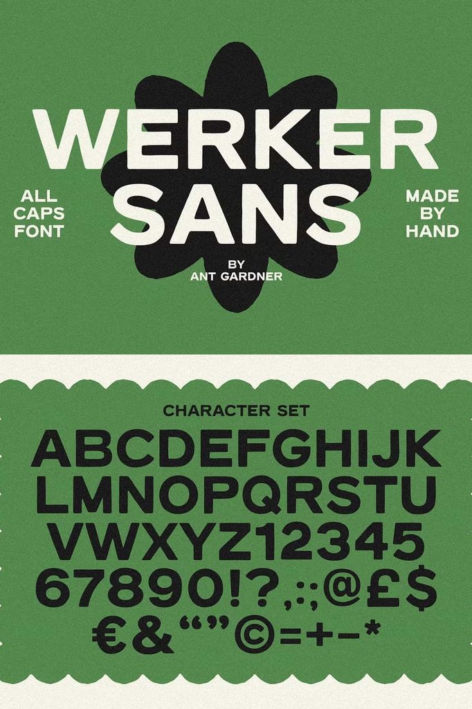
WERKER SANS includes uppercase letters, numbers, and essential punctuation, giving designers the basic character set needed for a wide range of creative projects. Use it for logos, posters, packaging, apparel, signage, social media graphics, promotional artwork, and other designs that depend on strong display text.
A Bold and Simple Hand Drawn Font
WERKER SANS focuses on two important qualities: boldness and simplicity. Its strong all-caps lettering creates a confident visual presence, while the hand drawn treatment prevents the typography from appearing overly mechanical or generic.
The handcrafted quality gives the font a more relaxed personality than a conventional geometric or corporate sans serif. This makes it useful for brands and projects that want to communicate creativity, authenticity, energy, or an approachable attitude.
Because WERKER SANS uses an uncomplicated structure, designers can incorporate it into many different visual styles. Place it in a minimalist layout for a contemporary appearance, or combine it with textures and illustrations to create a more rugged handcrafted aesthetic.
All-Caps Typography for Strong Headlines
The all-caps format makes WERKER SANS especially effective for headlines and display text. Uppercase lettering naturally creates a strong visual block, allowing short phrases to stand out immediately.
Use WERKER SANS for poster titles, campaign headlines, brand names, event announcements, product names, and promotional messages. Its bold construction allows the text to remain visually prominent even when you place it alongside photography or illustrations.
Experiment with letter spacing to control the mood of your design. Tighter spacing can create a compact and powerful appearance, while additional spacing can give the typography a more open and contemporary feel.
Perfect for Logo and Branding Design
WERKER SANS Font can create distinctive logos and brand identities with a bold handcrafted personality. Its all-caps construction makes business names easy to present as strong wordmarks, while the hand drawn character gives the identity a more human quality.
Use it for creative studios, clothing brands, restaurants, cafés, lifestyle companies, handmade businesses, event brands, outdoor projects, publishing ventures, and other organizations that want a confident but approachable identity.
For logo design, let WERKER SANS handle the main brand name and pair it with a simple secondary font for taglines or supporting information. This creates a clear hierarchy and allows the hand drawn lettering to remain the primary visual element.
Numbers and Essential Punctuation
WERKER SANS includes numbers and essential punctuation, making it more practical for real-world design applications. These additional characters allow you to create complete headlines, dates, prices, short statements, promotional messages, and other display compositions without switching to a different font.
This flexibility can prove useful for posters, packaging, menus, event graphics, advertisements, labels, and social media campaigns. You can keep the same typographic style throughout a design instead of mixing unrelated character styles.
Use the available punctuation to build expressive headlines and clear messaging. Numbers can also support product names, event dates, promotional offers, edition numbers, or other information that needs to remain visually consistent with the main typography.
Bold Typography for Posters
WERKER SANS works naturally in poster design because its bold all-caps lettering creates an immediate focal point. Use it for event titles, promotional campaigns, concerts, exhibitions, workshops, product launches, or community events.
Place the main headline at a large size and build the rest of the composition around it. Combine the typography with photography, illustrations, geometric shapes, or textured backgrounds depending on the style of the project.
The hand drawn quality can also help posters feel more personal and creative. Use a simple composition to emphasize the lettering, or introduce rough textures and graphic details for a more expressive visual direction.
Ideal for Packaging and Product Labels
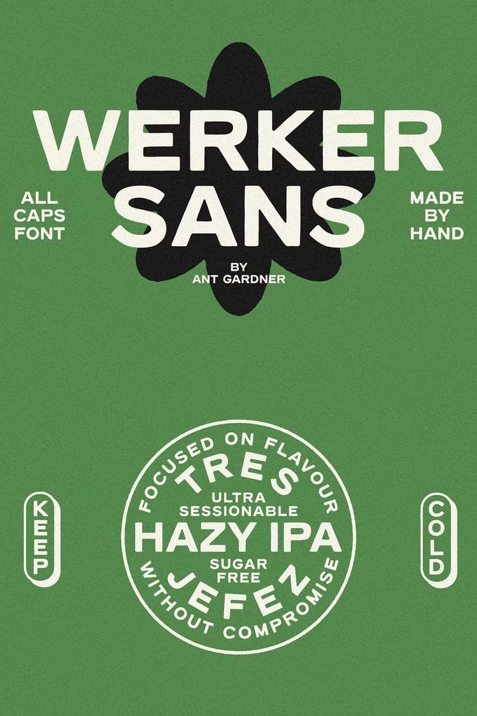
WERKER SANS can help packaging communicate confidence and simplicity. Its bold lettering works well for product names, labels, promotional phrases, badges, and packaging headlines.
The hand drawn appearance can complement handmade, artisan, food, beverage, lifestyle, outdoor, and creative products. Use the font to create a strong product name and pair it with a clean supporting typeface for descriptions and practical information.
For a minimalist package, place WERKER SANS on a clean background with limited supporting graphics. For a more handcrafted look, combine it with paper textures, illustrations, stamps, or organic shapes.
Apparel and Merchandise Design
WERKER SANS provides a strong display style for apparel and merchandise. Its all-caps structure creates bold graphic shapes that work effectively on T-shirts, hoodies, caps, tote bags, posters, stickers, and other promotional products.
Use short slogans, brand names, phrases, or single words to create impactful designs. The hand drawn character adds personality while the bold construction helps the typography remain visible from a distance.
You can experiment with centered layouts, oversized lettering, stacked words, or curved compositions. Combine WERKER SANS with simple illustrations to create merchandise that feels distinctive without becoming overly complicated.
Recommended Design Applications
- Logo and brand identity design
- Posters and promotional graphics
- Apparel and merchandise
- Product packaging and labels
- Social media graphics
- Event and campaign branding
- Restaurant and café graphics
- Outdoor and lifestyle branding
- Signage and display graphics
- Product names and headlines
- Stickers and promotional products
- Editorial display typography
Create Engaging Social Media Graphics
Strong typography can help social media posts communicate quickly, and WERKER SANS provides a bold visual solution for headline-driven content. Use it for announcements, quotes, product promotions, campaign messages, event graphics, and branded posts.
Keep your primary message short and place it prominently within the layout. Combine WERKER SANS with simple imagery and supporting typography to create a clear hierarchy. Its all-caps format can also help establish consistency across a series of branded posts.
For a more dynamic composition, experiment with different sizes and alignments. You can create visual movement by stacking words, changing line lengths, or combining large headlines with smaller supporting information.
Pair WERKER SANS with Complementary Fonts
Although WERKER SANS can work effectively on its own, pairing it with another typeface can create a more complete design system. A clean sans serif or simple serif can handle body copy, descriptions, captions, and other information.
Let WERKER SANS dominate the display hierarchy and use the supporting font at smaller sizes. This contrast helps maintain readability while allowing the hand drawn lettering to communicate the project’s personality.
Avoid combining WERKER SANS with several other highly decorative fonts. Its handcrafted style already provides plenty of character, so a restrained companion typeface usually creates the strongest result.
Build a Confident Visual Identity
WERKER SANS can help brands communicate confidence while maintaining an approachable character. Its bold lettering creates strength, while the hand drawn details introduce a more human quality.
This balance makes it useful for brands that want to avoid an overly corporate appearance. Use the font across selected brand touchpoints such as logos, packaging, social media graphics, promotional materials, signage, and merchandise.
Maintain consistent typography and spacing across your materials to create a recognizable identity. You can also combine WERKER SANS with a simple graphic system to reinforce the brand without distracting from the lettering.
Why Choose WERKER SANS Font?
WERKER SANS Font gives designers a bold all-caps hand drawn style with a simple and practical character set. Its uppercase letters, numbers, and essential punctuation support a wide range of display applications.
The font combines the visual strength of bold typography with the approachable quality of handcrafted lettering. This makes it flexible enough for branding, posters, packaging, apparel, signage, social media, and promotional design.
Final Thoughts
WERKER SANS Font provides a bold and simple approach to hand drawn typography. Its all-caps construction creates strong visual impact, while its handcrafted character adds personality and warmth to modern design projects.
Use WERKER SANS for logos, posters, packaging, apparel, merchandise, social media graphics, signage, event materials, and promotional campaigns. Its numbers and essential punctuation also make it practical for complete display compositions that include dates, prices, short messages, and other supporting details.
If you need a typeface that combines straightforward structure with a handmade personality, WERKER SANS offers a versatile option. Keep your layouts focused, experiment with scale and spacing, and pair the font with complementary typography to create bold, memorable designs that communicate clearly and confidently.