TWO MUCH – Chunky Hand-Drawn Sans Font
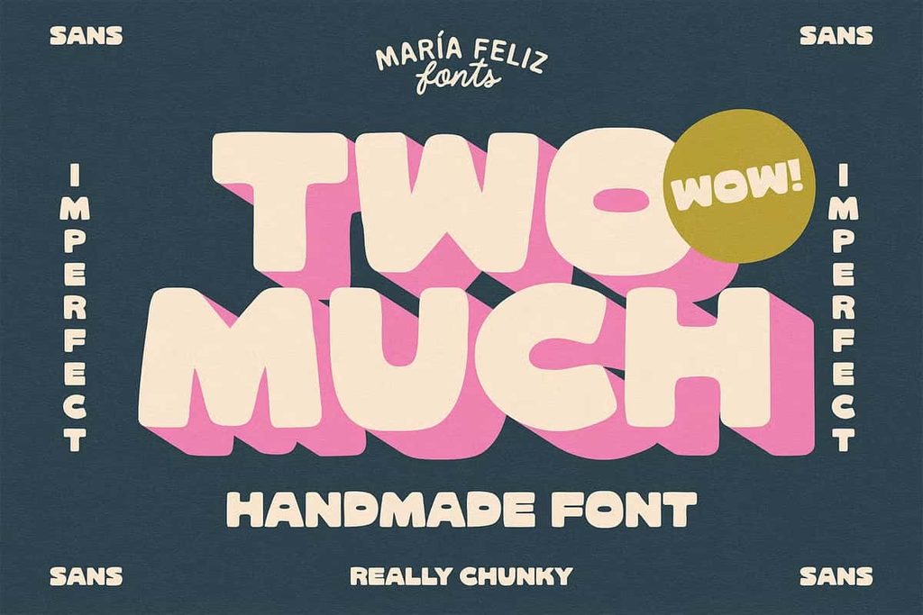
TWO MUCH is a chunky hand-drawn sans font created to give your designs an organic, playful, and unmistakably expressive personality. Built around irregular shapes and bold letterforms, this typeface moves away from perfectly polished typography and embraces the natural character of hand-drawn lettering. Its substantial forms create an immediate visual impact, making TWO MUCH an excellent choice for titles, short phrases, branding, posters, packaging, and other attention-grabbing designs.
With its chunky construction and relaxed appearance, TWO MUCH adds energy without becoming overly complicated. The hand-drawn qualities introduce subtle irregularities that make each composition feel more personal and creative. At the same time, the strong sans-serif foundation keeps the lettering clear and easy to recognize. This balance allows you to create expressive designs that feel bold, modern, and approachable.
A Bold Hand-Drawn Typeface With Organic Character
TWO MUCH embraces the charm of imperfect lettering. Instead of following the rigid precision of traditional geometric typefaces, it introduces a more natural visual rhythm. The irregular shapes create movement across each word, giving your typography a handmade quality that immediately catches the eye.
This organic approach makes TWO MUCH particularly effective for creative projects that need personality. Whether you are designing a poster headline, a product label, a social media graphic, or a bold logo, the font helps your message stand out while maintaining a friendly and accessible appearance.
Chunky Letterforms That Grab Attention
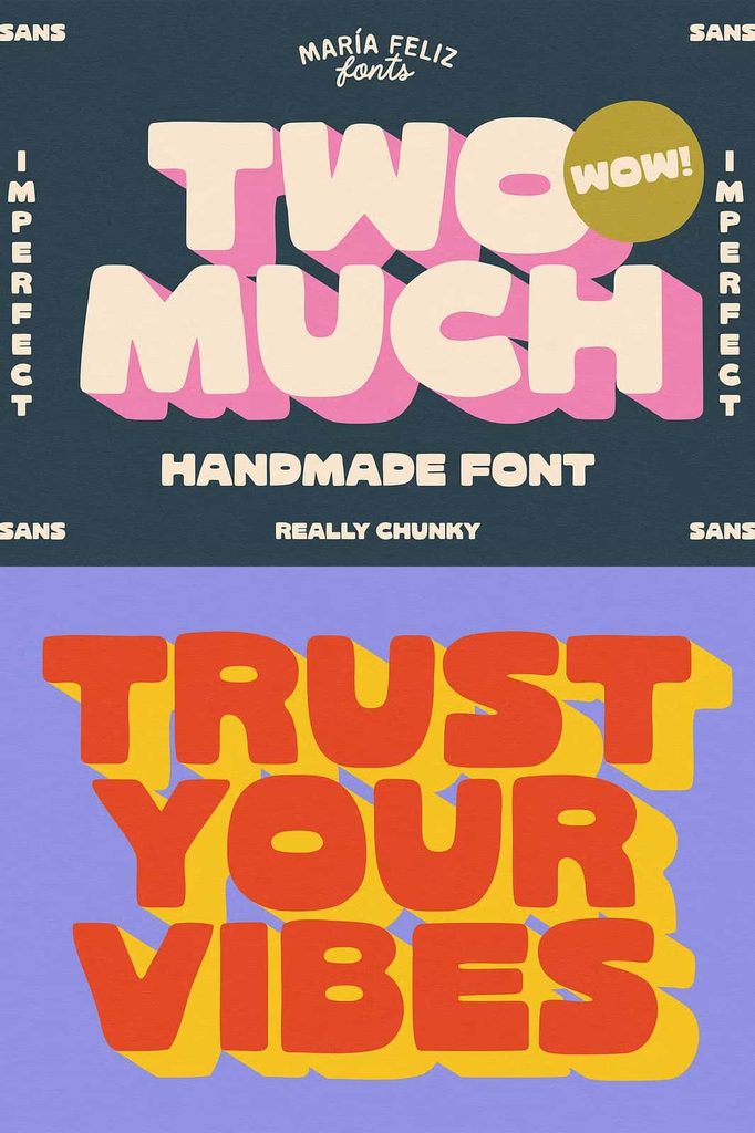
The substantial letterforms give TWO MUCH its strong visual presence. The chunky construction allows short words and phrases to occupy space confidently, making the typeface ideal for display typography. Use it at larger sizes to create powerful headlines or combine several words to build a bold typographic composition.
Its weight also makes the font suitable for designs where typography needs to compete with illustrations, photography, textures, or other visual elements. TWO MUCH can hold its own within a busy composition and still communicate your message clearly.
Perfect for Impactful Titles
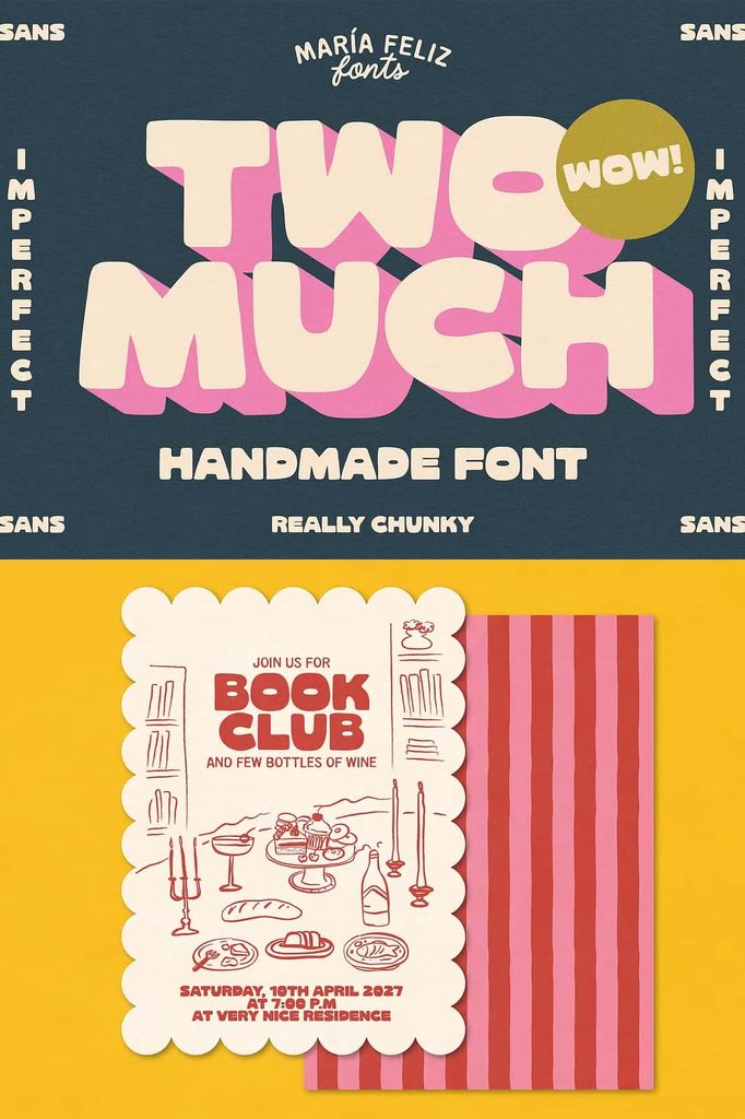
TWO MUCH performs especially well when you need a title that demands attention. Its thick, hand-drawn forms create an immediate focal point and help short phrases become prominent visual elements. Use it for poster headlines, campaign titles, event graphics, album artwork, book covers, or promotional designs.
Because the typeface has such a strong personality, you can often create an effective composition with only a few words. Let the chunky lettering take center stage and support it with simple graphic elements, clean backgrounds, or contrasting typography.
Add Personality to Branding
A distinctive typeface can help a brand establish a memorable visual identity, and TWO MUCH provides plenty of personality for creative branding projects. Its hand-drawn appearance works well for businesses and products that want to communicate energy, originality, confidence, or a relaxed attitude.
Use TWO MUCH for logos, brand names, product collections, promotional headlines, packaging, stickers, merchandise, and campaign graphics. Its irregular qualities can make a wordmark feel more approachable than a perfectly constructed geometric sans serif, while its chunky weight gives the identity a confident presence.
Great for Creative and Lifestyle Brands
TWO MUCH can complement brands connected to fashion, food, entertainment, art, handmade products, street culture, lifestyle, creative services, and youth-focused projects. Its expressive appearance allows you to build a visual identity that feels energetic without relying on excessive decorative elements.
Ideal for Posters and Social Media Graphics
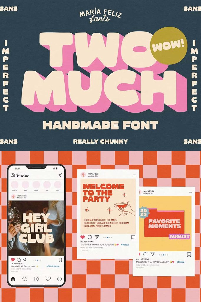
When a design needs to communicate quickly, strong display typography can make a significant difference. TWO MUCH helps create headlines that viewers can notice immediately. Use it for posters, flyers, advertisements, social media posts, digital banners, announcements, and promotional graphics.
The font works particularly well with short statements and bold phrases. Experiment with large sizes, tight compositions, layering, and contrasting backgrounds to create dynamic visual arrangements. Its organic character can also complement illustrations, hand-drawn artwork, stickers, doodles, and textured graphics.
Bring an Organic Feel to Packaging
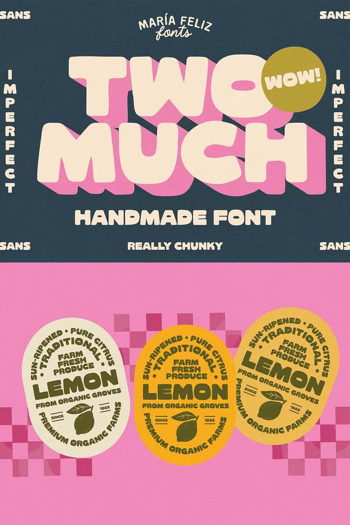
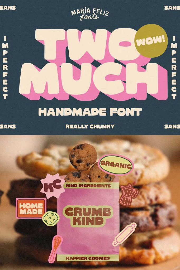
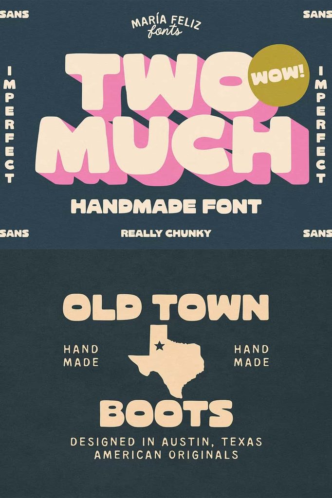
TWO MUCH can give product packaging a playful and handcrafted appearance. Use it for product names, labels, flavor names, collection titles, stickers, tags, and promotional packaging. The chunky forms can create strong shelf presence while the irregular lettering adds warmth and individuality.
This style works especially well for food and beverage products, creative goods, apparel, accessories, stationery, handmade products, and lifestyle collections. Combine the font with simple illustrations or natural textures to strengthen its organic visual character.
A Versatile Font for Short Phrases
TWO MUCH is designed to shine when you keep the message concise. Short phrases allow its chunky letterforms to become the primary visual feature without overwhelming the composition. Use it for slogans, headlines, product statements, campaign messages, quotes, and decorative text.
Its strong appearance makes it easy to build a hierarchy around a few carefully selected words. Instead of filling a layout with excessive information, let TWO MUCH communicate the central message with confidence.
Use It as a Display Font
Because of its substantial construction, TWO MUCH works best as a display typeface. Increase the size to showcase its irregular shapes and expressive details. Use smaller supporting fonts for body copy and secondary information, creating a clear contrast between the bold headline and the rest of your layout.
Pair TWO MUCH With Simple Typography
The expressive personality of TWO MUCH makes it easy to pair with cleaner fonts. A minimalist sans serif can provide a modern counterpoint, while a simple serif can introduce a more editorial feel. Keeping supporting typography restrained allows the chunky hand-drawn lettering to remain the main attraction.
You can also experiment with different weights, sizes, and spacing in your overall composition. Use TWO MUCH for the primary headline and a neutral typeface for descriptions, captions, and other supporting content. This approach creates balance without taking away from the font’s distinctive character.
Creative Uses for TWO MUCH
This chunky hand-drawn sans font offers plenty of creative possibilities. Consider using TWO MUCH for:
- Bold logo designs and wordmarks
- Poster headlines and promotional artwork
- Social media graphics and digital campaigns
- Product packaging and labels
- Stickers, badges, and merchandise
- Event titles and announcements
- Book covers and album artwork
- Food and beverage branding
- Creative lifestyle branding
- Advertising headlines and campaign graphics
- Quotes and short phrases
- Hand-drawn inspired illustrations and compositions
Make Your Designs Stand Out
TWO MUCH gives designers a simple way to introduce boldness and personality into their typography. Its chunky structure creates immediate impact, while its organic irregularities keep the overall appearance playful and approachable. The result is a typeface that feels handmade without losing the strength required for modern display design.
Choose TWO MUCH when you want your typography to feel confident, creative, and full of character. From impactful titles and expressive logos to packaging, posters, and social media graphics, this chunky hand-drawn sans font can turn simple words into memorable visual statements.
With its bold presence and natural imperfections, TWO MUCH encourages you to step away from overly polished typography and embrace a more expressive approach. Use it to create designs that feel energetic, distinctive, and unmistakably your own.