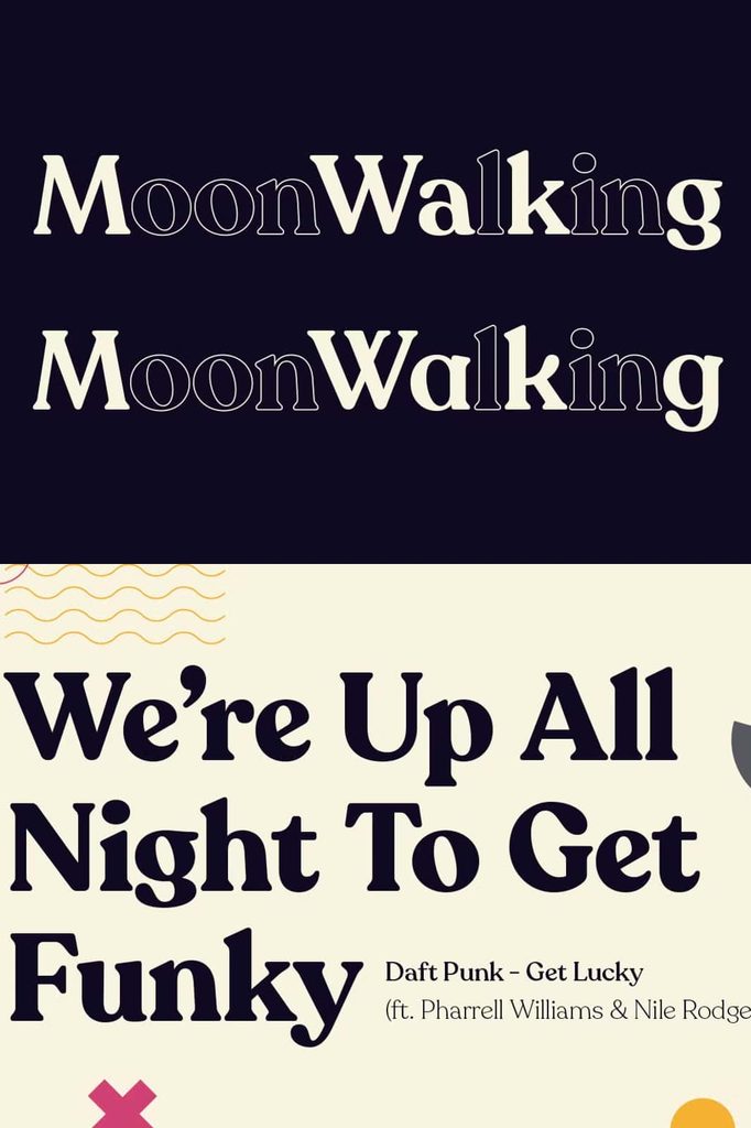
Recoleta Font – Retro 1970s Style with a Modern Touch
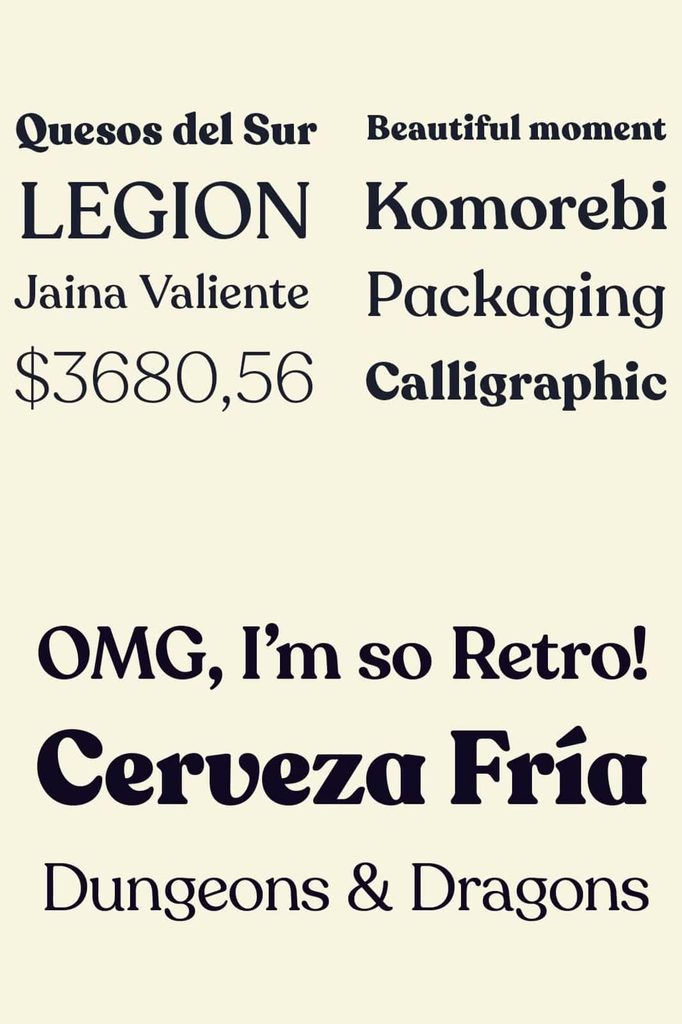
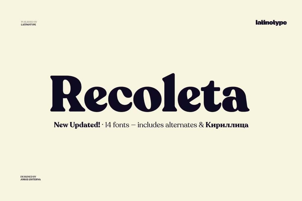
Recoleta Font brings together the warmth, personality, and expressive character of popular 1970s typefaces in one distinctive design. Inspired by memorable lettering styles from the era, Recoleta combines soft, rounded shapes with elegant curves and confident angled strokes. The result feels familiar without looking outdated, giving designers a versatile typeface that connects nostalgic influences with contemporary visual design.
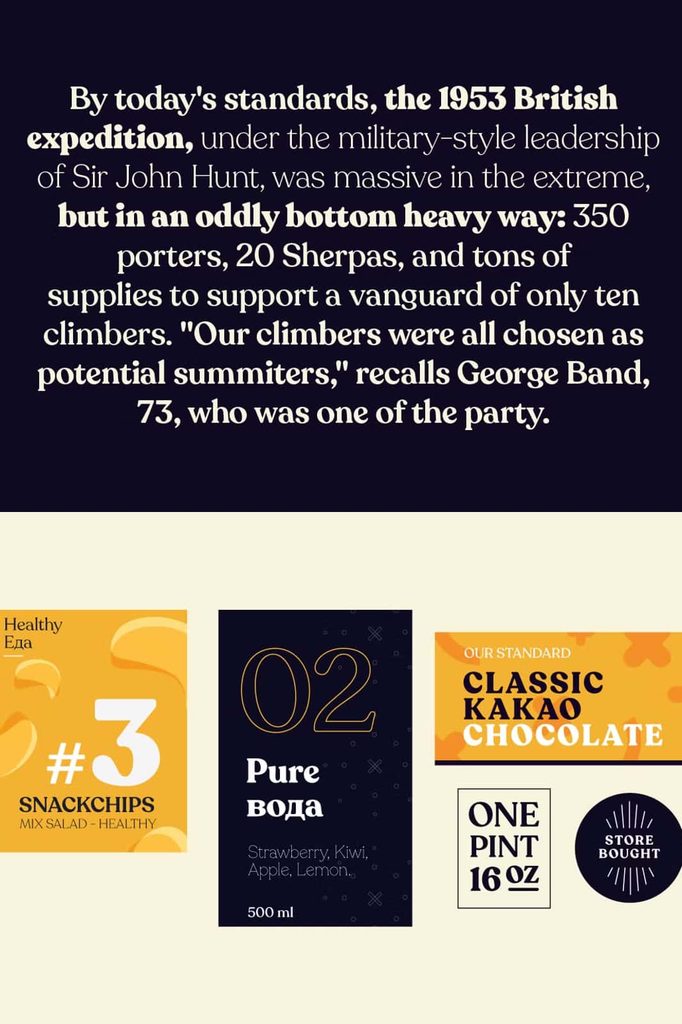
With its unique personality and flexible character set, Recoleta works across a wide range of creative projects. It can add warmth to a brand identity, personality to packaging, character to editorial layouts, or a bold visual presence to large headlines. The typeface balances decorative qualities with practical readability, allowing designers to use it for both expressive display work and selected areas of supporting text.
A Distinctive Blend of 1970s Typography
Recoleta draws inspiration from several influential typographic styles associated with the 1970s. Its design brings together different visual ingredients instead of copying a single historical typeface. Soft and gentle shapes recall the friendly appearance of Cooper, while fluid and angled strokes introduce the dynamic character associated with Windsor. Recoleta combines these influences into a cohesive type family with its own recognizable identity.
This combination gives Recoleta an appealing balance between softness and structure. Rounded forms create a welcoming impression, while sharper transitions and expressive curves prevent the design from feeling overly simple. The contrast makes the typeface especially useful when you want typography to communicate personality rather than simply deliver information.
Soft Curves and Expressive Letterforms
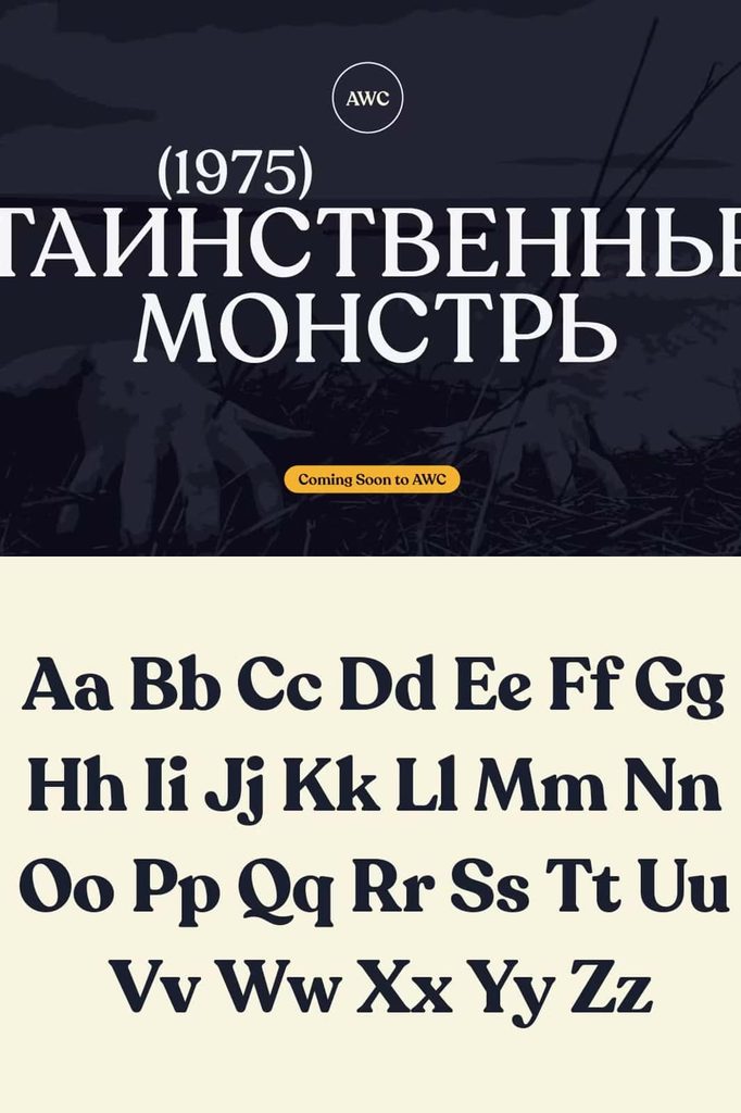
One of the defining qualities of Recoleta Font is its expressive construction. The letters feature rounded forms, smooth curves, and carefully shaped details that create a strong visual rhythm. These characteristics help individual words stand out while maintaining a cohesive appearance across longer phrases.
The typeface can create a warm and approachable atmosphere, making it suitable for brands that want to appear confident without becoming overly formal. Its distinctive shapes also make it effective for creative industries, lifestyle brands, food packaging, fashion projects, publishing, and other applications where typography needs to carry a strong visual identity.
Multiple Weights for Greater Design Flexibility
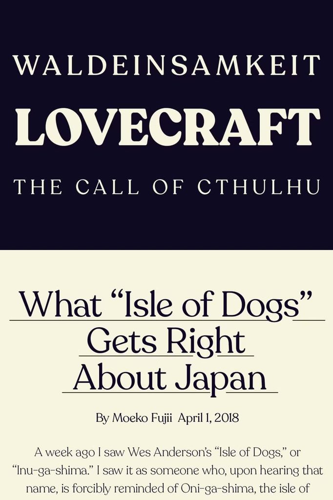
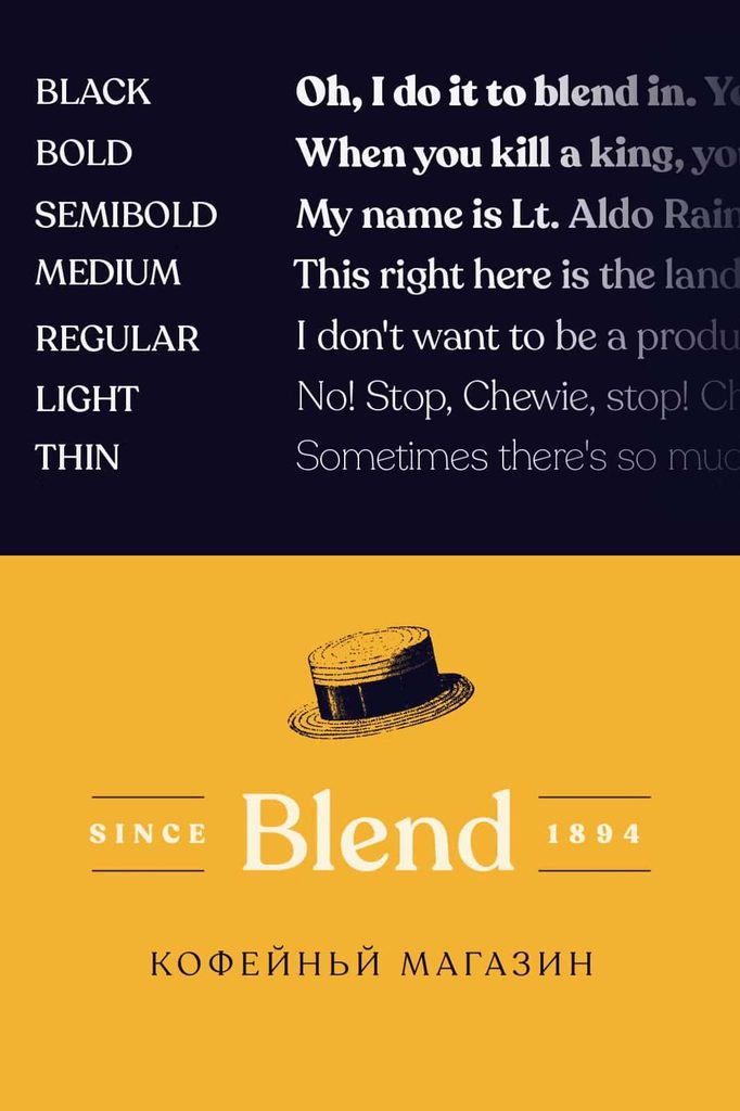
Recoleta offers a variety of weights, giving designers greater control over hierarchy, contrast, and typographic color. Instead of relying on one fixed style, you can select a lighter or heavier weight according to the needs of your project. This flexibility allows the family to support different levels of emphasis while preserving its recognizable visual character.
Lighter weights work particularly well when you need a softer typographic presence. They can support body copy, secondary information, captions, introductory text, and other areas where the type should remain visually interesting without dominating the composition.
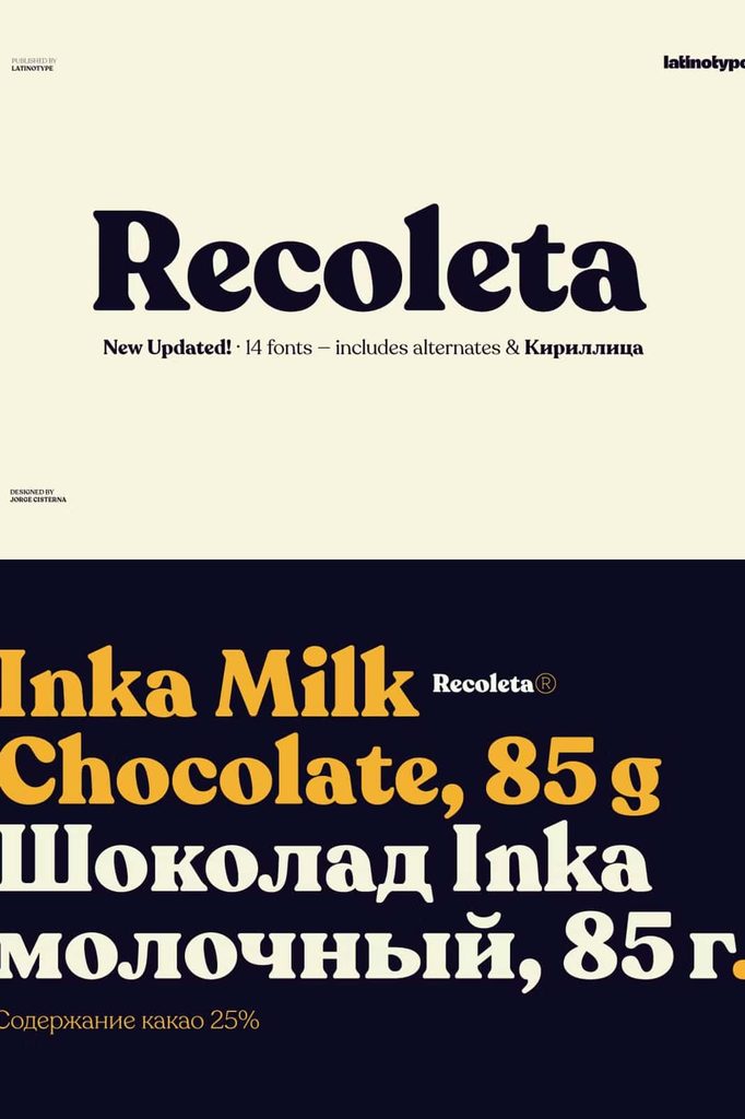
Heavier weights create a much stronger presence. They work especially well for headlines, campaign titles, posters, packaging statements, website banners, and other large-scale applications. Their substantial forms can immediately attract attention and establish a clear visual focal point.
Light Weights for Elegant Typography
The lighter styles provide a refined alternative for projects that require a more delicate typographic treatment. Their softer appearance can complement illustrations, photography, editorial layouts, and sophisticated branding systems. By reducing visual weight while retaining Recoleta’s distinctive shapes, these styles help designers create contrast without introducing an entirely different typeface.
Heavy Weights for High-Impact Headlines
The heavier styles deliver the bold personality that makes Recoleta particularly effective for display typography. Large headlines gain greater presence, while short phrases can become strong visual elements within a composition. Designers can use these weights to create memorable titles, campaign graphics, posters, product names, and attention-grabbing marketing materials.
Stylish Alternates for Unique Branding
Recoleta also includes stylistic alternates that give designers additional ways to customize their typography. These alternate characters can replace standard letterforms with different visual variations, allowing you to create a more individual composition without changing the overall typeface.
This feature becomes particularly valuable for branding projects. A logo, business card, label, or wordmark can use carefully selected alternate characters to develop a distinctive appearance. Instead of presenting the same standard letterforms every time, you can experiment with different character combinations and create typography that feels more personal to the brand.
Create More Distinctive Logos and Wordmarks
Branding often depends on small typographic details. A subtle character variation can change the personality of a wordmark and help it stand apart from similar designs. Recoleta’s stylistic alternates give you the freedom to explore these possibilities while maintaining the core visual language of the font.
Use the alternate characters selectively to enhance initials, emphasize particular letters, or create a more decorative treatment for a brand name. This flexibility makes Recoleta a useful choice for designers who want a typeface that offers both a strong default style and additional creative options.
Perfect for Branding, Packaging, and Editorial Design
Recoleta Font adapts naturally to many creative applications. Its combination of retro inspiration and contemporary execution makes it suitable for brands that want to communicate personality, warmth, creativity, and confidence.
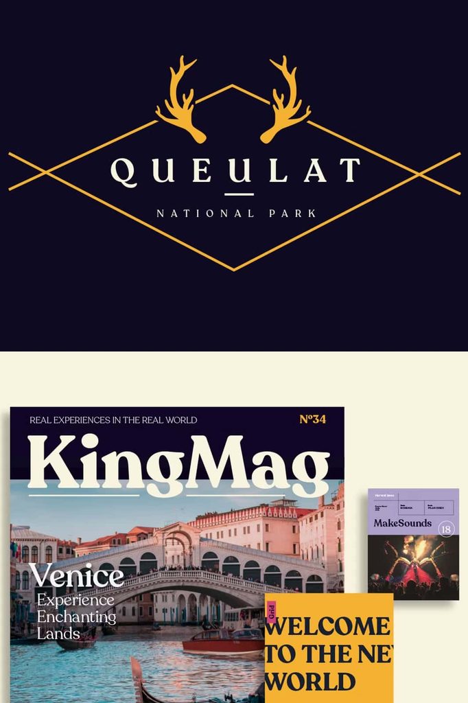
For branding, Recoleta can establish a recognizable visual voice across logos, business cards, stationery, social media graphics, and promotional materials. Its distinctive forms can help a brand develop a memorable typographic identity while its range of weights provides options for supporting typography.
In packaging design, Recoleta can give product names and promotional statements a strong personality. The heavier weights can create immediate shelf impact, while lighter styles can support product information and secondary messaging. Its nostalgic character can also complement packaging concepts inspired by vintage aesthetics while still feeling relevant to modern consumers.
Ideal for Posters and Display Graphics
Recoleta performs especially well when typography becomes a major part of the visual composition. Posters, event graphics, advertisements, album artwork, magazine covers, and social media campaigns can all benefit from its expressive forms.
Large text allows the curves and distinctive letter details to become more visible. Combine different weights to create hierarchy, or pair a bold headline with a lighter supporting line to build contrast. The result can feel energetic, stylish, and visually engaging without requiring excessive decorative elements.
Bring Retro Character into Modern Projects
Recoleta Font captures the spirit of 1970s typography while avoiding a purely historical appearance. Its familiar influences provide a nostalgic foundation, but the unified design gives the typeface a fresh and contemporary personality. This balance allows designers to reference retro aesthetics without making a project look dated.
Whether you are developing a complete brand identity, designing packaging, creating editorial artwork, or building an eye-catching headline, Recoleta provides multiple tools for shaping the final result. Its varied weights help establish hierarchy, while stylistic alternates create additional opportunities for customization.
Why Choose Recoleta Font?
- Combines popular 1970s typographic influences into one distinctive design.
- Features soft, rounded forms with expressive curves and angled details.
- Provides multiple weights for different levels of visual emphasis.
- Supports lighter typography for supporting text and heavier styles for headlines.
- Includes stylistic alternates for customized lettering.
- Works well for logos, business cards, packaging, posters, and branding.
- Brings nostalgic character to contemporary design projects.
- Creates strong visual personality without relying on excessive decoration.
Final Thoughts on Recoleta Font
Recoleta Font offers a distinctive interpretation of retro typography by combining recognizable 1970s influences with a fresh contemporary structure. Its soft shapes, fluid details, varied weights, and stylistic alternates give designers plenty of room to explore different visual directions. Use lighter styles when you need a subtle typographic presence, or choose heavier weights when your headline needs to command attention.
For designers searching for a typeface with warmth, personality, and flexible display potential, Recoleta provides a strong creative foundation. Its combination of nostalgic forms and modern versatility makes it suitable for branding, packaging, editorial design, advertising, posters, logos, and many other projects that require memorable typography.