Papyrcuts Cut Out Font – Bold Papercut Typography with Urban Energy
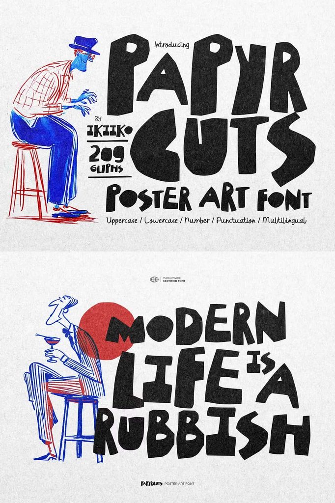
Papyrcuts Cut Out Font brings a bold, handmade aesthetic to modern typography with its distinctive papercut style and raw artistic attitude. Inspired by the spontaneous character of cut-and-paste artwork, this typeface creates lettering that feels physically crafted rather than digitally constructed. Each character carries the visual energy of torn paper, giving your designs an authentic DIY personality that immediately captures attention.
With its rough edges, expressive shapes, and urban-inspired appearance, Papyrcuts can transform ordinary words into powerful graphic elements. The font combines a handmade visual language with a contemporary street-inspired attitude, making it an excellent choice for designers who want to create work that feels unconventional, energetic, and authentic.
Whether you are designing a striking poster, developing a magazine title, creating streetwear branding, or building an edgy promotional campaign, Papyrcuts Cut Out Font gives you the tools to make typography become an important part of the visual composition. Its raw appearance can add movement, texture, and attitude without requiring excessive decorative elements.
What Makes Papyrcuts Cut Out Font Unique?
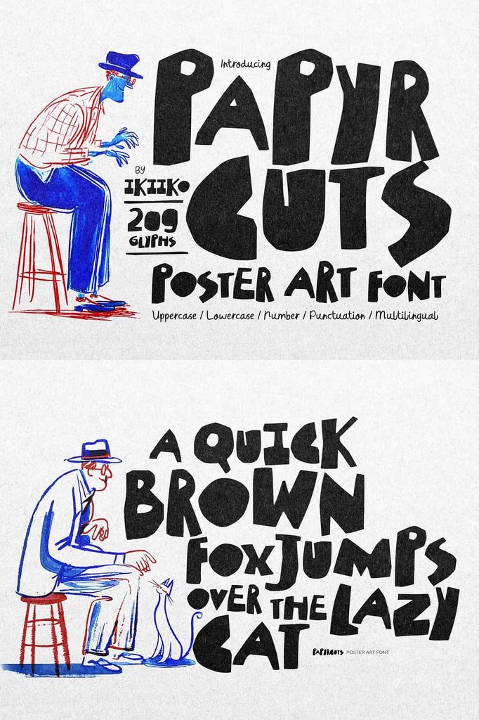
Papyrcuts stands apart through its carefully crafted cut-out appearance. Instead of presenting perfectly smooth and uniform characters, the typeface recreates the visual qualities associated with handmade paper lettering. The letters appear as though someone physically cut, arranged, and assembled them to create a bold typographic composition.
This handmade quality creates an immediate sense of authenticity. The font feels spontaneous, imperfect, and creative, allowing designers to communicate a strong DIY spirit. It can also introduce contrast into otherwise clean layouts, making it especially useful when you want typography to become the central visual feature.
The raw character of Papyrcuts also gives it an urban edge. Its bold forms can complement photography, collage artwork, illustrations, textures, and street-inspired graphics. Combine these elements to build designs that feel energetic and contemporary.
Bold Papercut Style for Creative Projects
The papercut aesthetic gives Papyrcuts a tactile quality that standard digital fonts often lack. Its characters suggest physical materials, handmade construction, and experimental graphic design. This makes the font particularly valuable for projects that need a crafted or unconventional appearance.
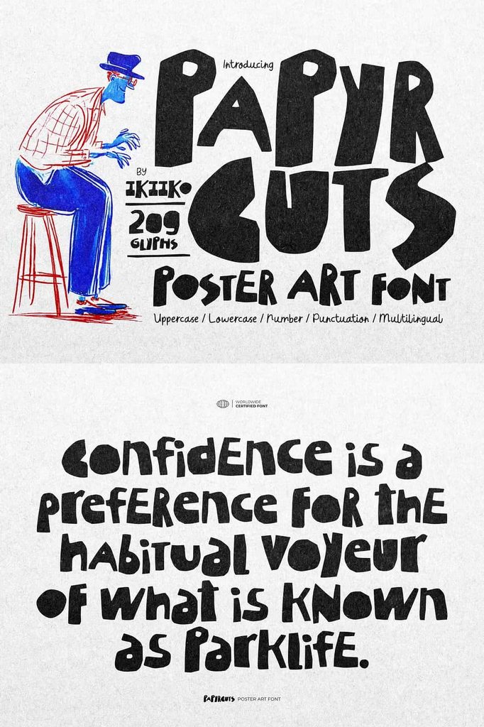
Use Papyrcuts to create bold headlines, attention-grabbing titles, brand statements, campaign slogans, and decorative typography. Because the letters naturally command attention, you can use them as the primary element in a composition and build the rest of the design around them.
Create a Handmade Visual Effect
Designers can strengthen the cut-out appearance by combining Papyrcuts with paper textures, grain, collage elements, rough backgrounds, photographs, or hand-drawn illustrations. These combinations can make the typography feel even more tactile and authentic.
Experiment with layering, overlapping, rotation, and uneven positioning to create a genuine cut-and-paste composition. These techniques can reinforce the DIY aesthetic and help your design feel more spontaneous.
Perfect for Poster Design
Papyrcuts Cut Out Font can make poster typography more dynamic and expressive. Its bold appearance allows headlines to stand out immediately, even when you place them over busy photographic or textured backgrounds.
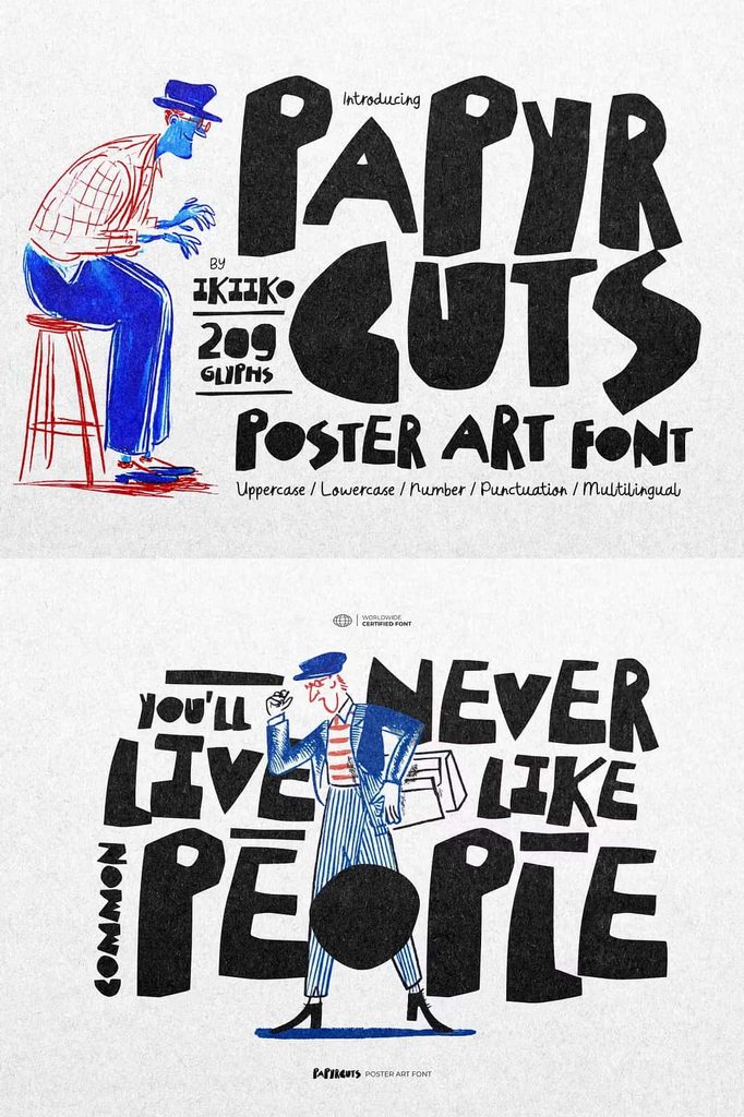
Use the font for music posters, art exhibitions, creative workshops, festivals, independent events, pop-up shops, cultural campaigns, and promotional artwork. Create oversized headlines, experiment with stacked words, and combine the lettering with collage imagery to produce a strong visual hierarchy.
For a more experimental composition, position individual words at different angles or allow selected letters to overlap. The handmade appearance of the font supports these unconventional layouts naturally.
Strong Choice for Magazine Titles
Editorial designers can use Papyrcuts to create memorable magazine covers and feature titles. Its raw personality can provide an interesting contrast against refined editorial layouts, photographs, and minimalist typography.
Apply the font to cover headlines, feature stories, section titles, pull quotes, or special editorial campaigns. Pair it with a clean serif or sans serif typeface to balance its expressive personality with strong readability.
Add Contrast to Editorial Layouts
One of the most effective ways to use Papyrcuts is to introduce it as a contrasting display typeface. Let the cut-out lettering create an energetic focal point while supporting typography handles the longer information.
This strategy allows you to maintain a professional editorial structure while adding a rebellious and artistic detail. The contrast can work particularly well in fashion, music, youth culture, art, lifestyle, and independent publications.
Ideal for Streetwear Branding
Papyrcuts naturally fits streetwear and urban branding because of its bold, handmade, and rebellious character. Use it to create clothing graphics, logos, campaign artwork, labels, tags, packaging, stickers, and promotional materials.
Streetwear designs often benefit from typography that communicates attitude rather than simply presenting information. Papyrcuts can help establish that attitude through its rough papercut forms and DIY-inspired appearance.
Use short brand statements, slogans, or bold words to create impactful apparel graphics. Combine the font with photography, distressed textures, hand-drawn illustrations, or collage elements to create a cohesive street-inspired identity.
Bring DIY Spirit to Your Designs
The handmade appearance of Papyrcuts makes it an excellent choice for designers who want to capture the spirit of independent creativity. Its rough visual language suggests experimentation, personal expression, and hands-on design.
This makes the font suitable for independent brands, artists, musicians, designers, creative studios, and cultural projects. Use it whenever you want your work to feel less corporate and more personal.
Creative Applications for Papyrcuts
You can apply Papyrcuts Cut Out Font to a wide variety of design projects. Its bold display style performs particularly well when you use it for short, impactful text.
- Poster designs
- Magazine covers and titles
- Streetwear branding
- Clothing graphics
- Logo concepts
- Music artwork
- Album and mixtape covers
- Event promotions
- Editorial layouts
- Advertising campaigns
- Social media graphics
- Packaging designs
- Stickers and merchandise
- Creative campaign graphics
- Urban-inspired branding
- Collage and mixed-media artwork
Build Eye-Catching Typography
Papyrcuts works best when you allow its distinctive character to take center stage. Use large type sizes for headlines and short phrases so viewers can appreciate the handmade details. You can also create visual rhythm by combining different scales and positions within the same composition.
Try pairing the font with a restrained supporting typeface. A simple sans serif can provide clarity, while a classic serif can create an unexpected editorial contrast. Keep supporting text clean so the bold papercut lettering remains the strongest visual element.
Experiment with Texture and Composition
Because Papyrcuts already creates a tactile impression, designers can enhance its personality through texture. Add subtle paper grain, photocopy effects, distressed surfaces, or collage imagery to reinforce the handmade concept.
You can also experiment with unconventional alignment. Break words across multiple lines, overlap characters, rotate individual elements, or combine several phrases to create a layered composition. These techniques can make the typography feel assembled by hand.
Why Choose Papyrcuts Cut Out Font?
Papyrcuts Cut Out Font gives designers a powerful way to introduce raw energy and handmade character into modern typography. Its papercut-inspired appearance immediately communicates creativity, while its bold construction ensures that headlines and brand messages remain visually prominent.
The font can help you move beyond predictable typography and create designs that feel more experimental. Its DIY character works particularly well when your project needs an independent, youthful, artistic, or urban identity.
Give Your Designs a Raw Artistic Edge
Typography becomes much more powerful when it carries its own personality. Papyrcuts Cut Out Font achieves this through a distinctive combination of bold lettering, handmade imperfections, and urban attitude. Each character feels as though it could have been cut from paper and arranged by hand, giving your work an authentic tactile quality.
From posters and magazine titles to streetwear branding, merchandise, advertising, packaging, and social media artwork, Papyrcuts can adapt to a wide range of creative applications. Use its strong display presence to attract attention, then build your composition around its handmade character.
If you want a typeface that rejects overly polished typography and embraces raw creativity, Papyrcuts Cut Out Font offers an exciting solution. Let its papercut-inspired forms introduce texture, attitude, and DIY energy to your next project, and create typography that feels bold, spontaneous, and unmistakably handmade.